April 11th, 2018 by Irina Maximova
The prime directive of AnyChart team is to develop the best interactive charts possible. While doing so, we create and use a number of different tools and technologies, and we always search for the new technologies that may help us and make our work more efficient. In this article, we want to talk about the way we make use of Clojure and ClojureScript, and why.
Read more »
April 6th, 2018 by AnyChart Team
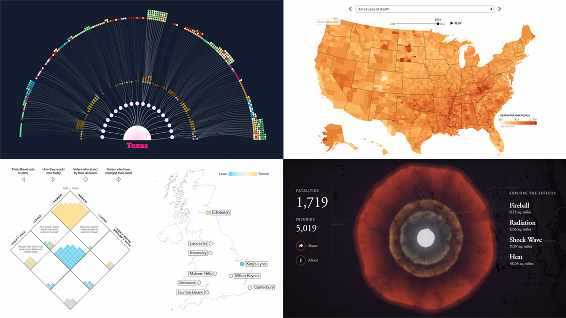 Data visualization keeps gaining popularity as a great way to represent information in an insightful manner, and a lot of charts and infographics come out every day. We are glad to continue our DataViz Weekly series, helping you not miss out on some interesting visualizations.
Today, we are sharing visualizations of data about the following:
- Southern United States’ music in 1939;
- leading causes of death in the US in 1980–2014, by county;
- nuclear bomb effect on your neighborhood;
- opinions on Brexit in the UK.
Read more »
March 30th, 2018 by AnyChart Team
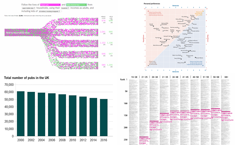 A new collection of fresh data visualization pieces that we’ve found out there on the Web just recently is already here! Check out the new DataViz Weekly post on our blog, putting a spotlight on some cool charts about the following:
- income mobility of different groups;
- job options by age;
- drinking habits in the UK;
- personal preferences of Republicans and Democrats.
Read more »
March 27th, 2018 by AnyChart Team
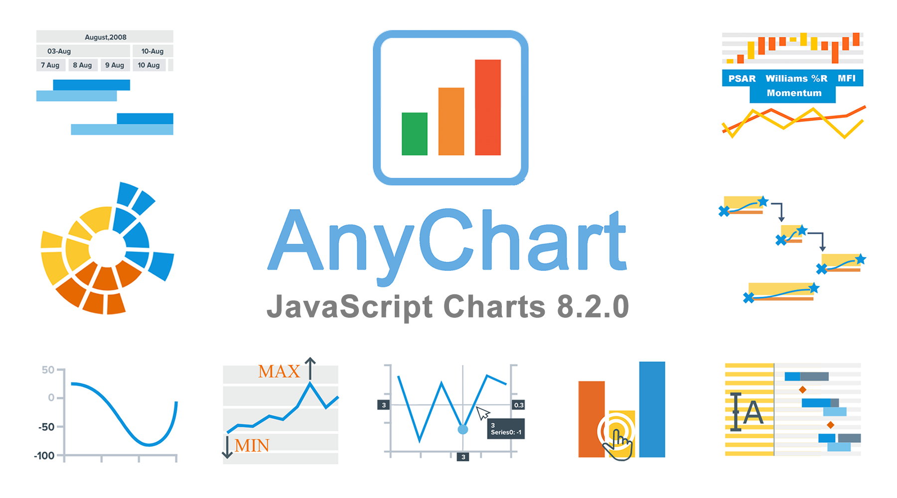 The time has come for another major update of our JavaScript chart libraries, recognized the best in JavaScript technologies earlier this year!
Meet version 8.2.0 of AnyChart, AnyStock, AnyGantt and AnyMap!
To start with, here’s a quick list of what major new cool features have been delivered to our interactive data visualization solutions with this new release:
- Sunburst Chart;
- negative logarithmic scale;
- crosshair multiple labels;
- minimum/maximum labels;
- new technical indicators and additional touch support in stock charts;
- custom drawing, data grid live editor, and new timeline in Gantt charts
Now, let’s take a closer look at each of the major news of AnyChart 8.2.0 and then see what’s next on our roadmap.
Read more »
March 23rd, 2018 by AnyChart Team
 Hey everybody, are you ready for another dose of interesting data visualizations? The new DataViz Weekly collection is already here! So – no matter whether it’s for fun, inspiration, or both – you are welcome to take a look.
Today in Data Visualization Weekly:
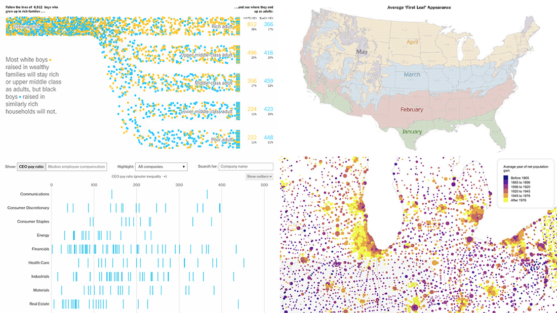
- “first leaf” appearance across the United States;
- different future of black and white boys raised in wealthy families;
- the pay of CEO vs. median employees in publicly traded companies;
- US population in the Alperin-Sheriff data set.
Read more »
March 16th, 2018 by AnyChart Team
 As always, when the end of another week is so close, we’ve selected four of the new interesting data stories and are glad to share them with you. It’s Data Visualization Weekly! And here are the visualizations and the stories they illustrate, which we invite you to take a look at:
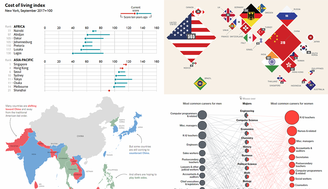
- career inequalities between men and women in the US;
- China-US rivalry for dominance in Asia;
- the most expensive cities worldwide;
- top 25 countries with the most billionaires.
Read more »
March 14th, 2018 by Irina Maximova

It is a pleasure to present a new Challenge AnyChart article! We love our customers and their original tasks, so we continue to show the unlimited capabilities of our JavaScript charting libraries to the blog readers.
The heroes of today’s tutorial are custom technical indicators. Below we’ll explore how to add them to a JS (HTML5) stock chart step by step. So, let’s begin.
Read more »
- Categories: AnyChart Charting Component, AnyStock, Big Data, Business Intelligence, Challenge AnyChart!, Charts and Art, Financial Charts, HTML5, JavaScript, Stock Charts, Tips and Tricks
- 1 Comment »
March 9th, 2018 by AnyChart Team
 Can’t wait to see some more of cool information graphics and visualization-based stories? Well, this is the right place and now is the right time! Check out the new Data Visualization Weekly issue:
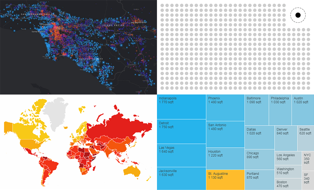
- Corruptions Perceptions Index by Transparency International;
- size of apartments available for $1,500 in every US city and town;
- mapping incomes across the US;
- visualizing outliers.
Read more »
March 8th, 2018 by AnyChart Team
 Less than four months have passed since we presented version 2.0 of our Qlik Sense extension for advanced data visualization. During that short time period, we released three more updates: 2.0.1, 2.1.0 and 2.2.0. And here’s a new one ready!
Meet AnyChart Qlik Sense extension 2.3.0!
The latest update adds two new chart types – Linear and Circular Gauges – as well as several new important features, further extending the power of our JavaScript charting libraries to the Qlik Sense environment. Check out the details in a quick overview below.
Read more »
March 2nd, 2018 by AnyChart Team
 A new Data Visualization Weekly post is here, bringing you another quick collection of interesting charts and infographics that we’ve come across just recently.
Let’s start with a list of the visualizations featured this time and then take a bit closer look at each of them:
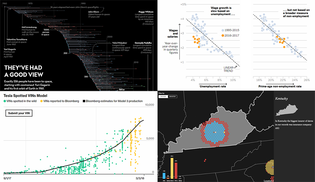
- all space travels in one visualization;
- why wages lagged behind US job growth;
- Tesla Model 3 output;
- Treasury of Weary Souls.
Read more »