November 17th, 2017 by AnyChart Team
 Welcome to our Data Visualization Weekly series where we bring you some of the latest news and information on a wide range of topics, from family and property to energy and education. We use creative and amazing data visuals from around the Web to present information.
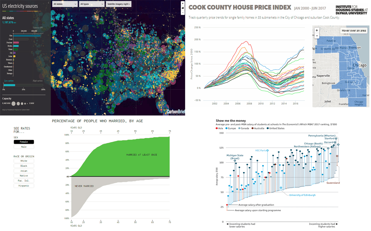
Today we introduce to you interesting data on 4 specific areas that you will find quite interesting to know something about, using a variety of visual elements. We take a closer look at energy generation, marriage statistics by age, and Chicago housing price trends. Another area that we will focus on is MBA – what schools give the biggest (and smallest) boost to salaries. So let’s begin straight away with the first topic.
Read more »
November 15th, 2017 by AnyChart Team
 When AnyChart JS Charts‘ dedicated extension for Qlik Sense first hit the stage on Qlik Branch in the spring of 2017, it was well received by the community. In fact, we delivered what many Qlik users craved: advanced flexibility which at the same time would not affect the ease of interactive data visualization. And that was just the beginning.
Now, we are happy to present version 2.0 of our extension for Qlik Sense!
The major update has brought new chart types and elaborate features out of the box, sharing another portion of the ultimate data visualization power inherent in the AnyChart JavaScript charting library with Qlik users.
Read more »
November 10th, 2017 by AnyChart Team
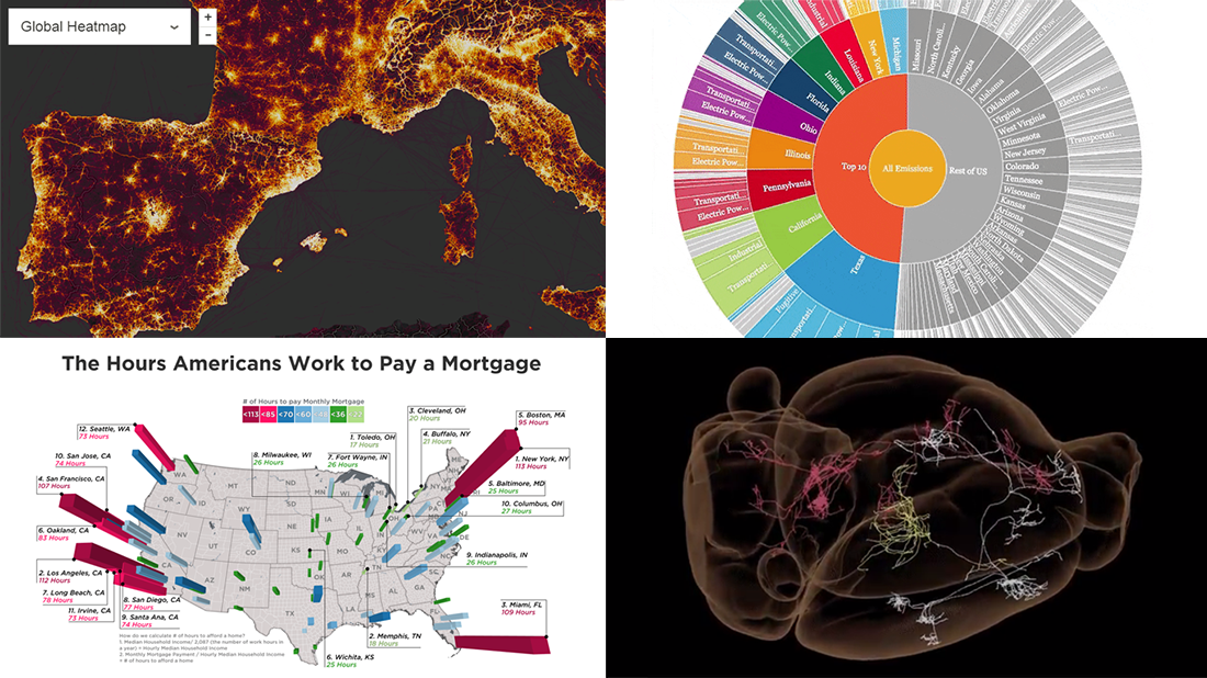 Another week, another four interesting visualization examples. That’s how our DataViz Weekly feature works!
For the present post, we’ve selected the following visual graphics:
- world map of fitness routes;
- how much Americans need to work to pay mortgage;
- explorer of US state greenhouse gas emissions;
- extensive map of mouse brain wiring.
Read more »
November 3rd, 2017 by AnyChart Team
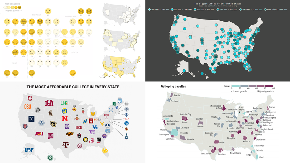 The new issue of DataViz Weekly is fully devoted to US maps. Here you’ll find four interesting geo visualizations telling data stories about the United States of America: the biggest cities, well-being, affordable colleges, high-growth entrepreneurship hotspots.
Read more »
October 28th, 2017 by Timothy Loginov
 Want to know how to build a JavaScript area chart? This article will show you how to do that and tell you who invented area charts in the late 18th century.
The area chart is one of the basic charts used to show changes in data over time. The key feature of this chart type is a colored area between the horizontal X-axis and the line marking the changing value. It can be filled with a color, gradient color, or with a hatch fill.
Look at the chart on the title image. That’s the data visualization being created along the tutorial. Such a JavaScript-based area chart will be interactive and good-looking in any browser, on any website and in any app in HTML5. All samples used in the article are available in our collection on CodePen.
Read the JS charting tutorial »
October 27th, 2017 by AnyChart Team
 Here we are, bringing you the new pick of interesting data visualization examples we came across lately!
Check out what visual graphics we’ve included in this week’s Data Visualization Weekly post:
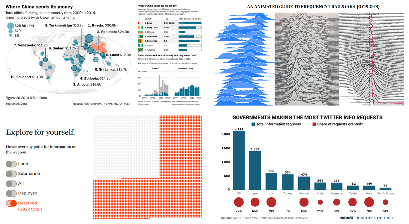
- where China sends money;
- what governments make the most requests for Twitter’s user data;
- visualizing every weapon in the US nuclear arsenal;
- animated interactive guide to frequency trails charts.
Read more »
October 27th, 2017 by Vitaly Radionov
 Meet Challenge AnyChart, a brand new feature on our blog that every dataviz engineer will fall in love with! Each article in this series will be a quick tutorial on how to complete a specific data visualization task that – at first sight – seems too complicated or even unsolvable with AnyChart JS Charts.
From now on, once in a couple of weeks, we’ll pick a thrilling challenge – one of those you’ve shared with our Support Team. And then we’ll show you the best way to deal with it. So all of you can see: Nothing is impossible in AnyChart!
The first challenge for the very first Challenge AnyChart issue is about making an advanced interactive visualization of the spot in a JavaScript polar chart.
Read more »
October 25th, 2017 by Timothy Loginov
 How to create a JavaScript bar chart and why is this important? Every day, data visualization becomes all the more powerful and important area of the Web. The volume of information grows, and it must be made understandable as fast as possible. That’s when data visualization instruments like charts and dashboards become a great help.
Creating HTML5 charts might seem a complicated task, but this assumption is wrong. This article blows this prejudice to pieces and shows how to build an interactive bar chart using JavaScript.
The result will look like on the picture above. Then you’ll also learn how to quickly modify and customize such a JavaScript (HTML5) bar chart. All the JS chart examples used along the tutorial can be found on CodePen.
Read the JS charting tutorial »
October 20th, 2017 by AnyChart Team
 We know that our Data Visualization Weekly has been watched and read by many people. So we are glad to continue this series of posts and share the next one right now, presenting new cool charts showing various interesting data.
Today in Data Visualization Weekly:
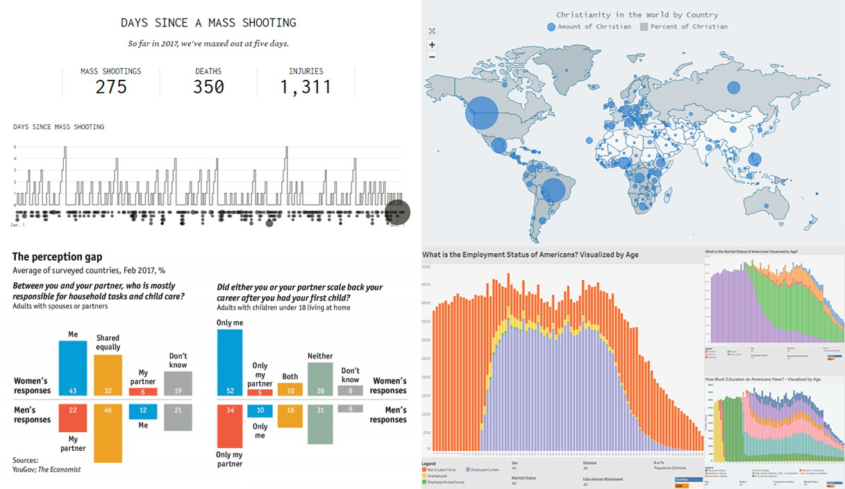
- days between mass shootings in the United States;
- interactive world map of Christianity;
- how US citizens differ by age;
- what women and men think about careers and household tasks.
Read more »
October 13th, 2017 by AnyChart Team
 The beauty of data visualization lies not only in a pretty design or any graphical features one might like to implement. Also – and actually, foremost – it is about making data speak and communicate trends, connections, and patterns previously hidden or simply been harder to discover and explore.
Check out the new Data Visualization Weekly with several new examples of dataviz that are both informative and cute:
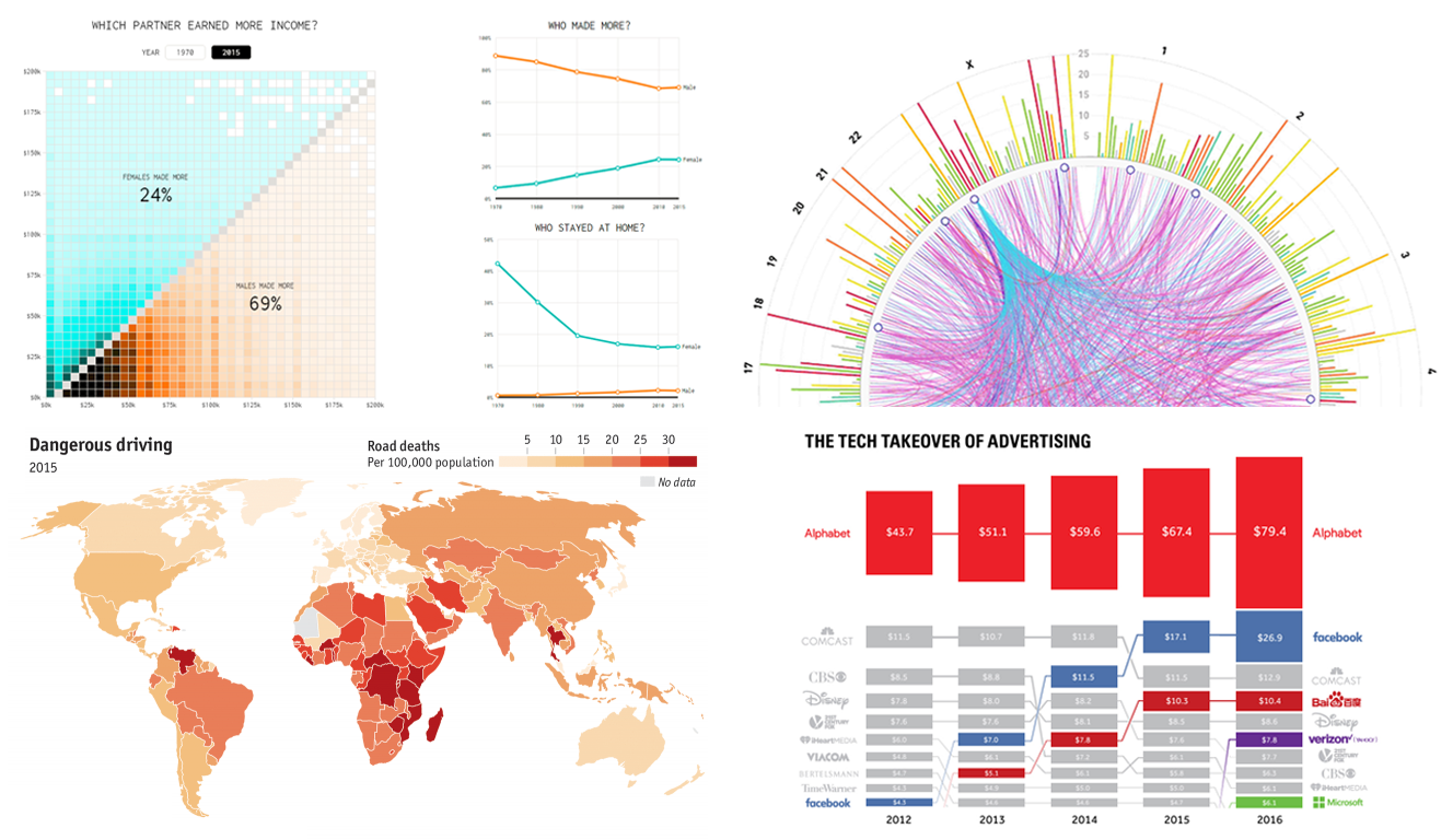
- tech takeover of the global advertising industry;
- road deaths in developing countries;
- who earns more in male-female partner households in the US;
- SFARI Gene – gene-centered autism research data and visuals.
Read more »