June 16th, 2017 by AnyChart Team
 It is no exaggeration to say that we encounter various examples of data visualization all the time, maybe even multiples times per day. Indeed, charts and infographics are a great tool to explore (and explain) diverse kinds of information. Data Visualization Weekly aims to highlight some peculiar examples of data visualization every week to let you quickly learn more about topical issues, funny life revelations, and so forth, not to mention getting inspiration for making your own visual presentations of data.
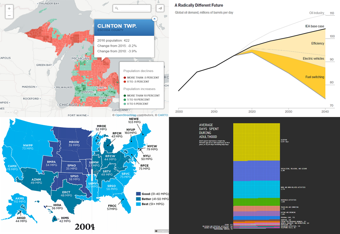
The new article in this series will show you four more of worth seeing examples that shed light on oil demand forecast, population change in Michigan, adult lifetime, and EV emissions data. Here they are.
Read more »
June 9th, 2017 by AnyChart Team
 Data is beautiful. And the Data Visualization Weekly series brought to you by AnyChart JS Charts is designed to prove that every time. Today we’ll take a look at another four cool visualizations of peculiar. They have seen the light just recently but are already famous.
This article introduces the following stunning data visualization masterpieces:
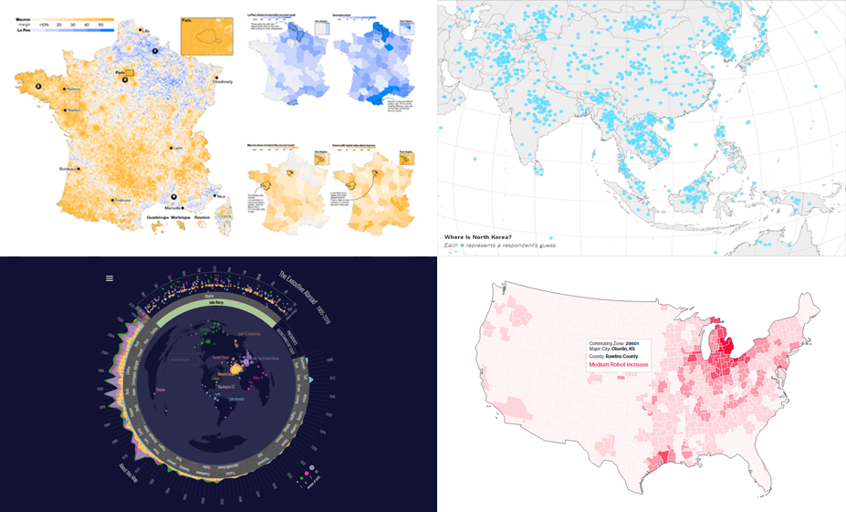
- charts (and a map) of the relationship between robotic automation and unemployment;
- French presidential election results in five maps;
- interactive visualization of international trips of POTUS and US SecState in 1905-2016;
- map of 1,746 adults’ guesses on where North Korea is located (and what they think should be done about it).
Read more »
June 2nd, 2017 by AnyChart Team
 Amazing charts are everywhere around us. We continue sharing the most interesting visualizations that have just recently seen the light and stayed popular around the Web within the past few days. And we are welcoming you to the new issue of the Data Visualization Weekly article series on our blog.
Before getting to another four amazing charts, we are glad to remind you of the biggest data visualization news of the week here in case you missed it: AnyChart JS Charts 7.14.0 was released just a few days ago! So, go ahead and check out the new cool features and improvements that are now available in the new versions of our JavaScript (HTML5) charting libraries – AnyChart, AnyMap, AnyStock, and AnyGantt – if you have not yet done so.
Read more »
May 30th, 2017 by AnyChart Team
 Here are the spring May flowers we promised. After the hard work put in over the past months, we’re happy to announce that the 7.14.0 release of our JavaScript charting libraries AnyChart, AnyStock, AnyMap, and AnyGantt is out and ready to download! It brings you new cool features and important improvements that will make your data visualization life even better.
Now, we invite you to discover all the new JavaScript/HTML5 charting capabilities that the 7.14.0 version of AnyChart’s data visualization software product family has to offer to you. Here’s a quick overview…
Read more »
- Categories: AnyChart Charting Component, AnyGantt, AnyMap, AnyStock, Business Intelligence, Dashboards, Financial Charts, Gantt Chart, HTML5, JavaScript, News, Stock Charts
- 7 Comments »
May 24th, 2017 by AnyChart Team
 Geovisualization and map-based analysis of geo-data sets related to given territories or spatial environments can provide significant insight into trends and assist greatly in exploring and associating the impacts of variables. Nowadays, maps are used for data visualization very frequently, both as standalone geovisualizations and part of complex dashboards.
In this new article within the framework of our Choose Right Chart Type for Data Visualization series, we’ll write about map charts and explain how (when) to properly use each of corresponding types.
Read more »
May 19th, 2017 by AnyChart Team
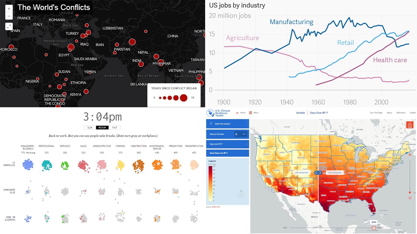 Hello everyone! We continue our effort to find and publish the best data visualization examples on a regular basis. The current issue of Data Visualization Weekly lists and narrates about another four cool charts and maps of those that were shared on our Twitter and Facebook accounts just recently. They are:
- American Workday;
- US Jobs by Industry;
- The World’s Conflicts;
- Climate Explorer.
Without more ado, let’s get down to seeing them now!
Read more »
May 17th, 2017 by AnyChart Team
 Achieving and maintaining effective Project Management is one of the most important challenges for every company. And high-quality visualization of resource usage and activity processes is a great tool for significantly improving the overall performance of a project. Keeping that in mind, we cannot omit the information on how to properly represent projects and resource data.
Read this article to learn what (specific) chart types you can choose to use in such cases.
Read more »
May 12th, 2017 by AnyChart Team
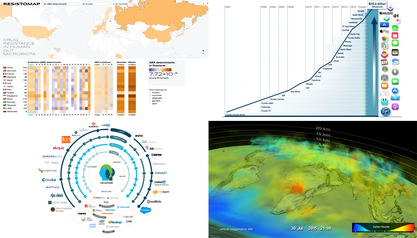 Visualizing data is a great way to facilitate its exploration and explanation. The new Data Visualization Weekly issue brings you, as always, some peculiar charts, maps, and other nice examples of how that can look. Today let’s see another cool set of carefully selected visualizations, four of those that we noticed and shared on social media over the past few days:
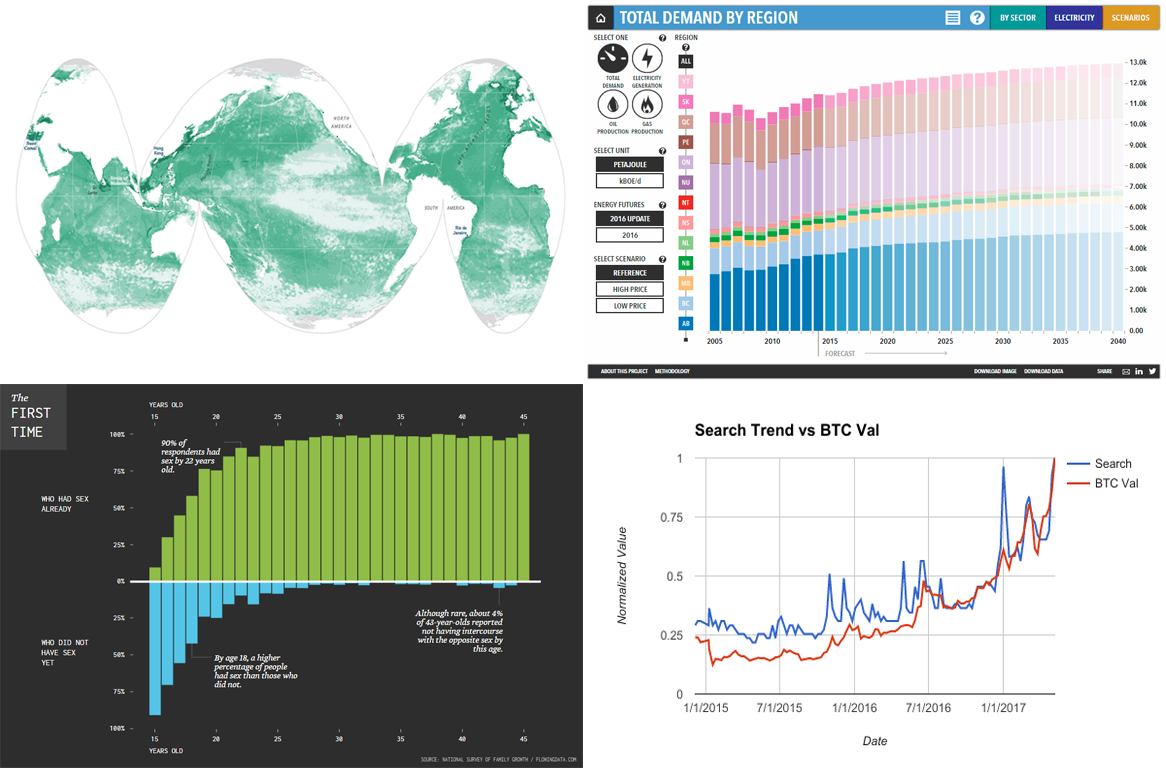
- ResistoMap: drug resistance in human gut microbiota in different countries;
- Diagram of tools that Cisco uses for enhancing digital engagement;
- Chart of Apple Services’ revenue growth;
- Video visualization of carbon dioxide’s behavior in the Northern Hemisphere.
Read more »
May 10th, 2017 by AnyChart Team
 In the previous articles from the Choose Chart Type for Data Visualization series, we covered the ways to visually represent information for data comparison, composition and distribution analysis, and observing trends over time. The current post sheds light on a situation when you only have Single-Value Data that can serve as Indicators of the current performance. In this quite widespread case, plotting each value on a separate chart often makes sense. That is where Gauges and Bullet charts come into play.
Read more »
May 5th, 2017 by AnyChart Team
 Data visualization techniques are an amazing means of communicating information. Their proper implementation enhances understanding of data and can be very helpful in clarifying (and even revealing) differences, trends, relationships, and other patterns and related aspects within data sets.
We keep on showing you interesting data visualization examples on a regular basis, within the framework of Data Visualization Weekly (and in earlier recaps of the week). And we hope you’ll find the current issue of the series worth checking out, great as another portion of inspiration and examples of how data visualization techniques work, or – at least – just interesting in terms of facts and trends communicated.
So, here’s a small selection from what we noticed on the Web and shared on social networks within the last seven days.
Read more »