September 15th, 2016 by AnyChart Team
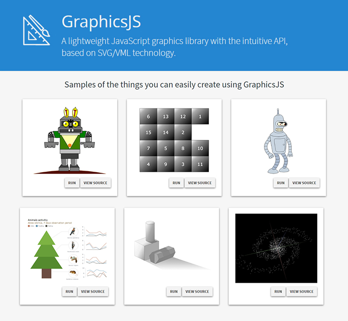
It is a pleasure for us to announce this today! We have just launched GraphicsJS, a free, open-source, lightweight JavaScript library which allows you to draw any JS graphics and animation for your HTML5 projects very easily. It is significantly more powerful and feature-rich than Raphaël, BonsaiJS, and other formerly leading SVG/VML graphics solutions.

GraphicsJS has always been the graphics engine that our JavaScript (HTML5) charting libraries are built on – AnyChart, AnyStock, AnyGantt, and AnyMap. As a result, it already powers data visualization activities for many of you – Oracle, Microsoft, Volkswagen, AT&T, Samsung, BP, Bosch, Merck, Reuters, Bank of China, Lockheed Martin, and thousands of all the other highly respected AnyChart’s customers including more than 70% of Fortune 1000 companies.
Of course, data visualization is not the only but just one of multiple fields where the library of GraphicsJS can be helpful and even essential. Generally speaking, this solution can help you produce virtually anything graphical from scratch: static and animated images, cartoons, games, interactive infographics, mind maps, and many other amazing things in HTML5.
Key Features of JS Graphics Library
- Mighty line drawing abilities – Bézier curves, arcs, rectangles, and many other kinds of forms and deformations.
- Powerful text manipulation features – multiline texts, measurement, including width, height, as well as wrap, overflow, indent, spacing, align, etc.
- Virtual DOM for drawing fast and only what is necessary.
- Smart layering system with z-index.
- Transformation engine – embarrassing in-browser transformations are not used.
- Legacy browser support (Internet Explorer 6+).
- Concise and convenient JavaScript API with chaining support.
By the way, making our graphics engine open-source is just the beginning as – we are also pleased to tell you – AnyChart is going to open the source code of our charting libraries soon! We believe that our great developments in the fields of graphics and data visualization should be even more visible and reachable to any programmer from any part of the world, not to mention that we would love to allow the community to contribute.
Please refer to GraphicsJS.org to learn more about GraphicsJS. As always, the demos are available on our Playground (Graphics section). Also, let’s not forget about the Graphics Documentation and Graphics API Reference.
What’s more, the GraphicsJS library and all relevant samples can be freely downloaded and forked on GitHub.
- Categories: AnyChart Charting Component, AnyGantt, AnyMap, AnyStock, Charts and Art, Dashboards, Financial Charts, Gantt Chart, GraphicsJS, GraphJam, HTML5, JavaScript, News, Stock Charts, Third-Party Developers, Tips and Tricks, Uncategorized
- 5 Comments »
September 2nd, 2016 by Margaret Skomorokh
A hotfix for AnyChart charting library is now available: we have released AnyChart, AnyMap, AnyGantt, and AnyStock 7.11.1. Here is a full list of improvements and bug fixes:
All Products
Improvements
- Legend width/height behavior improved.
- Scatter Series behaviour made consistent with other series.
- Credits behaviour improved.
- The appendTheme() method added for easier management of themes.
- Beta version of the Data Adapter Module added for easier management of external files.
- Export Server can now return images as base64 strings or as shareable links.
Bug Fixes
- XML Schema validity problems fixed.
- Various minor Export Server issues fixed.
- Various minor Interactivity issues fixed.
- Inconsistent zIndex behaviour fixed.
- Various XML serialization/deserialization fixed.
- Various JSON serialization/deserialization fixed.
- The toXML() deserialization method no longer adds unnecessary data into XML.
AnyChart
Improvements
- Circular Gauge Ranges and Axis Bar can now be properly rounded.
Bug Fixes
- Pie events fixed.
- Funnel Chart label placement algorithm fixed.
- Series on/off problems fixed.
- 3D Chart events fixed.
- Context Menu in Linear Gauges fixed.
- Series Legend Interactivity issues fixed.
- Seat Map labels fixed.
- Legend Interactivity issues fixed.
- Issues with Ordinal Axis Labels fixed.
- Circular Gauge Gradient display issues fixed.
- Tree Map coloring issues fixed.
- Range Marker issues fixed.
AnyMap
Bug Fixes
- The remove() method problems fixed.
AnyGantt
Bug Fixes
- Problems with inheritance of PERT Chart settings fixed.
- PERT Chart export CSV issues fixed.
AnyStock
Improvements
- Overall Performance improved, especially in Firefox.
AnyChart version history: https://www.anychart.com/products/anychart/history/
AnyMap version history: https://www.anychart.com/products/anymap/history/
AnyGantt version history: https://www.anychart.com/products/anygantt/history/
AnyStock version history: https://www.anychart.com/products/anystock/history/
Trial download of AnyChart charting library: https://www.anychart.com/download/
September 1st, 2016 by AnyChart Team
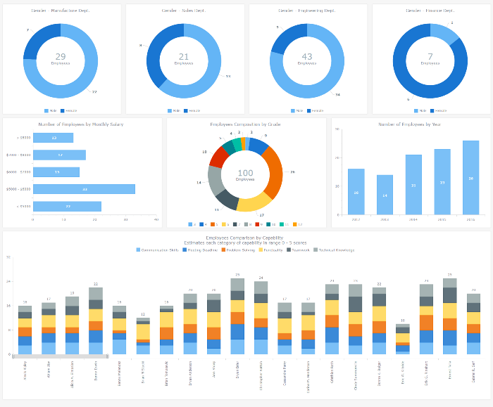
An HR dashboard is a powerful BI solution that can mightily facilitate making right, data-driven decisions about the workforce in your company – from recruiting and training courses to compensations and job promotions. Smart visualization of all relevant staff-related data, with all charts and graphs on a single page, allows your Human Resources Department to see various metrics at-a-glance. As a result, HR managers are given the power to easily identify trends, outliers, and relationships when it comes to reports and data analysis, and to make sure each decision is well-timed and will drive even more success for your enterprise.
After all, it is the employees that are the most valuable asset.
To inspire and show you how easy it gets to implement this approach with the help of AnyChart JS Charts library, we added an interactive JavaScript-based Human Resources Dashboard to the Business Solutions section of our website as a new HTML5 business dashboard sample with the full source code. It nicely visualizes various employee related data, including demographics, payrolls, performance measurements, and so on. Of course, you are welcome to fork this sample and use our HR Dashboard fully or partially to create your own solution.

Now let’s have a closer look at this interactive HTML5 dashboard, including its composition and some peculiar features. Read more »
August 15th, 2016 by Margaret Skomorokh
Here are the the data visualizations (and related information) that we have posted this week on AnyChart Facebook Page and in Twitter, including a JS Linear Gauge by AnyChart:
- The Real Value of $100 in Each State – Everything is relative. This map by Tax Foundation shows the real value of $100 in each state in the U.S. Prices for the same goods are often much cheaper in states like Missouri or Ohio than they are in states like New York or California. As a result, the same amount of cash can buy you comparatively more in a low-price state than in a high-price state. (The visualization is based on the data published by The Bureau of Economic Analysis.)
- Sugar Consumption by Mona Chalabi – This chart showing sugar consumption from 1700 to 2000 is only one of many wonderful handmade “data sketches” in Mona Chalabi’s Instagram. Visit it to learn about crying frequency per week, handwriting vs. typing speed, median cost of a funeral, and other facts, visualized in drawings.
- Guide to Figuring out the Age of an Undated World Map – With this visual guide from xkcd.com, you will always be able to figure out the age of an undated world map.
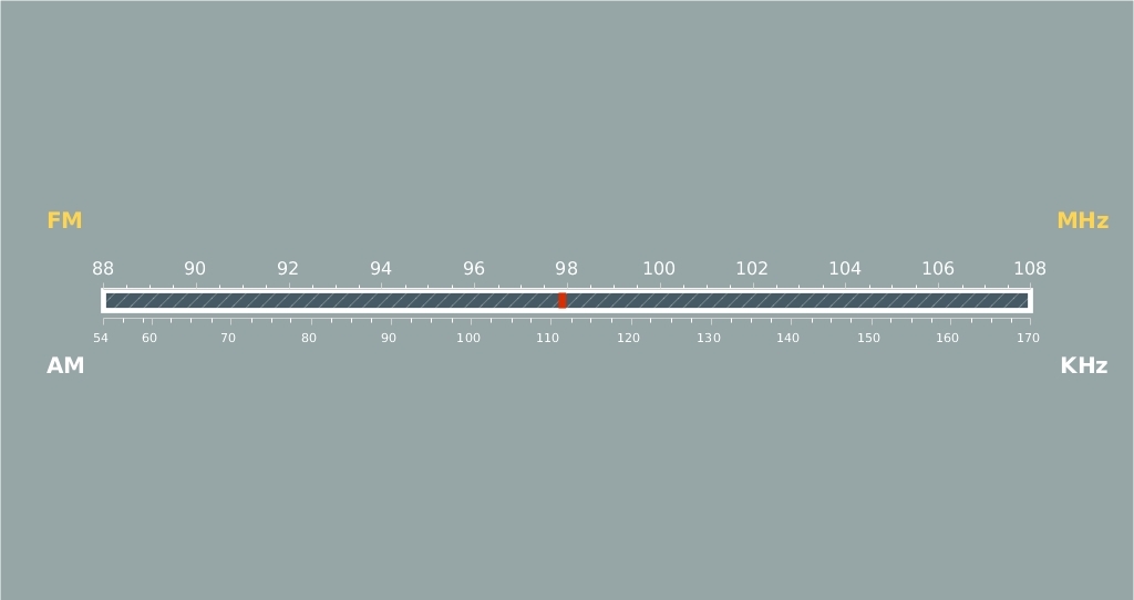
- Radio Scale – JS Linear Gauge by AnyChart – A linear gauge (added in AnyChart 7.11.0) is visual representation of a measuring device with a horizontal or vertical scale and a pointer or multiple pointers indicating particular values. The scale is usually color zoned, which helps to see what range the value of interest falls in. Linear gauges can represent thermometers, battery indicators, rulers, and any other devices with straight line–shaped scales. For example, this interactive gauge from our gallery represents a radio scale. To learn more about linear gauges in AnyChart, see the following article:
August 5th, 2016 by Margaret Skomorokh
Here is a quick recap of the visualizations that we have shared with you this week on AnyChart Facebook Page and in Twitter (including an HTML5 PERT Chart by AnyGantt):
- Where Europe is most and least innovative, in 6 maps (a data visualization by The Washington Post) – The continent’s most creative and productive regions are in Germany, France, Britain and the Nordic countries. Southern England, northern Denmark, southern Germany and Paris are particularly successful — whereas Romania, Poland and Spain have disproportionately more regions that lack innovation.
- Pokémon dual-type charts – looks like playing Pokémon Go is not that easy!
- Global Sharknado Threat Map – Created by an unprecedentedly cross-discipline team of nameless chain-smoking scientists in white lab coats, this map is intended as a resource to coastal communities regarding the nature and likelihood of a sharknado incursion. Right?X
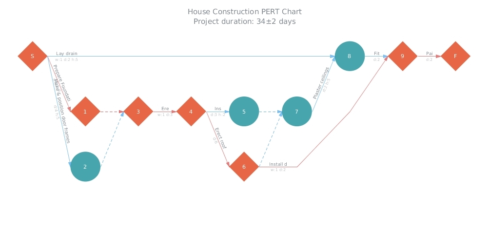
- House Construction (HTML5 PERT Chart by AnyGantt). In AnyGantt 7.11.0, we have added a new decision-making tool – PERT Charts. PERT is an abbreviation for “Program (Project) Evaluation and Review Technique”. This technique, developed by the U.S. Navy in the 1950s, is used in project management to analyze and represent the tasks involved in completing a given project. It is applied mostly in large-scale projects where time is the major factor and allows to schedule a project without knowing precisely the details and durations of all activities. For example, PERT was used in planning the 1968 Winter Olympics in Grenoble. You can see more samples of AnyGantt PERT charts in our PERT Chart Gallery.
July 27th, 2016 by Timothy Loginov
Good news! We have released AnyChart, AnyStock, AnyMap, and AnyGantt 7.11.0. In the new versions of our products, you will find such long-awaited features as JS Stock Drawing Instruments, Pert Charts, Linear Gauges, Seat Maps, and more. Here is the full list of improvements:
AnyStock

JS Stock Overlay Drawing Instruments
Stock Overlay Drawing Instruments are a complete set of drawing tools that allow end users to add drawings to charts. It includes such tools as Line segment, Ray, Trend Line, Vertical Line, Horizontal Line, Rectangle, Ellipse, Triangle, Trend channel, Andrew’s pitchfork, Fibonacci fan, Fibonacci arc, Fibonacci retracement, Fibonacci Time Zones, Buy/Sell Signals, and more – all of them being fully configurable and easily manageable.
Take a look at Stock Overlay Drawing Instruments Demo >>
Take a look at Stock Overlay Drawing Instruments in the Gallery >>
Learn more about Stock Overlay Drawing Instruments >>
AnyChart
AnyMap
AnyGantt
AnyChart version history: https://www.anychart.com/products/anychart/history/
AnyStock version history: https://www.anychart.com/products/anystock/history/
AnyMap version history: https://www.anychart.com/products/anymap/history/
AnyGantt version history: https://www.anychart.com/products/anygantt/history/
Trial download of our JS framework: https://www.anychart.com/download/
July 22nd, 2016 by Margaret Skomorokh
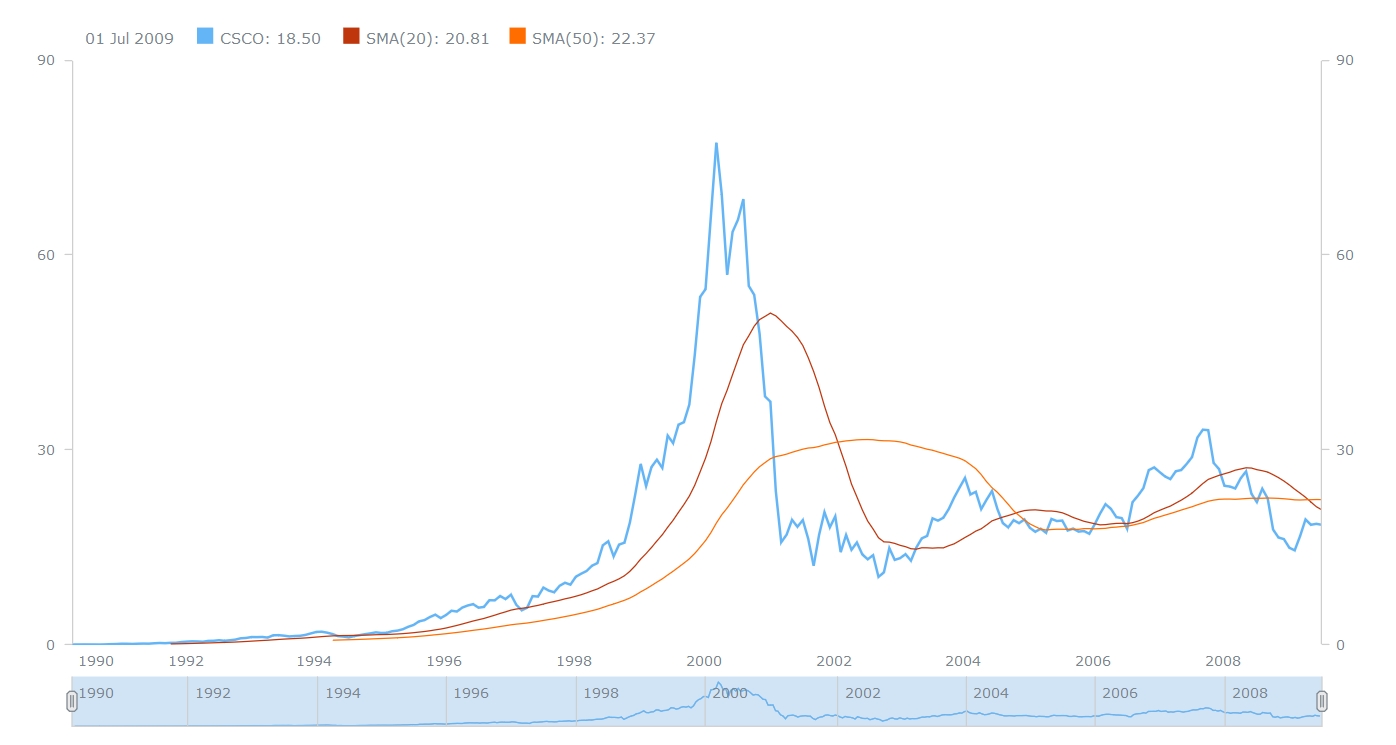
In this post, you will find a recap of the data visualizations that we have shared with you this week on AnyChart Facebook Page and in Twitter. One of them is a JavaScript Stock Chart by AnyChart:
July 16th, 2016 by Margaret Skomorokh
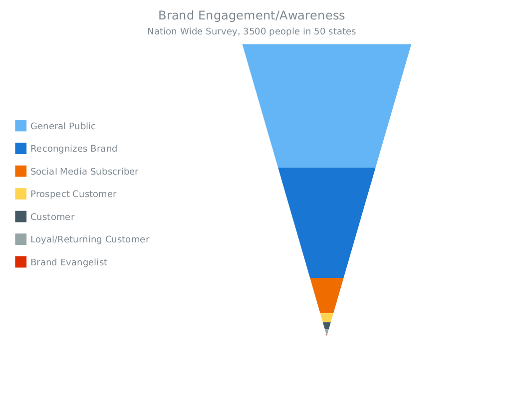
This week we have shared with you on AnyChart Facebook Page and in Twitter a few cool data visualizations, including a JavaScript Funnel Chart by AnyChart. Here is a quick recap:
- Is Sushi ‘Healthy’? What About Granola? Where Americans and Nutritionists Disagree
(an infographic by The Upshot) – Is popcorn good for you? What about pizza, orange juice or sushi? Or frozen yogurt, pork chops or quinoa? Which foods are healthy? In principle, it’s a simple enough question, and a person who wishes to eat more healthily should reasonably expect to know which foods to choose at the supermarket and which to avoid. Unfortunately, the answer is anything but simple.
- Game of Thrones: the most Googled characters – This visualization by The Guardian shows the most googled characters from Game of Thrones, episode by episode. See and find out which events in the show had the biggest effect on search traffic. (Spoiler alert: It reveals significant plot points of seasons one through to five.)
- FiveThirtyEight 2016 Election Forecast – Hillary Clinton vs. Donald Trump: who will win the 2016 presidential elections? Here is a forecast by Nate Silver (FiveThirtyEight), showing how the 538 Electoral College votes could break down in the presidential election – it is explained in 7 data visualizations. The forecast will be continually updated through Election Day on Nov. 8.
- Brand Engagement (JavaScript Funnel Chart by AnyChart) – On this interactive Funnel Chart, you can see a visualization of a Nation Wide survey on a Brand recognition. Funnel Charts are mostly used to represent stages in a sales process and show the amount of potential revenue for each stage. They can also be useful in identifying potential problem areas in an organization’s sales processes. A Funnel Chart is similar to a Stacked Percent Column Chart.
July 9th, 2016 by Margaret Skomorokh
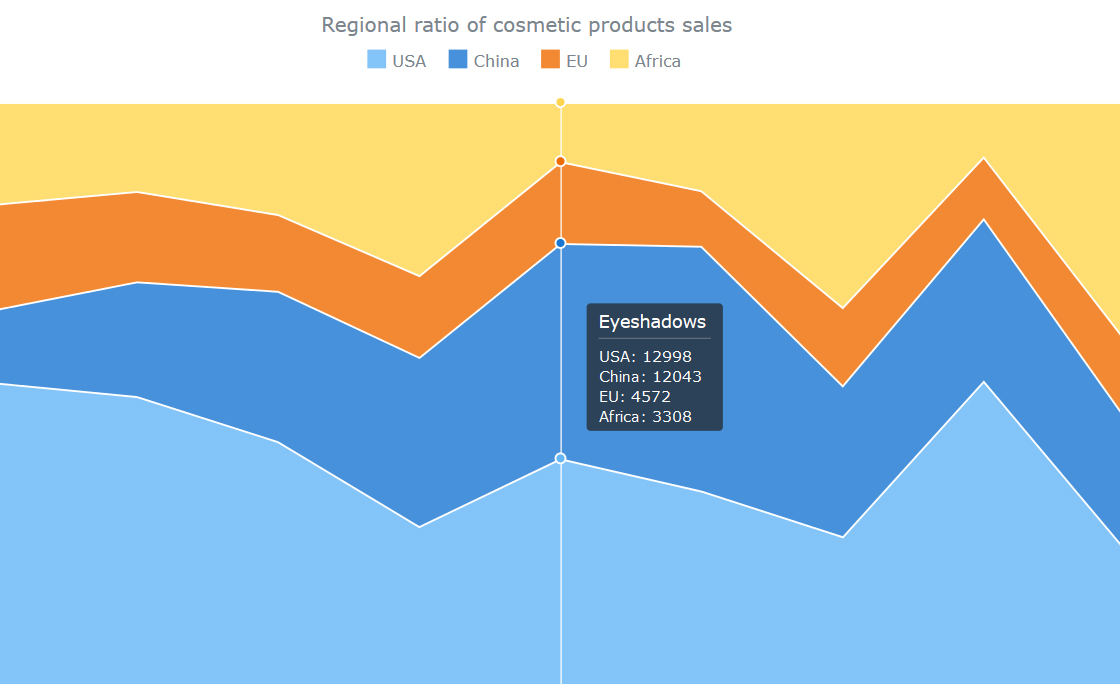
Here is a quick recap of the visualizations (and related information) that we have shared with you this week on AnyChart Facebook Page and in Twitter (including a JS Stacked Area chart by AnyChart):
- Six Infographics for Independence Day – The Declaration of Independence, signed on July 4th, 1776, is both a symbol of American liberty and an enduring monument to the philosophy of America’s forefathers. But Today, Independence Day is more than a celebration of this important moment in history. It’s also an opportunity for robust American fun: fireworks, hot dogs, excessive drinking, and lounging about in the summer sun. Here are 6 infographics that explore the history, patriotism, pyrotechnics, and personal excesses of one of America’s favorite holidays.
- Dontclick.it – What changes for the user and the interface once you can’t rely on the habit of clicking? Check out Dontclick.it, an experimental clickfree interface, and see is clicking is irresistible for you!
- 10 Cities Americans Are Moving To Right Now – Whether for professional or personal reasons, people sometimes pick up and move. In the United States, folks have been migrating to urban areas in recent generations, but these days the places they wind up are not necessarily the major hubs we might expect. Real estate information platform, Realtor.com, combined its internal data with U.S. Census Bureau information and discovered where Americans are moving these days. The results might surprise you.
- AnyChart JS Stacked Area Chart – This interactive 100% Stacked Area chart was created with our charting component. Stacked Area charts are multi-series Area charts that display the trend each value contributes over time or categories. They are good at emphasizing the magnitude of changes over time, as well as at drawing attention to the total value across a trend. In a 100% Stacked chart, values are not displayed, and only the percentage each value contributes is shown, so that users can easily compare them.
July 2nd, 2016 by Margaret Skomorokh
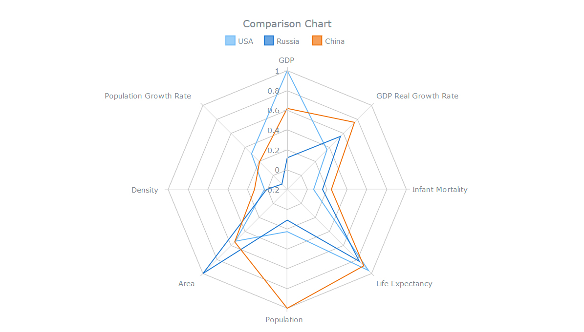
This week we have posted on AnyChart Facebook Page and in Twitter some beautiful data visualizations and related information; we have also shared AnyChart HTML5 Radar Chart. If you have missed the posts, you can read this recap:
- EU referendum: full results and analysis (by The Guardian) – Britain has voted by a substantial margin to leave the European Union. The picture that is emerging is of a heavily polarised country, with remain areas coming in more strongly for remain than expected, and leave areas more strongly for leave. Scotland and London have voted overwhelmingly for remain, but outside the capital, every English region had a majority for leave.
- What happens in an anxious brain? How do we learn? How to stop being afraid of dogs? Neuroscience answers all these questions. Neurotic Neurons is nice interactive animation about neurons and anxiety (a part of the Explorable Explanations project). It explains the concept of exposure therapy, which is used in Cognitive Behavioral Therapy.
- Who needs genres when there is data? Decibels & Decimals is a collection of beautiful data visualizations and thoughts about the modern music environment. This project by Brady Fowler, a graduate of Georgetown University, aims to bring data-driven thinking to extract trends in music sharing, creation, performance and reception.
- Du Hast – Rammstein’s Du Hast: a programmer’s version (misheard lyrics).
-
AnyChart HTML5 Radar Chart – This interactive chart compares 3 countries by 8 criteria, helping to see each country’s strong points. It is an example of how you can use a Radar chart (also known as web chart, spider chart, star chart, cobweb chart, star plot, irregular polygon, or kiviat diagram) – a graphical method of displaying multivariate data in the form of a two-dimensional chart of three or more quantitative variables represented on axes starting from the same point.
