April 16th, 2016 by Margaret Skomorokh
Releases announced on our site – AnyChart, AnyStock, and AnyMap 7.10.0 – will be available by the end of April; we are working hard to release the new version of our charting framework as soon as possible. A lot of great and long-awaited features will be added.
In the new version of AnyChart, you will find:
- TreeMap Charts
- Save as Excel/CSV
- Keep Only/Exclude Data Point
- Context Menu
AnyStock will be updated with:
- Common Chart Types (Candlestick, Spline, Area, Marker, and more)
- Legend Interactivity
- Data Grouping Settings
Finally, the following features will be added to AnyMap:
- Dot/Point Maps
- Drill Down
- Points Connection
AnyChart is a robust JavaScript/HTML5 charting framework combining all major features you need. And we do our best to improve our products even more.
By the way, this week we have posted on AnyChart Facebook Page and in Twitter some interesting data visualizations:
- The NYPL Map Warper is a tool for digitally aligning (“rectifying”) historical maps from the The New York Public Library’s collections to match today’s precise maps. Visitors can browse already rectified maps or assist the NYPL by aligning a map.
- How the Rest of the Delegate Race Could Unfold – This interactive delegate calculator by The Upshot lets you simulate how the Republican and Democratic nominating contests could unfold. Adjust the sliders to see how the outcomes can change (each line in the charts represents one possible outcome). The calculator uses each state’s delegate allocation rules, along with estimates of how favorable each district is for each candidate. To compute these estimates, Upshot used a model based on demographics and results from past primaries and caucuses.
- Markov Chains Explained Visually – Enjoy this interactive visual explanation of Markov Chains. In addition, you can use a Markov chain “playground” to make your own Markov chains by messing around with a transition matrix! Markov chains, named after Andrey Markov, are mathematical systems that hop from one “state” (a situation or set of values) to another.
April 8th, 2016 by Margaret Skomorokh
Have you seen data visualizations (including an HTML5 Gauge by AnyChart) that we have shared this week on AnyChart Facebook Page and in Twitter? Here is a quick recap of these posts:
- The Speed of a Unicorn – Do you believe in magic? And do you know where the fastest unicorns live? To find out, check out this interactive data visualization by Fleximize. (Unicorns are rare beasts of the business world, startup companies that are valued at $1B or more. Once considered the stuff of myth, there are now over 180.)
- How Machines Destroy (And Create!) Jobs, In 4 Graphs – For hundreds of years, people have been talking about machines taking jobs from people. Less often discussed: machines creating new jobs. See 4 graphs on NPR demonstrating how machines influence the job market. All in all, technology gives, and technology takes.
- Vienna electorate poster – This elegant data-driven infographic illustrates Vienna’s electorate gap related to the increasing number of foreign nationals who are usually ineligible to vote in citywide or national elections. How did the share of foreign nationals in Vienna evolve since 1971? What are the changes of the total population in relation to changes in the electorate since 2002? Are there any significant differences by age? The poster provides answers to these questions – district by district.
- Solid Gauge (an HTML5 gauge by AnyChart) – Is it a Pie Chart? Is it a bar chart? No! It is an interesting way to use Circular Gauge by AnyChart to show manufacturing process. Circular Gauge is a visual representation of a measuring device with radial axes that sweep any angle from 0 to 360 degrees and pointers (Needles, Knobs, Markers) that indicate values. Circular Gauges can look like speedometers, clocks, compasses, volume controls, or any other similar tools.
April 2nd, 2016 by Margaret Skomorokh
This week we have posted on AnyChart Facebook Page and in Twitter the following data visualizations (including WinLoss – a JavaScript Sparkline chart by AnyChart):
- FBI vs Apple Map – Want to know where your state sides on the Apple vs FBI debate? Check its voting record. While the FBI and Apple case is on hiatus until April 5, the public debate rages on about whether Apple should assist the FBI in unlocking the San Bernadino shooter’s iPhone. Turns out, it’s pretty easy to find out if your state supports Apple or the FBI: just look at its voting results from the 2012 presidential election. This map on The Next Web clearly demonstrates the correlation.
- The SORTING project by Carlo Zapponi is an attempt to visualize and help to understand how some of the most famous sorting algorithms work. This project provides two standpoints to look at algorithms, one is more artistic, the other is more analytical aiming at explaining algorithm step by step.
- Who is the oldest person in the world? What are the worst games ever made? What is the best way to visualize data on marijuana laws? Enjoy this selection of 47 weirdest charts from 2015 (picked up FiveThirtyEight), and you will learn everything you need and do not need to know!
- WinLoss (JavaScript Sparkline chart by AnyChart) – Sparklines are small charts: lines, areas, or columns without labels and any decorations. They can be intertwined with text or placed into table cells. While most of chart types are aimed to present as much data as possible, sparklines is a way to focus on the main point of interest and create a compact data visualization. These charts are good at showing a general shape of any measurement; there is also a special type of Sparklines (called WinLoss) that is used predominantly for scores in sports and games. It shows no values but positive and negative positions. Here we see a score table for English football teams. The first and second columns contain the numbers of the teams and their names, the two next columns contain win and loss scores, and in the fifth column, which is the widest, there are WinLoss SparkLines. Negative values are colored in red, and positive ones are blue. The last column contains the percentage of victories.
March 26th, 2016 by Margaret Skomorokh
We have added a new dashboard to AnyChart Business Dashboard Solutions – a section of our site with sample dashboards demonstrating how AnyChart charting framework can be applied to various visualization tasks in various industries. Investment Portfolio Dashboard is a sample solution for personal portfolio management, based on data from finance.yahoo.com.
Some say that portfolio management is the art and science, which consists of making decisions about investment content combination and policy, matching investments to objectives, asset allocation for individuals and institutions, and balancing risk against performance.
If you want to be perfectly accurate, investment management is the professional asset management of various securities (shares, bonds, and other securities) and other assets (e.g., real estate) in order to meet specified investment goals for the benefit of the investors. Investors may be institutions (insurance companies, pension funds, corporations, charities, educational establishments, etc.) or private investors (both directly via investment contracts and more commonly via collective investment schemes e.g. mutual funds or exchange-traded funds).
Or, in plain English, managing investment porfolio is creating a collection of assets that can diminish the risk inherent in stock markets by diversification or avoiding having too many eggs in one basket.
Whatever the case is, any porfolio management must include the following steps: choosing investment horizon and goals, building portfolio, and performance monitoring. Each of the steps needs a dashboard of its’ own, so there are three tabs in our dashboard: Goals, Portfolio, and Performance.
The Goals tab provides a user with a way to mix the portfolio and a way to see the prognosis for it, so there are two charts: a Donut chart and a combination of a Line chart and a Range Area chart. The Portfolio tab shows the mix of the instruments and all basic information about them (here you see the same Donut chart and a table). Finally, in the Performance tab you will find a Stock chart demonrtrating the performance of our investment porfolio.
Using AnyChart, we have created a user-friendly and fast-rendering visualization. To learn how it was done, you can see a detailed tutorial: Creating Investment Portfolio Dashboard. Our dashboard is minimalistic, but it can be easily extended, and it does not matter how much additional information you need to show: our charting framework is flexible enough to cope with any task.
March 18th, 2016 by Margaret Skomorokh
Here is a quick recap of the visualizations that we have shared with you this week on AnyChart Facebook Page and in Twitter (including a JavaScript Map by AnyChart that shows where and when women were granted suffrage):
- If Countries’ Web Domains Were Land Masses, Earth Would Look Like This – On this map by Nominet, the world is definitely not as it seems. Why? Because countries have been scaled according to the number of country code domain names they have registered, and not by their geographical size.
- Goldilocks – How many habitable exoplanets are out there? According to astrobiology, a planet must neither be too far away from, nor too close to a star to support life; either extreme would result in a planet incapable of supporting life. Such a planet is colloquially called a “Goldilocks Planet”. The Goldilocks project is an interactive map, showing all the known exoplanets, their host stars, composition and atmosphere, and other life-and-death information.
- Charles Darwin first published On the Origin of Species in 1859, and continued revising it for several years. As a result, his final work reads as a composite, containing more than a decade’s worth of shifting approaches to his theory of evolution. In fact, it wasn’t until his fifth edition that he introduced the concept of “survival of the fittest,” a phrase that actually came from philosopher Herbert Spencer. The Preservation of Favoured Traces is a cool interactive data visualization that traces Darwin’s thoughts and revisions by color-coding each word of the final text.
- Ranking of Happiness 2013-2015 – Ken Caldeira on happiness across cultures.
- World JavaScript Map of Woman Suffrage – World JavaScript Map of Woman Suffrage by AnyChart. We’ve used a Choropleth Map to show where and when women were granted suffrage, as you can see, a lot has changed in the last century, and it was a long and bumpy road for the humankind.
March 13th, 2016 by Margaret Skomorokh
This week we have shared with you on AnyChart Facebook Page and in Twitter some really neat data visualizations – including an HTML5 Gantt chart by AnyGantt. Here is a quick recap of our posts:
- How Do People Play The Trading Game? (Or: How 13,000 People Turned 108 Real Hours of Their Lives Into 6.7 Trillion Imaginary Dollars) – a nice trading game and an article about it on Bloomberg Business.
- How You Will Die – this colorful simulation by FlowingData tells you how and when you will die, given your sex, race, and age. Good news: mortality rate is much lower in the earlier years of life than in the older years. Another interesting fact is that if you get past a certain age, the probability to die of cancer decreases. Earlier we posted a simulation by the same author, predicting how long you will leave. Here it is (in case you did not see it): Years You Have Left to Live, Probably
- Is there a connection between performance and popularity in tennis? Untangling Tennis is visual and data analytic exploration of success in tennis, uncovering the relationship between the two things. In this article you can see a few of the many phenomena that can be discovered about the life and career of a professional tennis player using this data visualization project. You can play with it and discover your own findings here: Untangling Tennis: Tool.
- Planned-vs-Actual: HTML5 Gantt Chart by AnyGantt – This HTML5 Gantt chart created with AnyGantt demonstrates how Gantts can be used for comparing plans and reality. A Gantt chart is actually a type of bar chart representing a project schedule (and, sometimes, other things), invented independently in 1896 and in the the 1910s by two different people. It was the second one, Henry Gantt, after whom Gantts were named. As you see, it is a complex data visualization containing a lot of information, and yet it is quite readable and visually appealing. AnyGantt, due to its’ flexibility and rich interactivity it offers, is a perfect tool for creating such a visualization.
March 5th, 2016 by Margaret Skomorokh
This week we have posted on AnyChart Facebook Page and in Twitter a few cool data visualizations and, of course, a sample from our gallery – an HTML5 Heat Map by AnyChart representing the periodic table of elements:
- The Cold Hard Math of How Trump Can Win, and How Rubio Can Stop Him — What will it take for Donald J. Trump — or Marco Rubio or Ted Cruz — to win the Republican nomination? The Upshot has built an interactive delegate calculator simulating how the race might unfold after the Super Tuesday.
- Forget Me Nots — With digital storage getting cheaper and cheaper we have gone from a default of forgetting to a default of digitally assisted remembering. Should we or should we not revisit our digital memories? Allison, the creator of the Forget Me Nots project, used 1,924 emails of ex-boyfriends to create three data visualizations exploring this question.
- A Day in the Life of Americans — This fascinating data visualization posted on FlowingData simulates a single day for 1,000 Americans representative of the population — to the minute. Looking at all these colored dots running back and forth is not only pleasant, but it is also quite thought-provoking.
- Periodic Table of Elements by AnyChart. A heat map is a graphical representation of data where the individual values contained in a matrix are represented as colors. This particular HTML5 heat map is our version of the periodic table (a tabular arrangement of the chemical elements, ordered by their atomic number, electron configurations, and recurring chemical properties).
At first glance, it looks quite minimalistic: the information you see is limited to the symbols of elements and color of boxes. However, the table is interactive, and if you hover any box, a label with additional information will appear. So, clever use of interactivity allows to create simple yet enlightening visualizations — and with AnyChart it is very easy!
February 28th, 2016 by Margaret Skomorokh
Here is a quick recap of the visualizations that we have shared with you this week on AnyChart Facebook Page and Twitter (including an interactive JS map by AnyChart):
Who Receives the Most Acknowledgements at The Oscars? — Visually has analyzed over 450 speeches in the 6 major award categories – Best Actor, Best Actress, Best Supporting Actor, Best Supporting Actress, Best Motion Picture and Best Director – to see if mothersget more credit than fathers or if agents steal the limelight from writers.
Map of Contemporaries — Did you realize that Alessandro Volta was younger than Napoleon? See which famous people shared their time on Earth. The Map of Contemporaries project is the history of the world in famous people’s lifespans. This data visualization is inspired by Wait But Why’s blog post about Horizontal History — the idea of taking a “horizontal” slice of time and tracing the lifetimes of all the famous people living at that time.
New York City Marathon in Six Charts — six data visualizations by The New York Times. The first chart is a great way to visualize the speed of participants. When the winner of the New York City Marathon crosses the finish line on Sunday, some of the slowest finishers are likely to be running their third miles, just inside Brooklyn. See it for yourself!
Top 30 Places to Visit in Italy — Check out this interactive JS map by AnyChart, showing top 30 places to visit in Italy (based on data from Tripadvisor.com and Wikipedia). As you can see, AnyChart allows to combine different types of information: our map is linked to images and short text descriptions, which is a great way to provide users with quick reference information. Please note that AnyChart is both flexible and fast rendering solution.
February 21st, 2016 by Margaret Skomorokh
A dashboard is a set of charts, which is usually created when you need to show a lot of different information about one particular subject. It can contain as many charts (of the same type or of different types) as it is necessary.
As you can see from the title of this interactive JS dashboard, it shows information about the stock prices of ACME Corporation for the given period. The dashboard contains two charts: the first one is a combination of three chart types (Japanese Candlestick, Range Area, and Spline) and the second one is a simple Column chart.
The Japanese Candlestick series in the upper chart shows us the open, high, low, and closing prices of ACME Stocks for each trading day within the mentioned period. Each vertical line represents the range between the highest and the lowest prices during the trading period, and the body represents the opening and the closing trades. While in classical Candlesticks the rise and fall of a stock price are coded with a white-colored and a black-colored body, in this dashboard light blue and dark blue colors are used.
Besides the Candlestick series, there are Range Area and Spline series in the first chart. The second chart contains a Column series showing the change in the volume of stocks sold.
As you can see, AnyChart is a powerful and flexible tool, allowing you to create sophisticated data visualizations like this JS dashboard. AnyChart offers a wide range of features and chart types, so you can easily implement any visual solution and communicate your data in the best way possible.
By the way, we have recently updated the roadmaps of AnyChart, AnyStock, and AnyMap. Check out all these great features that are coming soon!
February 18th, 2016 by Margaret Skomorokh
Edward Tufte one-day course in San Francisco
Edward Tufte, which was once called “The Leonardo da Vinci of data”, is a statistician and artist, a professor emeritus of political science, statistics, and computer science at Yale University, and an author of 4 classic books on data visualization. In December 2015, Mr. Tufte read his one-day course in data visualization (Presenting Data and Information) in San Francisco. We were there and enjoyed it a lot! See our short report about this event, along with some photos we took during the lecture.
In this picture Edward Tufte shows a most remarkable book – Euclid’s Geometry (1570) with pop-up 3D models:
And here is an image of Russian army command center, which was used by Mr. Tufte to express his disapproval of 3D Pie charts. He said that a country that uses 3D Pie charts in its’ command center will lose any war. However, we believe that, if used properly, 3D Charts can be a decent tool for data visualization – that is why we have added them in AnyChart JavaScript Charts Library.
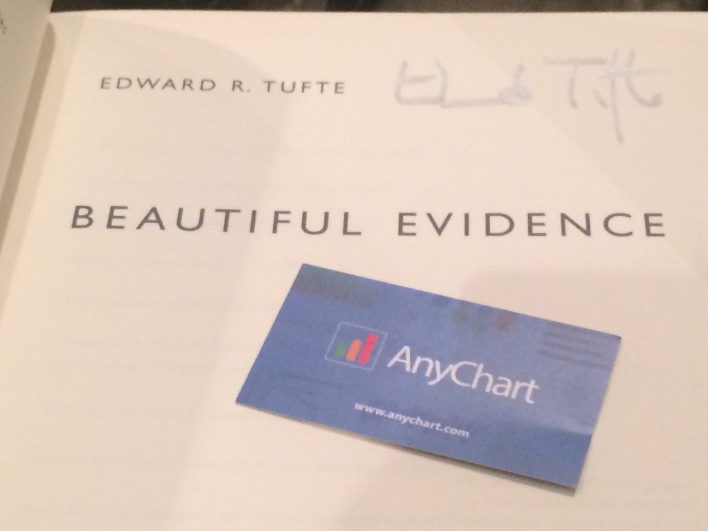
After the lecture, we were lucky to get our books signed by the author and talk to him. Mr. Tufte remembered us because AnyChart implemented Sparkline Charts – a type of charts he invented. He suggested that we use AnyChart to create some of the challenging data visualizations mentioned in his books. Challenge accepted, coming soon!
Our short but intensive conversation with Mr. Tufte was followed by discussing Sparklines in Twitter:
So we ended up getting a boxed set of four books: Beautiful Evidence, Visual Explanations: Images and Quantities, Evidence and Narrative, Envisioning Information, and The Visual Display of Quantitative Information.

")