April 5th, 2017 by AnyChart Team
 Charts are one of the best ways to display your data in a way that’s meaningful to readers, but if you don’t have great chart captions, your readers may interpret that meaningful information incorrectly.
Readers’ attention spans are waning by the second. In fact, humans now have a shorter attention span than goldfish (yes that cute, little fish you won from the carnival can pay attention better than the average person). This means that most people are scanning through your work. Without a clear, concise chart caption, your chances of getting your message across are slim.
Fear not! Here are some tips to help you come up with excellent chart captions, titles for graphs and dashboards.
Read more »
March 31st, 2017 by AnyChart Team
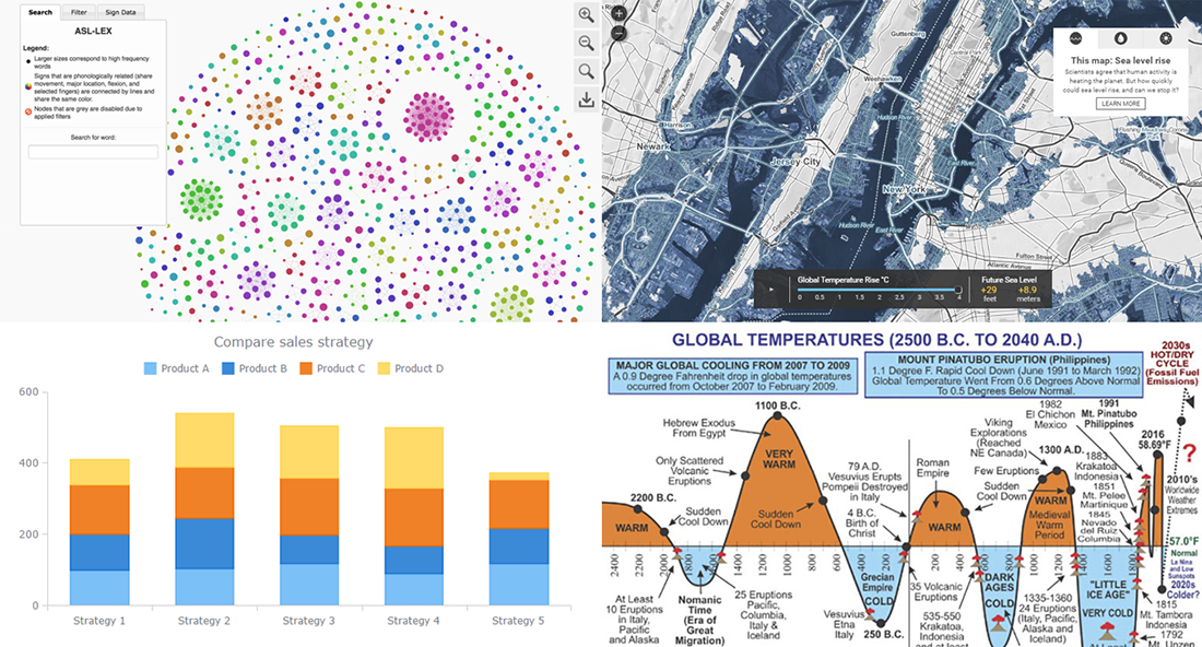
Today is the 13th Friday of the 2017 year, and another weekend is coming! In the meantime, we invite you to enjoy another portion of last week’s notable works in the data visualization field. The first highlight here is the article about stacked bar charts and how to use them, written by our Data Visualization Expert Vitaly Radionov specifically for Smashing Magazine. After briefing you on that, we’ll also take a look at this year’s winners of the Vizzies Challenge, a graph of global temperature change from 2500 BC to 2040 AD, and a (scary) map visualization of the sea level rise expected in the (near?) future.
Read more »
March 30th, 2017 by Sandor van der Neut
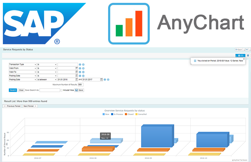 We as ‘mere’ humans are not very good at processing raw statistical data visually when it’s delivered to us in an unrefined form. We are, however, very good in detecting complex patterns when data is presented to us in a graph or a chart. It is therefore no wonder that as a developer you often get the requirement to represent data in a more comprehensible form. When you want to visualize data in the SAP Web UI in a more graphical way the standard possibilities available to you are rather limited. Luckily there are ways to overcome these limitations. When you combine SAP with the graphical power of AnyChart JS Charts a whole range of new possibilities will become available to you.
In this blog I will describe how you can integrate AnyChart in the SAP Web UI with relative ease, how you can feed AnyChart objects with SAP data using both a ‘pull’ and a ‘push’ mechanism and how you can respond in the SAP backend to the events triggered from user interaction with an AnyChart object.
Read more »
March 28th, 2017 by AnyChart Team
. Click to see its interactive version") With the explosion of data in the past few years, the relevance of understanding it better has grown to the highest extent. That is why expertise in interactive charting and dashboard design, as well as in the whole big Data Visualization and Data Science fields in general, has become so important nowadays. In fact, it is usually rather difficult to understand raw data as deeply and quickly as needed. Luckily, neat visual representation of information can be helpful in clarifying even very large amounts of data, discovering and exploring patterns in data, and then making (right) data-driven decisions.
With the explosion of data in the past few years, the relevance of understanding it better has grown to the highest extent. That is why expertise in interactive charting and dashboard design, as well as in the whole big Data Visualization and Data Science fields in general, has become so important nowadays. In fact, it is usually rather difficult to understand raw data as deeply and quickly as needed. Luckily, neat visual representation of information can be helpful in clarifying even very large amounts of data, discovering and exploring patterns in data, and then making (right) data-driven decisions.
Creating dashboards is a great way of transforming diverse relevant data into informative, insightful visualizations as the basis for further analysis. In order to obtain the highest possible efficiency, they should be insightful, featuring robust usability, and visually (and aesthetically) appealing.
Today we’ll talk about the most notable dashboard design trends. Understanding them is very important to each data professional who wants to further improve their skills by keeping up with the times and adhering to the best practices.
Read more »
March 24th, 2017 by AnyChart Team
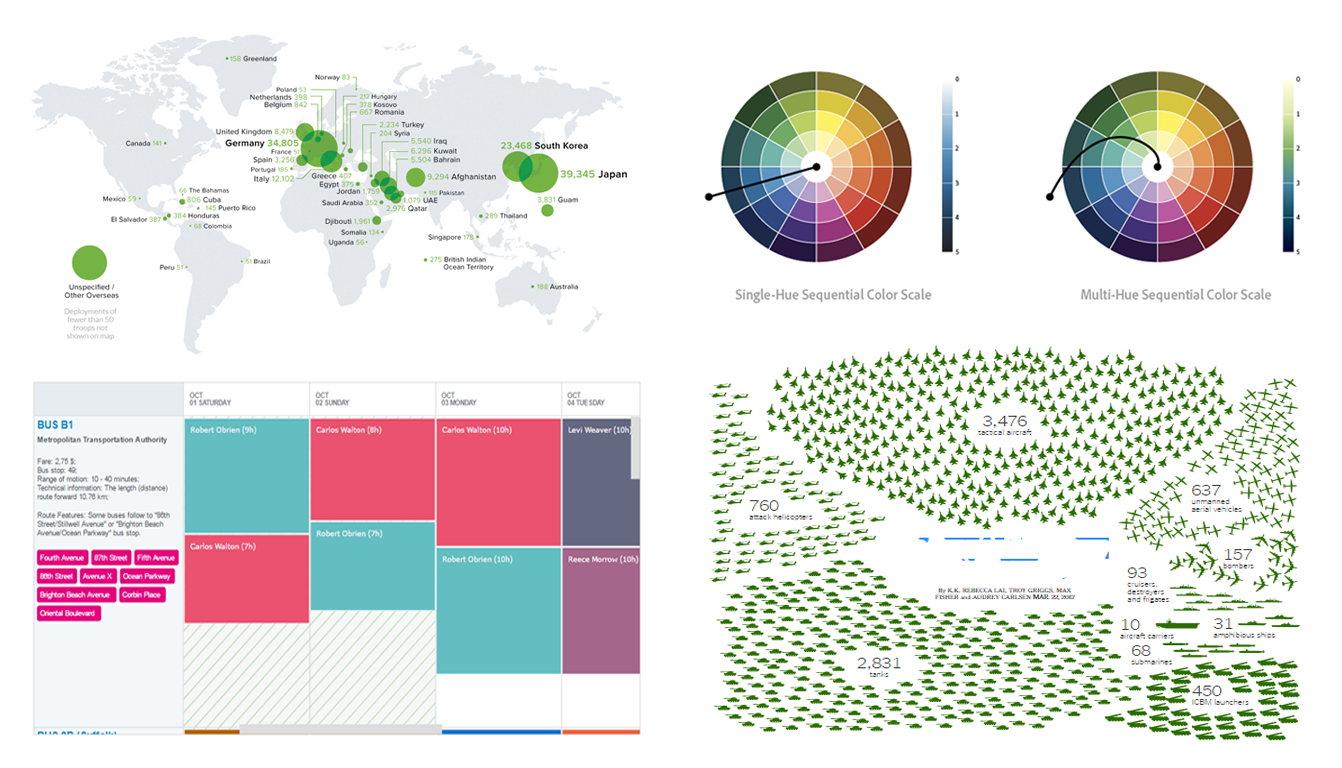 In today’s Data Visualization Weekly issue, you’ll find another set of eye-catching dataviz examples shared and discussed on media within the last seven days. The current issue highlights several visualizations of America’s military expenditure, bus schedule as a chart for resource management, and explanation on how to use color in data visualization to the best effect.
Read more »
March 20th, 2017 by AnyChart Team
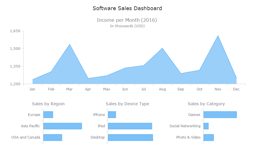
 Technical Support Dashboard is a great tool to keep track of all the support and related activities in your company. It can be very helpful in both monitoring your support team’s performance and revealing issue patterns in customer requests for further use by product strategy and development officers. And when you already have data, all you need is to decide how to visualize it, preferably quickly, easily, and fully compatibly with your own corporate software.
Now that the Web has completely adhered to the HTML5 standard, JavaScript charting libraries are the best type of solution for interactive data visualization. They can deliver all necessary dashboarding features and make the whole process of creating a dashboard for your web app pretty straightforward. Of course, you should just choose a right JavaScript charting library first that will entirely comply with your specific data visualization objectives.
But let’s get back to the very gist. Today we are glad to present the Technical Support Dashboard created with the JavaScript charting library of AnyChart. It is our new sample, available under the Apache 2.0 license, and you can feel free to make good use of it in your own business intelligence solutions. In particular, such a dashboard will help you fully control the support and make right data-driven decisions based on your data.
Now let’s take a closer look at this cool (and helpful) interactive JavaScript (HTML5) dashboard.
Read more »
March 17th, 2017 by AnyChart Team
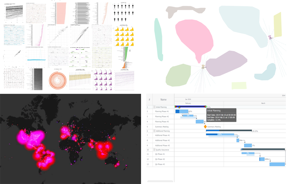 25 data visualization examples of how you can present the same dataset, an animated map of Twitter users’ reaction during this year’s Oscars, JavaScript-based self-driving cars, and an interactive Gantt chart sample with customized connectors in the Live Edit mode. These are the masterpieces that we are highlighting in today’s Data Visualization Weekly post.
Without more ado, let’s get to our latest collection of popular and most shared new charts from around the Web.
Read more »
March 10th, 2017 by AnyChart Team
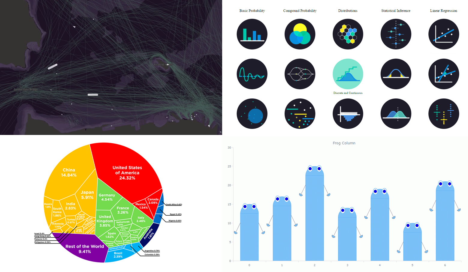 Now it’s time to say hello to last week’s most eye-catching data visualizations. As always, choosing just some of the best new and most popular pieces is a difficult task. But we are more than glad to do that for Data Visualization Weekly! And please don’t stop making more and more charts, people! That’s pleasant and greatly inspiring to see so many cool data visualizations emerge every week. Examining them also allows all of us to keep learning from the best practices, expand the vision, and further improve skills and understanding.
Today’s Data Visualization Weekly issue highlights the following four great presentations:
- animated map of shipping in the San Francisco Bay;
- interactive visualization of statistics and probability;
- Voronoi diagram of the global economy;
- “frog” column chart of whatever you need.
Read more »
March 5th, 2017 by AnyChart Team
Creating good data visualization is a huge investment of your time, but it’s also one of the most important things if you want to build a competitive, serious application. The best way to get consumers to see and feel your data is through pristine visualization, but choosing the best JavaScript charting library isn’t cut and dry. There are so many factors to consider when you’re thinking about JS charting.
Don’t fret! We’ve outlined some of the most important factors to consider when choosing a JS library. Here are 10 things you need to be thinking about right now.

Read more »
March 3rd, 2017 by AnyChart Team
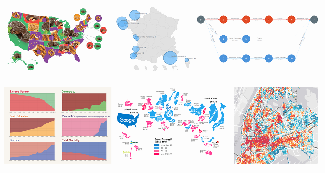 We are back with another collection of interesting charts, maps and infographics being popular lately. As you probably noticed, our Data Visualization Weekly series took a short break. In fact, no new issue came out last week. But the reason is simple and (hopefully) excusable. In fact, we were working really hard to get things done with the exciting major 7.13.0 update that our JavaScript charting libraries has received earlier this week.
Now the source code of AnyChart, AnyMap, AnyStock and AnyGantt is open. Plugins for all popular JS frameworks are available. And all the new features from the 7.13.0 release work great. That means we can finally get back to you to showcase new data visualizations that people followed most on our Twitter, Facebook and LinkedIn accounts over the last days. Moreover, the current issue of Data Visualization Weekly will cover the last two weeks instead of just one, to reimburse you for the delay. So, let’s take a look at the following great visual pieces now:
- Most Popular Girl Scout Cookies;
- History of Global Living Conditions in Interesting Charts;
- Interactive Map of Popular Surfing Areas in France;
- Most Popular Brands in Each Country;
- PERT Chart of Airplane Design Process;
- Revealing Age of Buildings in New York City.
Read more »