February 28th, 2017 by AnyChart Team
Reliability has always been our main priority at AnyChart JS Charts. And you definitely know you can trust us, with our JavaScript charting libraries’ public roadmaps, consistent releases, and highly experienced Quality Assurance team. Today we are glad to tell you about another major step that we have just taken in this regard:
AnyChart is now open!
 |
Basically, it means we fully opened the following:
– Source code of our JavaScript charting libraries – it is now available for review and download on GitHub.
– Issue tracker – so you can help us further improve our products, if you can/want.
– Build scripts – to let you compile custom binaries with the chart types you need.
– List of branches – to demonstrate our development cycle and prove you can trust us. |
However, that’s not all! In addition to becoming open, we introduced multiple important improvements and new features with the new major release. Let’s see now what else was added to the 7.13.0 versions of our JavaScript charting libraries – AnyChart (JS charts), AnyStock (timeline data based JS charts), AnyMap (JS maps), and AnyGantt (JS charts for project/resource management).
JavaScript Charting 7.13.0: New Features in AnyChart, AnyStock, AnyMap, AnyGantt
 |
Plugins
To make using our JavaScript charting libraries with the most popular JavaScript frameworks as easy as possible, we created special plugins for AngularJS, Ember.js, jQuery, Meteor, Node.js, and React. Save your time and effort by using these plugins when utilizing one of these frameworks. |
 |
Social Network Sharing
Now any JS (HTML5) chart powered by our JavaScript charting libraries can be easily shared on social networks Facebook, LinkedIn, Pinterest, and Twitter. We included this function in the context menu, so this can be quickly done from there. Properties specific to a particular social network can be set in the exports namespace. |
 |
Vertical Charts
Most of the series in our AnyChart and AnyStock Javascript charting libraries are now also available in the vertical orientation. Whenever that is what you’re looking for, you are welcome to use the isVertical() method. To make the process of building the most popular vertical chart types even more straightforward, we added special constructors, verticalArea() and verticalLine(). Look at vertical charts in our Gallery. |
 |
Pareto Chart
The Pareto chart, named after prominent economist and sociologist Vilfredo Pareto, is currently one of the most popular chart types in the field of management. And we simply could not make you get along without it anymore. So, let’s all welcome the Pareto chart type! Starting from the 7.13.0 version, AnyChart offers it out of the box. Now you can easily create a Pareto chart by using the anychart.pareto() constructor. |
 |
Step, Stick, Jump Line Charts
Please also meet these major new arrivals to the list of chart types supported in AnyChart and AnyStock. We introduced Backward and Forward modifications of the Step chart as well as the Jump Line and Stick. The Step Line Forward and Step Line Backward charts are now available with the help of the stepDirection() method. To add a Jump Line chart or create a Stick chart, use the jumpLine() and stick() methods. |
 |
Custom Series Drawing
Imagination is freedom. You definitely need to easily visualize your data exactly the way you see it. And we keep on doing our best to deliver you the ultimate customization features. Now we added the new rendering() method to AnyChart and AnyStock so you could put any creative idea into action and build any custom chart. Custom drawing examples: Frog Chart, Cherry Chart, and Column Chart with Rounded Edges. |
 |
Legend Customization
We added new options to work with the legend in AnyChart, AnyMap and AnyStock. First, the itemsLayout() now lets you improve the legend’s visual appearance, especially when multiple series are displayed. Second, the legend can now be placed inside a data plot (the positionMode() method) to facilitate a more efficient use of space on a chart. Third, the drag() method allows you to easily position the legend on your JS chart. |
") |
New Technical Indicators
To expand the range of stock JS (HTML5) charting opportunities available in AnyStock, we added more of technical indicators: Adaptive Moving Average (AMA); Modified Moving Average (MMA); Average True Range (ATR); KDJ; Bollinger Bands (BBands); Bollinger Bands %B (BBands %B); Bollinger Bands Width (BBands Width); Stochastic Oscillator (Fast / Slow / Full). Learn more of all the technical indicators in our Docs. |
 |
Individual Point Settings
Sometimes applying individual settings to a particular data point can be very useful. Although that might not be habitual for stock JS (HTML5) charts, we decided to provide you with this great customization opportunity in the AnyStock JavaScript charting library. Starting from the 7.13.0 release, you are allowed use the allowPointsSettings parameter in the anychart.stock() constructor to enable this option. |
 |
Resource Chart Interactivity
With the previous, 7.12.0 release of AnyGantt, we introduced the redesigned Resource chart. In the new, 7.13.0 version of this HTML5 / JS library, we are glad to present you several major new features added this time. First of all, now you can enable and adjust the Hover and Select interactivity settings in our new Resource charts. |
 |
Resource Chart Events
With the previous, 7.12.0 release of AnyGantt, we introduced the redesigned Resource chart. In the new, 7.13.0 version of this JavaScript charting library, we are glad to present you several major new features added this time.
First of all, now you can enable and adjust the Hover and Select interactivity settings in our new Resource charts. |
 |
Resource Chart Tooltips
Third, we have also added Tooltips to the new Resource chart with the current 7.13.0 release of AnyGantt. They will help you display additional information about each activity you are visualizing, in a convenient, greatly interactive way. |
 |
Connector Customization in Gantt Charts
Of course, we could not leave our Gantt charts without proper attention with regard to new features. This time we made tuning the visual appearance of the Live Editing mode in HTML5 Gantt charts more flexible by adding the new Connector Customization features. You are welcome to take a look at them in action in AnyGantt’s Gallery. |
We hope you like the 7.13.0 versions of our JavaScript charting libraries and enjoy the openness of AnyChart!
By the way, we have already scheduled the next major update on May 2017. Please see the roadmaps of AnyChart, AnyStock, AnyMap and AnyGantt in case you would like to find out what you will get with that release. All in all, 2017 is going to be no less fruitful in terms of new features in AnyChart JS Charts than the rich year of 2016!
Please contact our Support Team at any time when you have any questions or requests for new features. We’ll be glad to be of help, as always!
AnyChart’s version history: https://www.anychart.com/products/anychart/history/.
AnyStock’s version history: https://www.anychart.com/products/anystock/history/.
AnyMap’s version history: https://www.anychart.com/products/anymap/history/.
AnyGantt’s version history: https://www.anychart.com/products/anygantt/history/.
Download our JavaScript charting libraries: https://www.anychart.com/download/.
Purchase a license (renovated Buy page): https://www.anychart.com/buy/.
February 17th, 2017 by AnyChart Team
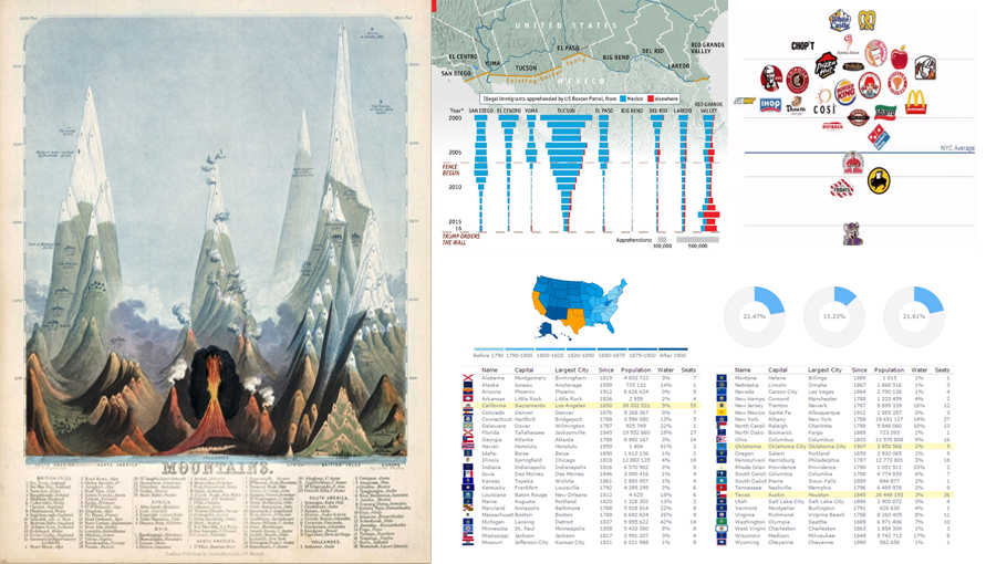 Data Visualization Weekly presented by AnyChart is here! In this new issue, we are glad to show you an interactive dashboard as well as maps and charts in another collection of the best and most followed dataviz masterpieces that we shared on Facebook and Twitter over the course of the last week. These include:
- Interactive Dashboard of US States
- Is Donald Trump’s Wall Necessary?
- Finding the Cleanest Restaurants in NYC
- Early Maps and Infographics of the 1800s
Read more »
February 14th, 2017 by AnyChart Team
 We are proud to tell you today that our company AnyChart has won the JavaScript Technologies category at the 2017 Devies Awards! The ceremony took place yesterday in San Francisco, CA, as part of DeveloperWeek, the world’s largest developer conference and expo with 8,000 attendees. Our CEO Anton Baranchuk received the award on behalf of the AnyChart team.
The DeveloperWeek Advisory Board received hundreds of nominations and, of course, thoroughly studied how much we did last year. What excited the judges most was the public release of our JavaScript graphics library GraphicsJS. And they concluded that to be last year’s most notable innovation in JavaScript technologies, exceptionally meaningful to the whole web development community.
The Devies Awards celebrate the most innovative companies in the field of developer technologies across 13 categories. Together with AnyChart, among this year’s winners are industry giants Microsoft and IBM.
Read more »
February 10th, 2017 by AnyChart Team
 All dataviz lovers are welcome to the new issue of Data Visualization Weekly brought to you by AnyChart JS Charts! Today we are publishing the best and new chart, map and infographic examples shared on our Twitter and Facebook accounts during the last seven days.
So, get ready for the best peculiar practices that made the previous week in data visualization special! And now let’s take a look at what dataviz inspirations were most followed. Read more »
February 2nd, 2017 by AnyChart Team

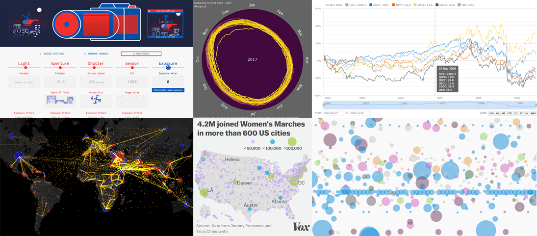
Data visualization weekly recaps became a tradition for our AnyChart Blog some time ago. Good news: we decided to resume it to highlight the best and new practices shared on our Facebook and Twitter accounts within the previous seven days. This means you will always be in the know of what charts, dashboards, maps, infographics, and video animations are trending and worth seeing.
As a matter of fact, data visualization is further evolving and gaining popularity as the best way to convey various information, whether it is in business reporting, analytics solutions, journalism, presentations, etc. That is why we are trying to monitor a lot of different sources and hope to deliver you the best of noteworthy, peculiar projects and practices for inspiration.
Now, let’s proceed to the visualizations that particularly caught our – and our followers’ – eyes during the last seven days, starting from January 27th, 2017. To put it in a nutshell first, the current data visualization weekly recap includes New York trees, Trump’s emotions, ocean salinity, words from Hamilton, US venture industry, and microphone sensitivity polar pattern. Read more »
January 18th, 2017 by AnyChart Team
 Choosing the right chart types for data analysis and reporting solutions is always a challenge. In fact, there are so many data visualization options out there that it can be really complicated to determine which one to use in a certain situation. And you cannot afford to make a mistake here, because applying data to an inappropriate type of chart will very likely end up causing confusion and even wrong business decisions.
To help you cope with this issue better (and faster), we have developed an information resource named Chartopedia, and it is a pleasure for us to introduce it to you today.
Read more »
- Categories: AnyGantt, AnyMap, AnyStock, Business Intelligence, Financial Charts, Gantt Chart, HTML5, JavaScript, News, Stock Charts, Tips and Tricks, Uncategorized
- 1 Comment »
December 26th, 2016 by AnyChart Team
This year has been so busy and fruitful for AnyChart JS Charts that now our team is extremely tired and feels incredibly happy at the same time. In fact, we went all out to make our JavaScript (HTML5) based charting libraries AnyChart, AnyStock, AnyGantt, and AnyMap even much more feature-rich, flexible, user-friendly, and faster with only one purpose – to bring you an unprecedented data visualization experience.
Looking back, we are proud of how MUCH was done in 2016! And now, we invite you to join us in quickly reviewing this year’s accomplishments that further strengthened AnyChart’s global leadership in interactive data visualization.
Without more ado, here is the list of new product and feature arrivals as well as major improvements to our JS charts solutions – a great chance to make sure you did not miss any important innovation.
1. More Types of JS Charts.
JS graphs and diagrams
- Treemap charts
- Linear gauges – LED, tank, and thermometer
- 3D area charts
- 3D bar charts
- 3D column charts
(AnyChart gallery)
Stock and financial JS charts
- Candlestick charts
- Spline charts
- Step line charts
- Area charts
- Step area charts
- Spline area charts
- Marker charts
- Range column charts
- Range area charts
- Range spline area charts
(AnyStock gallery)
JS Gantt charts
- PERT (Program Evaluation and Review Technique) charts
- Resource charts (redesigned; beta)
(AnyGantt gallery)
JS maps
- Dot (point) maps
- Flow (connector) maps
- Seat maps
(AnyMap gallery)
2. More Features in JS Charts.
All JS charts
JS graphs and diagrams
- Chart themes/palettes (demo)
- Exclude/include data points
- Context menu
- Save data as XSLX and CSV
- Save chart configuration as XML and JSON
- String tokens
- Chart statistics
- Standalone chart elements
- Tooltip settings improvement
(AnyChart docs)
Stock and financial JS charts
- Drawing tools and annotations (demo)
- Technical indicators – MACD, RSI, SMA, EMA, ROC, Aroon, and custom
- Data grouping
- Markers on data points
- Range selection UI
- Legend interactivity
- Y-scale comparison mode (changes and percentage changes)
(AnyStock docs)
JS Gantt charts
- Calendar support
- Smart timeline
- Event markers for time intervals and important events
- Timeline markers for multiple milestones
(AnyGantt docs)
JS maps
- Drill down
- Longitude/latitude API
- Move/zoom API
- Rich integration of keyboard and mouse controls
- 13 map projections
(AnyMap docs)
3. Easier JS charting.
- Chart editor (demo)
- Demos of business solutions including the following JavaScript (HTML5) dashboards:
- Web Audience dashboard
- Human Resources dashboard
- Investment Portfolio dashboard
- Sales dashboard
- CIO dashboard
- Site Speed Overview dashboard
- States of the US dashboard
- Migration tool – a small library for easier transit from AnyChart 5/6 to 7
- 20+ technical integration templates and samples for easy JS/HTML5 data visualization with any popular technology stack:
- ASP.NET – C# / C#, SignalR / VB.NET – MySQL integration template
- Clojure – ClojureScript – PostgreSQL integration template
- Go – (Revel) – MySQL integration template
- iOS – Objective-C – SQLite integration template
- Java Servlets – Maven, JDBC, JSP – MySQL integration template
- Java Spring – Maven, Hibernate – MySQL integration template
- Julia – MySQL integration template
- NodeJS – (Express, Jade) / Socket.IO – MongoDB integration template
- Perl – Catalyst – MySQL integration template
- PHP – (Laravel / Slim / Symfony) – MySQL integration template
- Python – Flask / Django – MySQL integration template
- R – Shiny – MySQL integration template
- Ruby on Rails – (Sinatra) – MySQL integration template
- Scala – Akka / Play – MySQL integration template
- Electron integration template
4. Faster JS Charts.
- Performance improvement (speed test):
- Less than 1s to render 250,000 data points
- Less than 60ms to stream 500 points
- Async rendering (docs)
5. New Products.
- AnyChart 7.x Plugins for Oracle APEX
- GraphicsJS, a powerful open-source JavaScript graphics library (SVG)
To sum up, 2016 was immensely intensive. But 2017 will be no less productive from the very beginning – we promise.
We wish you a peaceful, prosperous, and happy new year!
- Categories: AnyChart Charting Component, AnyGantt, AnyMap, AnyStock, Business Intelligence, Dashboards, Financial Charts, Gantt Chart, GraphicsJS, HTML5, JavaScript, News, Oracle Apex, Stock Charts
- 2 Comments »
December 19th, 2016 by AnyChart Team
Making your data visualization life ever easier is what we at AnyChart are boundlessly passionate about. This time we focused on further simplifying the integration of our JS charting solutions into your web development environment.
So, prepare to replan your schedule! From now on, you will spend tangibly less time on charting. And please greet the 21 New Technical Integration Templates that we have just released! They will help you deploy HTML5 graphs, maps, stock charts, dashboards, and Gantt diagrams in your stack as easily (and rapidly!) as never before, no matter what programming languages, frameworks, and databases are used.
You can find the templates right here on our website, in the Technical Integrations section.

Basically, our powerful JavaScript/HTML5 based solutions for interactive data visualization – AnyChart, AnyMap, AnyStock, and AnyGantt – are inherently compatible with all major technologies and platforms. Configuring each JS charting library is easy, and we are sure all of you are more than capable of making even rather complicated integrations prefectly done by yourself. But we keep on doing our best to bring you the ultimate simplicity and clarity so you could get along without additional research and other time-consuming activities.
The integration templates we’ve added cover the most popular languages, frameworks and libraries, and database programs. Below is the list of the newly available combinations.
Templates for easily integrating AnyChart JS charting libraries into your stack:
 |
ASP.NET integration
- ASP.NET, C# and MySQL
- ASP.NET, C#, SignalR and MySQL
- ASP.NET, VB.NET and MySQL
|
 |
Go integration
- Go and MySQL
- Go, Revel and MySQL
|
 |
Java integration
- Java Spring, Maven, Hibernate and MySQL
- Java Servlets, Maven, JDBC, JSP and MySQL
|
 |
Julia integration
|
 |
NodeJS integration
- NodeJS and MongoDB (using Socket.io)
- NodeJS, Express, Jade and MongoDB
|
 |
Perl integration
- Perl, Catalyst Web Framework and MySQL
|
 |
PHP integration
- PHP, Laravel and MySQL
- PHP, Slim and MySQL
- PHP, Symfony and MySQL
|
 |
Python integration
- Python, Flask and MySQL
- Python, Django and MySQL
|
 |
R integration
|
 |
Ruby on Rails integration
- Ruby on Rails, Sinatra and MySQL
- Ruby on Rails and MySQL
|
 |
Scala integration
- Scala, Akka and MySQL
- Scala, Play and MySQL
|
We hope you agree that this is a tremendous addition to the JS charting integration samples published earlier:
- Clojure, ClojureScript and PostgreSQL,
- iOS, Objective-C and SQLite,
- NodeJS and MongoDB,
- PHP and MySQL,
- PHP, Slim and MySQL.
So, you are welcome to make use of our integration templates and samples for easier data visualization. All of them are released on GitHub under the Apache 2.0 License, rest in the AnyChart Integrations repository, and can be forked and changed in any way.
We are going to keep the collection growing further. Meanwhile, please send us your suggestions on what other particular integration you are interested to learn about first, and – as always! – that one will be prioritized; just contact our Support Team for that and name your stack.
To make your JS charting life even easier, we will release special AnyChart plugins for Angular, Ember, jQuery, Meteor, and React JavaScript frameworks in February 2017, with the 7.13.0 update. But this is a completely other remarkable story. Stay tuned. And thanks for being with us!
- Categories: AnyChart Charting Component, AnyGantt, AnyMap, AnyStock, Business Intelligence, Dashboards, Financial Charts, Gantt Chart, HTML5, JavaScript, News, Stock Charts, Third-Party Developers, Tips and Tricks
- 2 Comments »
October 31st, 2016 by Margaret Skomorokh
AnyChart JS charting library updated! We are glad to announce four new releases: AnyChart, AnyStock, AnyMap, and AnyGantt 7.12.0 are now available for download.
AnyChart 7.12.0 New Features
AnyStock 7.12.0 New Features
AnyMap 7.12.0 New Features
AnyGantt 7.12.0 New Features
 |
Brand New Resource Chart (Beta)
We are doing our best to improve our products and this time we decided to take a fresh look at Gantt and Resource charts. We have studied how people manage projects and company resources, what they want to see, how they want to display things happening, and goals they want to achieve. As the result, we understood that we have to redesign Resource and Gantt Charts completely. In this release we present the beta version of new Resource Chart.
Take a look at Resource Chart and Resource Chart with Time Tracking in the Gallery.
Learn more about Resource Chart and Resource Chart with Time Tracking.
|
 |
Calendar Support
One of the main features of the new Resource Chart is the ability to set the calendar for all resources or some of them. You can configure weekends, holidays, time of availability, beginning of a calendar year, and so on.
Learn more about the Calendar>>
|
 |
Smart Timeline
New Resource Chart features the improved timeline that looks nice with any data. This new Smart Timeline will be made interactive and available in Gantt Charts in the next update.
Learn more about the Smart Timeline >>
|
AnyChart version history: https://www.anychart.com/products/anychart/history/
AnyStock version history: https://www.anychart.com/products/anystock/history/
AnyMap version history: https://www.anychart.com/products/anymap/history/
AnyGantt version history: https://www.anychart.com/products/anygantt/history/
Trial download: https://www.anychart.com/download/
October 19th, 2016 by AnyChart Team
In today’s world of data, a well-designed web analytics dashboard is a must-have for everyone who is managing a website, a web app, or a number of various web projects. You get tons of statistics about traffic, and you should make them work and help you make right decisions.
How much traffic are you getting? Who are your visitors? Where are they coming from? And maybe even most important – is your marketing strategy working well? It gets much easier and takes significantly less time to answer all these questions when the data is visualized. Here comes an interactive analytics dashboard that allows you to have your data organized, see everything at-a-glance, and pay sufficient attention to all metrics that are important to you.
First-class dashboarding experience is one of the biggest advantages of our interactive data visualization solutions. JavaScript graphs, maps, and stock charts powered by AnyChart can be easily put on a single, effective, interactive HTML5 dashboard, making your traffic data analytics even more powerful and insightful. And here is another great example – Web Audience Dashboard, freshly made by the team of AnyChart for your inspiration.
Look at this:

(large image / interactive version)
And now we definitely should take note of some composition and development features of this dashboard.
Read more »


")

