September 24th, 2008 by Anton Baranchuk
AnyChart, the world leading company in data visualization, and Apex Evangelists, the world leading consulting company which 100% specializes in working with Oracle Application Express, announced today a global partnership to provide high quality customized data visualization solutions for Oracle APEX.
Apex Evangelists are extremely knowledgeable in all areas of Application Express development and have extensive experience of working with the AnyChart products.
Dimitri Gielis has announced about the partnership at Oracle Open World conference (post in his blog)
More details>>
Read more »
September 3rd, 2008 by Alex Batsuev
Google has released the new browser of the next generation – Google Chrome
It is amazing how fast it is, and also it has a lot of features in such minimal, simple and useful interface
But the most important news for our team is the fact that AnyChart works like a charm with Google Chrome!
And it is the good news for our customers as well – all their reporting, statistical, BI and other systems built with AnyChart will work in the new browser without any extra efforts.
July 28th, 2008 by Anton Baranchuk
Our sales managers get a lot of questions from prospective customers regarding other companies that have chosen AnyChart. We’ve decided to publish the list of some clients with well-known names.
https://www.anychart.com/company/clients.php
July 24th, 2008 by Timothy Loginov
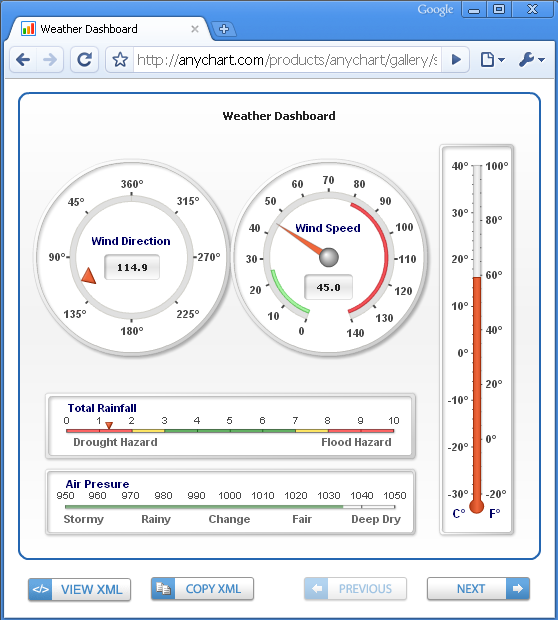
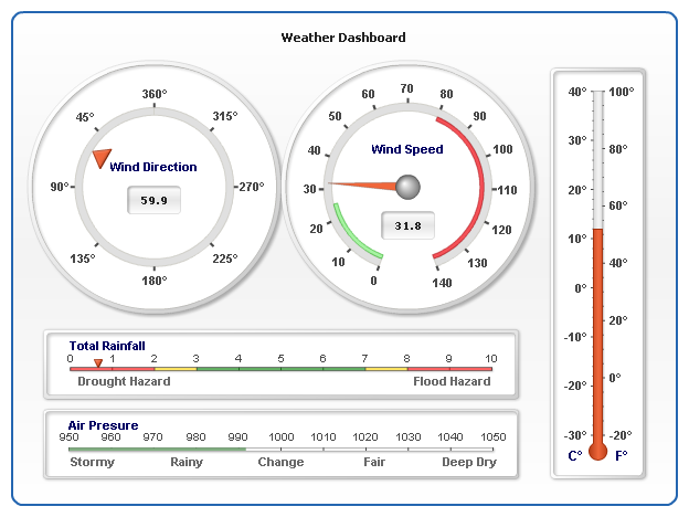
On July 25th, AnyChart Team is proud to present AnyChart version 5.0 with the multipurpose, feature rich Gauge engine.
Version 5.0 Release Overview:
- Gauges Charting Engine
- Circular (Angular) Gauges – variable angles, multiple scales, auto-fit.
- Linear Vertical and Horizontal – color ranges, multiple scales and pointers.
- Image Gauge – for nice look and total customization.
- Custom Labels – to add descriptions and annotations.
- Indicator Gauge – to represent device or business indicators.
- Bullet Graphs.
- Thermometer Styled Linear Gauges.
- Tank Styled Linear Gauges.
- Basic Charts Engine Improvements
- Exploded Slices for Single-Series Pie and Donut Charts.
- Sorting feature for Pie and Donut Charts.
- Dashed Grids and Lines.
- Opera Tooltip Redraw Bug Fixed.
- Map Tooltip Position in Flex Component Bug Fixed.
- Animation in Dashboard Mode Fixed.
Please take a look at the Gauge Samples in our Chart Gallery:
And do not miss an opportunity to test:
The trial version can be downloaded from Download Section.
Existing users eligible for the free or discounted upgrade – please contact support team to upgrade to version 5.0.
Here is a sample Gauges Dashboard created with AnyChart version 5.0:
June 6th, 2008 by Alex Batsuev
Until now AnyChart was able to get data only in XML format. However it’s not always convenient and requires at least knowledge of XML.
Now we make the life of AnyChart users easier and add the ability of handy Flash chart implementation in JavaScript. Now AnyChart.js has a new method – setJSData, that allows you to set parameters and data to the chart as a JavaScript object.
You can view a simple example here:
http://6.anychart.com/tips_and_tricks/xml-and-js/js-sample.html
How to create an object with settings and data:An object with settings and data has the same structure as AnyChart XML. XML nodes and attributes are properties. Nodes, that can be repeated (for example, <point />) are arrays.
For example:
var chartData = {
 charts: {
   chart: {
     chart_settings: {
        title: { text: "Chart Title" }      },
      data: {
       series: [
         point: [{name: "pt1", y: 12}, {name: "pt2", y: 23}]
       ]
     }
   }
 }
}
Or:
var chartData = {}
chartData.charts = {};
chartData.charts.chart = {};
chartData.charts.chart.chart_settings = {};
chartData.charts.chart.chart_settings.title = {};
chartData.charts.chart.chart_settings.title.text = "Chart Title";
chartData.charts.chart.data = {};
chartData.charts.chart.data.series = [];

var seriesObj = {};
seriesObj.point = [];
seriesObj.point.push({name: "Pt1", y: 12});
seriesObj.point.push({name: "Pt1", y: 23});

chartData.charts.chart.data.series.push(seriesObj);
Object’s structure is equivalent to XML structure. The description of XML you can find here:
http://6.anychart.com/products/anychart/docs/xmlReference/index.html
Setting chart description object to AnyChart is done using setJSData method.
Also we’ve created several examples of using setJSData, including JSON example:
1. An example of object-creation using JavaScript:http://6.anychart.com/tips_and_tricks/xml-and-js/js-sample.html
2. An example of JSON-creation forming: http://6.anychart.com/tips_and_tricks/xml-and-js/json-sample.html
3. An example of JSON-data loading from the text file using AJAX:
http://6.anychart.com/tips_and_tricks/xml-and-js/json-ajax-sample.html
May 8th, 2008 by Timothy Loginov
Flex application’s range of use is very wide, but the maximum effect this platform has introduced to Business Intelligence. On using Flex it became available to create convenient and interactive dashboards for BI. One of the key moments of dashboards are charts, and their functionality and obviousness affects most of all on comfort of the whole dashboard. AnyChart perfectly fits these criteria, this component greatly surpasses the default Flex Charting Component in functionality and appearance.
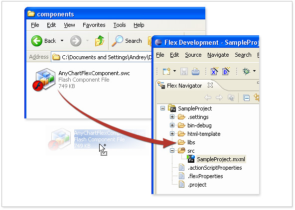
Earlier AnyChart was intended for use in HTML-pages and its integration in Flex components was quite a problem, but now we’ve created a Flex component, which gives the amusing results in connection with XML tools in Flex application.
We have created an extensive set of samples that show and explain how AnyChart Flex Charting Component can be used to create Interactive Dashboards, Drilldown charts and Maps in Flex 3.
View: the tutorial and live samples of charting applications in Flex.
May 8th, 2008 by Timothy Loginov
AnyChart is a flexible component for creation charts in Web, you can easily create a lot of charts using it, PHP is one of the most server popular scripting engines, MySQL – is the most popular database to be used with PHP, so we have created a set of samples that explain and demonstrate creation of PHP SWF Flash Charts with AnyChart Flash Charting Component.
Samples include charting data from Array, from MySQL, creation of drilldown (and self drilldown) charts as well as creation of interactive flash maps.
Look through: tutorial of creation flash charts with AnyChart and PHP.
Download: sample package of charting from Array, MySQL and Drilldown Dashboards Creation.
March 20th, 2008 by Timothy Loginov
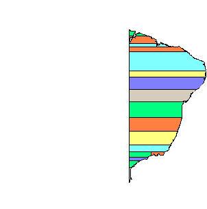
Good news for AnyChart customers from Brazil – today we have published maps of all states of Brazil.
Interesting facts are that back in XVI century the current territory of Brazil was divided into Captaincies, which are a historical administrative divisions of the former Spanish and Portuguese colonial empires. Each one was governed by a captain general.
In the Portuguese Empire, captaincies (capitanias, in Portuguese) were the administrative divisions and hereditary fiefs of the Portuguese state in some of its colonies.
Portugal Empire leaders didn’t think a lot about regional divisions and in 1534 Hereditary Captaincies maps looked like straight stripes of variable height of land, divided parallel to the Equator from the coast to the Tordesilhas Line, created by King John III of Portugal in 1534. Nice map, isn’t it? But this didn’t last long, and in 1573 only Two Viceroyalties were formed:
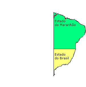
Since that time many things have happened and Brazil administrative maps were changed several time. The last reform have happened in 1990.
You can look at that map and map of all states in the following interactive flash dashboard created with AnyChart Flash Chart and Map Technology:
Click to view map of Brazil and all its states
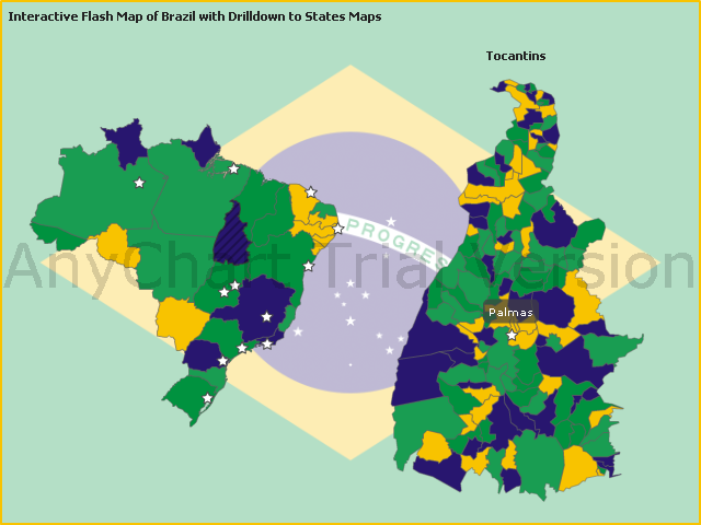
So, now you can create Drilldown Maps, Geographical Related Dashboards, Real Estate, Distributor, Franchise, Dealer, locators, statistical or reporting applications etc. – for Brazil Market.
All you need are AnyChart Flash Maps and Sample Source Code from Brazil Flash Map Sample.
P.S.
By the way – Internet usage in Brazil has increased greatly in the last few years and in September 2007 was estimated in 42,600,000 people by ITU (International Telecommunications Union), and a 22.4 % penetration rate, and 6,417,000 of users are Broadband subscribers (June/07, per Teleco) with 3.4% penetration rate.
Brazil is the seventh country in Internet usage in the world.
Historical Maps of Brasil are obtained from Wikipedia
March 7th, 2008 by Anton Baranchuk
AnyChart for SharePoint beta is available now. It is a charting component designed specifically for Microsoft’s SharePoint portal technology. This web part allows you to create different charts based on SharePoint list data. This product doesn’t require installing any code to the server. AnyChart Flash charting technology is used as the charting engine.
Using AnyChart for SharePoint you can easily build and configure any dashboard in minutes. This solution intended for everybody who deals with creation of dashboard, reporting, analytics, statistical, financial or any other data visualization solutions.
Product page: http://6.anychart.com/products/sharepoint/overview/
Download beta: http://6.anychart.com/products/sharepoint/download/
Installation tutorial: http://6.anychart.com/products/sharepoint/demos/installation.php
Live demo: http://www.SharePointCharting.com/
February 29th, 2008 by Alex Batsuev
Sometimes it is necessary to create custom preview of the component in the Flex Builder “Design” view.
It is undocumented feature 😉
I’ve found very interesting class in the Flex SDK 3: mx.core.UIComponentGlobals.
This class contains static field designMode:Boolean.
Just check that field in your component code.
You can download example component with the source code from here:
http://6.anychart.com/tips_and_tricks/designMode/DesignModeComponent.zip
Also you can download the usage sample:
http://6.anychart.com/tips_and_tricks/designMode/DesignModeComponentSample.zip
Running in the Flex Builder “Design” mode it shows AnyChart image. But when it runs in the flash player it shows only gray rectangle.