Stunning New Charts & Maps from Around Internet — DataViz Weekly
October 4th, 2024 by AnyChart Team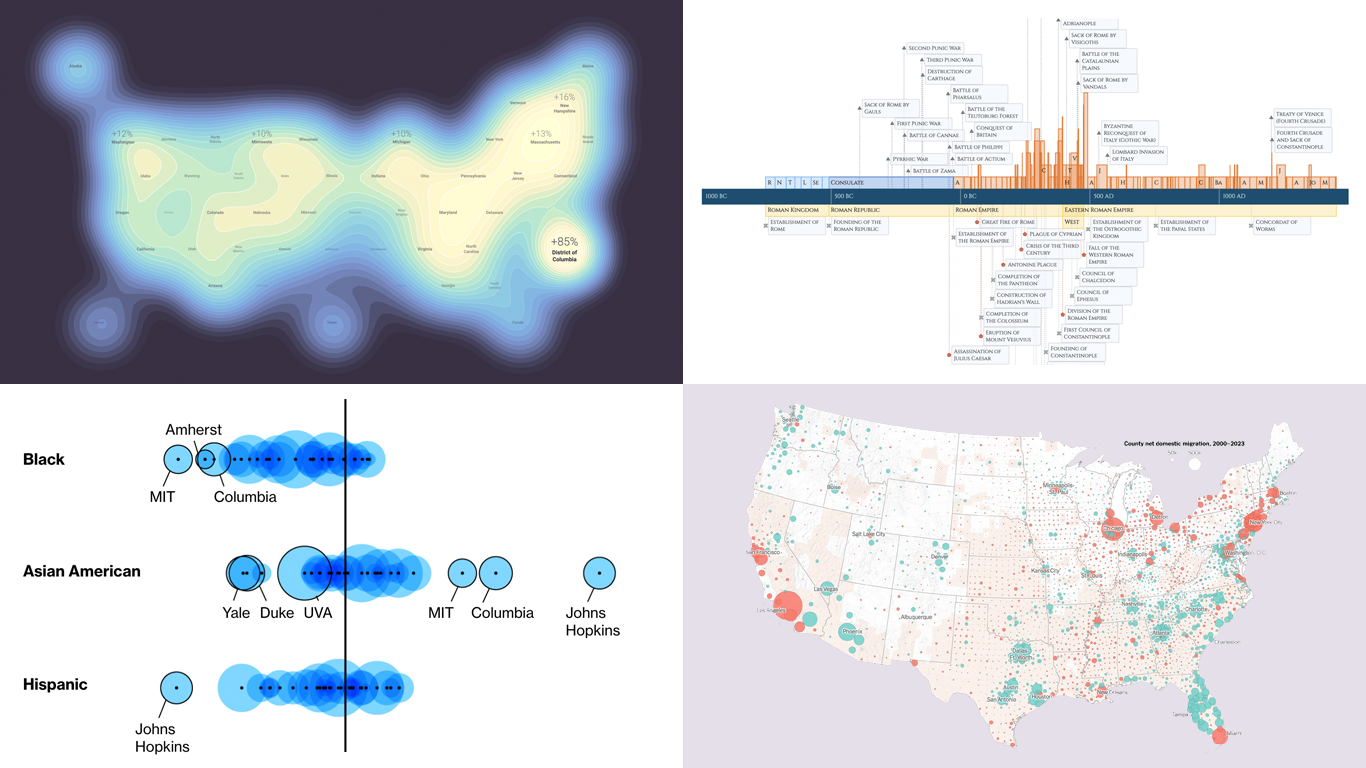 Charts and maps have a unique power to let data talk, transforming raw numbers into meaningful insights that anyone can grasp. In this edition of DataViz Weekly, we’re featuring some of the most stunning new examples of how data visualization brings information to life.
- Hazard-prone locations in the United States attracting migration — NYT
- Shifts in college admissions after the affirmative action ruling — Bloomberg
- Google search trends around U.S. elections — Google Trends and Truth & Beauty
- Interactive timeline of Roman history — AnyChart
- Categories: Data Visualization Weekly
- No Comments »
Stunning New Data Visualizations Not to Miss — DataViz Weekly
May 17th, 2024 by AnyChart Team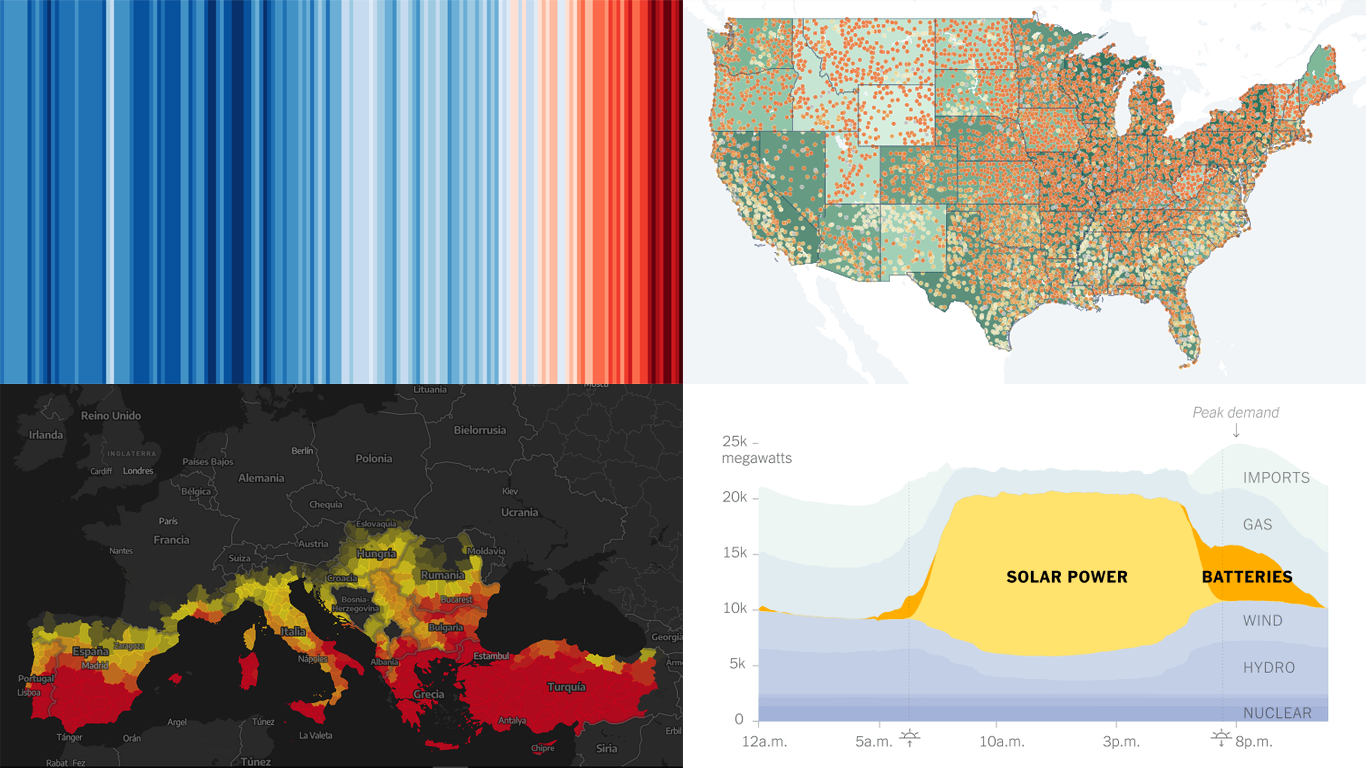 Data visualization is not just about making data look pretty; it’s about uncovering hidden patterns, revealing trends, and providing a clearer understanding of information. Through innovative visual techniques, we can explore data in ways that traditional methods can’t match. This week on DataViz Weekly, we bring you four compelling projects that showcase the transformative power of data visualization:
- Revealing the warming stripe for 2023 — Ed Hawkins
- Analyzing and predicting megafires in Europe — elDiario.es
- Understanding the growing role of giant batteries in electricity grids — NYT
- Analyzing segregation in U.S. schools — Stanford University
- Categories: Data Visualization Weekly
- No Comments »
Top Recent Climate and Environment Data Visualizations Worth Looking At — DataViz Weekly
November 25th, 2022 by AnyChart Team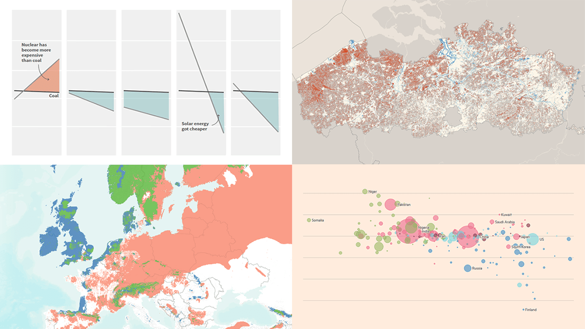 Against the backdrop of the United Nations Climate Change Conference COP27, quite a few data visualizations on climate and environmental issues came out. Earlier, we showed you the Emissions Map by the Climate Trace coalition. This time on DataViz Weekly, here are some more of the top recent ones we believe are worth looking at:
- Uneven distribution of climate change effects across the world — FT
- Future of European forests under different climate scenarios — Appsilon
- Rise of clean energy — Reuters
- Endangered Flemish agricultural land under the seventh manure action plan — De Tijd
- Categories: Data Visualization Weekly
- No Comments »
Most Interesting New Visualizations of Data — DataViz Weekly
November 11th, 2022 by AnyChart Team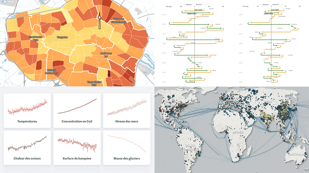 Join us as we look at some of the most interesting data charts and maps we have seen out there these days. Here’s what visualizations are featured today on DataViz Weekly:
- Presidential party results in midterm and other elections in the U.S. — Reuters
- Six indicators of (worsening) climate change — Le Monde
- Global greenhouse gas emissions in detailed inventory — Climate TRACE
- Car parking spaces in Berlin — Tagesspiegel
- Categories: Data Visualization Weekly
- No Comments »
Best Data Visualizations We’ve Come Across Most Recently — DataViz Weekly
October 28th, 2022 by AnyChart Team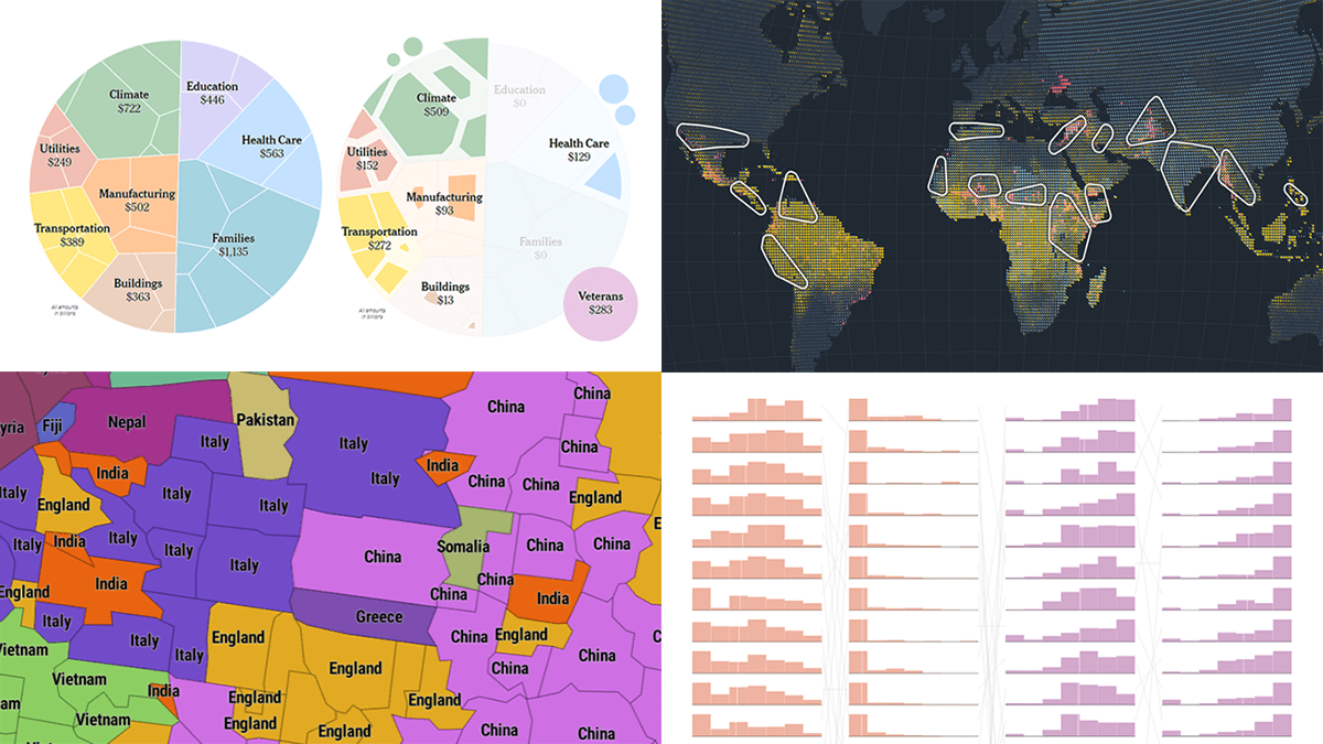 Interesting charts and maps come out all the time. DataViz Weekly is here to show you the best data visualizations we have seen most recently! Look at our newest picks!
- Feelings at work by occupation — FlowingData
- Impact of climate on conflicts — Auswärtiges Amt (German Foreign Office)
- U.S. President Biden’s legislative agenda — The Upshot
- Australians’ birth countries, languages, and religions — SBS News
- Categories: Data Visualization Weekly
- No Comments »
Reviewing Four New Exciting Data Visualizations — DataViz Weekly
March 25th, 2022 by AnyChart Team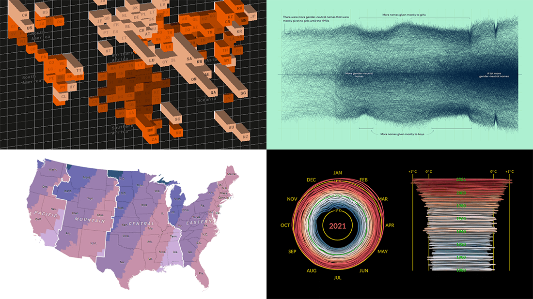 If you are reading this, you (almost certainly) love good data graphics. Well, we won’t leave you hanging! Check out a new DataViz Weekly review of exciting data visualizations recently built by honored professionals.
- Sunrise times with permanent daylight saving time in the U.S. — The Washington Post
- Inequality between rich and poor people’s carbon emissions — Bloomberg
- Gender-neutral baby names in America — Georgios Karamanis
- 3D climate spiral for 1880–2021 — NASA
- Categories: Data Visualization Weekly
- No Comments »
Recalling Most Awesome Recent Data Visualizations — DataViz Weekly
February 11th, 2022 by AnyChart Team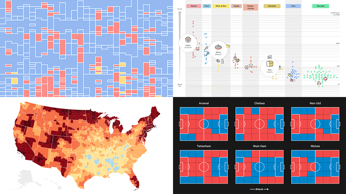 It’s Friday, time to recall the most awesome data visualizations of all that have caught our attention over the past week. So everyone, welcome to DataViz Weekly!
- Decline of English on Spotify — The Economist
- English Premier League contenders for the Champions League qualification — The Athletic
- Carbon footprint of food — Der Tagesspiegel
- Air temperature change in every U.S. county — The Guardian
- Categories: Data Visualization Weekly
- No Comments »
Visualizing Data on Income, Volcano Eruption, Shopping, Climate — DataViz Weekly
January 28th, 2022 by AnyChart Team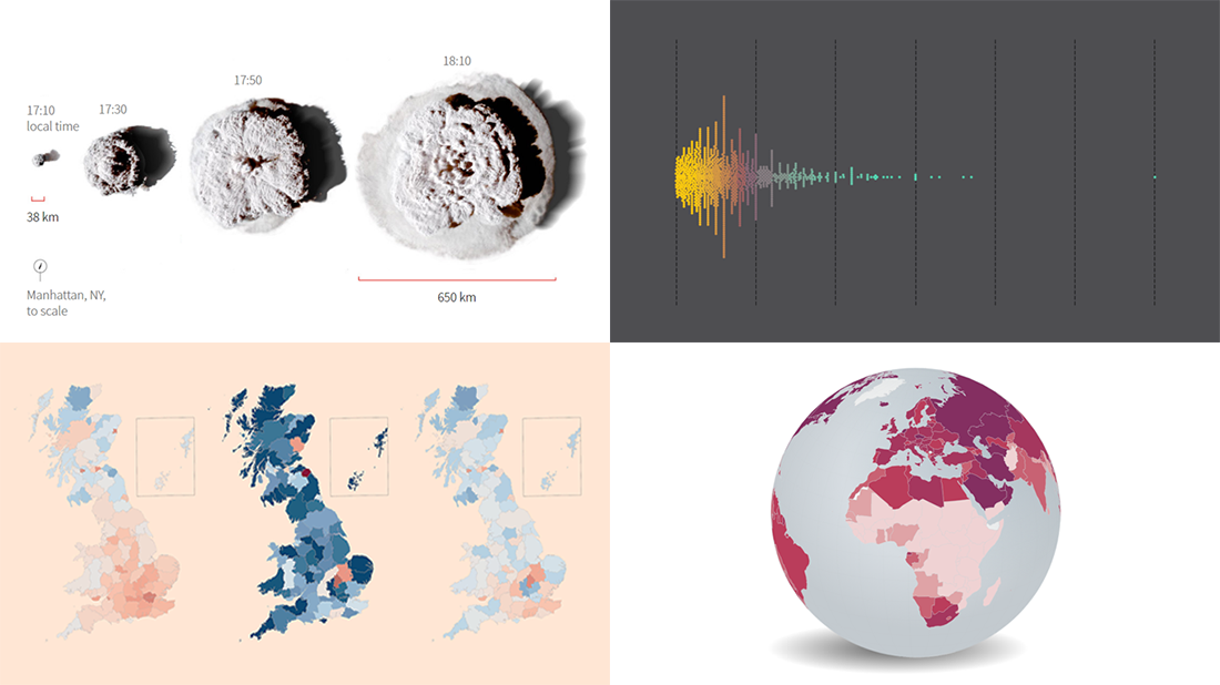 Continuing our regular roundups of the most interesting charts, maps, and infographics, we are glad to spotlight a bunch of new awesome projects for your inspiration. Today on DataViz Weekly:
- Americans’ annual personal income — Nathan Yau
- Tonga eruption’s true scale — Reuters
- High street crisis in Great Britain — The Financial Times
- Climate change drivers and sufferers — Der Tagesspiegel
- Categories: Data Visualization Weekly
- No Comments »
2021 Year in Review in Graphics — DataViz Weekly
December 31st, 2021 by AnyChart Team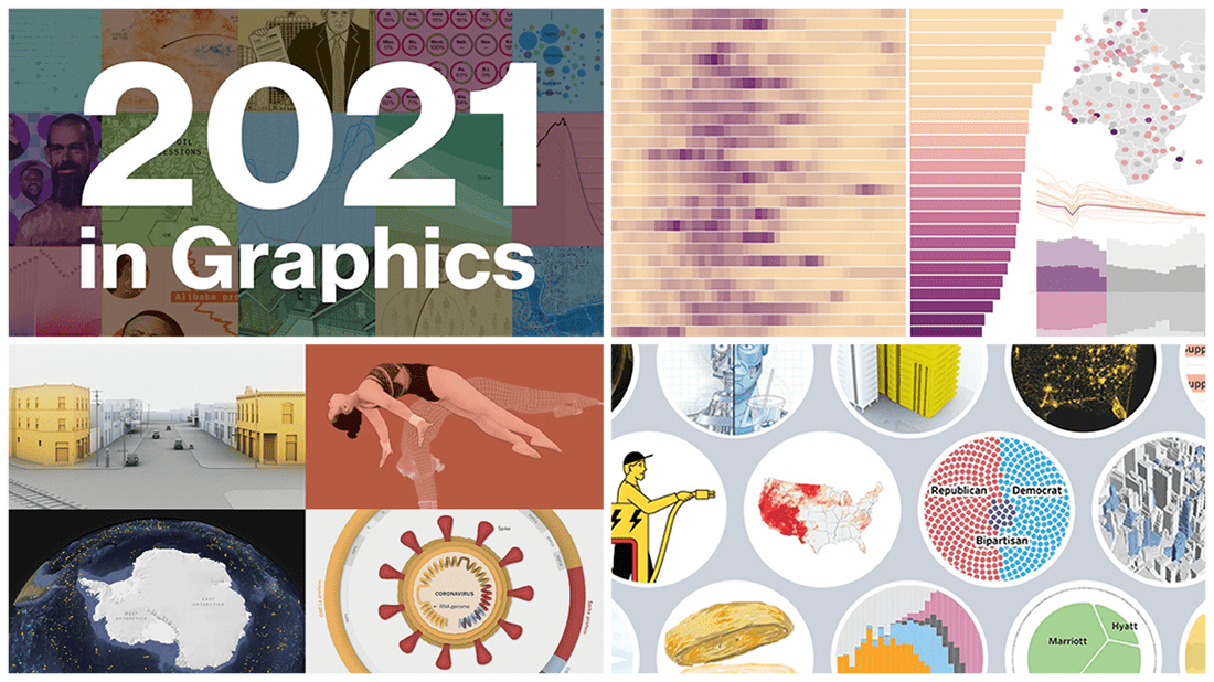 As we get ready to ring in the New Year 2022, it’s a great time to take a look back at 2021! Over the last 365 days, various experts in data graphics and visual storytelling have done their best to help us better understand what was going on around us with the help of static and interactive charts, maps, and infographics. Now we want to let you recall the most important matters that shaped the passing year from the lens of data visualization.
Here, in the final DataViz Weekly issue of 2021, we bring you a roundup of the year-in-review-in-graphics recaps on Bloomberg, The Wall Street Journal, The New York Times, and POLITICO.
Check it out, see the awesome visuals, and enjoy the start of a very happy, healthy, and prosperous new year that we wish you all to have in 2022! 😎🎉
- Categories: Data Visualization Weekly
- 1 Comment »
Data Visualization Best Practices in Action — DataViz Weekly
December 17th, 2021 by AnyChart Team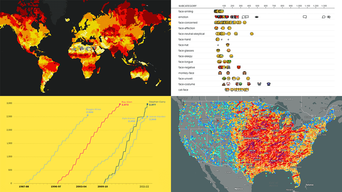 Committed to bringing you the most robust charting solutions, we also continue to curate weekly roundups highlighting projects that greatly implement data visualization best practices, for your inspiration. A new one is here! Look what we’ve got for you to check out this time on DataViz Weekly:
- Tornadoes since the late 19th century — Tornado Archive
- Emoji use frequency in 2021 — Unicode
- Links between climate change and violent conflicts — Crisis Group
- Curry’s rise to the NBA’s three-point king — The Washington Post
- Categories: Data Visualization Weekly
- No Comments »