New Data Graphic Examples Worth Checking Out — DataViz Weekly
June 28th, 2019 by AnyChart Team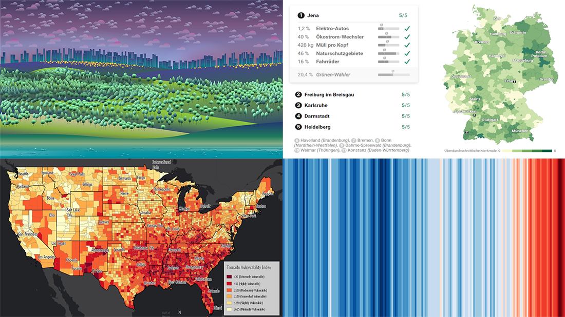 We’ve picked another four awesome projects as new data graphic examples to showcase in DataViz Weekly this Friday. Check them out right away as they are definitely worth it:
- Suicides in the Netherlands
- Where Germany is really green
- Temperature change worldwide
- Vulnerability to tornadoes across the United States of America
- Categories: Data Visualization Weekly
- 1 Comment »
New Cool Diagrams, Graphs, and Maps Visualizing Interesting Data — DataViz Weekly
June 21st, 2019 by AnyChart Team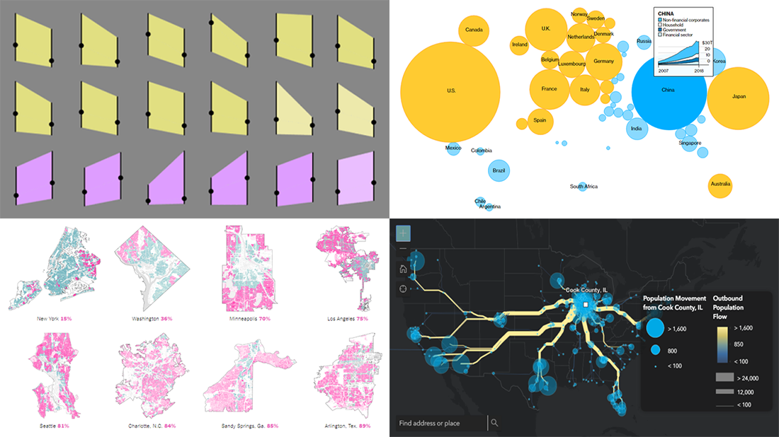 Generally, data becomes much easier to make sense of when it is visualized in diagrams, maps, or other forms of graphics. DataViz Weekly shows you examples of how this is true in reality. Today, we’ve put together another four of the latest data visualization projects discovered by our team around the internet. They bring insight into the following topics:
- Single-family home zoning in the United States of America
- Time use of parents vs people without kids
- Debt of emerging market countries
- U.S. internal migration
- Categories: Data Visualization Weekly
- 1 Comment »
4 Great Visualization Projects on Privacy, Electricity, Ocean, and Emotions — DataViz Weekly
June 14th, 2019 by AnyChart Team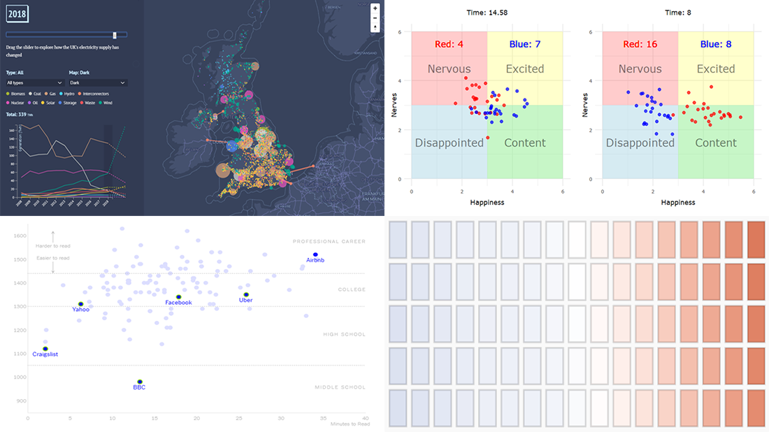 Are you ready to check out new compelling visualization projects? DataViz Weekly is awaiting your attention! Today in the focus:
- Privacy policies of 150 popular websites and apps
- Transformation of electricity supply in the United Kingdom
- Oceans in the changing climate
- Emotions during a basketball game
- Categories: Data Visualization Weekly
- No Comments »
Most Interesting Data Visualization: GBP, EU Election, MHW, Bob Ross — DataViz Weekly
June 7th, 2019 by AnyChart Team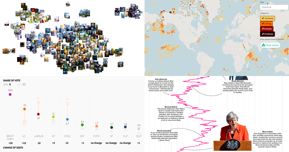 Take a look at four of the most interesting data visualization projects and stories we have found around the web during the last few days. Here’s what we feature today in DataViz Weekly:
- GBP rate change in the context of Brexit turns
- European Parliament election in the United Kingdom
- Marine Heatwave Tracker
- Evolution of Bob Ross’s famous phrases over all 403 episodes of The Joy of Painting
- Categories: Data Visualization Weekly
- No Comments »
Graphics Visualizations About Immigration, Elections, Pitchers, and Salinity — DataViz Weekly
May 17th, 2019 by AnyChart Team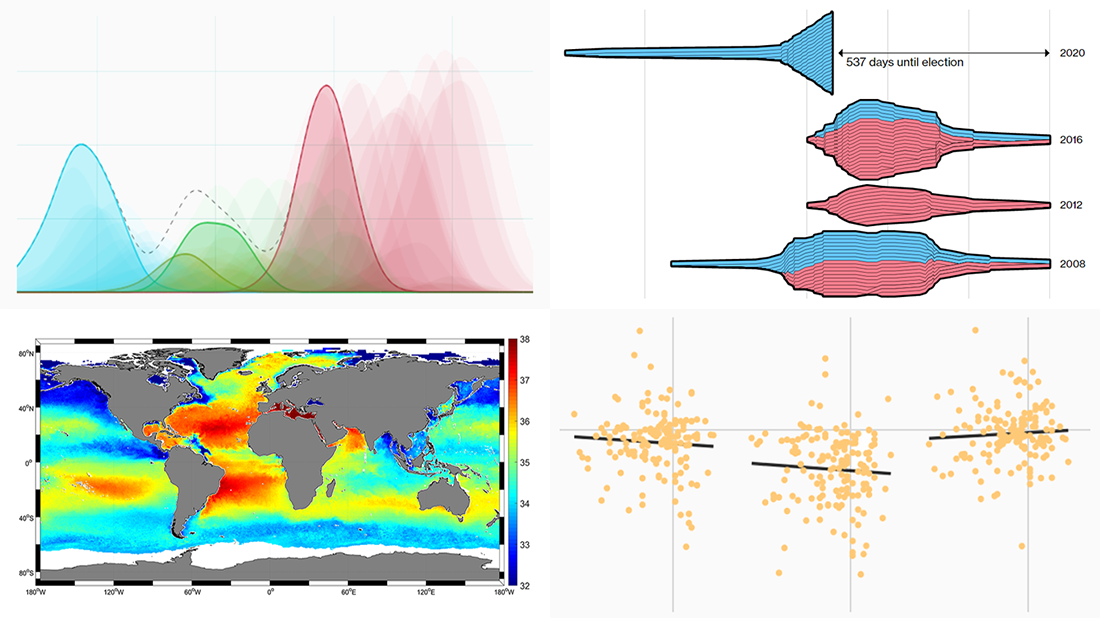 New DataViz Weekly is here, highlighting some of the new cool graphics visualizations we found around the web just recently:
- Finding a link between undocumented immigration and crime in the United States
- Competition in the U.S. presidential elections since 1980
- MLB pitchers’ pitch distribution
- Sea-surface salinity
- Categories: Data Visualization Weekly
- No Comments »
Visual Data Graphics on EU Regions, Freedom of Press, IMF Forecasts, and Climate Change — DataViz Weekly
April 26th, 2019 by AnyChart Team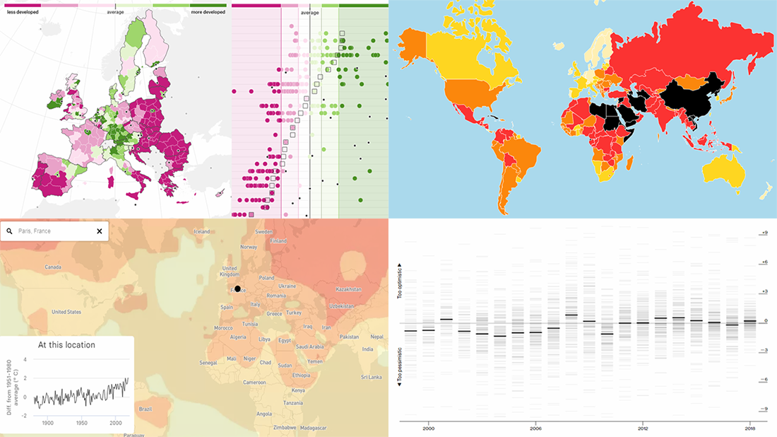 Get ready for another dose of cool visual data graphics — DataViz Weekly is here! Today we are glad to acquaint you with the following new interesting projects:
- The Pudding explains why EU regions redraw their borders.
- Reporters Without Borders shares its annual World Press Freedom Index for 2019.
- Bloomberg analyzes errors in the International Monetary Fund’s spring forecasts of same-year GDP growth.
- BuzzFeed visualizes how climate change has already transformed the planet.
- Categories: Data Visualization Weekly
- No Comments »
Chart Visualization Examples Showing Data About Snow, Prejudice, Names, and Prosperity — DataViz Weekly
March 8th, 2019 by AnyChart Team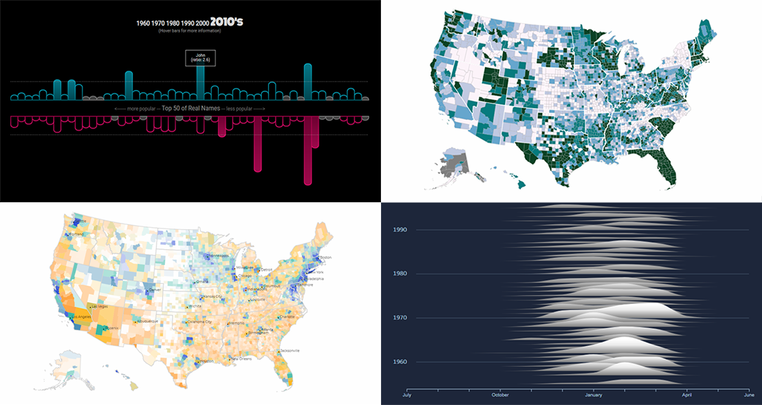 It’s Friday, and here’s another selection of cool chart visualization projects we’ve come across these days. Look at them for fun and inspiration!
Today on DataViz Weekly:
- winter weather and snow in Canada;
- partisan prejudice across the United States of America;
- names in movies and TV shows vs real life;
- prosperity in the United States, by county.
- Categories: Data Visualization Weekly
- No Comments »
Visualizing Statistics About Greenhouse Gases, Carbon Footprints, Movie Franchises, and Coal Production — DataViz Weekly
February 22nd, 2019 by AnyChart Team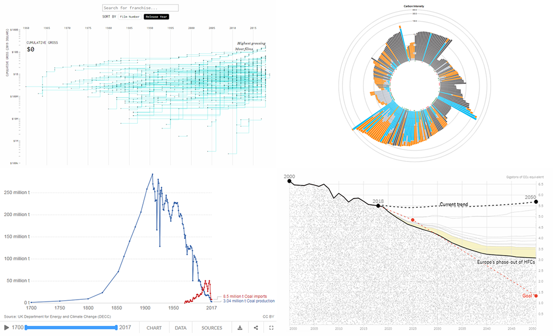 Don’t miss out on a new serving of interesting online projects visualizing statistics as we continue the DataViz Weekly series on the AnyChart blog! This time, we are glad to feature data graphics on the following subjects:
- scenarios of the greenhouse gas emissions reduction for the United States;
- carbon footprints of consumer products;
- box office revenue of movie franchises;
- rise and fall of coal production in the United Kingdom.
- Categories: Data Visualization Weekly
- No Comments »
Data Analytics and Visualization Examples Worth Seeing: High Street, Neighborhoods, Trains, Climate — DataViz Weekly
February 8th, 2019 by AnyChart Team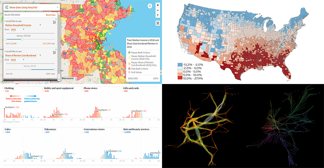 Check out new interesting data analytics and visualization examples from around the web. Here are the topics in the focus of today’s DataViz Weekly:
- high-street crisis in town centers across England and Wales;
- interactive maps of changes in Greater Boston’s neighborhoods;
- connectivity between train stations in the Netherlands;
- economic costs of climate change vs election results in the United States.
- Categories: Data Visualization Weekly
- No Comments »
New Cool Data Visualizations on Emissions, Climate, Travel, and Music — DataViz Weekly
December 7th, 2018 by AnyChart Team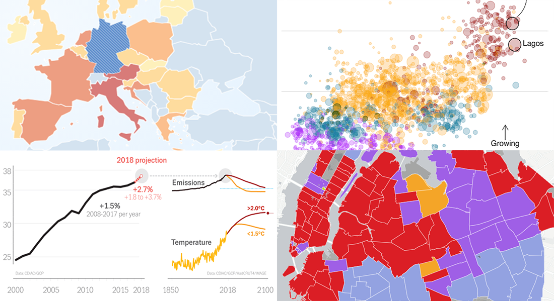 Take a look at new cool data visualizations recently published on the web. In today’s DataViz Weekly, we are glad to feature interesting information graphics from the Global Carbon Project, BBC News, Berliner Morgenpost, and Vivid Seats, dedicated to the following subjects:
- carbon dioxide emissions;
- current state of climate change;
- top 2018 summer travel destinations for Germans;
- top music genres and artists in NYC by neighborhood.
- Categories: Data Visualization Weekly
- No Comments »