Visualizing Hubble Observations, Census Evolution, Conflicts, and Media Consumption — DataViz Weekly
April 10th, 2020 by AnyChart Team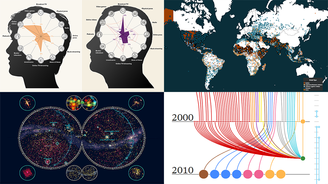 In the new DataViz Weekly post, we are glad to tell you about new compelling visualizations we have come across these days. Here’s what projects made it to our today’s selection, from people’s activities to Hubble observations:
- 30 years of the Hubble Space Telescope’s observations — Physics Today
- Evolution of the U.S. census from 1790 to 2020 — The Pudding
- 10 conflicts to worry about in 2020 — ACLED
- Media consumption during the COVID-19 pandemic — Visual Capitalist
- Categories: Data Visualization Weekly
- No Comments »
Creating JavaScript Column and Bar Charts on COVID-19 Data
April 6th, 2020 by Jay Stevenson Need compelling JS charts for your website or app? Start with the basics! Complete this quick data visualization tutorial and you’ll learn how to easily create JavaScript column and bar charts that will look great in any HTML5-based project, allowing for easy comparisons.
Chart examples to be built and demonstrated in this tutorial will be visualizing the latest novel coronavirus cases data from JHU CSSE as COVID-19 is the most topical issue nowadays.
Keep reading and you’ll see JS charting is actually very simple. Especially if you have at least a very basic understanding of programming (more than that is awesome but far from necessary).
Read the JS charting tutorial »
- Categories: AnyChart Charting Component, HTML5, JavaScript, JavaScript Chart Tutorials, Tips and Tricks
- No Comments »
Social Distancing in Data Visualizations — DataViz Weekly
April 3rd, 2020 by AnyChart Team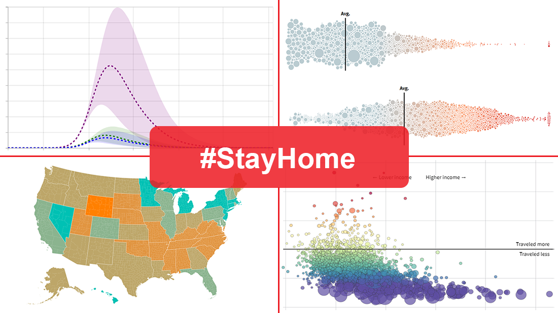 Many health and epidemiology experts consider social distancing to be the most effective way to slow the spread of COVID-19 at the current stage. But does it really work and help?
In today’s DataViz Weekly, we put a focus on data visualizations — charts and maps — on where we, in the United States, have been on social distancing. The following projects deserved to get featured in this special “#StayHome” edition:
- “The Social Distancing of America” — Reuters
- “Where America Didn’t Stay Home Even as the Virus Spread” — NYT
- “Social Distancing Scoreboard” — Unacast
- “COVID-19 Projections Assuming Full Social Distancing Through May 2020” — IHME, UW Medicine
- Categories: Data Visualization Weekly
- 1 Comment »
Coronavirus in US in Charts and Maps — DataViz Weekly
March 20th, 2020 by AnyChart Team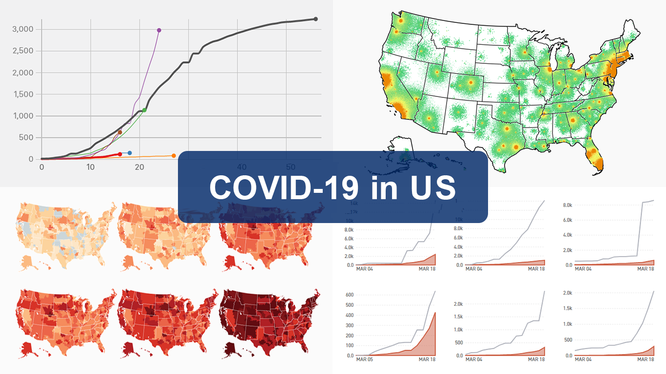 As the novel coronavirus pandemic is in full swing, COVID-19 is now by far the most topical issue on the global agenda. So it’s no surprise that the vast majority of the data visualization projects we’ve come across this week are about the outbreak. That’s why the new DataViz Weekly article is entirely devoted to the same subject — the coronavirus.
We are quite sure many of you have already seen some if not all of the best dashboards, charts, and trackers of the global COVID-19 outbreak from Johns Hopkins University, The New York Times, Financial Times, Business Insider, The Guardian, Bloomberg, and others. Awesome animated simulations from The Washington Post’s Harry Stevens, showing why epidemics like this spread exponentially and how social distancing could help to flatten the curve of COVID-19 cases, have almost certainly came to your attention and does not need to be presented additionally.
Headquartered in the United States, we decided to find out more about what has been going on about COVID-19 in America. Join us on a review of four interesting (though sometimes a bit frightening) data graphics features created by top media outlets, which provide insight into where the U.S. stands — from the perspective of cases and tests (Politico), scenarios (TIME), and hospital bed capacity (The Upshot by NYT), as well as compared to the rest of the world (BuzzFeed News). Check out the special “COVID-19 in US” edition of DataViz Weekly on the AnyChart blog.
- Categories: Data Visualization Weekly
- 2 Comments »
Interesting New Visualizations on COVID-19, Income, Hockey, and Internet — DataViz Weekly
March 13th, 2020 by AnyChart Team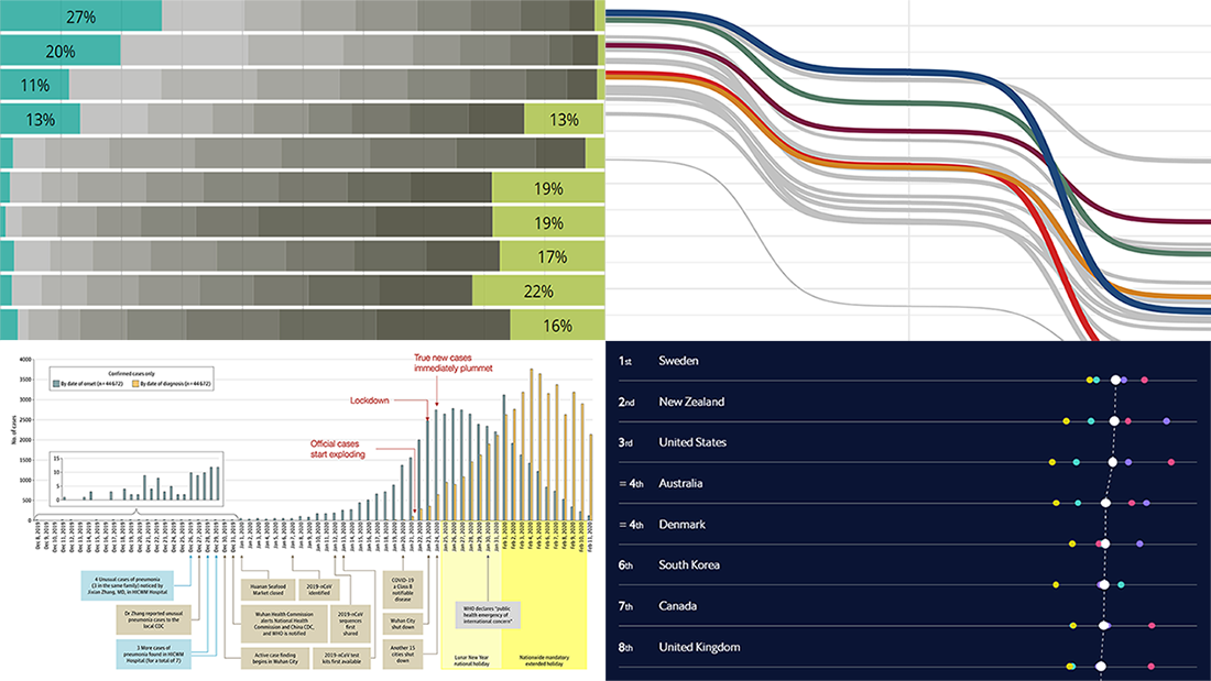 We continue to introduce you to interesting new visualizations from around the Web. These are great illustrations of how data becomes easier to make sense of when it’s represented in the right charts and maps. Check out the new DataViz Weekly article highlighting another four projects:
- Call to action on the novel coronavirus (COVID-19) — Tomas Pueyo
- Income estimates for small areas in England and Wales — ONS
- Hockey goals — Georgios Karamanis
- Inclusive Internet Index 2020 — EIU
- Categories: Data Visualization Weekly
- No Comments »
Fresh Visualization Projects on Super Tuesday, Cost of Living in Germany, London Cycling, and NO2 in China — DataViz Weekly
March 6th, 2020 by AnyChart Team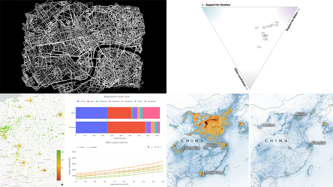 Today is Friday. We have already chosen four new stunning visualization examples and are excited to show you them! Look how powerful the right charts and maps can be when you need to explore and communicate data. Here’s a quick list of the fresh visualization projects this new DataViz Weekly blog post puts a spotlight on:
- Takeaways from Super Tuesday — The New York Times
- Cost of living in German cities — Fabian Nobis
- Cycling all streets in central London — Davis Vilums
- Nitrogen dioxide over China and Wuhan — NASA Earth Observatory
- Categories: Data Visualization Weekly
- No Comments »