New Impressive Data Visualization Projects — DataViz Weekly
April 16th, 2021 by AnyChart Team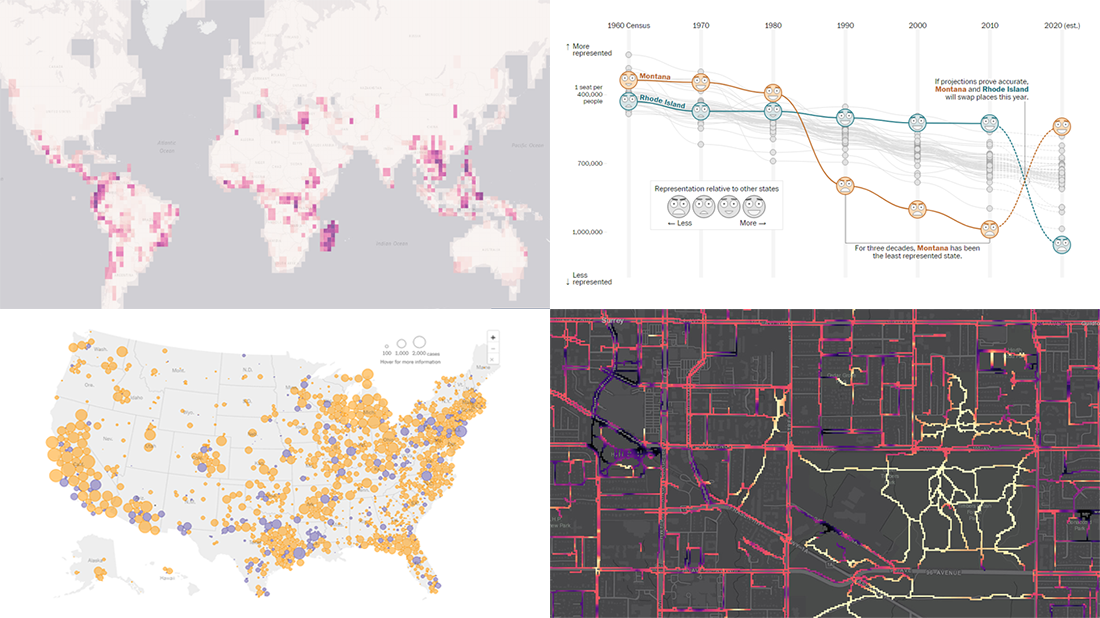 Hello and greetings to all who are fond of data visualization! We’ve curated a new collection of impressive maps and charts that came into existence just a little while ago. See what projects are praised this time on DataViz Weekly and read next to learn more about each:
- Reshuffling of the U.S. House seats after the 2020 Census — The Washington Post
- Runnability of streets — Simon Fraser University
- Probability of finding undiscovered species across the world — Map of Life
- Coronavirus in American prisons — The New York Times
- Categories: Data Visualization Weekly
- No Comments »
Data Visualization for COVID-19 Dashboard Tracker Using AnyChart JS Charts
April 12th, 2021 by AnyChart Team![]() Data visualization has played an important role during the COVID-19 pandemic, allowing governments, scientists, healthcare professionals, and the general public to better understand different aspects of the crisis. There are many illuminating projects all over the web that leverage charts and maps to effectively communicate what the coronavirus statistics have to say. Some of them are using our data visualization tools under a free license provided as part of the special initiative we announced last spring to support the global COVID-19 data analysis effort.
Data visualization has played an important role during the COVID-19 pandemic, allowing governments, scientists, healthcare professionals, and the general public to better understand different aspects of the crisis. There are many illuminating projects all over the web that leverage charts and maps to effectively communicate what the coronavirus statistics have to say. Some of them are using our data visualization tools under a free license provided as part of the special initiative we announced last spring to support the global COVID-19 data analysis effort.
We told you about two examples of such projects earlier: StopCorona and iConcepts SARS-CoV-2 Stats. Now let us introduce you to another interesting resource — COVID-19 Dashboard Tracker by Maxime des Touches. Launched more than a year ago, while Maxime was yet a computer science student, it has turned from a simple online data table into a complex interactive data visualization project offering up-to-date insight into how the pandemic unfolds in France and worldwide.
Maxime kindly agreed to talk to us about his COVID-19 tracker, experience using AnyChart, and the pandemic in general. Check out our quick interview, glance at a few screenshots, and try his open-source dashboard by yourself. (Stack: HTML/jQuery/JSON.)
- Categories: AnyChart Charting Component, AnyStock, Big Data, Dashboards, HTML5, JavaScript, Stock Charts, Success Stories
- No Comments »
Visualizing Data on Poverty, Happiness, Music, and Retail — DataViz Weekly
April 9th, 2021 by AnyChart Team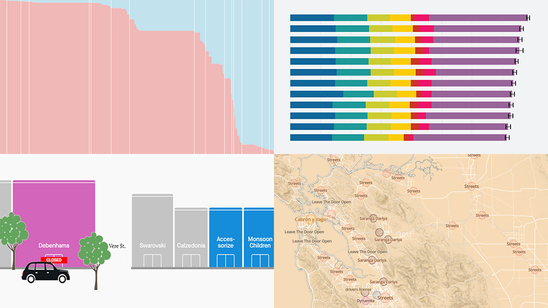 Look at these new exciting examples of data visualizations! We’ve stumbled upon these just recently and are more than happy to present them to you today on DataViz Weekly:
- Share of population with income below the poverty threshold — Our World in Data
- World Happiness Report 2021 — SDSN
- Most popular music in your city and worldwide — The Pudding
- COVID’s impact on retail stores on Oxford St, Rodeo Dr, and Russell St — Quartz
- Categories: Data Visualization Weekly
- No Comments »
Some of Best Visualizations of Recent Days — DataViz Weekly
April 2nd, 2021 by AnyChart Team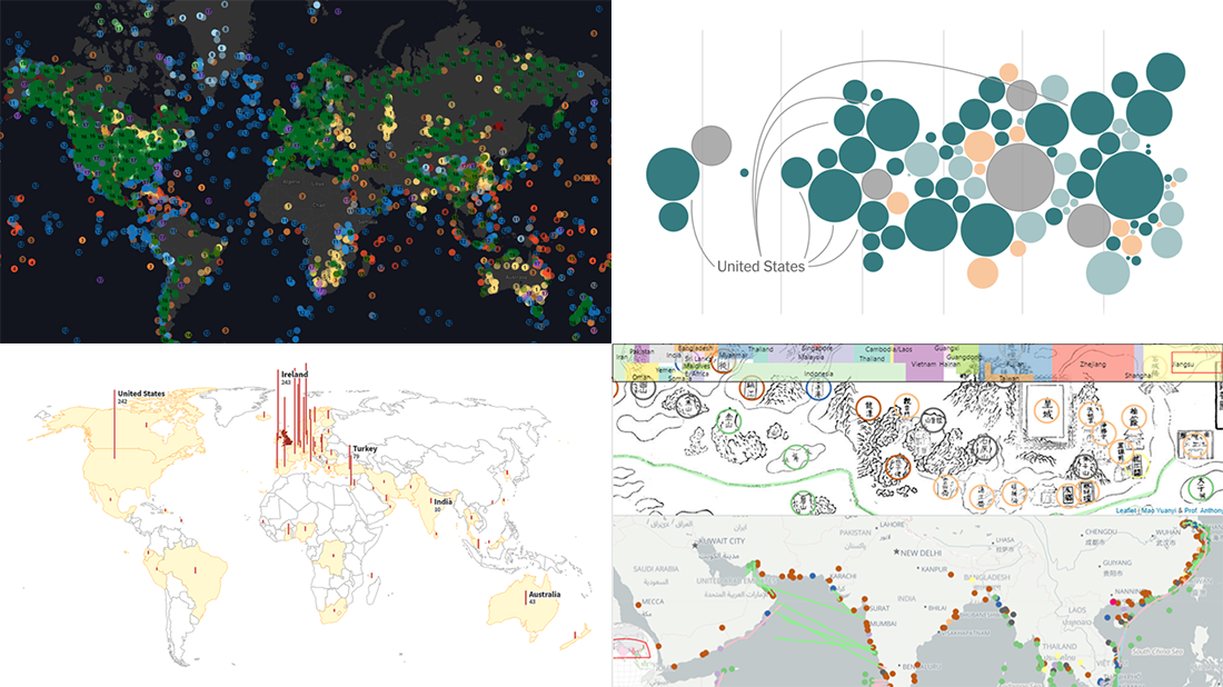 As we continue to bring you regular roundups of the best visualizations we have stumbled upon out there, it’s Friday and DataViz Weekly here! Read next and you’ll meet the following new stunning projects:
- Country wealth and vaccination roll-out — The New York Times
- Spread of the Kent variant across Britain and worldwide — Reuters
- Earth’s сlimate history in proxy data — Carbon Brief
- Interactive Mao Kun map explorer — Ryan Carpenter
- Categories: Data Visualization Weekly
- No Comments »
Fresh Compelling Data Graphics Worth Seeing — DataViz Weekly
March 26th, 2021 by AnyChart Team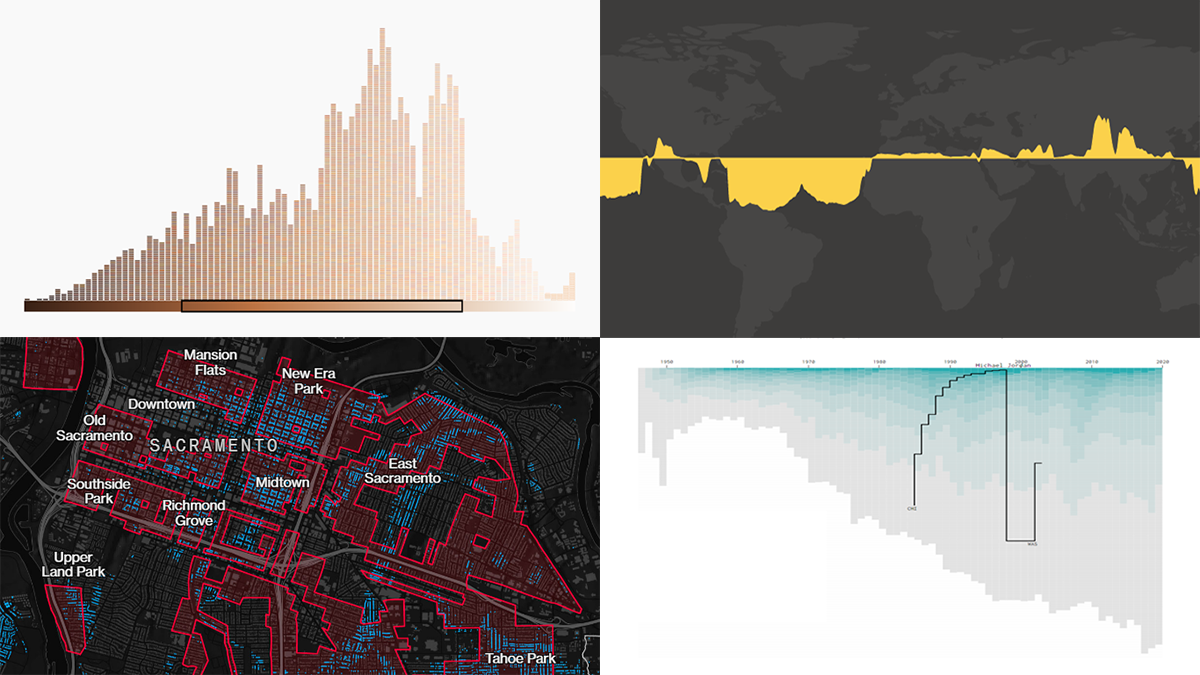 Get your weekly dose of cool data visualization stuff! We have come across these four new amazing projects just lately and are glad to tell you about them right now. Here are the graphics featured this time on DataViz Weekly:
- Career timelines for all NBA players since 1946 — Nathan Yau
- Bias and anti-blackness in the names of foundation shades — The Pudding
- Flood risk in historically redlined and non-redlined neighborhoods — Bloomberg CityLab
- Elevation and bathymetry worldwide along parallels — Nicolas Lambert
- Categories: Data Visualization Weekly
- No Comments »
Analyzing Skin Tones, Pandemic Timeline, Chinese Names, and Dutch Elections — DataViz Weekly
March 19th, 2021 by AnyChart Team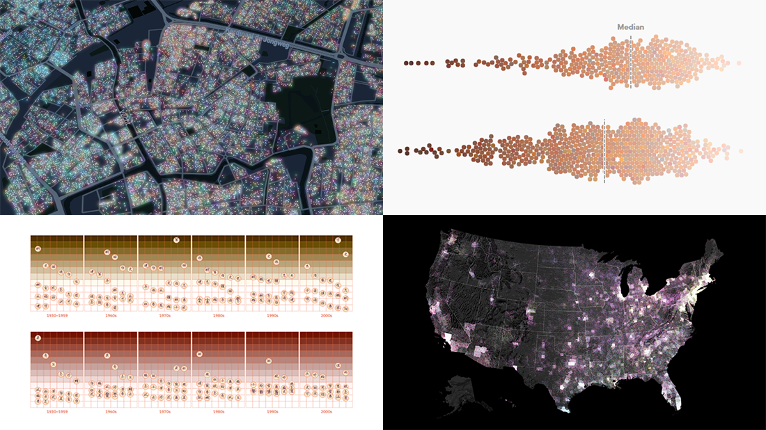 Every day, a number of new data visualizations on various topics come out around the internet. We are keen to curate the most awesome graphics and share them with you on DataViz Weekly! Today in the spotlight:
- Skin tones on the Instagram feeds of fashion and beauty brands — Quartz
- Timeline of the pandemic year — WaPo
- Evolution of Chinese names — Kontinentalist
- Dutch election results in detail — NRC
- Categories: Data Visualization Weekly
- 1 Comment »
Creating Waterfall Chart with JS
March 16th, 2021 by Dilhani Withanage Do you want to know how to easily add a waterfall chart to a web page or application using JavaScript? This tutorial will make sure you’re prepared to confidently deal with that sort of interactive data visualization development!
Waterfall charts illuminate how a starting value turns into a final value over a sequence of intermediate additions (positive values) and subtractions (negative values). These additions and subtractions can be time-based or represent categories such as multiple income sources and expenditures. In finance, a waterfall chart is often called a bridge; you may have also heard it referred to as a cascade, Mario, or flying bricks chart.
To see waterfall charts in action and learn how to build them with JavaScript (HTML5), we need some interesting real-world data to visualize. In this tutorial, let’s look at the 2020 income statement for Alphabet Inc. (GOOGL), the parent company of Google.
Hence, be with me to reach our target step by step, so in the end, you’ll see how a lot of numbers can be made sense of with real ease when illustrated as a beautiful, interactive, JS waterfall chart. All aboard!
Read the JS charting tutorial »
- Categories: AnyChart Charting Component, Business Intelligence, HTML5, JavaScript, JavaScript Chart Tutorials, Tips and Tricks
- No Comments »
Recognizing Most Interesting New Data Visualizations — DataViz Weekly
March 12th, 2021 by AnyChart Team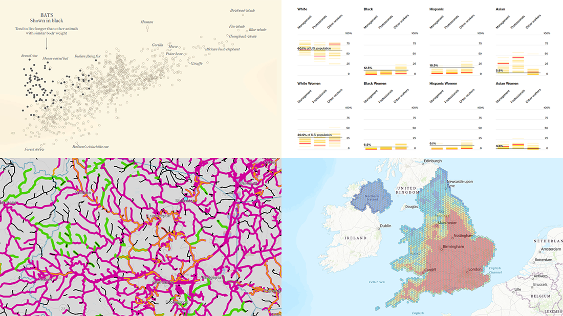 Welcome back to DataViz Weekly, our regular blog feature where we recognize some of the most interesting data visualizations we’ve recently seen out there. Here’s our new selection of stunning graphics from different people — take a look!
- Bats and the origin of virus disease outbreaks — Reuters
- Race and gender diversity within the biggest corporations in the U.S. — Bloomberg
- All roadwork projects in West Virginia for 2021 — WVDOT
- Climate threats to heritage sites in England, Wales, and Northern Ireland — National Trust
- Categories: Data Visualization Weekly
- No Comments »
Four New Robust Visualizations to Check Out on Weekend — DataViz Weekly
March 5th, 2021 by AnyChart Team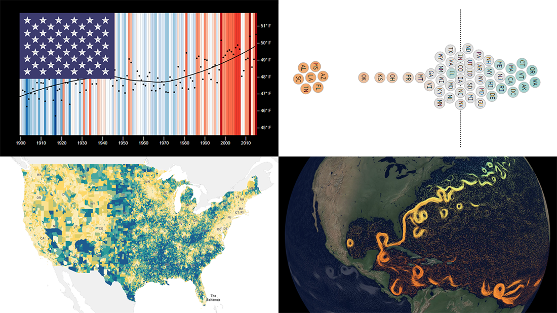 This week, we’ve found a number of new cool projects that could serve as good examples of robust data visualization. Here are the four ones we like the most. Watch how compelling charts and maps let data speak — join us as we overview these projects today on DataViz Weekly:
- Climate stripes for each U.S. state — Luke Browne, YSE
- Causes and dangers of the Gulf Stream weakening — The New York Times
- Minimum wage change in the U.S. by state since 1968 — Nathan Yau
- Homes worth <$100,000 and >$1,000,000 in the U.S. — Social Explorer
- Categories: Data Visualization Weekly
- No Comments »
Attacks on Press, COVID-19 Deaths, Infection Simulation, and U.S. Election — DataViz Weekly
February 26th, 2021 by AnyChart Team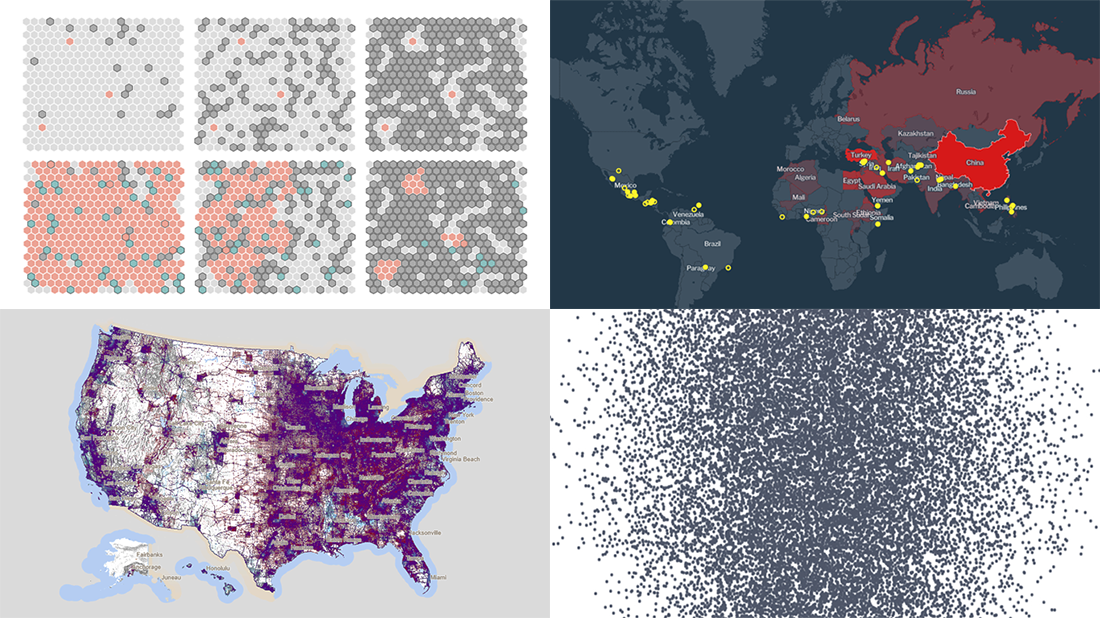 Hey everyone, Friday’s here and with it, a new DataViz Weekly article is out! Look at some of the best data visualization projects we have come across out there this week:
- Exploring all attacks on journalists worldwide in 2020 — Geoff McGhee for CPJ
- Visualizing the scale of 500,000 COVID-19 deaths in the United States — Sam Hart, Reuters
- Simulating the spread of infection for different immunity scenarios — Thomas Wilburn, NPR
- Mapping every vote in the 2020 U.S. election — Kenneth Field
- Categories: Data Visualization Weekly
- No Comments »