Impressive Charts on Age, Energy, Climate, and Music — DataViz Weekly
August 7th, 2020 by AnyChart Team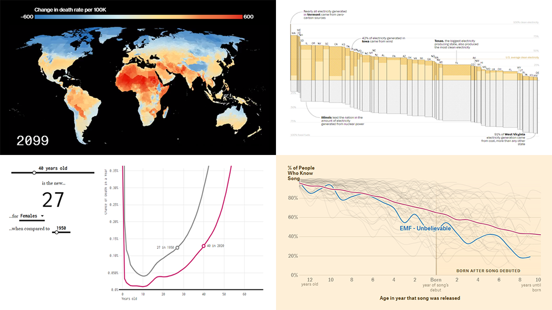 Lately, we’ve come across a lot of new impressive charts all over the internet. Here are some of the most interesting ones — check them out and you’ll see the real power of data visualization in action! Today in DataViz Weekly:
- New age for your age — FlowingData
- Electricity generation in the U.S. states by fuel source — The Washington Post
- Mortality consequences of climate change and income inequality — Bloomberg Green
- 1990s music recognition across generations — The Pudding
- Categories: Data Visualization Weekly
- No Comments »
Plotting Data on Park Soundscapes, $600 Unemployment, COVID-19 Deaths, and Game of Thrones Battles — DataViz Weekly
July 31st, 2020 by AnyChart Team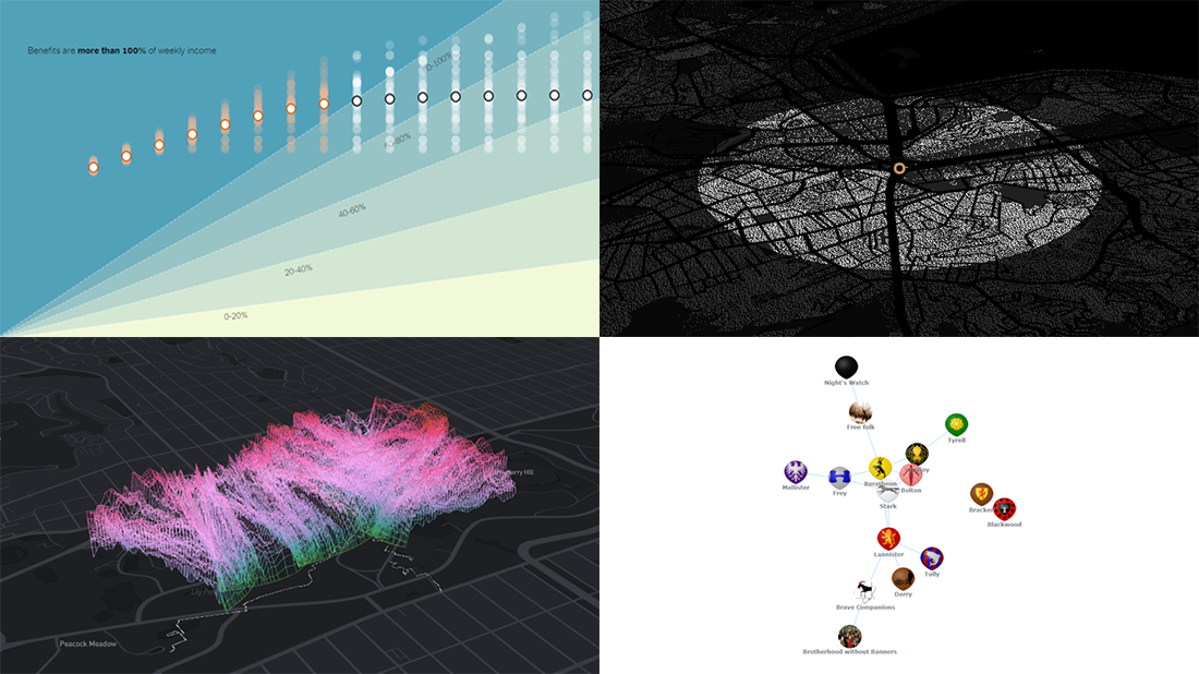 There are many ways of plotting data. Which one to choose in your case? The answer depends, of course, on what kind of data you need to analyze and what questions you want it to answer. In DataViz Weekly, we meet you with some of the best practices on a regular basis. The only thing that unites them is, all the highlighted projects have been launched in public just about now. So here are the new great examples and inspirations:
- Changing soundscapes of urban parks worldwide — MIT Senseable City Lab
- Extra $600 unemployment benefits in America — The New York Times
- COVID-19 deaths in Brazil (as if all of them happened in one neighborhood) — Agência Lupa & Google News Initiative
- Game of Thrones battles in a network graph — Wayde Herman
- Categories: Data Visualization Weekly
- No Comments »
Good Charts That Let Data Speak — DataViz Weekly
July 24th, 2020 by AnyChart Team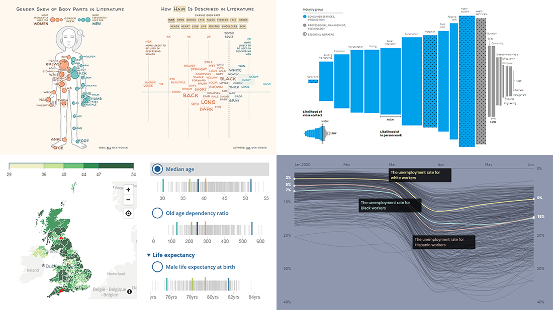 Good charts let data speak, providing insight, revealing patterns and trends, and telling stories. Look at new projects featuring graphics like that, from data visualization professionals!
- Physical traits defining men and women in literature — The Pudding
- Remote work dividing America — Reuters
- Racial disparities in unemployment in America — ProPublica
- Ageing indicators across the United Kingdom — ONS
- Categories: Data Visualization Weekly
- No Comments »
Curating New Interesting Data Visualizations Worth Checking Out — DataViz Weekly
July 17th, 2020 by AnyChart Team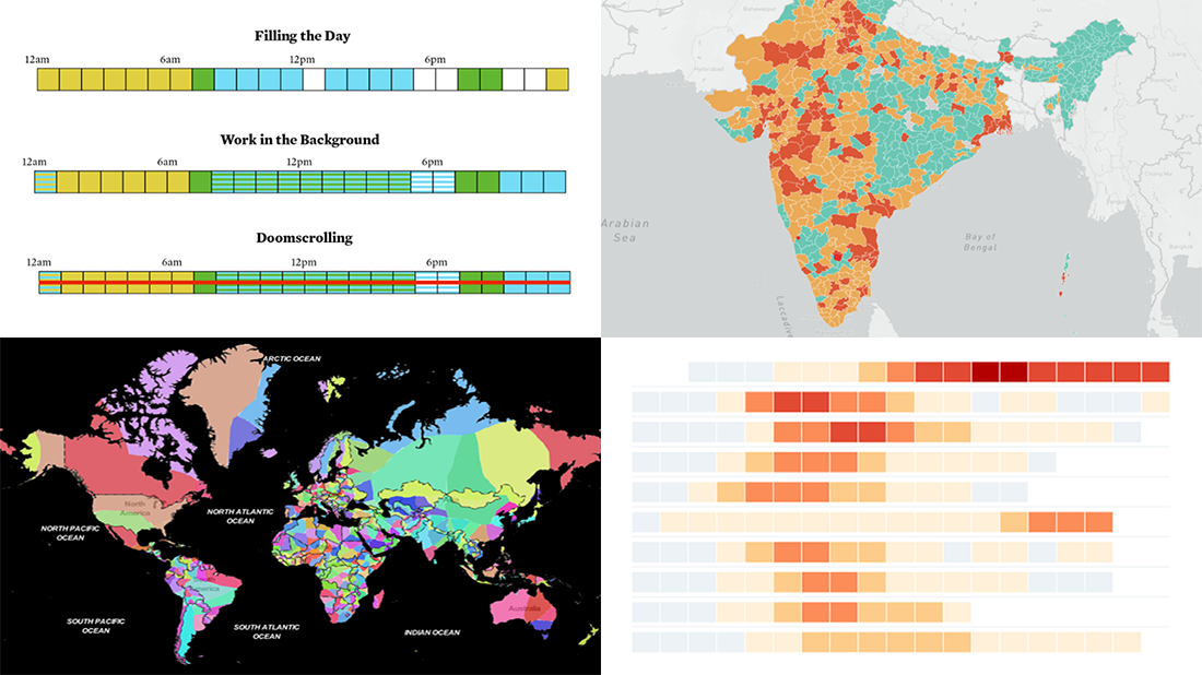 We continue to curate new interesting data visualizations from around the web for our DataViz Weekly blog. Join us as we look at some of the best charts and maps we have seen these days!
- Parenting and Working During Lockdown — Nathan Yau
- Nearest Neighboring Countries — Topi Tjukanov
- Excess Deaths Worldwide — The Economist
- Reopening India from Lockdown — Development Seed and Mapbox
- Categories: Data Visualization Weekly
- No Comments »
New Cool Graphics From Around the Web — DataViz Weekly
July 10th, 2020 by AnyChart Team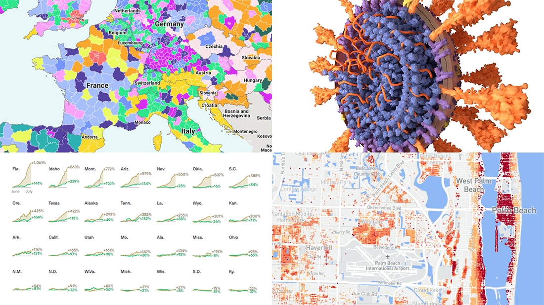 It’s Friday and we’re glad to share with you some of the most interesting third-party visualizations we’ve recently come across. Here’s what DataViz Weekly has for you to check out this time — look at these cool graphics:
- Future of jobs in the regions of Europe — McKinsey Global Institute, Google, et al.
- Flood risk factor database for the United States — First Street Foundation, et al.
- Changes in new cases against testing — Axios
- All we know about SARS-CoV-2 — Scientific American
- Categories: Data Visualization Weekly
- 1 Comment »
New Great Graphics from Data Visualization Experts — DataViz Weekly
July 3rd, 2020 by AnyChart Team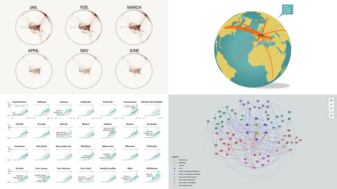 Check out new interesting graphics created by different data visualization experts and made public these days. We’ve met them around the web and decided to introduce you to them in today’s DataViz Weekly. These examples are definitely worth seeing if you like good charts and maps (as we do)!
- American Restaurant Reopenings — Nathan Yau
- Sustaining Peace Project — AC4, The Earth Institute, Columbia University
- International Migrant Stock — Nicolas Lambert and Françoise Bahoken
- Global Shutdown — Washington Post
- Categories: Data Visualization Weekly
- No Comments »
Information Visualization Techniques in Action on Democracy, Covid-19, Inequality & Gerrymandering — DataViz Weekly
June 26th, 2020 by AnyChart Team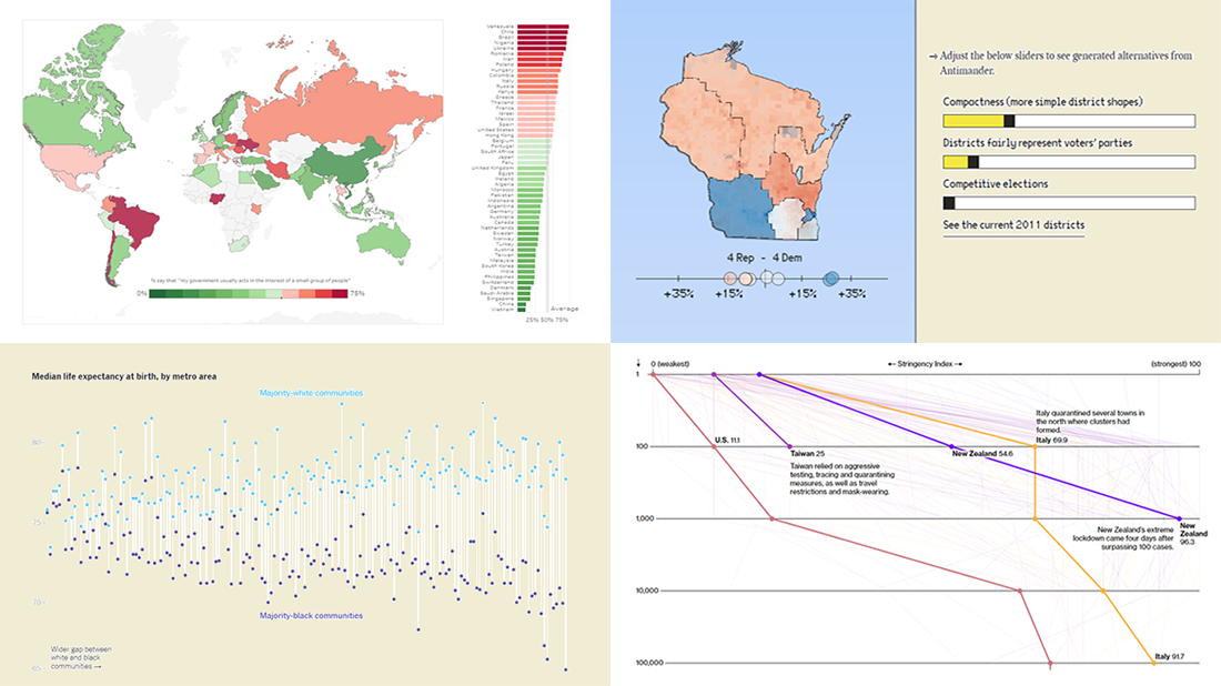 DataViz Weekly is here exhibiting new interesting projects from around the web that demonstrate a great use of different information visualization techniques to deliver better insight. See our new picks:
- Democracy Perception Index 2020 — Dalia
- Government reactions to the Covid-19 pandemic — Bloomberg News
- Gaps between Black and White America — The New York Times Opinion
- Antimander, a tool to expose gerrymandering in congressional districts — Joel Simon
- Categories: Data Visualization Weekly
- No Comments »
New Charting Best Practices Worth Looking At — DataViz Weekly
June 19th, 2020 by AnyChart Team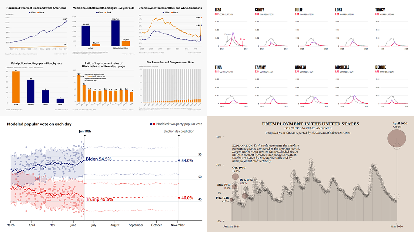 In data visualization, theory is very important but practice is absolutely everything. We continue to share with you some of the new charting best practices we’ve come across around the web so you could see what others do and keep improving. Check out how various experienced data visualization professionals make data speak and tell insightful stories, in DataViz Weekly.
Today, we are happy to meet you with the following new interesting projects:
- Black Lives Matter and racial disparities in America, in 25 charts — Business Insider
- The Economist’s forecast model for the 2020 U.S. presidential election — The Economist
- Unemployment rate in the United States since 1948 — FlowingData
- Names with a similar trajectory of popularity over time as Karen — The Pudding
- Categories: Data Visualization Weekly
- No Comments »
New Data Graphics to Check Out This Weekend — DataViz Weekly
June 12th, 2020 by AnyChart Team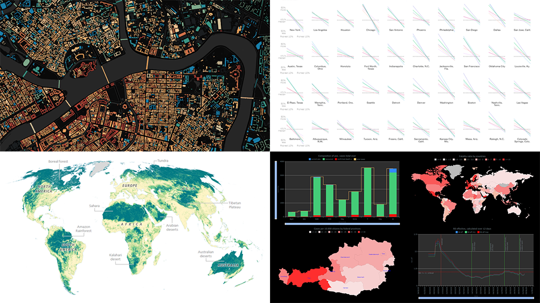 Hey everyone! Here’s DataViz Weekly with a quick presentation of four new data graphics projects that we’ve found worth checking out. Look at these stunning examples of charts and maps in action!
- Areas with the humanity’s lowest impact on the natural world — National Geographic
- COVID-19 in Austria (and worldwide) — Jürgen Höfer
- Age of buildings in Saint Petersburg (Russia) — Nikita Slavin
- Chronic health conditions by income and race — NYT
- Categories: Data Visualization Weekly
- 1 Comment »
Visual Presentations of Data About Jobs, Simpsons, NYC and Journals — DataViz Weekly
June 5th, 2020 by AnyChart Team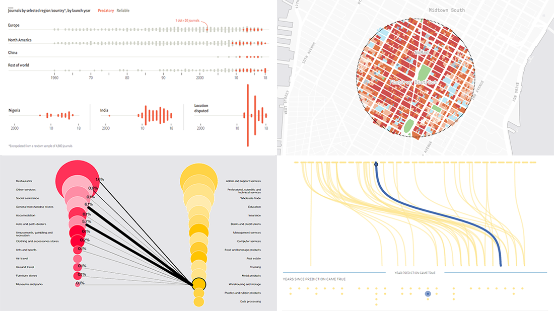 Every week, we meet a number of new visual presentations of data around the web. Then, on Friday, we pick the four most interesting of them to tell you about. The following projects made it to DataViz Weekly this time:
- Job losses in the United States, the second wave — Bloomberg
- Predictions from The Simpsons that came true — Seffana Mohamed-Ajaz
- Morphocode’s city explorer — Morphocode
- Dodgy academic journals — The Economist
- Categories: Data Visualization Weekly
- No Comments »