Coronavirus in US in Charts and Maps — DataViz Weekly
March 20th, 2020 by AnyChart Team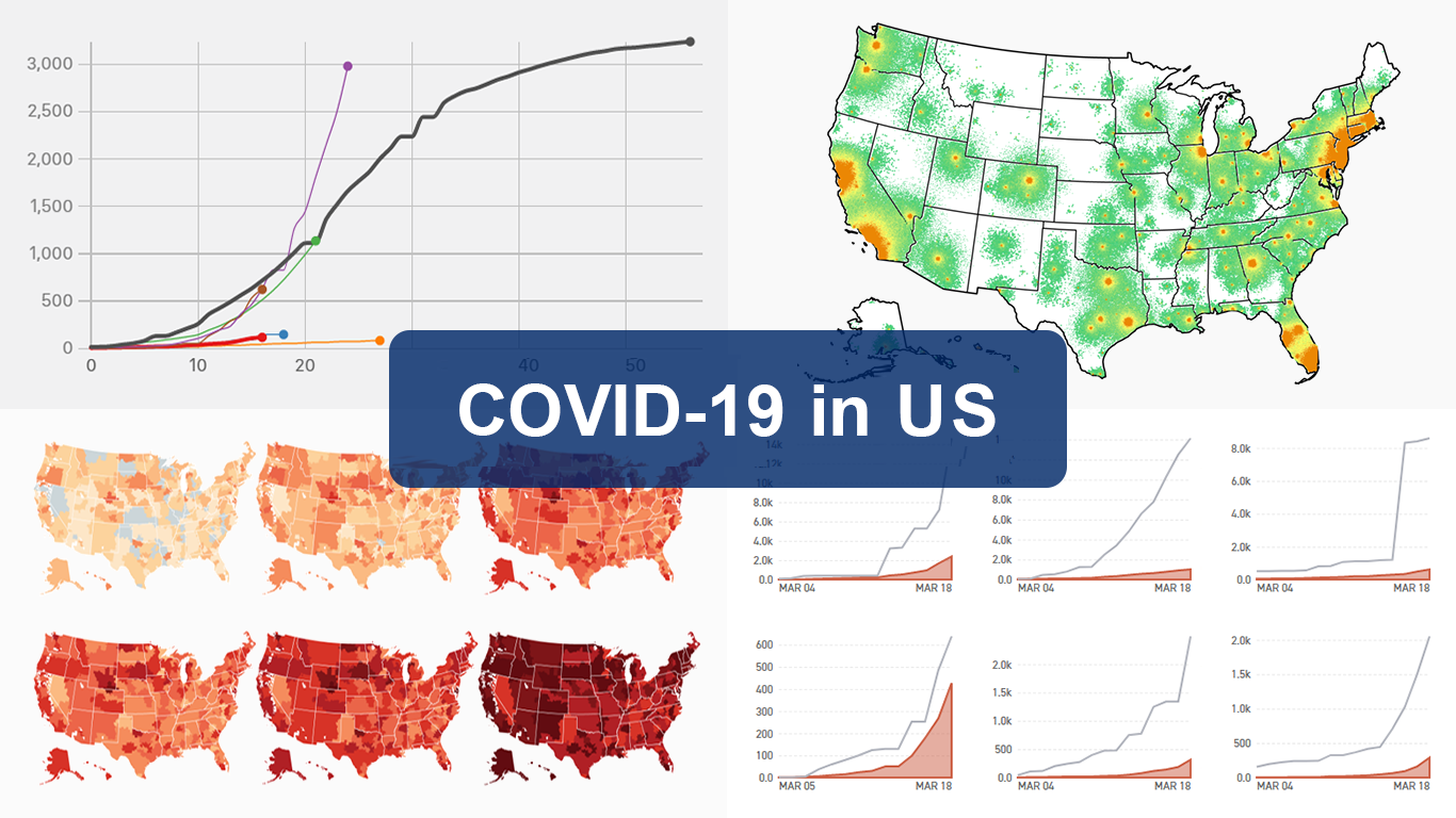 As the novel coronavirus pandemic is in full swing, COVID-19 is now by far the most topical issue on the global agenda. So it’s no surprise that the vast majority of the data visualization projects we’ve come across this week are about the outbreak. That’s why the new DataViz Weekly article is entirely devoted to the same subject — the coronavirus.
We are quite sure many of you have already seen some if not all of the best dashboards, charts, and trackers of the global COVID-19 outbreak from Johns Hopkins University, The New York Times, Financial Times, Business Insider, The Guardian, Bloomberg, and others. Awesome animated simulations from The Washington Post’s Harry Stevens, showing why epidemics like this spread exponentially and how social distancing could help to flatten the curve of COVID-19 cases, have almost certainly came to your attention and does not need to be presented additionally.
Headquartered in the United States, we decided to find out more about what has been going on about COVID-19 in America. Join us on a review of four interesting (though sometimes a bit frightening) data graphics features created by top media outlets, which provide insight into where the U.S. stands — from the perspective of cases and tests (Politico), scenarios (TIME), and hospital bed capacity (The Upshot by NYT), as well as compared to the rest of the world (BuzzFeed News). Check out the special “COVID-19 in US” edition of DataViz Weekly on the AnyChart blog.
- Categories: Data Visualization Weekly
- 2 Comments »
Interesting New Visualizations on COVID-19, Income, Hockey, and Internet — DataViz Weekly
March 13th, 2020 by AnyChart Team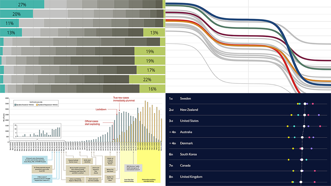 We continue to introduce you to interesting new visualizations from around the Web. These are great illustrations of how data becomes easier to make sense of when it’s represented in the right charts and maps. Check out the new DataViz Weekly article highlighting another four projects:
- Call to action on the novel coronavirus (COVID-19) — Tomas Pueyo
- Income estimates for small areas in England and Wales — ONS
- Hockey goals — Georgios Karamanis
- Inclusive Internet Index 2020 — EIU
- Categories: Data Visualization Weekly
- No Comments »
Fresh Visualization Projects on Super Tuesday, Cost of Living in Germany, London Cycling, and NO2 in China — DataViz Weekly
March 6th, 2020 by AnyChart Team Today is Friday. We have already chosen four new stunning visualization examples and are excited to show you them! Look how powerful the right charts and maps can be when you need to explore and communicate data. Here’s a quick list of the fresh visualization projects this new DataViz Weekly blog post puts a spotlight on:
- Takeaways from Super Tuesday — The New York Times
- Cost of living in German cities — Fabian Nobis
- Cycling all streets in central London — Davis Vilums
- Nitrogen dioxide over China and Wuhan — NASA Earth Observatory
- Categories: Data Visualization Weekly
- No Comments »
Top Languages, Airbnb Litigations, Train Travels, and Gmail Filters — DataViz Weekly
February 28th, 2020 by AnyChart Team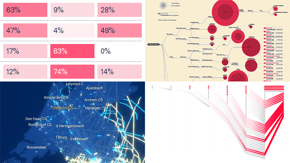 Another week has brought multiple new awesome charts and infographics into the focus of our attention. Join us on a quick review of the most interesting data visualization projects, within the framework of the regular DataViz Weekly feature on the AnyChart blog.
- Top 100 languages and their origins — WordTips
- Airbnb’s legal challenges — Bloomberg
- Dutch trains on an average working day — Jan Willem Tulp for NS
- Political email filtering in Gmail — The Markup
- Categories: Data Visualization Weekly
- No Comments »
Pesticide Sales, Workweek vs Happiness, Bloomberg’s Ads, and Epidemics Spread — DataViz Weekly
February 21st, 2020 by AnyChart Team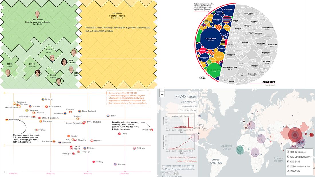 Hey chart lovers, check out a new portion of cool data visualizations! We have come across these fresh projects just about now and are glad to feature them in DataViz Weekly:
- Hours worked vs happiness — Visual Capitalist
- Mike Bloomberg’s advertising budget — The Washington Post
- Pesticide sales of global agrochemical giants — Unearthed
- Covid 2019 spread in comparison with other epidemics — London School of Hygiene & Tropical Medicine
- Categories: Data Visualization Weekly
- No Comments »
Magic Quadrant, State Taxes, Parks and Roads, and Train Disruptions — DataViz Weekly
February 14th, 2020 by AnyChart Team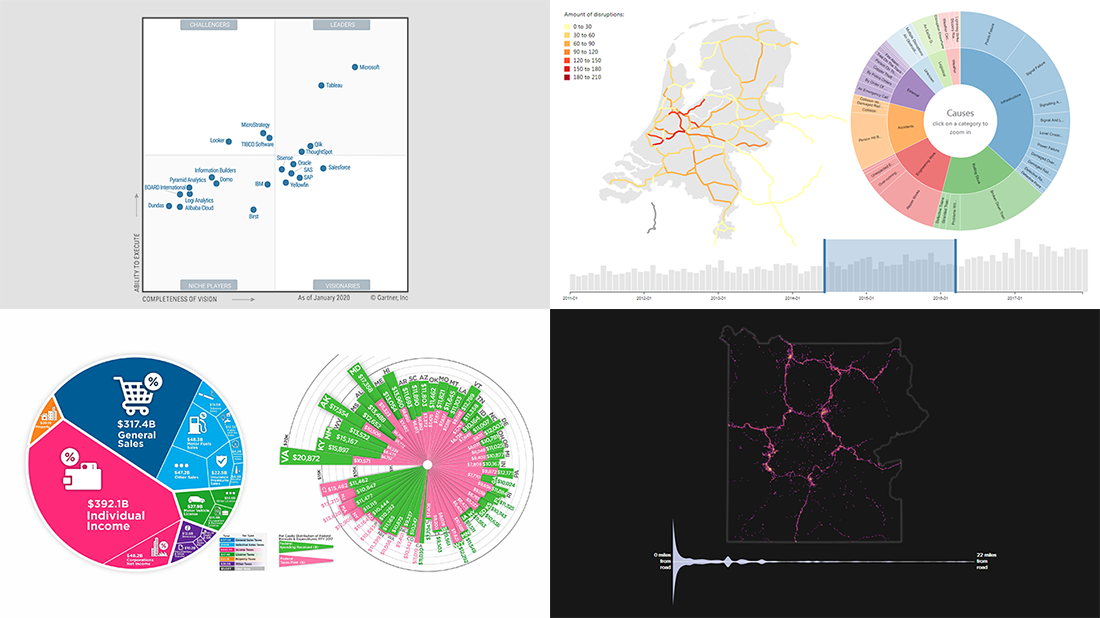 Can’t wait to meet new awesome data visualizations in DataViz Weekly? There you go! Today we are pleased to put a spotlight on the following graphics worth seeing:
- Magic Quadrant for Analytics and BI Platforms — Gartner
- State taxes in the United States of America — Howmuch.net
- Viewing locations at U.S. national parks — Nick Underwood, Clare Sullivan and Peter Newman, UW-Madison
- Disruptions in the Dutch railway system — Chris Mostert, TU Delft
- Categories: Business Intelligence, Data Visualization Weekly
- No Comments »
Iowa Caucus, Weather to Climate, Interest Rates, and Food’s Carbon Footprint — DataViz Weekly
February 7th, 2020 by AnyChart Team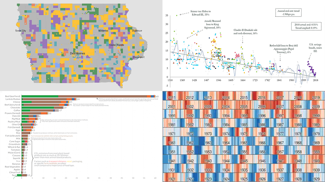 A new DataViz Weekly post is finally out! Here’re some of the most interesting charts and maps we’ve found just lately:
- 2020 Iowa caucus results for Democrats — The New York Times
- Transition from weather to climate — Neil Kaye, Met Office
- Global real interest rates since the early 14th century — Paul Schmelzing, Bank of England
- Greenhouse gas emissions across the supply chain of diverse food products — Our World in Data
- Categories: Data Visualization Weekly
- No Comments »
Coronavirus Cases, Radio Coverage, Animal Trade, and Job Growth — DataViz Weekly
January 31st, 2020 by AnyChart Team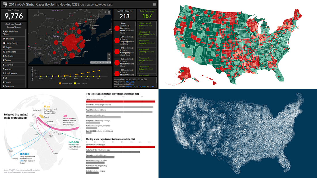 DataViz Weekly is here! Look at four new interesting data visualization projects we’ve discovered around the web just recently. Coronavirus cases are already confirmed in more than 20 countries, making 2019-nCoV a topical global issue. So we could not help but highlight an important dashboard dedicated to it among the four. Here’s a full list of what is featured in this new DataViz Weekly post:
- Wuhan coronavirus cases — JHU CSSE
- American FM radio coverage — Erin Davis
- Global trade in live animals — The Guardian
- Job growth across the United States — The Daily Yonder
- Categories: Data Visualization Weekly
- No Comments »
Hot Visualizations on Youth Life, American Names, Climate Change, and Mother Tongues — DataViz Weekly
January 24th, 2020 by AnyChart Team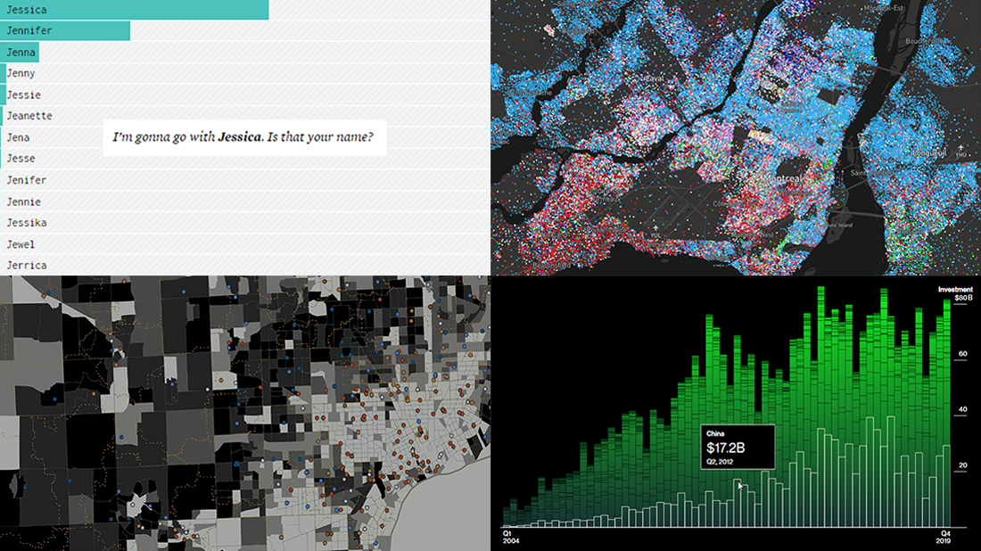 Check out some of the new hot visualizations we have come across this week! Not only are they good graphical data presentation examples, they also bring interesting insights.
- Youth life expectancy and educational opportunity across the United States — Child Trends
- Guessing names based on what letter(s) they start with — FlowingData
- Climate change scoreboard — Bloomberg Green
- Mother tongues across Canada — Anagraph
- Categories: Data Visualization Weekly
- No Comments »
Visualizing Organization Structure, Location Guesses, Time Allocation, and Retreats from Streets — DataViz Weekly
January 17th, 2020 by AnyChart Team Join us on a quick review of some of the most interesting projects with cool charts and maps made public just recently. These are good examples of visualizing organization structure, changes in time spending patterns, and more. Here’s a full list of the projects highlighted in today’s DataViz Weekly:
- Structure of British government departments — Peter Cook
- Identifying Iran on unlabeled maps — Morning Consult
- Time allocation before and with a baby — Caitlin Hudon
- Retreats from busy streets in big cities — Hans Hack
- Categories: Data Visualization Weekly
- No Comments »