AnyChart Blog Named in 50 Best Data Visualization Blogs to Follow in 2019
April 10th, 2019 by AnyChart Team Yay, AnyChart Blog with our flagship regular feature DataViz Weekly has made it to the Top 50 Data Visualization Blogs and Websites To Follow in 2019! Curated by Feedspot, this newly updated list ranks our blog as high as second — right next to Nathan Yau’s brilliant blog FlowingData deservedly occupying the first place among the best data visualization blogs.
- Categories: News
- 1 Comment »
Data Charts for Visual Analysis of Languages, MLB Fandom, Gender Gap, and IRS Audit Rates — DataViz Weekly
April 5th, 2019 by AnyChart Team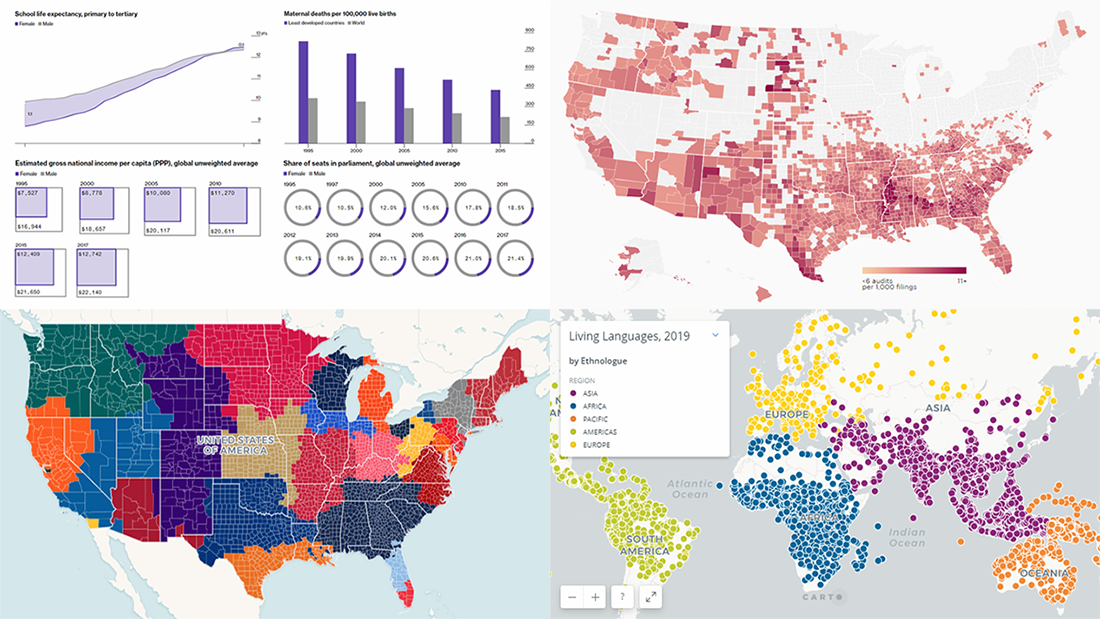 Data charts are greatly helpful in analysis, making it much easier for us people to make sense of numbers and percentages from various statistics and reports through visualization. Let’s take a quick look at how this works in reality.
Today we’ll meet you with four of the new interesting projects we’ve recently come across, featuring cool data visualizations about the following:
- world languages;
- MLB fandom;
- global gender gap;
- IRS audit rates.
- Categories: Data Visualization Weekly
- No Comments »
Data Visualization Practices on Relationships, Brands, Hollywood, and Wildlife — DataViz Weekly
March 29th, 2019 by AnyChart Team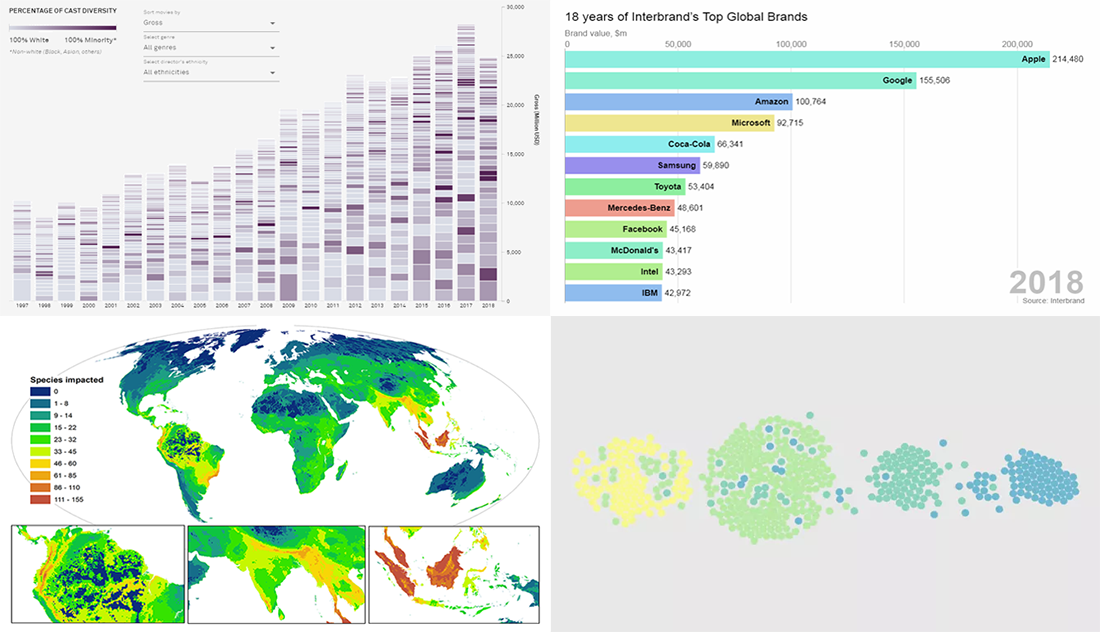 By looking at the best data visualization practices, not only do you have fun and learn something interesting about life and the world around us, but you can also pull together ideas that will help you take your charting skills to the next level. DataViz Weekly on the AnyChart blog is the right place to get such inspiration as that’s where we share with you some of the most interesting charts and graphics-based projects that have recently come to our attention.
Join us as we take a quick overview of new data visualizations on the following subjects:
- relationship timeline in 1970s vs 2010s
- top global brands in 2000-2018
- Asian on-screen representation in Hollywood movies
- global hotspots of human impact on threatened species
- Categories: Data Visualization Weekly
- No Comments »
Visualization Techniques in Action, Unveiling Insight into Mueller Investigation, Partisan Bias, Light Pollution, and Women in Politics — DataViz Weekly
March 22nd, 2019 by AnyChart Team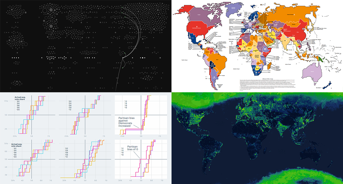 Data visualization techniques help us people analyze and communicate data in a much more convenient and effective manner than raw digits or spreadsheets. We’ve been proving this for years by publishing DataViz Weekly, our regular blog feature in which we show you some of the best new data graphics-based projects from all over the web.
This week, we’ve run across and decided to highlight new interesting charts on the following subjects:
- connections in the Mueller investigation;
- partisan bias as a metric to reveal a partisan gerrymander;
- light pollution;
- women in politics.
Look at these nice examples of data visualization in action.
- Categories: Data Visualization Weekly
- No Comments »
New Interesting Data Visualizations on NBA, Spending, and Gender Pay Gap — DataViz Weekly
March 15th, 2019 by AnyChart Team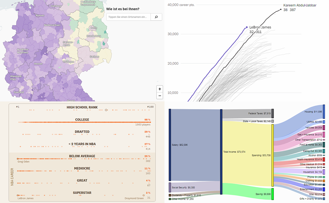 Continuing the regular DataViz Weekly feature on the AnyChart blog, today we are happy to tell you about new interesting data visualizations we’ve found these days — wonderful examples of charts designed for visual storytelling and analytics:
- gender pay gap in Germany;
- NBA’s all-time scoring leaders, now with LeBron James in top 4;
- from leading high school basketball players to NBA superstars;
- household spending in the United States, by income group.
- Categories: Data Visualization Weekly
- No Comments »
Chart Visualization Examples Showing Data About Snow, Prejudice, Names, and Prosperity — DataViz Weekly
March 8th, 2019 by AnyChart Team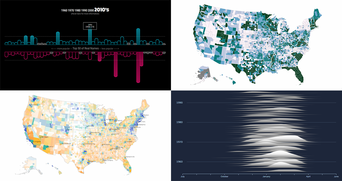 It’s Friday, and here’s another selection of cool chart visualization projects we’ve come across these days. Look at them for fun and inspiration!
Today on DataViz Weekly:
- winter weather and snow in Canada;
- partisan prejudice across the United States of America;
- names in movies and TV shows vs real life;
- prosperity in the United States, by county.
- Categories: Data Visualization Weekly
- No Comments »
New Great Data Visualization Examples on Elevation, Energy, Misspelling, and Jobs — DataViz Weekly
March 1st, 2019 by AnyChart Team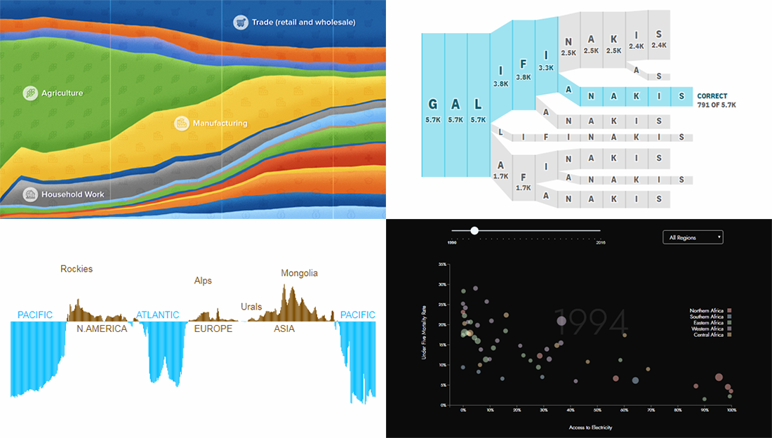 Hey everyone! Check out new great data visualization examples we’ve recently found around the web! The projects we feature today on DataViz Weekly are about Earth’s elevation and ocean depth, renewable energy in Africa, misspellings of celebrity names, and history of employment in the United States.
- Categories: Data Visualization Weekly
- No Comments »
Visualizing Statistics About Greenhouse Gases, Carbon Footprints, Movie Franchises, and Coal Production — DataViz Weekly
February 22nd, 2019 by AnyChart Team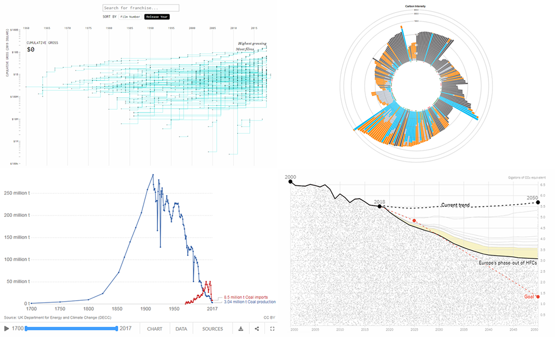 Don’t miss out on a new serving of interesting online projects visualizing statistics as we continue the DataViz Weekly series on the AnyChart blog! This time, we are glad to feature data graphics on the following subjects:
- scenarios of the greenhouse gas emissions reduction for the United States;
- carbon footprints of consumer products;
- box office revenue of movie franchises;
- rise and fall of coal production in the United Kingdom.
- Categories: Data Visualization Weekly
- No Comments »
Analyzing Trump Speech, Green Infrastructure in London, GE’s Rise and Downfall, NYC Traffic Collisions — DataViz Weekly
February 15th, 2019 by AnyChart Team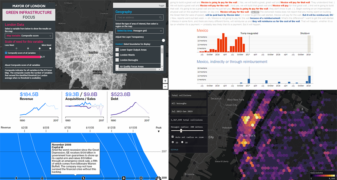 The new cool interesting data visualization projects we praise today on DataViz Weekly are helpful in analyzing Trump speech regarding the U.S.-Mexico wall, green infrastructure in London, rise and downfall of General Electrics, and traffic collisions in New York City. Take a quick look.
- Categories: Data Visualization Weekly
- No Comments »
Data Analytics and Visualization Examples Worth Seeing: High Street, Neighborhoods, Trains, Climate — DataViz Weekly
February 8th, 2019 by AnyChart Team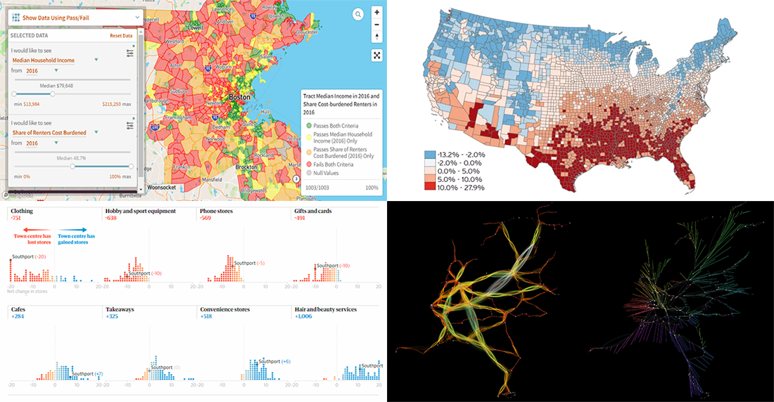 Check out new interesting data analytics and visualization examples from around the web. Here are the topics in the focus of today’s DataViz Weekly:
- high-street crisis in town centers across England and Wales;
- interactive maps of changes in Greater Boston’s neighborhoods;
- connectivity between train stations in the Netherlands;
- economic costs of climate change vs election results in the United States.
- Categories: Data Visualization Weekly
- No Comments »