Interesting Visualizations on Russia’s Borders, Paths to Congress, Child Time, News Lifespan — DataViz Weekly
February 1st, 2019 by AnyChart Team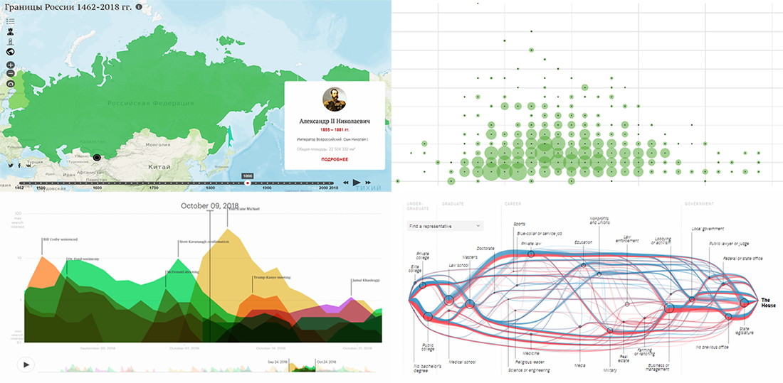 DataViz Weekly is here to meet you with some of the interesting visualizations we’ve come across these days. The new selection includes data-based projects worth seeing, with charts and infographics on the following topics:
- Russian borders from 1462 through 2018;
- career paths to the U.S. Congress;
- time to have the first child;
- lifespan of news stories.
- Categories: Data Visualization Weekly
- No Comments »
Tesla Sales, Brexit Vote, Birth Costs, Health Disparities — DataViz Weekly
January 25th, 2019 by AnyChart Team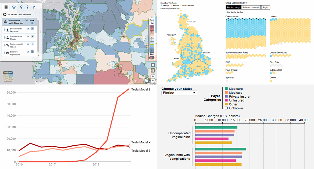 In the new DataViz Weekly post, we highlight interesting interactive data visualizations that have come to our attention this week. Take a look at charts showing details about Tesla sales, Brexit vote in the British Parliament, birth charges in American hospitals, and environmental health disparities in the Washington state.
- Categories: Data Visualization Weekly
- No Comments »
Trump Tweets, Big Mac Index, California Wildfires, Mid-Range Shots in NBA — DataViz Weekly
January 18th, 2019 by AnyChart Team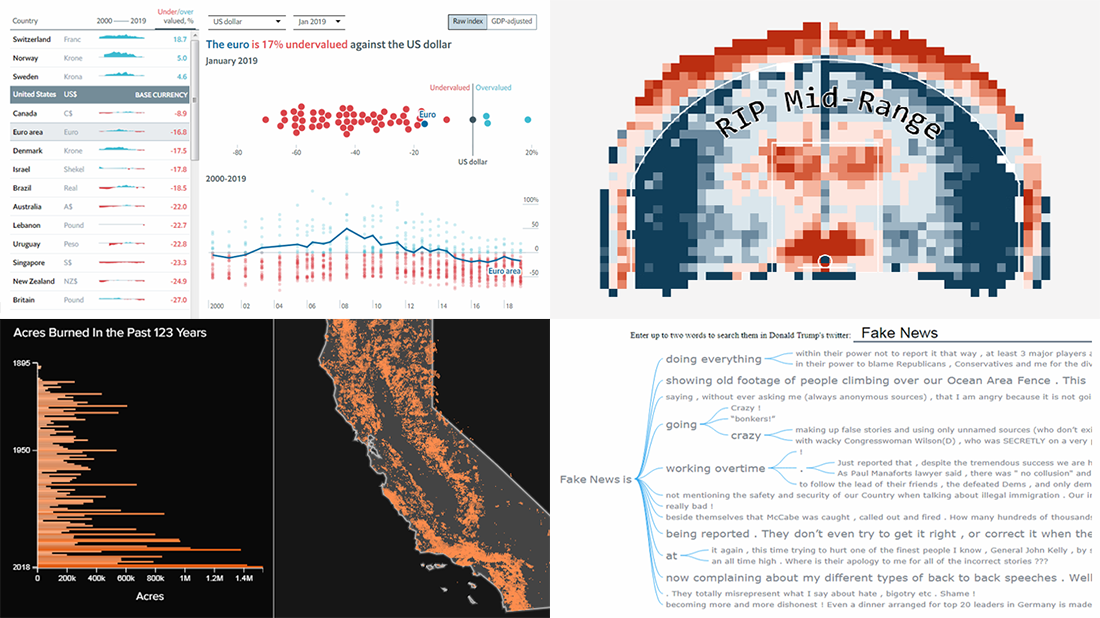 Take a look at some of the cool data visualization examples that appeared on the web just recently! The new article in the DataViz Weekly series features interesting, inspiring projects about words in Trump tweets, destiny of mid-range shots in NBA games, relative value of the world currencies according to the latest Big Mac Index data, and 100+ years of wildfires in California. Also, don’t miss out on an exciting news in the concluding part.
- Categories: Data Visualization Weekly
- No Comments »
Cool Data Stories and Reports with Visualizations — DataViz Weekly
January 11th, 2019 by AnyChart Team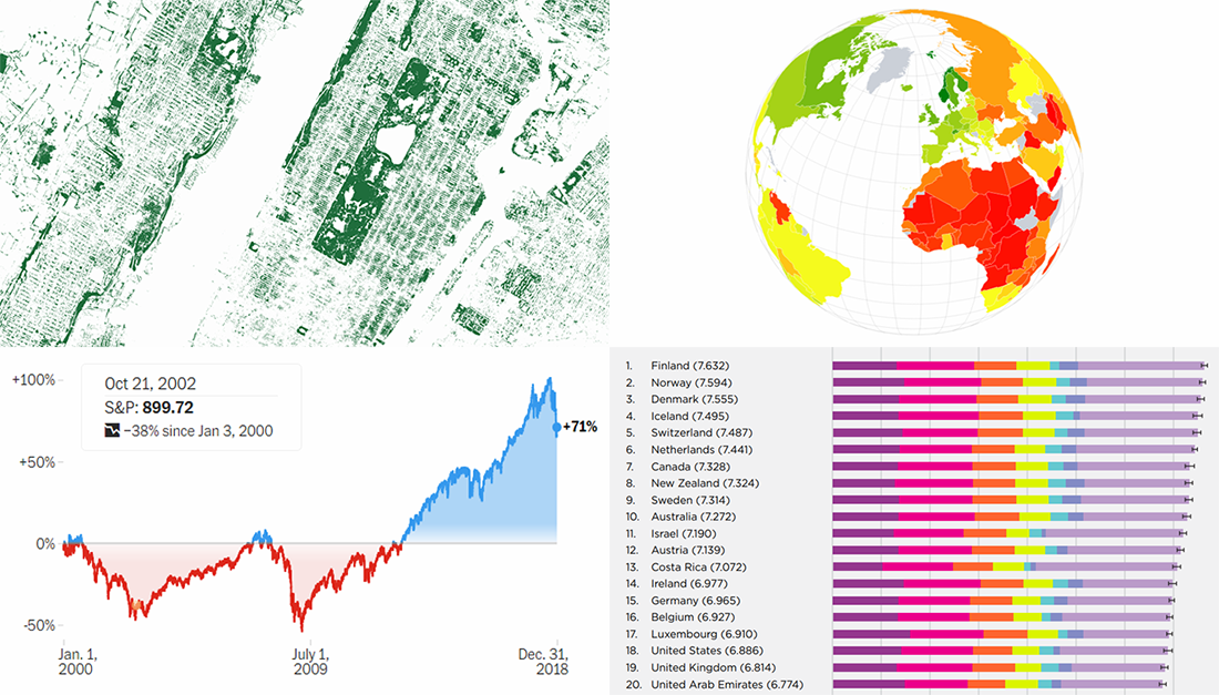 Check out some more interesting visualizations in cool data stories and reports from the last year. We’ve never put them on DataViz Weekly, but now is still a good time to do that. Today, we are glad to feature nice projects about happiness and prosperity around the world, as well as about stock market volatility and mapping tree canopy.
- Categories: Data Visualization Weekly
- No Comments »
Year in Review in Graphics from Top U.S. Publications — DataViz Weekly
January 4th, 2019 by AnyChart Team Happy New Year, everyone! 2019 is already here. But while we still feel the proximity of the last year, let’s take another look back. 2018 brought us numerous interesting visual stories based on data and graphics. For this year’s first DataViz Weekly, we’ve put together year-in-review projects of the graphics teams at four leading media publications in the U.S. (we are a U.S. based company, right): The Wall Street Journal, The New York Times, The L.A. Times, and The Washington Post. Check out some of the key facts, trends, and findings of 2018 in their top picks.
- Categories: Data Visualization Weekly
- 1 Comment »
Best Data Visualizations of 2018 — DataViz Weekly
December 28th, 2018 by AnyChart Team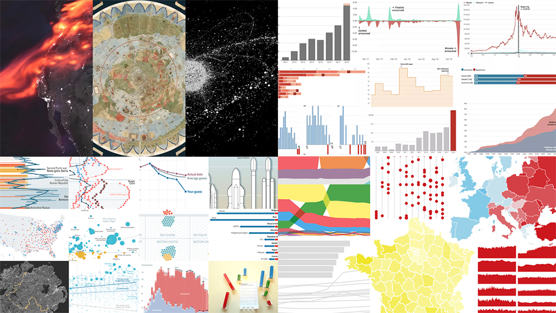 The last days of 2018 are a great time to look back at these 12 months. The year’s final issue of DataViz Weekly is here to familiarize you with four cool selections of the best data visualizations that show the picture of 2018, curated by four major media outlets: POLITICO, Recode, The Economist, and Fast Company. Take a quick look at the lists and check out the charts.
- Categories: Data Visualization Weekly
- 3 Comments »
New Interesting Charts on China’s Rise, Top B-Schools, NFL, and Food Categorization — DataViz Weekly
December 21st, 2018 by AnyChart Team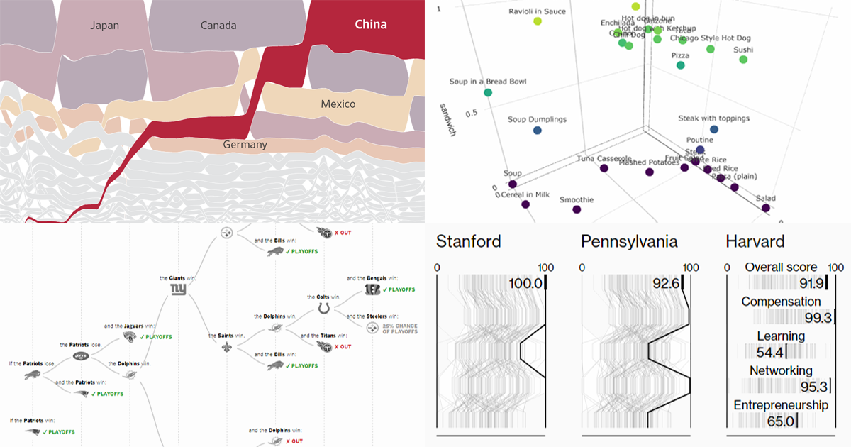 Get ready for another portion of new interesting charts from around the web! Here’s what topics are covered in the data visualization projects that have made it to DataViz Weekly this time:
- China as a trade Leviathan;
- top business schools in America and worldwide;
- NFL playoff paths for each team;
- food categorization as a sandwich, salad, or soup.
- Categories: Data Visualization Weekly
- No Comments »
Visualizing Data About Occupations, Airfares, Patents, and Porn — DataViz Weekly
December 14th, 2018 by AnyChart Team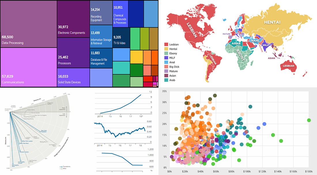 DataViz Weekly is here to tell you about new web projects and articles that feature interesting data graphics. This time, we showcase charts and infographics visualizing data about occupations of single earners in couple households in America, companies winning patent wars, change in air ticket prices globally, and Pornhub trends in 2018.
- Categories: Data Visualization Weekly
- No Comments »
New Cool Data Visualizations on Emissions, Climate, Travel, and Music — DataViz Weekly
December 7th, 2018 by AnyChart Team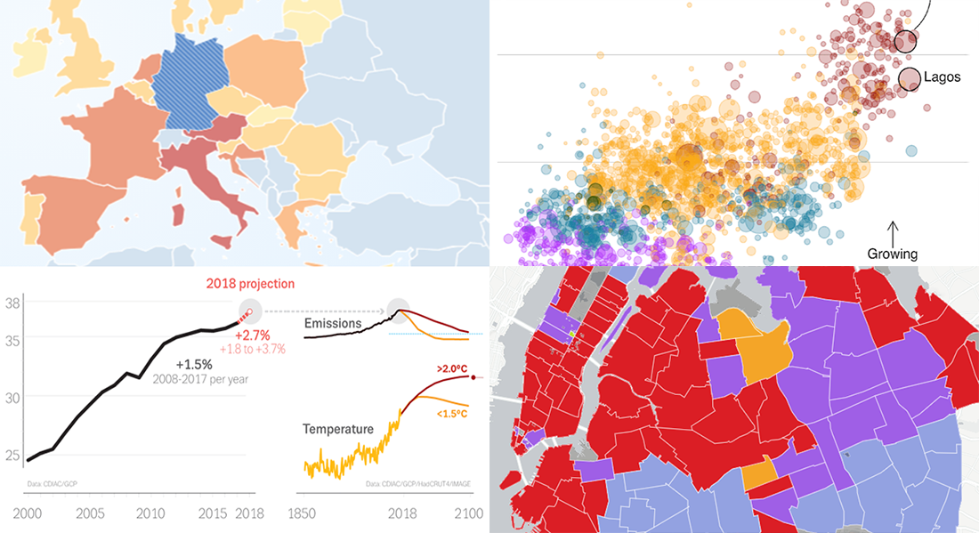 Take a look at new cool data visualizations recently published on the web. In today’s DataViz Weekly, we are glad to feature interesting information graphics from the Global Carbon Project, BBC News, Berliner Morgenpost, and Vivid Seats, dedicated to the following subjects:
- carbon dioxide emissions;
- current state of climate change;
- top 2018 summer travel destinations for Germans;
- top music genres and artists in NYC by neighborhood.
- Categories: Data Visualization Weekly
- No Comments »
New DataViz About Dating, TV Shows, Populists, and School Safety — DataViz Weekly
November 30th, 2018 by AnyChart Team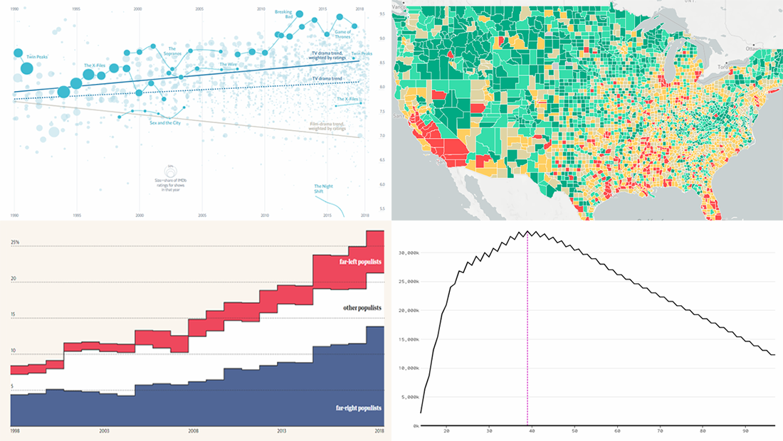 Data visualization is a wonderful way to represent data for intuitive, insightful exploration. The following new dataviz works we’ve found are actually good examples to prove this point.
Today on Data Visualization Weekly:
- dating pool by age;
- TV shows in IMDb user ratings;
- rise of populist parties in Europe;
- safety on the roads around American schools.
- Categories: Data Visualization Weekly
- No Comments »