Data Visualization in Action: Fresh Examples — DataViz Weekly
February 14th, 2025 by AnyChart Team We’re back with DataViz Weekly, where we showcase some of the best new data visualization examples — from individual charts and maps to full-scale visual stories and projects. Take a look at our latest picks:
- Swiss research funding — Colas Droin
- Education and voting patterns in U.S. presidential elections — Jon Boeckenstedt
- City walkability and improvement potential — The Economist & Matteo Bruno et al.
- Self-censorship in Super Bowl halftime shows — Artur Galocha for The Washington Post
- Categories: Data Visualization Weekly
- No Comments »
Noteworthy New Visualizations to Explore — DataViz Weekly
February 7th, 2025 by AnyChart Team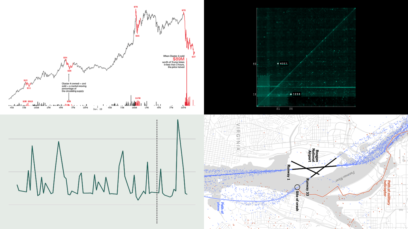 Continuing our regular DataViz Weekly, we’re glad to share the most interesting of all the new data visualizations we’ve recently come across, well worth a look. Here’s what we have lined up this time:
- PIN code popularity — ABC News
- Complexity of D.C. airspace amid the Potomac River midair collision — The New York Times
- Trading patterns in the Trump memecoin — Bloomberg Crypto
- U.S. federal expenditures in real time — The Hamilton Project
- Categories: Data Visualization Weekly
- No Comments »
New Charts & Maps Turning Data Into Insights — DataViz Weekly
January 31st, 2025 by AnyChart Team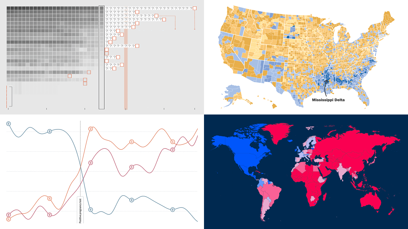 DataViz Weekly is here with a spotlight on new charts and maps that do a great job of turning data into meaningful insights. Today, we invite you to explore the following projects, each demonstrating how data visualization helps reveal patterns, tell stories, and deepen understanding:
- European electricity transition — Ember
- The United States vs. China on global trade — Lowy Institute
- Single-parent families in America — The Washington Post
- Pregnancy through health metric shifts — Maggie Appleton
- Categories: Data Visualization Weekly
- No Comments »
Compelling Fresh Data Visualizations Not to Miss — DataViz Weekly
January 24th, 2025 by AnyChart Team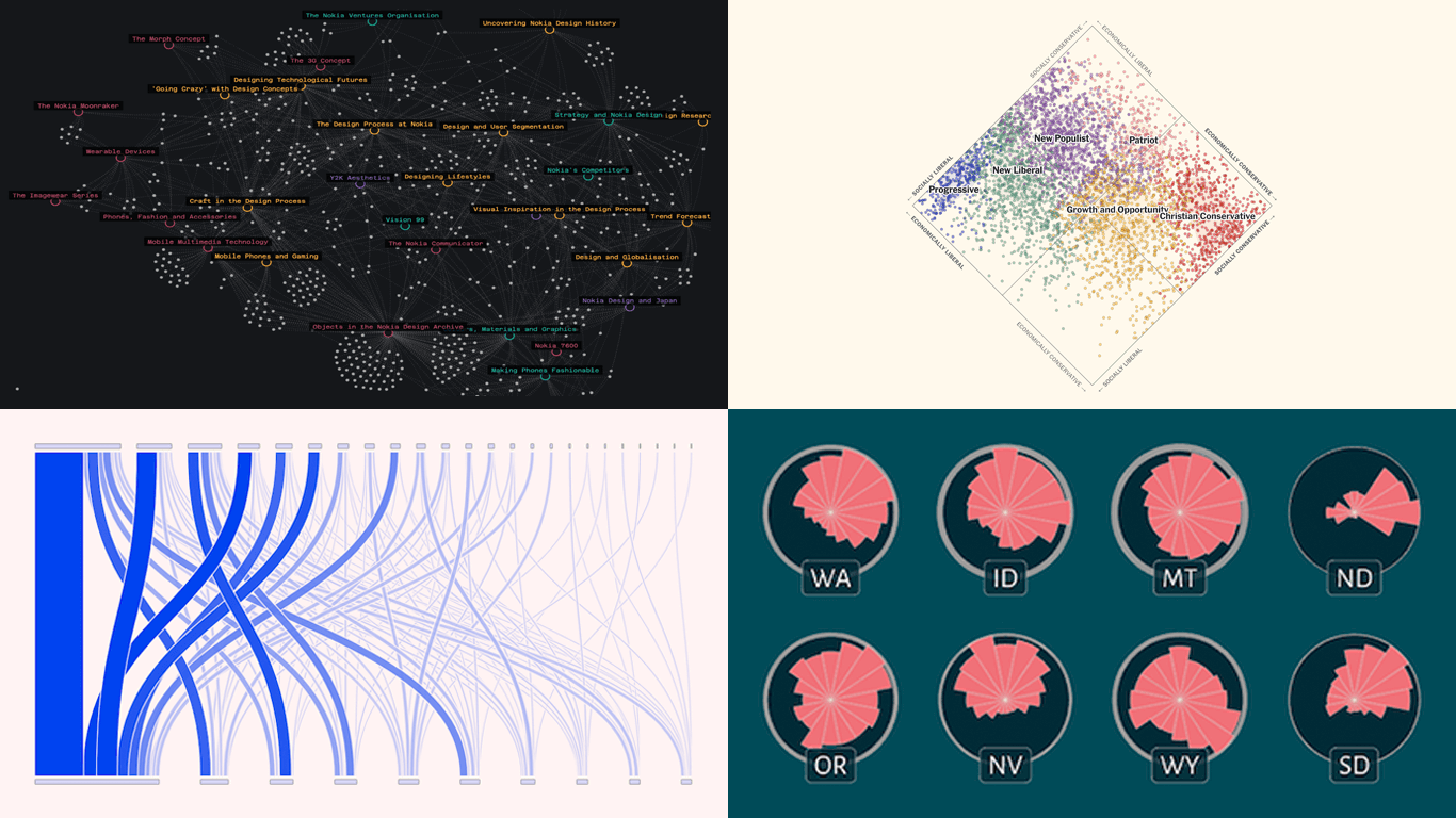 Welcome to the first regular edition of DataViz Weekly in 2025! Last Friday, we wrapped up the year with a special Best Data Visualizations of 2024 post. Now we’re back to our usual format, highlighting some of the most compelling new visuals that caught our attention recently. Here are the first featured projects of the year — dive in and get inspired:
- Nokia Design Archive — Aalto University
- AI research collaborations — Rest of World
- Orientation of ski slopes — OpenSkiStats
- Policy preferences in a hypothetical U.S. multiparty system — NYT Opinion
- Categories: Data Visualization Weekly
- No Comments »
Best Data Visualizations of 2024 — DataViz Weekly
January 17th, 2025 by AnyChart Team In 2024, data visualization remained a vital tool for exploring complex topics and presenting insights in engaging ways. From global conflicts and environmental challenges to cultural phenomena and historical trends, charts and maps provided valuable perspectives and captivated audiences.
This special edition of DataViz Weekly highlights the best data visualizations of 2024. Featuring projects selected by FlowingData, The Pudding, and the Global Investigative Journalism Network (GIJN), as well as year-in-review collections from leading media sources, it offers a curated look at some of the most compelling visual storytelling created during the year. All aboard!
- Categories: Data Visualization Weekly
- No Comments »
Recent Data Visualization Projects Worth Exploring — DataViz Weekly
December 6th, 2024 by AnyChart Team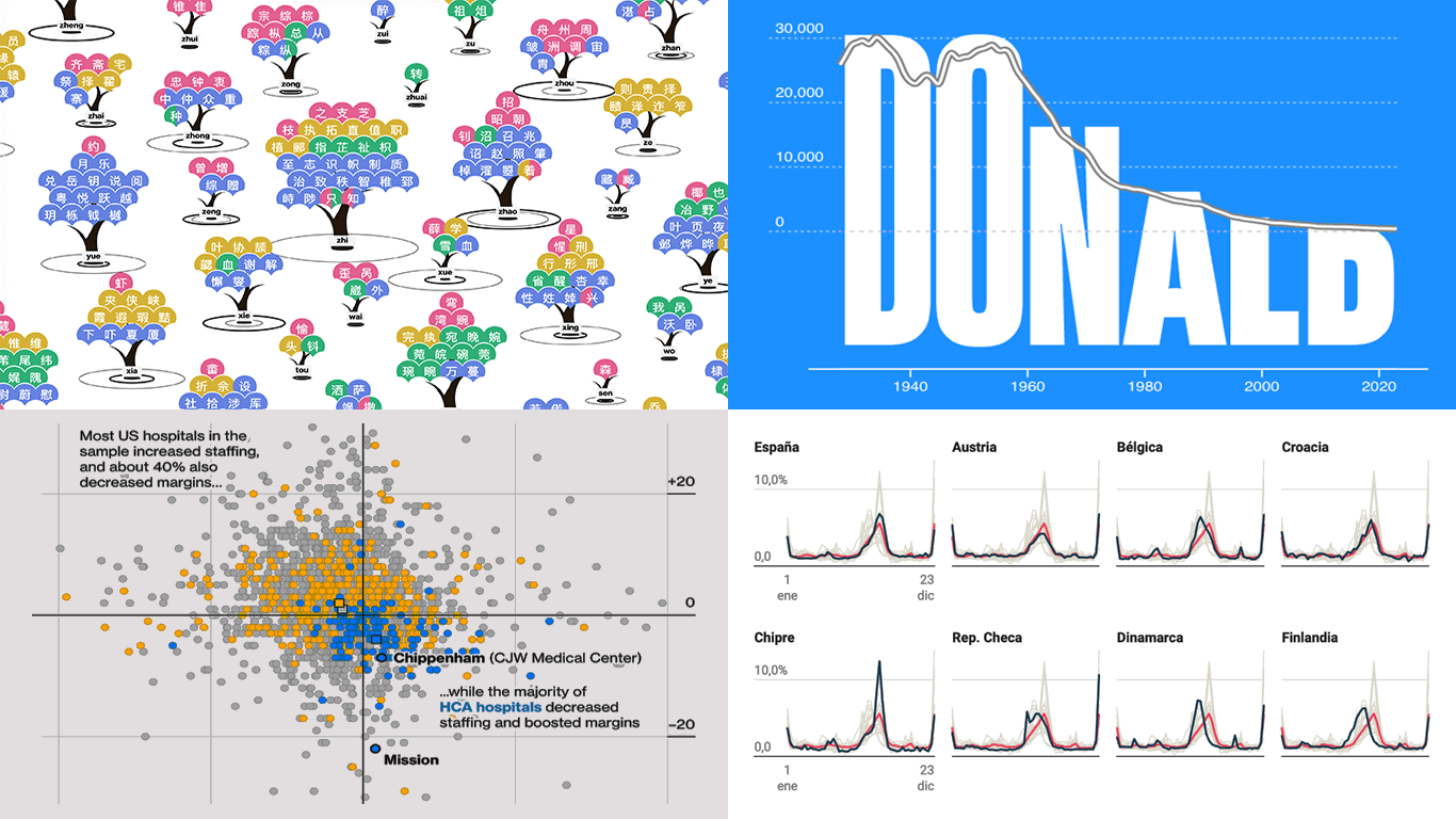 Data visualization makes complex information accessible and insightful, serving as a valuable tool for both analysis and communication. This edition of DataViz Weekly features four recent projects that showcase its application across diverse topics.
- Chinese name complexity in Pinyin translation — CSH
- Name popularity visualized through letter size — Jetpack.AI
- Nurse practitioner risks and HCA Healthcare — Businessweek
- Temporal vacation trends across Europe — El Confidential
- Categories: Data Visualization Weekly
- No Comments »
Awesome New Data Visualization Works — DataViz Weekly
November 15th, 2024 by AnyChart Team Welcome back to DataViz Weekly, where we spotlight the most awesome data visualization works we have recently come across. Check out the projects we’re diving into this time:
- Love songs: death or evolution? — The Pudding
- Historical dry streaks in NYC — Bloomberg Green
- NYC subway ridership in detail — Subway Stories
- Vote swings in U.S. presidential elections — NYT
- Categories: Data Visualization Weekly
- No Comments »
27 Election Maps of 2024 U.S. Presidential Vote Results — DataViz Weekly Special Edition
November 8th, 2024 by AnyChart Team The 2024 U.S. presidential election has concluded, and media outlets worldwide are offering a plethora of data graphics to convey the election results. In this special edition of DataViz Weekly, we’ve curated a collection of over twenty election maps, showcasing diverse ways to represent voting data — cartograms, choropleth maps, bubble maps, and more. Whether you’re a data enthusiast, professional, or simply intrigued by the 2024 election outcomes, explore the latest U.S. election maps from top media!
? Also see our previous special editions with election maps: 2020 U.S. election maps and 2024 UK election maps.
- Categories: AnyMap, Dashboards, Data Visualization Weekly
- No Comments »
Fresh Data Visuals That Impressed Us — DataViz Weekly
November 4th, 2024 by AnyChart Team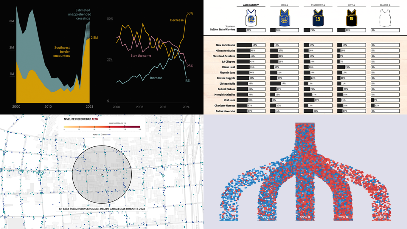 We’re a bit behind schedule after last week’s big release of updates for our Qlik Sense extensions, including the transformative AI Splits feature in the Decomposition Tree. But finally, here we are with a fresh edition of DataViz Weekly! Check out the projects with charts and maps that stood out to us most lately:
- U.S. immigration trends in historical context — ProPublica
- Crime trends in Buenos Aires — LA NACION
- Evolution of NBA uniform colors — The Pudding
- Internal migration and political polarization in the United States — The Upshot
- Categories: Data Visualization Weekly
- No Comments »
Top Data Visualizations We’ve Recently Seen — DataViz Weekly
October 18th, 2024 by AnyChart Team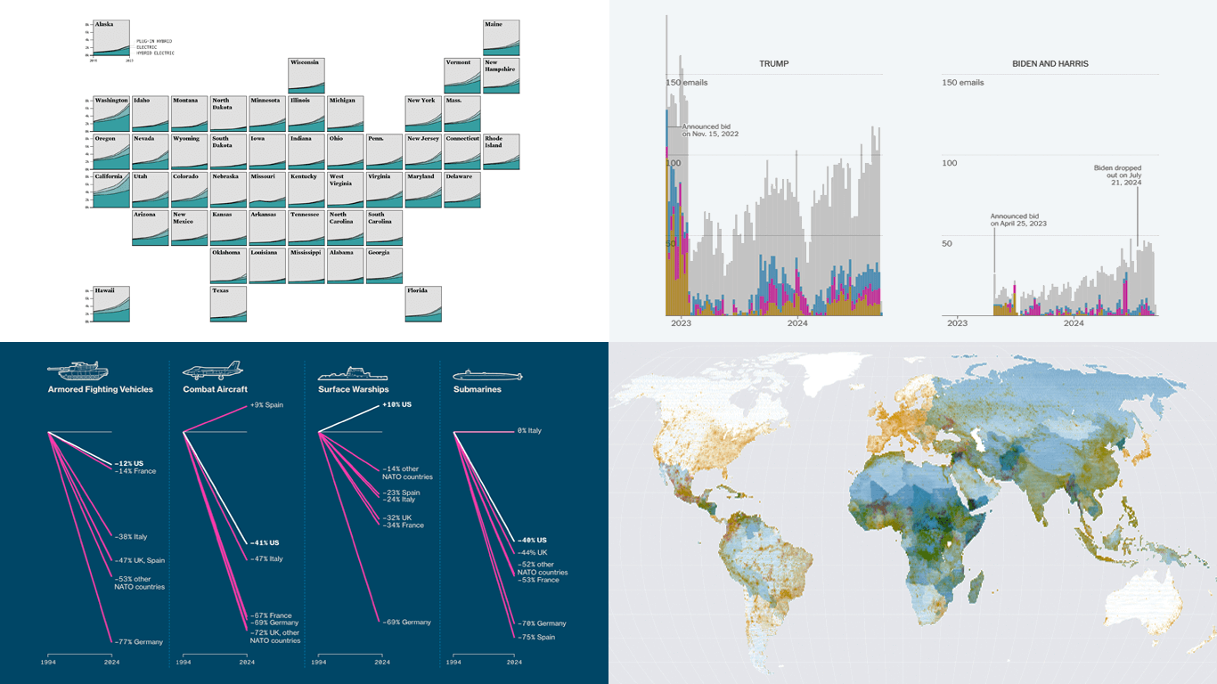 It’s Friday, which means it’s the perfect moment to look back at the data visualizations that have sparked our curiosity over the past few days. So, without further ado, welcome to DataViz Weekly!
- Electric vehicle adoption across the United States — FlowingData
- Europe’s military reductions and defense challenges — Bloomberg
- Climate—Conflict—Vulnerability Index for global risk assessment — UniBw München, PIK, AA, Truth & Beauty
- Campaign emails with donation incentives in the 2024 U.S. presidential race — The New York Times
- Categories: Data Visualization Weekly
- No Comments »