Best Data Visualizations of 2022 — DataViz Weekly
December 30th, 2022 by AnyChart Team 2022 has been fruitful in terms of data visualizations for every taste and interest. On DataViz Weekly, we’ve shown you more than 200 awesome projects as great examples of effective charting and mapping in action. Today, in the year’s last edition, let’s look at the best data visualizations of 2022 through the eyes of third-party experts!
Find out which projects made it to the “best of the year” selections of Nathan Yau, DataJournalism.com, The Pudding, and Kenneth Field.
- Categories: Data Visualization Weekly
- No Comments »
Amazing New Data Graphics That Really Caught Our Attention — DataViz Weekly
December 23rd, 2022 by AnyChart Team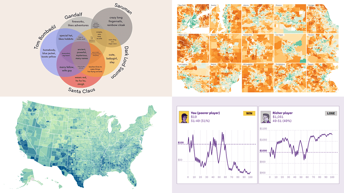 While the Christmas spirit is already in the air, join us for a quick look at some amazing new data graphics that really caught our attention these days. And you’ll even know what Santa Claus has in common with Gandolf, Dark Lord Sauron, and Tom Bombadil. So, here’re the data visualizations featured in this DataViz Weekly:
- Inevitability of the super rich — The Pudding
- Adult illiteracy across the United States — ProPublica
- Carbon emissions footprint per household across the United States — The New York Times
- Intersections between Santa Claus and Tolkien’s characters — Tea with Tolkien
- Categories: Data Visualization Weekly
- No Comments »
Newest Collection of Effective Data Visualization Examples — DataViz Weekly
December 16th, 2022 by AnyChart Team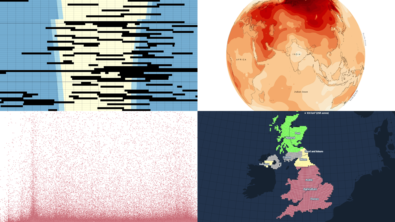 It’s easier to analyze data when it is visualized in the form of a chart or a map. On DataViz Weekly, we share with you some vivid examples we have recently seen out there. Here’s our newest collection!
- Blackouts in Kyiv — Volodymyr Agafonkin
- Earth’s slowest-warming parts — The Washington Post
- Twitter Blue subscribers — The New York Times
- Land use in the United Kingdom — Bloomberg
- Categories: Data Visualization Weekly
- No Comments »
Awesome New Data Visualization Works for Your Inspiration — DataViz Weekly
December 9th, 2022 by AnyChart Team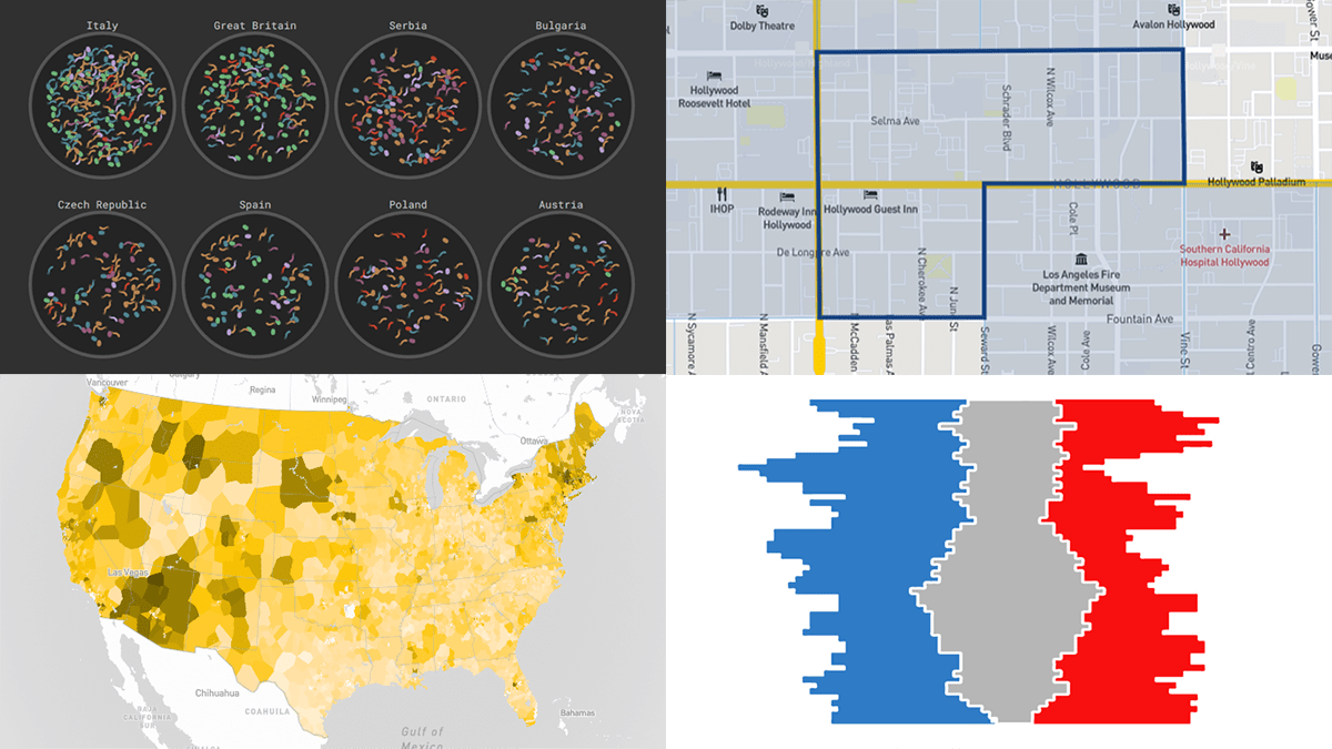 DataViz Weekly consistently curates the most awesome new data visualization works that might serve as an inspiration for your own great projects. Check out what we’ve got for you today!
- Russian influencers in Europe — Texty
- Fast food prices across the United States — Riley Walz
- Split delegations in the U.S. Senate since 1914 — Reuters
- Disadvantaged communities across the U.S. — CEQ
- Categories: Data Visualization Weekly
- No Comments »
Impressive New Visualizations Allowing Data to Speak — DataViz Weekly
December 2nd, 2022 by AnyChart Team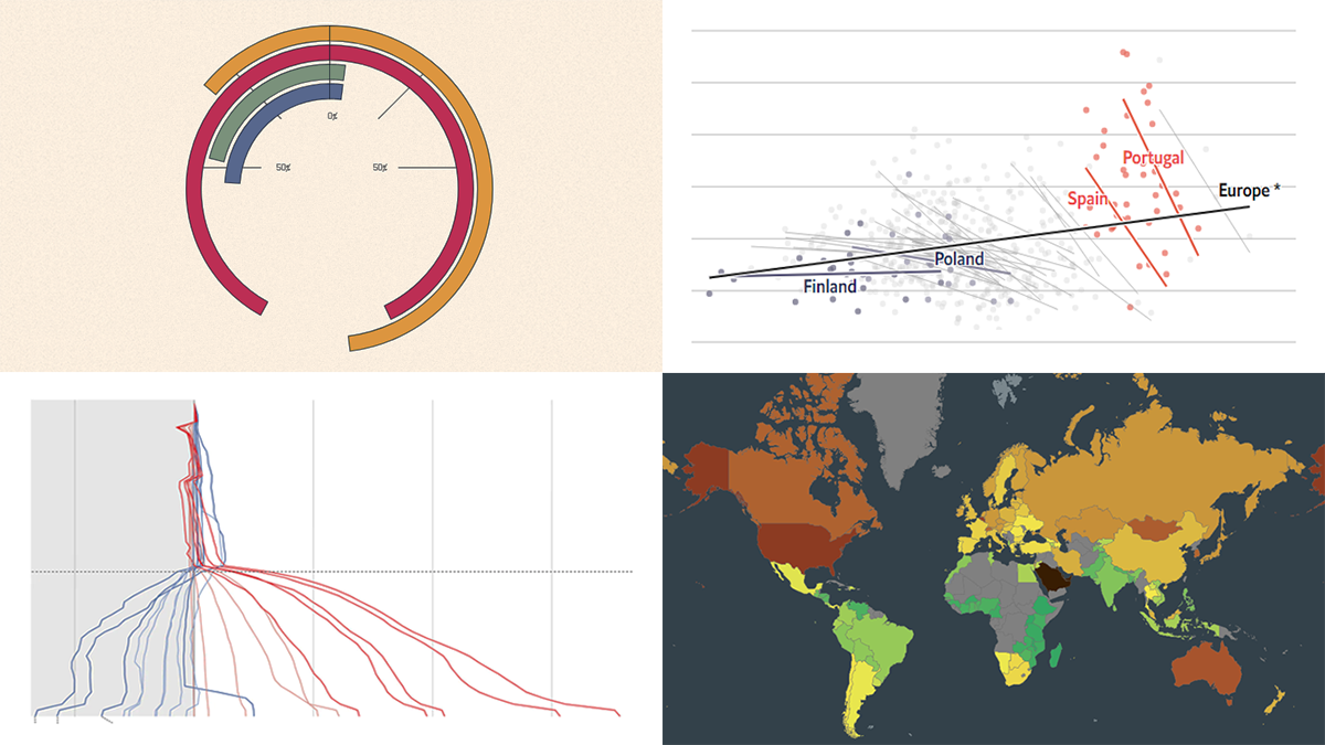 We continue the DataViz Weekly series with a new collection of interesting charts and maps curated from around the internet. Today, we want to put a spotlight on the following impressive visualizations that truly let data speak:
- Winter death toll in Europe — The Economist
- Upward mobility from personal experience — The Pudding
- Shifts in Democrat and Republican follower counts on Twitter under Elon Musk — The Washington Post
- Carbon footprint by country — Electricity Maps
- Categories: Data Visualization Weekly
- No Comments »
Top Recent Climate and Environment Data Visualizations Worth Looking At — DataViz Weekly
November 25th, 2022 by AnyChart Team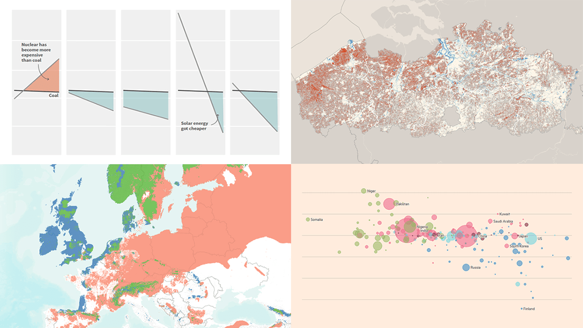 Against the backdrop of the United Nations Climate Change Conference COP27, quite a few data visualizations on climate and environmental issues came out. Earlier, we showed you the Emissions Map by the Climate Trace coalition. This time on DataViz Weekly, here are some more of the top recent ones we believe are worth looking at:
- Uneven distribution of climate change effects across the world — FT
- Future of European forests under different climate scenarios — Appsilon
- Rise of clean energy — Reuters
- Endangered Flemish agricultural land under the seventh manure action plan — De Tijd
- Categories: Data Visualization Weekly
- No Comments »
Visualizing Data on Global Population, Mariupol Destruction, Mississippi River Exports, Air Traffic — DataViz Weekly
November 18th, 2022 by AnyChart Team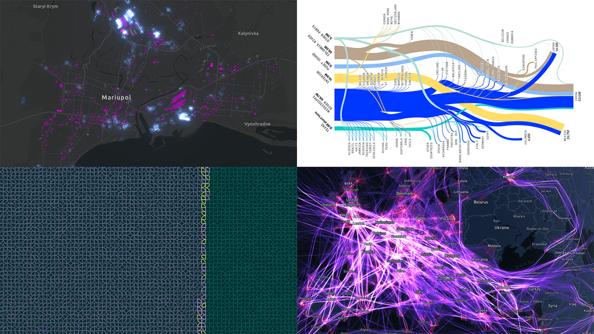 It’s Friday, which means it’s time for DataViz Weekly to shine and illuminate the best we’ve recently seen in data visualization! Meet the following projects and check them out!
- Your place among the 8-billion population — The Washington Post
- Destruction of Mariupol in a time-lapse record — Conflict Observatory
- U.S. exports through the Mississippi River — Bloomberg Green
- Global air traffic on a single day — Carlos Bergillos
- Categories: Data Visualization Weekly
- No Comments »
Most Interesting New Visualizations of Data — DataViz Weekly
November 11th, 2022 by AnyChart Team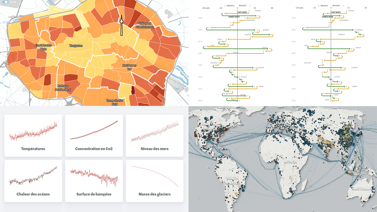 Join us as we look at some of the most interesting data charts and maps we have seen out there these days. Here’s what visualizations are featured today on DataViz Weekly:
- Presidential party results in midterm and other elections in the U.S. — Reuters
- Six indicators of (worsening) climate change — Le Monde
- Global greenhouse gas emissions in detailed inventory — Climate TRACE
- Car parking spaces in Berlin — Tagesspiegel
- Categories: Data Visualization Weekly
- No Comments »
Coolest New Data Graphics to Not Miss Out On — DataViz Weekly
November 4th, 2022 by AnyChart Team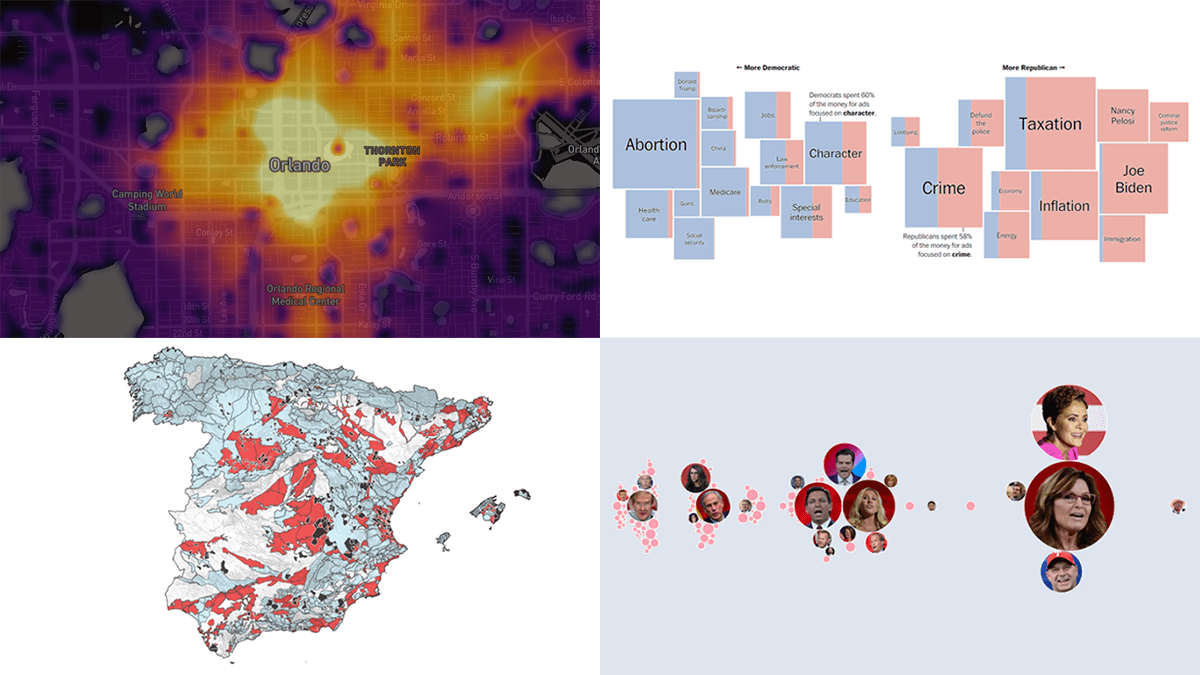 DataViz Weekly is where we curate the coolest data graphics published just about now around the web. Check out our new collection!
- Top topics in political ads ahead of the U.S. midterms — The Washington Post
- Republican candidates spreading election denial online — Bloomberg
- Access to essential services in cities — Leonardo Nicoletti, Mikhail Sirenko, Trivik Verma
- Tap water contamination across Spain — DATADISTA
- Categories: Data Visualization Weekly
- No Comments »
Best Data Visualizations We’ve Come Across Most Recently — DataViz Weekly
October 28th, 2022 by AnyChart Team Interesting charts and maps come out all the time. DataViz Weekly is here to show you the best data visualizations we have seen most recently! Look at our newest picks!
- Feelings at work by occupation — FlowingData
- Impact of climate on conflicts — Auswärtiges Amt (German Foreign Office)
- U.S. President Biden’s legislative agenda — The Upshot
- Australians’ birth countries, languages, and religions — SBS News
- Categories: Data Visualization Weekly
- No Comments »