Exploring Eclipse Impact, Nature Access, Marital Ages, Voter Profiles — DataViz Weekly
April 12th, 2024 by AnyChart Team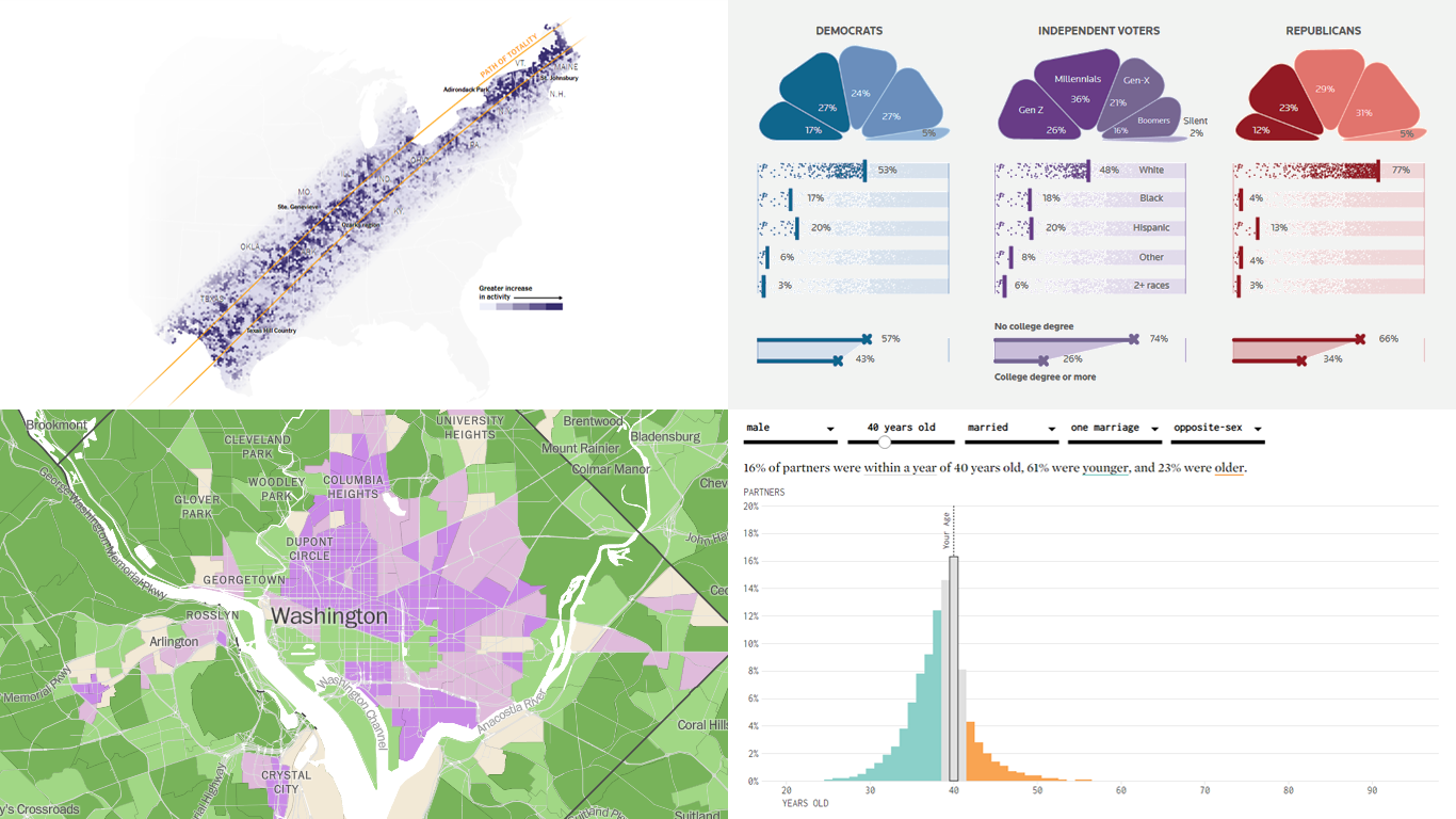
Welcome back to DataViz Weekly! We’re thrilled to restart our series, presenting each Friday a carefully curated selection of recent data visualizations that have caught our eye from around the web. These charts and maps serve as excellent examples of how data can be transformed into insightful and engaging graphical representations for understanding complex issues.
This time, we feature:
- Eclipse traffic and movements — The New York Times
- America’s access to natural spaces — The Washington Post
- Marital age patterns — FlowingData
- Profiling independent voters — Reuters
Join us as we take a closer look at these visualizations and check them out for a dose of inspiration.
- Categories: Data Visualization Weekly
- No Comments »
Ukraine-Russia in Data Visualizations — DataViz Weekly
February 24th, 2023 by DataViz Weekly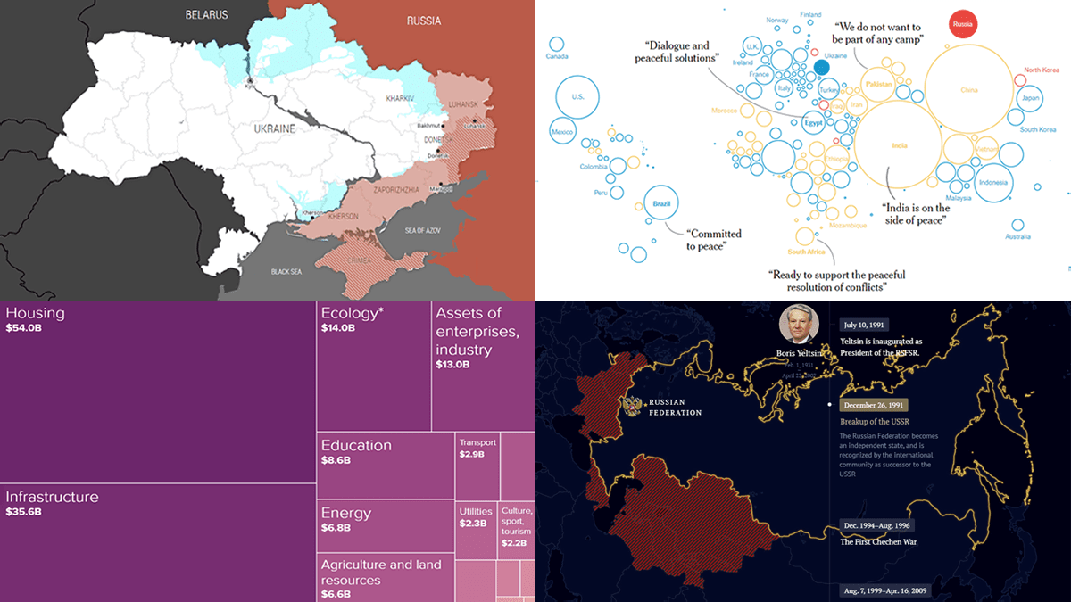 One year ago today, on February 24, 2022, Russia launched a massive attack on Ukraine. To mark this anniversary, DataViz Weekly has put together a collection of remarkable data visualizations that may offer insights into the conflict. These include Grid’s interactive that maps out how events unfolded over the last 365 days, Politico’s series of graphics that highlight some of the key numbers, The New York Times’s charts that illustrate the world’s stance, and Russia Beyond’s timeline of Russia’s territorial evolution since the 9th century.
- Categories: Data Visualization Weekly
- No Comments »
Most Notable New Data Visualizations — DataViz Weekly
February 10th, 2023 by AnyChart Team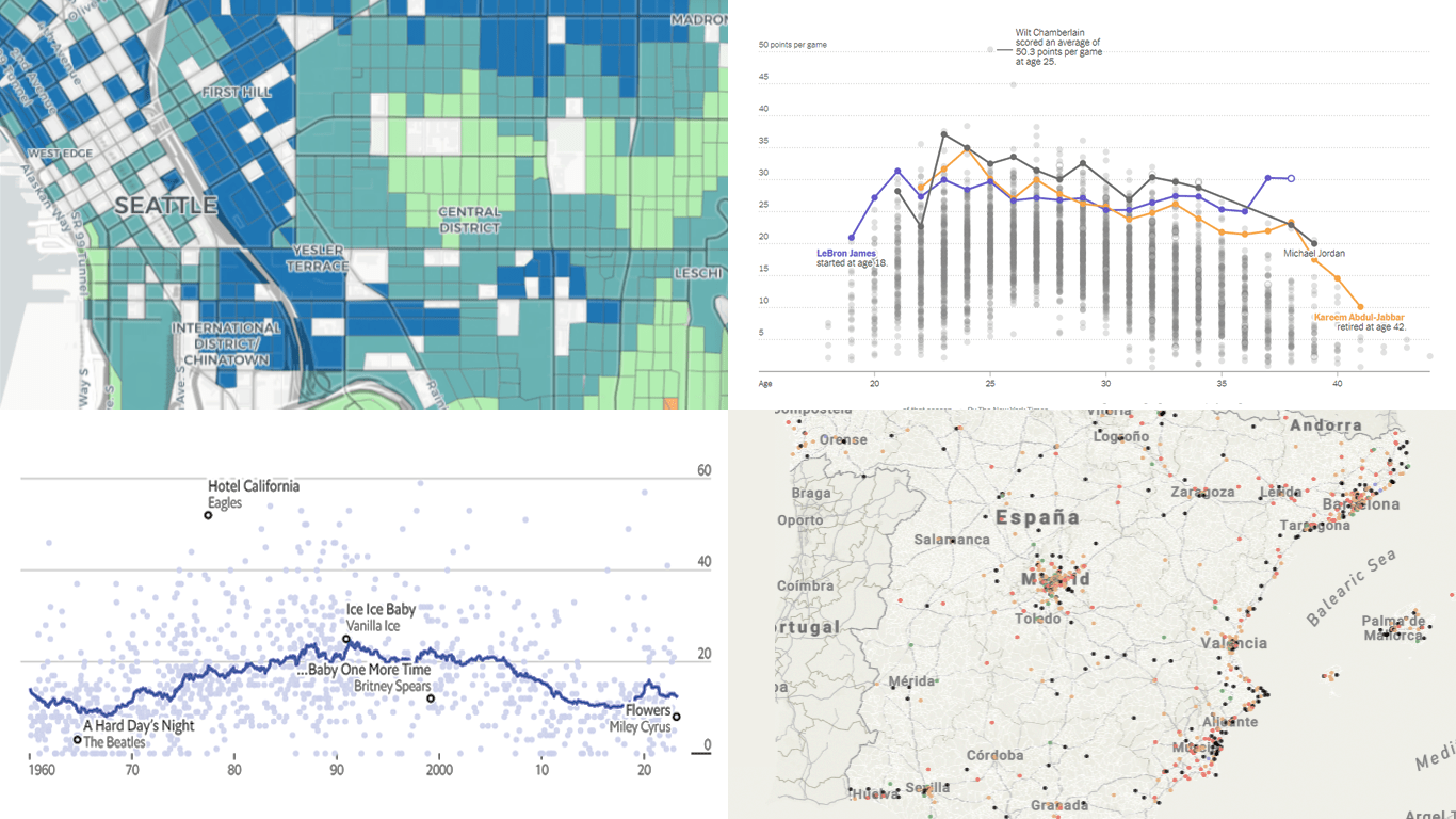 If you like cool data visualizations, DataViz Weekly is for you! In our new roundup, check out some of the most notable graphics we have seen around the web over the last seven days.
- Seattle as a 15-minute city — Nat Henry
- LeBron James vs the NBA’s other top scorers — The New York Times
- Subnational immigration patterns across Spain — El Confidencial
- Intro length in the top songs in 1960–2023 — The Economist
- Categories: Data Visualization Weekly
- No Comments »
Exciting Visual Graphics That Tell Stories — DataViz Weekly
January 13th, 2023 by AnyChart Team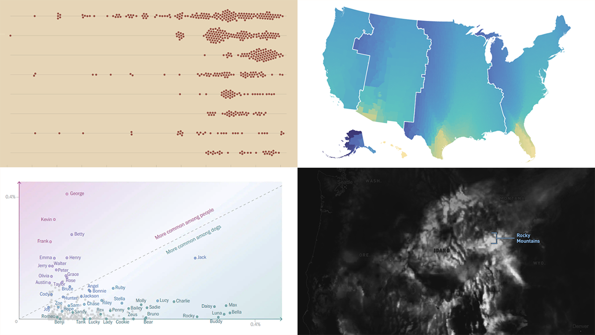 DataViz Weekly is our regular blog feature where we curate the most exciting charts, maps, and infographics we’ve recently come across. Today, we want to attract your attention to some cool visual stories published out there near the end of the last year, which we did not get a chance to spotlight before:
- Animal species extinction over time — Reuters
- Daylight optimization in the United States — FiveThirtyEight
- Top human names for dogs — The Washington Post
- Snowfall across the U.S. — William B. Davis
- Categories: Data Visualization Weekly
- No Comments »
2022 Year in Data Visualizations — DataViz Weekly
January 6th, 2023 by AnyChart Team Finally we are in 2023! May this new year be the best one for all of you!
Before getting too far into 2023, we thought it would be interesting to look back at 2022 in data visualizations. And the first DataViz Weekly in the new year seems like a nice occasion! Let’s say farewell to 2022 by recalling its hottest topics with the help of “year in graphics” features on Politico, The Post, NYT, and Bloomberg.
- Categories: Data Visualization Weekly
- No Comments »
Best Data Visualizations of 2022 — DataViz Weekly
December 30th, 2022 by AnyChart Team 2022 has been fruitful in terms of data visualizations for every taste and interest. On DataViz Weekly, we’ve shown you more than 200 awesome projects as great examples of effective charting and mapping in action. Today, in the year’s last edition, let’s look at the best data visualizations of 2022 through the eyes of third-party experts!
Find out which projects made it to the “best of the year” selections of Nathan Yau, DataJournalism.com, The Pudding, and Kenneth Field.
- Categories: Data Visualization Weekly
- No Comments »
Amazing New Data Graphics That Really Caught Our Attention — DataViz Weekly
December 23rd, 2022 by AnyChart Team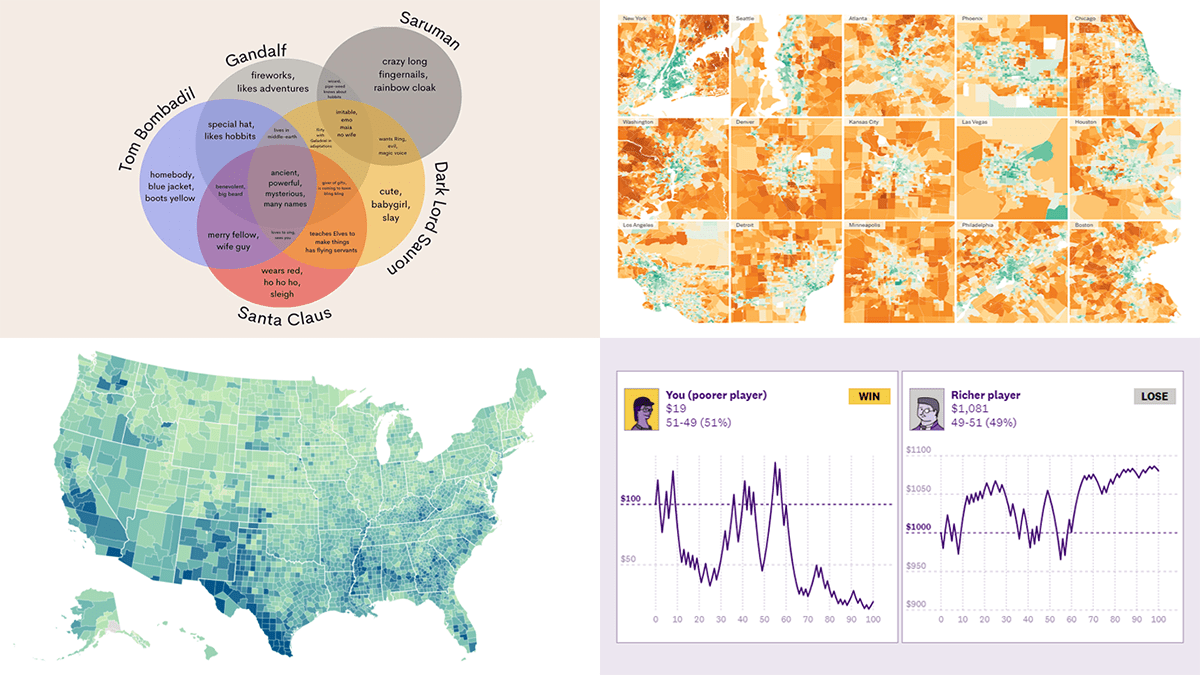 While the Christmas spirit is already in the air, join us for a quick look at some amazing new data graphics that really caught our attention these days. And you’ll even know what Santa Claus has in common with Gandolf, Dark Lord Sauron, and Tom Bombadil. So, here’re the data visualizations featured in this DataViz Weekly:
- Inevitability of the super rich — The Pudding
- Adult illiteracy across the United States — ProPublica
- Carbon emissions footprint per household across the United States — The New York Times
- Intersections between Santa Claus and Tolkien’s characters — Tea with Tolkien
- Categories: Data Visualization Weekly
- No Comments »
Newest Collection of Effective Data Visualization Examples — DataViz Weekly
December 16th, 2022 by AnyChart Team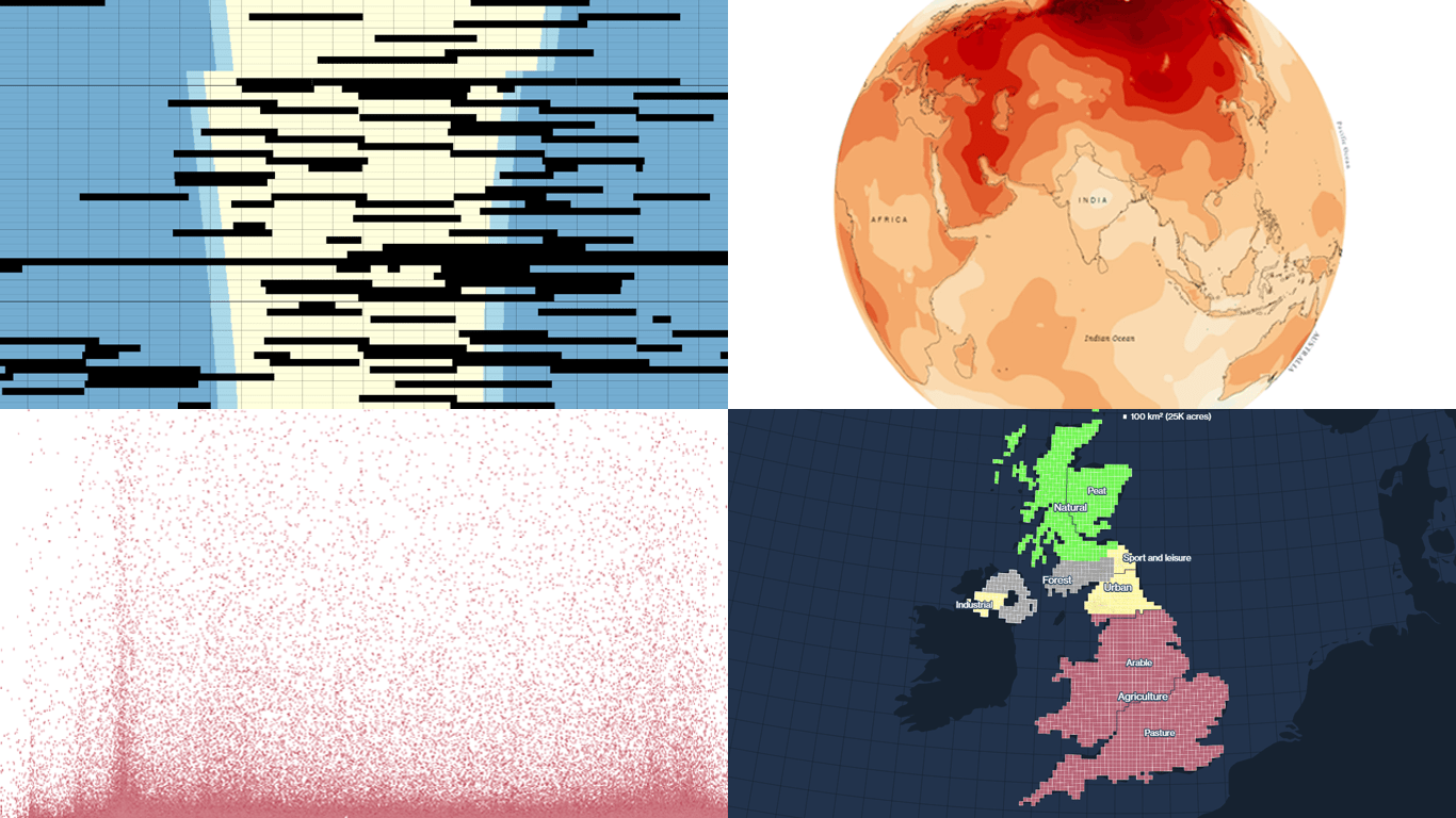 It’s easier to analyze data when it is visualized in the form of a chart or a map. On DataViz Weekly, we share with you some vivid examples we have recently seen out there. Here’s our newest collection!
- Blackouts in Kyiv — Volodymyr Agafonkin
- Earth’s slowest-warming parts — The Washington Post
- Twitter Blue subscribers — The New York Times
- Land use in the United Kingdom — Bloomberg
- Categories: Data Visualization Weekly
- No Comments »
Awesome New Data Visualization Works for Your Inspiration — DataViz Weekly
December 9th, 2022 by AnyChart Team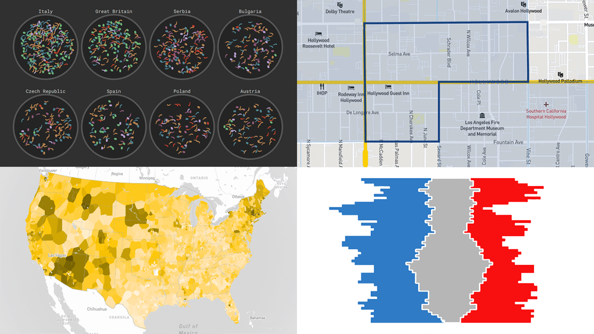 DataViz Weekly consistently curates the most awesome new data visualization works that might serve as an inspiration for your own great projects. Check out what we’ve got for you today!
- Russian influencers in Europe — Texty
- Fast food prices across the United States — Riley Walz
- Split delegations in the U.S. Senate since 1914 — Reuters
- Disadvantaged communities across the U.S. — CEQ
- Categories: Data Visualization Weekly
- No Comments »
Impressive New Visualizations Allowing Data to Speak — DataViz Weekly
December 2nd, 2022 by AnyChart Team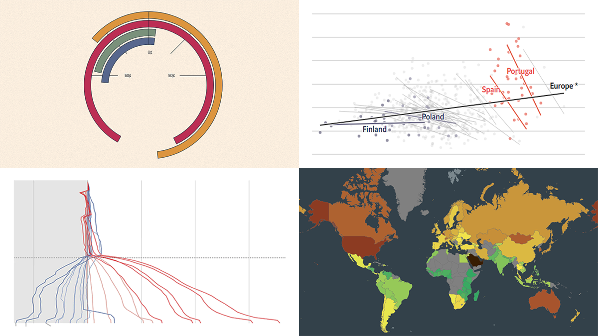 We continue the DataViz Weekly series with a new collection of interesting charts and maps curated from around the internet. Today, we want to put a spotlight on the following impressive visualizations that truly let data speak:
- Winter death toll in Europe — The Economist
- Upward mobility from personal experience — The Pudding
- Shifts in Democrat and Republican follower counts on Twitter under Elon Musk — The Washington Post
- Carbon footprint by country — Electricity Maps
- Categories: Data Visualization Weekly
- No Comments »