New Data Visualization Projects You Shouldn’t Miss Out There — DataViz Weekly
September 16th, 2022 by AnyChart Team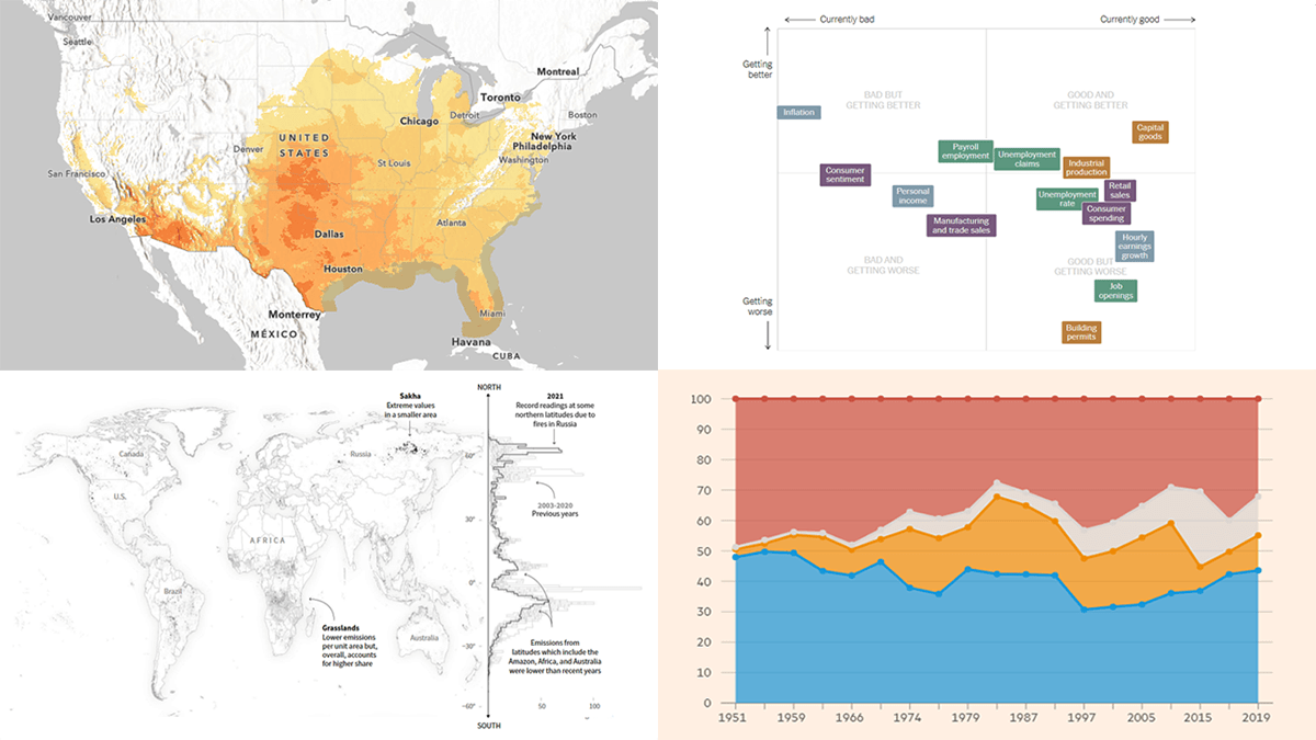 Each Friday, DataViz Weekly gives you a therapeutic dose of data visualization inspiration headed into the weekend! Here are four new projects we believe you should not miss:
- Queen Elizabeth II’s 70-year reign — The Financial Times
- Current condition of the U.S. economy — The New York Times
- Carbon emissions from Arctic wildfires — Reuters
- Local exposure to climate-related hazards across the U.S. — Esri for NOAA
- Categories: Data Visualization Weekly
- No Comments »
New Examples of Charts Enabling Effective Visual Data Exploration — DataViz Weekly
September 9th, 2022 by AnyChart Team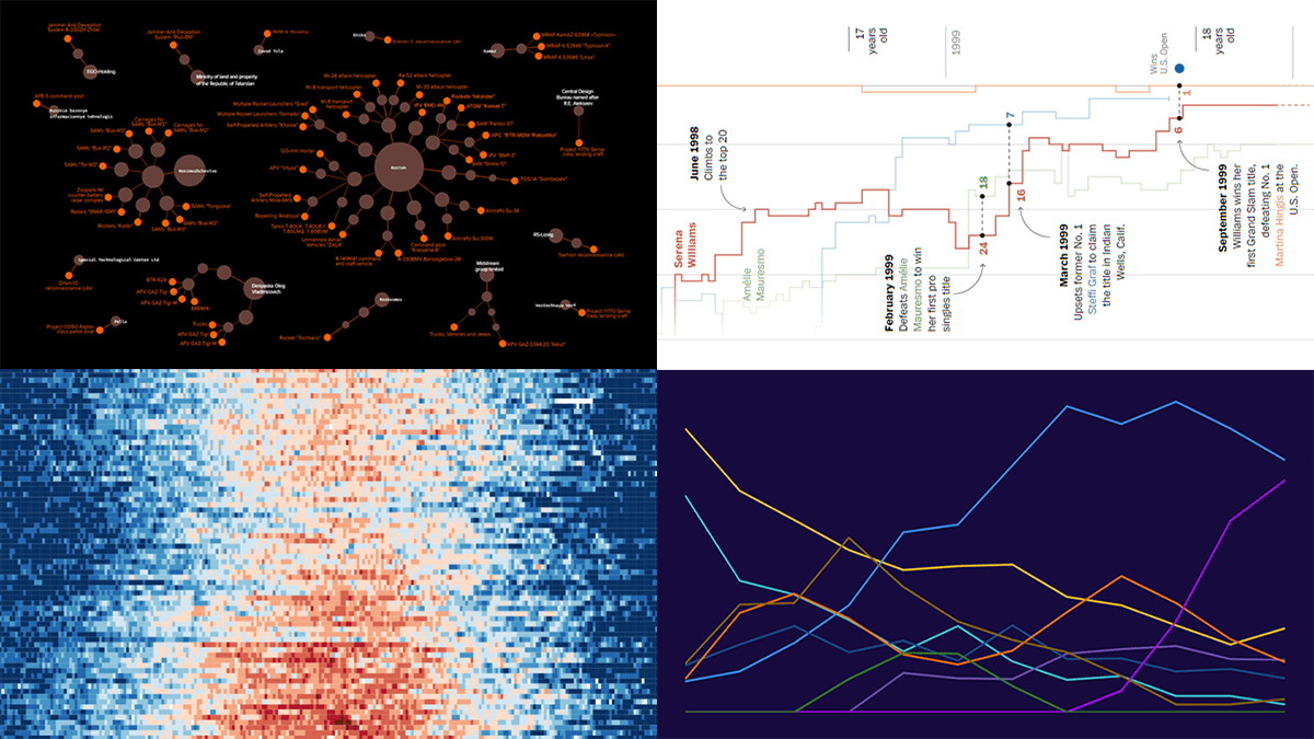 DataViz Weekly is back with a quick look at some of the most interesting new examples of charts that enable effective visual data exploration. Here are the projects featured this time:
- Producers of Russian military equipment — Texty
- Wins, losses, and comebacks in Serena Williams’s professional tennis career — The Washington Post
- Tropical nights in Spain over the decades — elDiario.es
- Platform origins of viral memes — Know Your Meme
- Categories: Data Visualization Weekly
- No Comments »
Creating Circle Packing Chart with JavaScript
September 8th, 2022 by Awan Shrestha A circle packing chart is a common data visualization technique for representing hierarchically organized data through nested circles. Due to the similarity to a treemap, which uses nested rectangles for the same purpose, sometimes it is called a circular treemap. Introduced to data analysis by American mathematician William Thurston in 1985, circle packings greatly reveal the hierarchical structure of data.
I want to show how you can easily build an elegant interactive circle packing chart with the help of JavaScript! In this step-by-step tutorial, we will be representing the world’s 100 wealthiest people in 2022 by country and industry, according to Forbes’ list of billionaires. So, get your packings done and get ready as your brain is going to get slightly richer!
Read the JS charting tutorial »
- Categories: AnyChart Charting Component, HTML5, JavaScript, JavaScript Chart Tutorials, Tips and Tricks
- 1 Comment »
Most Stunning Recent Data Representations — DataViz Weekly
September 2nd, 2022 by AnyChart Team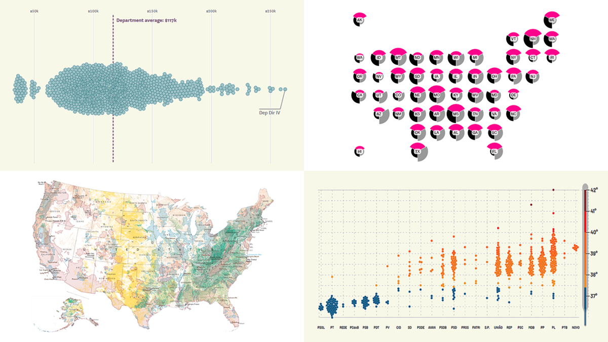 Hey y’all fans of charts and maps! It’s time for DataViz Weekly where we traditionally show you the most stunning data representations we have recently come across! See our newest picks and check them out right away:
- Salary of full-time employees in San Francisco’s government — The San Francisco Chronicle
- Vulnerability to political election interference across the United States — Bloomberg
- Brazilian federal deputies’ performance on socio-environmental issues — Repórter Brasil
- The most important places to conserve in the U.S. — National Geographic
- Categories: Data Visualization Weekly
- No Comments »
Wonderful New Data Visualizations Worth Checking Out — DataViz Weekly
August 26th, 2022 by AnyChart Team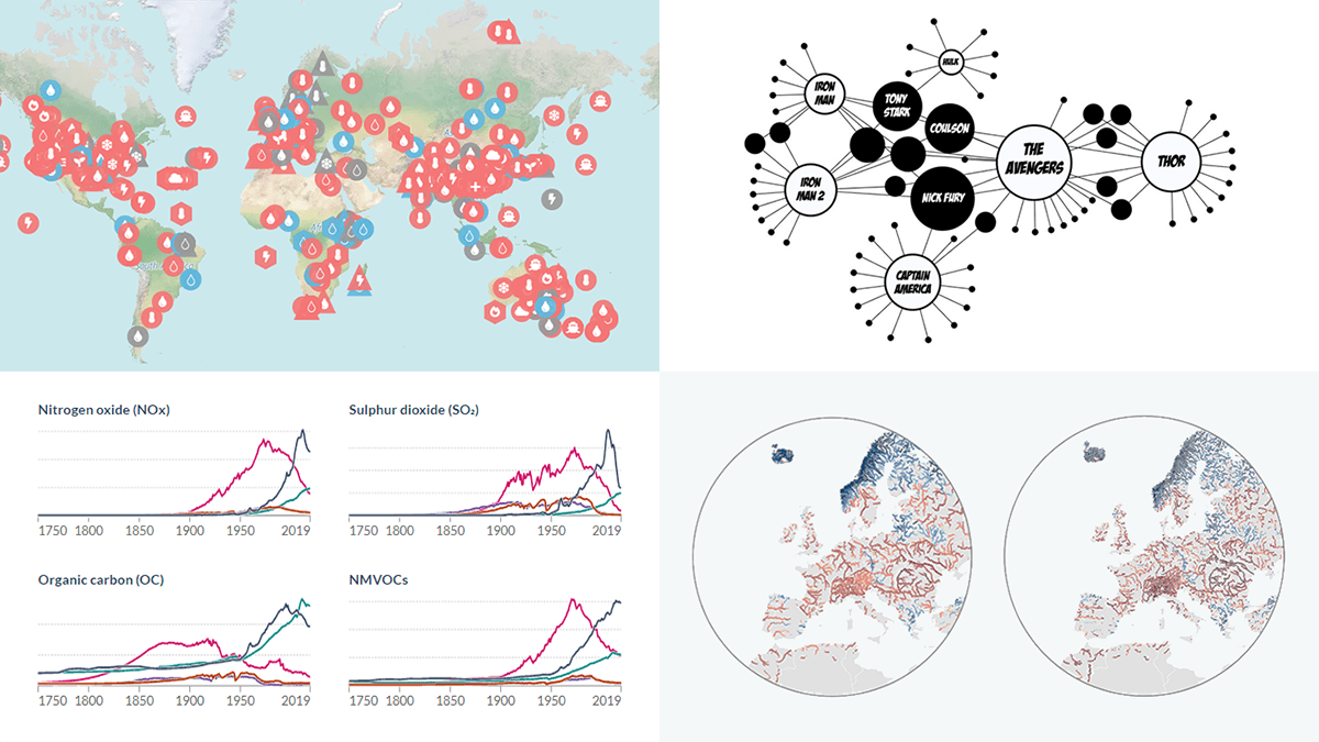 Ready to see some wonderful data visualizations? DataViz Weekly is here as always on Friday! Check out these awesome new ones:
- Extreme weather attribution to human-caused climate change — Carbon Brief
- River discharge anomaly in Europe — Dominic Royé
- Air pollution emissions by country since 1750 — Our World in Data
- Connections in the Marvel Cinematic Universe — Tristan Guillevin
- Categories: Data Visualization Weekly
- No Comments »
Visual Representations of Data in Select New Stories — DataViz Weekly
August 19th, 2022 by AnyChart Team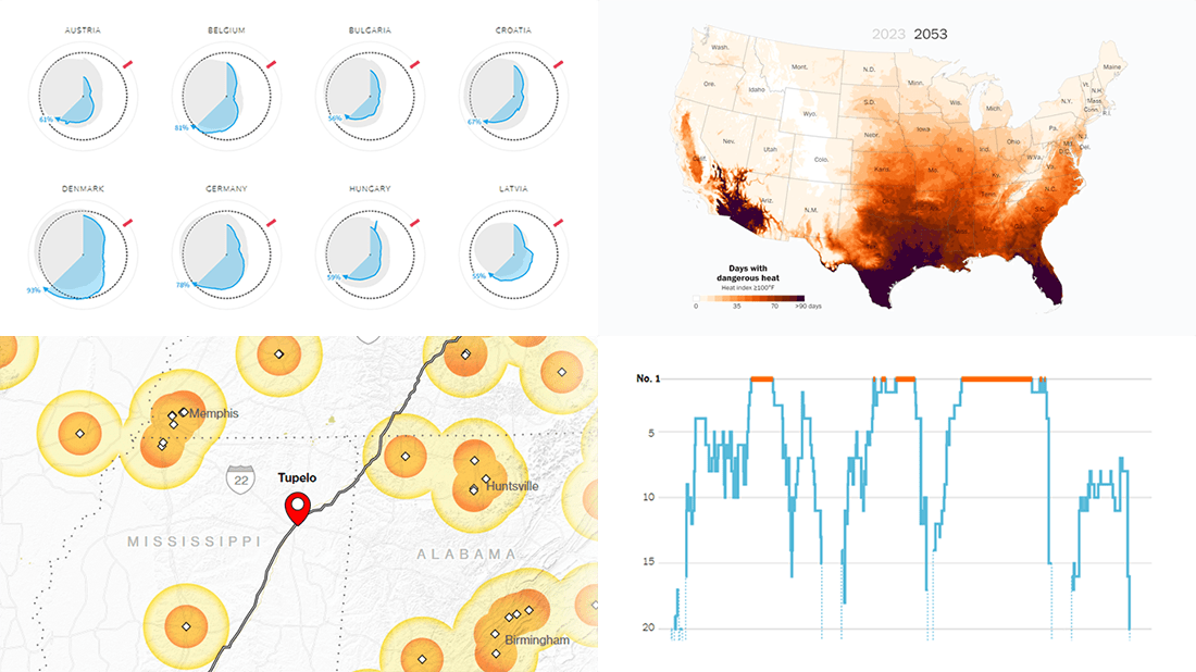 We continue to curate roundups of our favorite data graphics we see each week. Keep reading this new DataViz Weekly to check out four recent stories with cool visualizations that are totally worth a look!
- European gas storage levels — Reuters
- EV charging along popular American roads — Bloomberg
- Serena Williams’s career in tennis — The New York Times
- Perilous heat waves in the U.S. by 2053 — The Washington Post
- Categories: Data Visualization Weekly
- No Comments »
How to Create Mosaic Plot with JavaScript
August 15th, 2022 by Shachee Swadia Have you heard of a mosaic plot? It is a very interesting chart type designed to facilitate exploring relationships between variables. Mosaic plots (also known as mosaic charts) visualize data in rectangular tiles whose width encodes one variable and height the other.
If you’d like to learn how to create such an elegant diagram with ease, follow me as I will show you the ropes right now! Along this tutorial, I will be building an interactive mosaic plot of social media adoption in the United States by age group and year, using JavaScript and explaining every step in detail.
Read the JS charting tutorial »
- Categories: AnyChart Charting Component, HTML5, JavaScript, JavaScript Chart Tutorials, Tips and Tricks
- No Comments »
Exploring Formula 1 History, Recession Indicators, Migration Patterns, Heat Effects — DataViz Weekly
August 12th, 2022 by AnyChart Team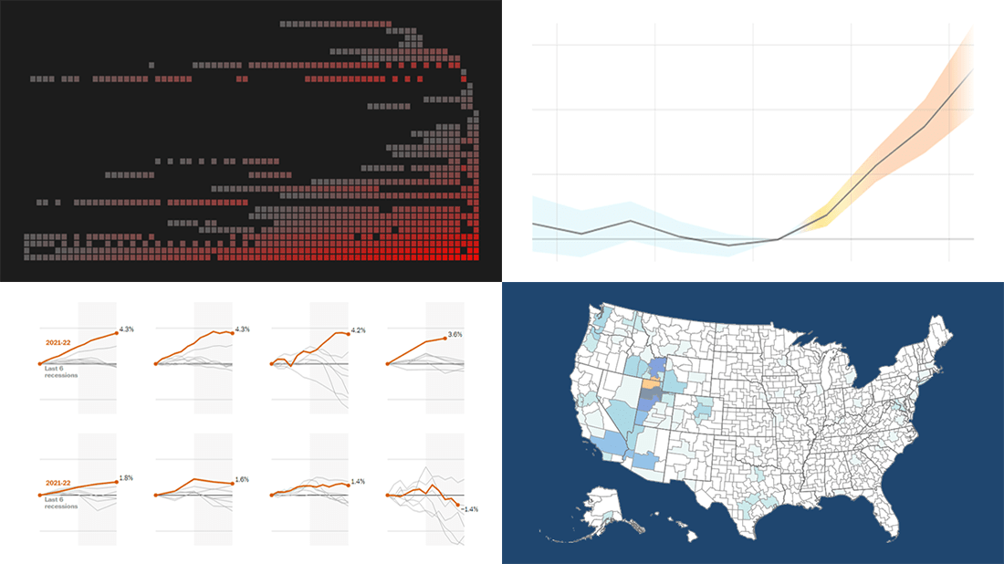 Visualizing data is an excellent way to quickly see patterns and trends hidden in it. In the DataViz Weekly series, we illuminate great fresh examples to illustrate how that works in practice. This time, we invite you to check out the following:
- 73 years of Formula One history — ATLO by Átlátszó
- Indicators of an economic recession in the U.S. — The Washington Post
- Migration patterns of young adults in the U.S. — Policy Impacts, U.S. Census Bureau, Opportunity Insights, Darkhorse Analytics
- Effects of rising temperatures outside on our daily lives — El País
- Categories: Data Visualization Weekly
- No Comments »
Bringing Data to Life with Exemplary Visualizations — DataViz Weekly
August 5th, 2022 by AnyChart Team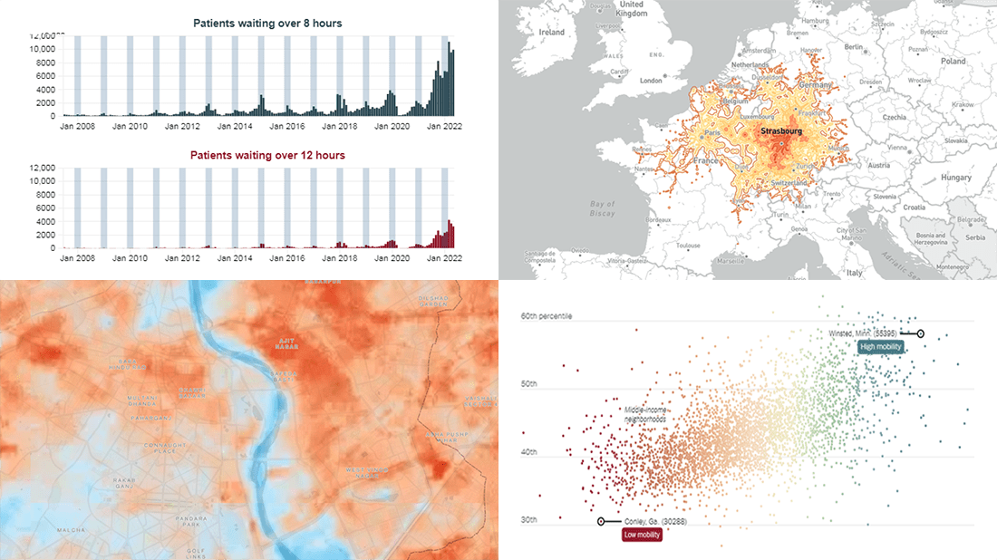 We’ve seen a lot of good new visualizations over the last week. Here are four projects with the best ones, amazing illustrations of how data can (and should) be brought to life with the right graphics. Featured today on DataViz Weekly:
- Five-hour train ride destinations in Europe — Benjamin Td
- Scotland’s NHS waiting times — DC Thomson
- Cool spots inside sweltering cities — Bloomberg Green
- Friendships between poor and rich as a factor of economic mobility — The Upshot
- Categories: Data Visualization Weekly
- No Comments »
How to Make Timeline Chart (in JavaScript)
August 4th, 2022 by Shachee Swadia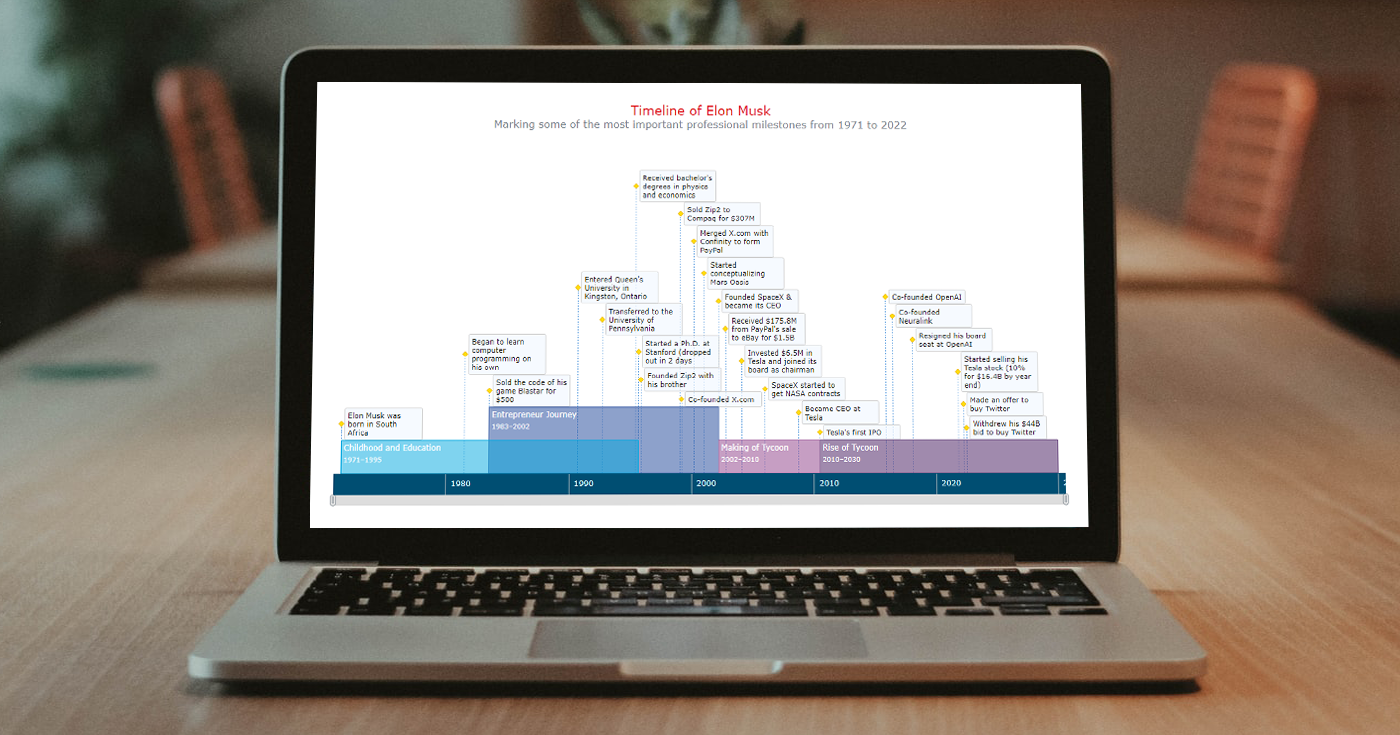 A timeline chart is an excellent way to represent important events and periods in chronological order. Now, let me teach you how to easily create an elegant interactive visualization like that using JavaScript!
To make this tutorial both helpful and entertaining, I decided to take real data. Join me as I visualize the life of Elon Musk in a JS timeline chart step by step, focusing on the most important events in his career as an entrepreneur and investor.
Read the JS charting tutorial »
- Categories: AnyChart Charting Component, HTML5, JavaScript, JavaScript Chart Tutorials, Tips and Tricks
- No Comments »