Fresh Collection of Interesting Charts & Maps — DataViz Weekly
June 10th, 2022 by AnyChart Team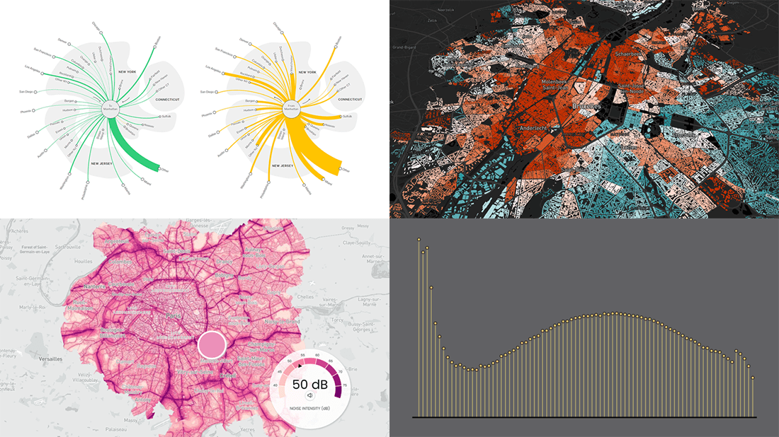 A lot of visualizations appear every day all over the web. On DataViz Weekly, we share with you those that we’ve found especially noteworthy. Check out our fresh collection of interesting charts and maps!
- Inequality and health in Brussels — Médor
- Noise pollution in Paris, London, and New York City — Possible
- Manhattan migration patterns — Bloomberg
- Commonness of divorce in the United States — FlowingData
- Categories: Data Visualization Weekly
- No Comments »
How to Make Treemap Using JS
June 8th, 2022 by Awan Shrestha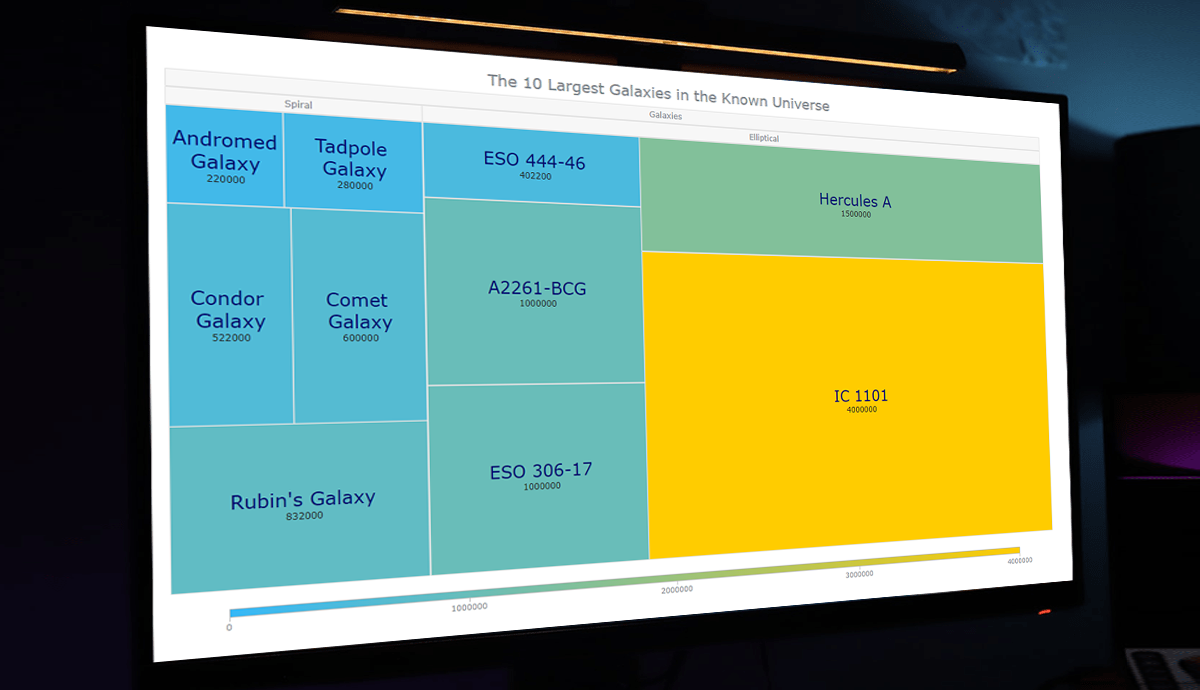 Treemap visualizations are widely used in hierarchical data analysis. If you need to build one but have never done that before, you might think the process is somewhat complicated. Well, not necessarily. I decided to make a step-by-step tutorial explaining how to create awesome interactive treemap charts with ease using JavaScript. And you’re gonna love the illustrations!
Are we alone in the universe? A question every one of us has asked ourselves at some point. While we are thinking about the odds of the Earth being the only habitable planet in the universe, or not, one of the things we might consider is how big the universe is. Let’s look at that with the help of treemaps! In this tutorial, we will be visualizing the scale of the 10 largest galaxies in the known universe using the treemapping technique.
So, would you like to know how to quickly build a JS-based treemap chart? Follow me in this stepwise tutorial and learn in an easy, fun way!
Read the JS charting tutorial »
- Categories: AnyChart Charting Component, HTML5, JavaScript, JavaScript Chart Tutorials, Tips and Tricks
- No Comments »
New Examples of Powerful Data Visualization in Action — DataViz Weekly
June 3rd, 2022 by AnyChart Team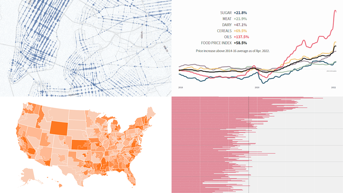 It’s Friday, and we are glad to show you four new examples demonstrating the power of data visualization in action! See what’s on DataViz Weekly today!
- Real costs of breastfeeding — The Washington Post
- Traffic violence across NYC in 2013–2021 — The New Yorker
- Global food crisis — Reuters
- Topical political issues across the U.S. in the run-up to the midterm elections — Axios
- Categories: Data Visualization Weekly
- No Comments »
Stunning Visualizations of Heat Records, Election Results, Time Splits, Air Pollution Data — DataViz Weekly
May 27th, 2022 by AnyChart Team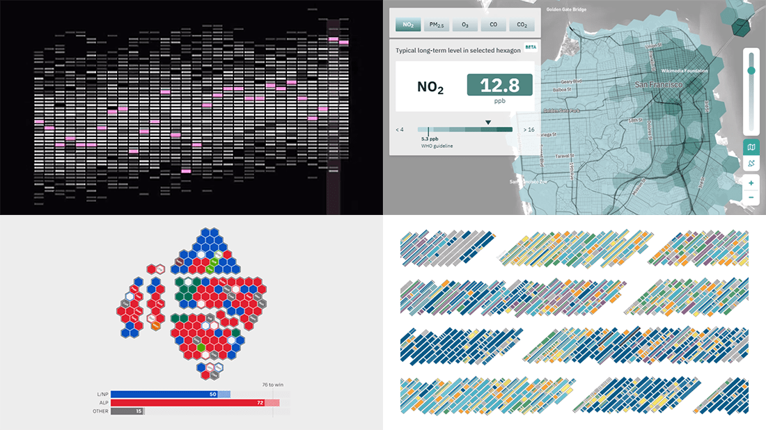 Ready for another serving of stunning data visualizations? Here you go with DataViz Weekly! Look at four projects that have caught our eyes most recently.
- Heat records in 400 U.S. cities — The Pudding
- 2022 Australian election’s unfolding and results — ABC News
- Air quality in the San Francisco Bay Area block by block — Aclima
- Data visualization project time splits by activity — Eli Holder on Nightingale
- Categories: Data Visualization Weekly
- No Comments »
How to Create Sankey Diagram (with JavaScript)
May 25th, 2022 by Shachee Swadia Would you like to learn how to quickly create a really cool chart called a Sankey diagram? You’re in the right place! Together, we will build an elegant Sankey chart using JavaScript, and then you’ll be able to produce such data visualizations by yourself with no hassle at all.
Depicting the flow of values from one set to another, Sankey diagrams are ideal when you need to graphically represent a many-to-many mapping between two domains or multiple paths through a number of stages. So, competence in making them will be a great addition to the skill set of anyone dealing with data visualization design and development.
110 years after it sank on April 15, 1912, the Titanic still holds us in its thrall, piquing people’s imagination. Now, we will use the JS Sankey diagramming technique to look at its passengers and crew and find out who survived and perished based on gender, age, and ticket class. Follow along!
Read the JS charting tutorial »
- Categories: AnyChart Charting Component, HTML5, JavaScript, JavaScript Chart Tutorials, Tips and Tricks
- No Comments »
Impressive Data Visualization Projects to Check Out — DataViz Weekly
May 20th, 2022 by AnyChart Team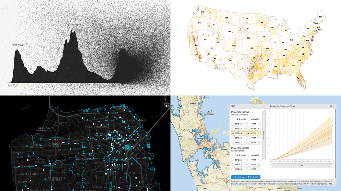 DataViz Weekly welcomes you! Check out four new data visualization projects that have impressed us the most during the last seven days!
- America’s path to one million COVID-19 deaths — The New York Times
- Flooding and wildfire risks for properties across the U.S. — First Street Foundation
- Sea level rise along New Zealand’s coast — NZ SeaRise
- Traffic fatalities in San Francisco — Stephen Braitsch
- Categories: Data Visualization Weekly
- No Comments »
Visualizing Abortion Data & Impact of Overturning Roe v. Wade — DataViz Weekly
May 13th, 2022 by AnyChart Team A leaked draft of a U.S. Supreme Court opinion suggests that the 1973 Roe v. Wade decision, establishing federal constitutional protection of abortion rights, could be overturned. If the justices strike down the ruling, each state will be able to determine the legality of abortions.
The document, which was later confirmed to be authentic, cast abortion rights back into the center of the political discourse in the United States. In the wake of that, we decided to make a special edition of DataViz Weekly to show you how some of the top publications — The Washington Post, Bloomberg, Reuters, and FiveThirtyEight — used data visualization to communicate the situation with abortions in the country and what is likely to change if the Supreme Court eventually overturns Roe.
- Categories: Data Visualization Weekly
- No Comments »
Building Area Chart with JavaScript
May 12th, 2022 by Awan Shrestha If you are into data visualization, one of the things that you might often need to do is represent a variable’s values over time. Or, you might need to compare multiple datasets in terms of how they are changing during a certain period. This is where area charts can be helpful.
Not sure how to build an elegant area chart? Now you will master a really easy way! In this step-by-step tutorial, we will be visualizing data on the military budgets of the USA and Russia over the past two decades in interactive area charts using JavaScript. All aboard!
Read the JS charting tutorial »
- Categories: AnyChart Charting Component, HTML5, JavaScript, JavaScript Chart Tutorials, Tips and Tricks
- No Comments »
Visualizing Data on F1, Indian Ocean, Oreo, Conflicts in Legal Amazon — DataViz Weekly
May 6th, 2022 by AnyChart Team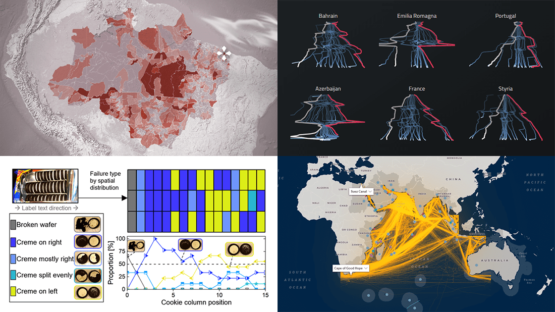 If you like good charts and maps, DataViz Weekly is your must-see destination! This series is designed to show you some of the most awesome data visualizations, and here are the new projects that we believe you wouldn’t like to miss:
- 2021 Formula One racing season — Joey Cherdarchuk
- Strategic importance of the Indian Ocean — Carnegie Endowment for International Peace
- Flow and fracture of the Oreo sandwich cookies — Crystal Owens, Max Fan, John Hart & Gareth McKinley (MIT)
- Rural conflicts in Brazil’s Legal Amazon — Agência Pública & CPT
- Categories: Data Visualization Weekly
- No Comments »
New Must-See Data Visualizations Around Internet — DataViz Weekly
April 29th, 2022 by AnyChart Team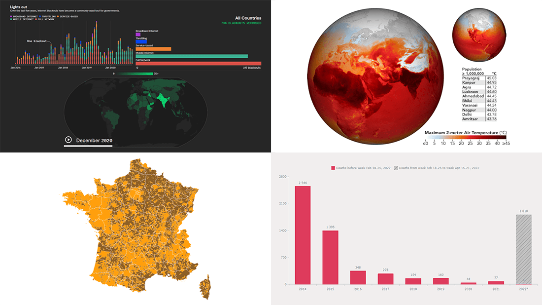 Now it’s time for DataViz Weekly! Let’s look at the four most interesting new data visualization projects we have recently come across!
- Deaths in the (self-proclaimed) DPR in 2014–2022 — Reddit user feoleoneo
- French presidential election results — Le Monde
- Internet blackouts worldwide since 2016 — Rest of World
- April heat wave in India — Joshua Stevens, NASA Earth Observatory
- Categories: Data Visualization Weekly
- No Comments »