Recognizing Most Interesting New Data Visualizations — DataViz Weekly
March 12th, 2021 by AnyChart Team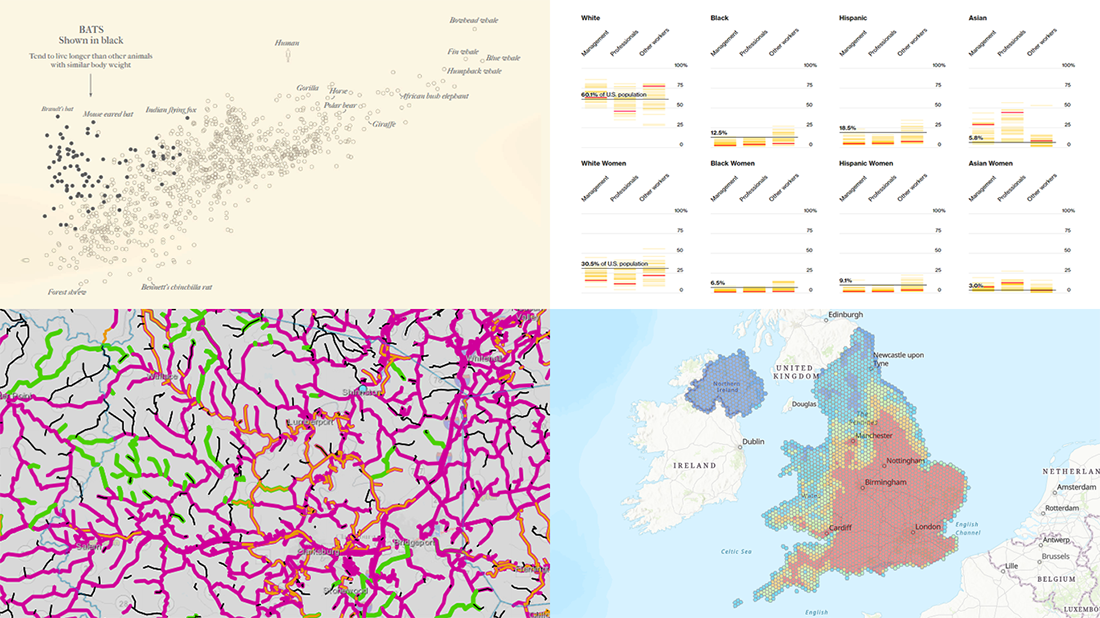 Welcome back to DataViz Weekly, our regular blog feature where we recognize some of the most interesting data visualizations we’ve recently seen out there. Here’s our new selection of stunning graphics from different people — take a look!
- Bats and the origin of virus disease outbreaks — Reuters
- Race and gender diversity within the biggest corporations in the U.S. — Bloomberg
- All roadwork projects in West Virginia for 2021 — WVDOT
- Climate threats to heritage sites in England, Wales, and Northern Ireland — National Trust
- Categories: Data Visualization Weekly
- No Comments »
Bullseye Chart and Gantt Chart Improvements in Qlik Sense Extensions by AnyChart
March 8th, 2021 by AnyChart Team
🎯 Bam! Meet Bullseye charts in Qlik Sense! Qlik counted on us to provide its customers with “additional choices for building even more compelling visualizations.” And we could not stop innovating, so Bullseye has become the 42nd chart type in AnyChart’s extensions for Qlik Sense — enjoy and hit the bull’s-eye in data-driven decision making!
Also, we have added new awesome features to our Gantt charts in Qlik Sense to help expedite actionable insights into your project data. Learn more about the highlights of the March 2021 release of the AnyChart and AnyGantt extensions in a quick overview, and download the latest version!
Read more at qlik.anychart.com »
- Categories: AnyChart Charting Component, AnyGantt, Big Data, Business Intelligence, Gantt Chart, News, Qlik
- No Comments »
Four New Robust Visualizations to Check Out on Weekend — DataViz Weekly
March 5th, 2021 by AnyChart Team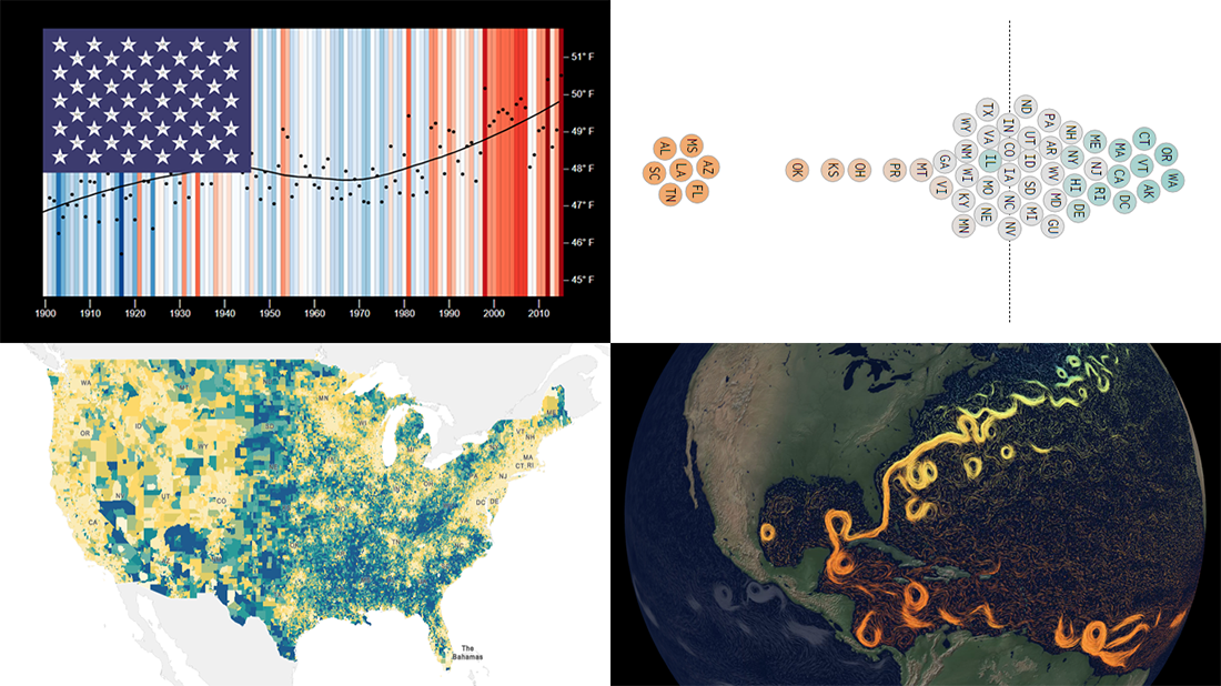 This week, we’ve found a number of new cool projects that could serve as good examples of robust data visualization. Here are the four ones we like the most. Watch how compelling charts and maps let data speak — join us as we overview these projects today on DataViz Weekly:
- Climate stripes for each U.S. state — Luke Browne, YSE
- Causes and dangers of the Gulf Stream weakening — The New York Times
- Minimum wage change in the U.S. by state since 1968 — Nathan Yau
- Homes worth <$100,000 and >$1,000,000 in the U.S. — Social Explorer
- Categories: Data Visualization Weekly
- No Comments »
How to Create Diverging Bar Chart with JavaScript
March 2nd, 2021 by Shachee Swadia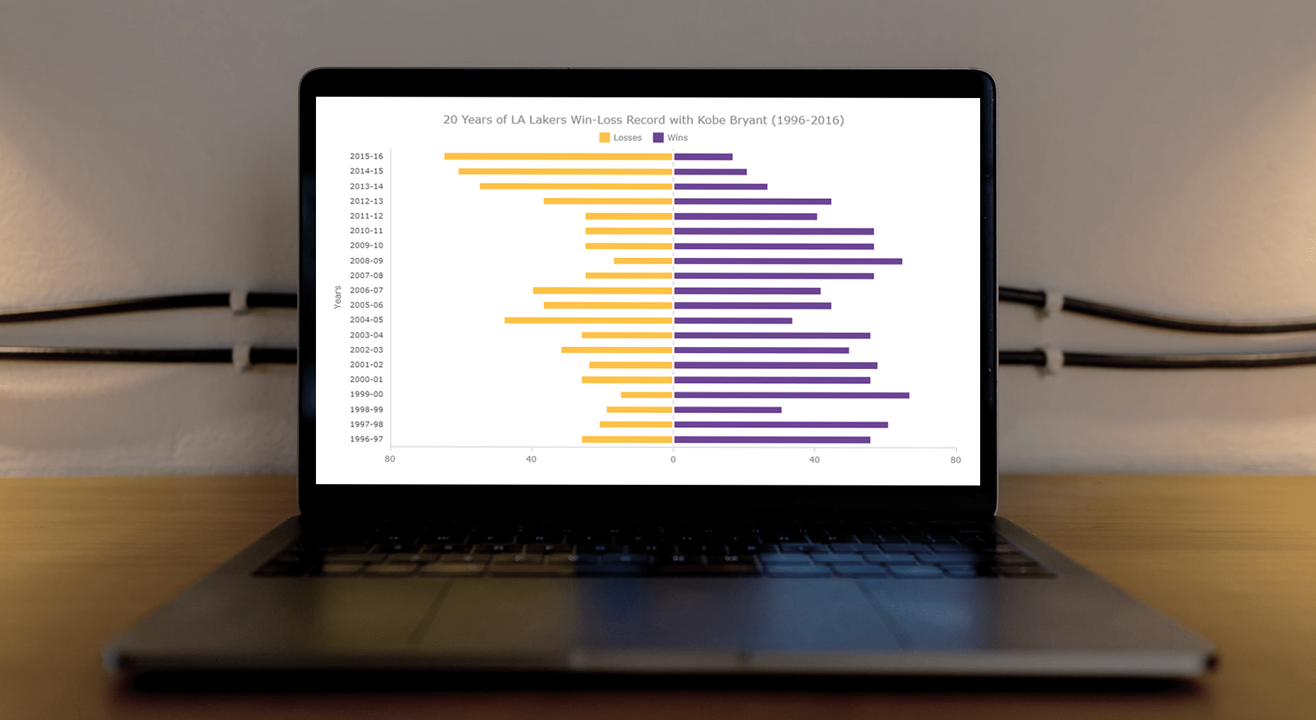 This article is a step-by-step guide that’ll show you how to build an interactive JavaScript range chart that visualizes 20 years of the LA Lakers’ performance with Kobe Bryant.
The year 2020 was pretty poignant for obvious reasons. But even before the pandemic, the year started on a sad note with the death of basketball legend Kobe Bryant. He was a star NBA athlete who had played for 20 years with one and only one team — the Los Angeles Lakers.
Remembering Kobe one year after that horrible crash, I wondered how the Lakers had performed in his two-decade era. So, I visualized that in an interactive Diverging Bar Chart with the help of pure JavaScript.
Thinking that this project might be helpful for those new to web charting, I also logged the entire process and made a tutorial. Check it out!
Read the JS charting tutorial »
- Categories: AnyChart Charting Component, HTML5, JavaScript, JavaScript Chart Tutorials, Tips and Tricks
- No Comments »
Attacks on Press, COVID-19 Deaths, Infection Simulation, and U.S. Election — DataViz Weekly
February 26th, 2021 by AnyChart Team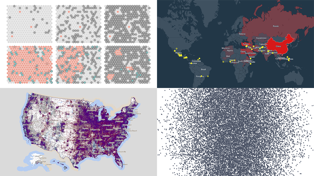 Hey everyone, Friday’s here and with it, a new DataViz Weekly article is out! Look at some of the best data visualization projects we have come across out there this week:
- Exploring all attacks on journalists worldwide in 2020 — Geoff McGhee for CPJ
- Visualizing the scale of 500,000 COVID-19 deaths in the United States — Sam Hart, Reuters
- Simulating the spread of infection for different immunity scenarios — Thomas Wilburn, NPR
- Mapping every vote in the 2020 U.S. election — Kenneth Field
- Categories: Data Visualization Weekly
- No Comments »
Visualizing Information on Coronavirus, MiLB Teams, and Providence Buildings — DataViz Weekly
February 19th, 2021 by AnyChart Team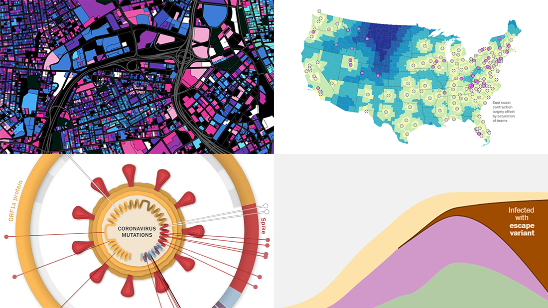 For us humans, data is usually easier to explore and analyze when it’s properly visualized. If you are looking for some good examples, you’ve come to the right place at the right time! DataViz Weekly is here to let you know about new great information visualizations.
Today on DataViz Weekly:
- Coronavirus vaccination pace, goals, and challenge — The Washington Post
- Coronavirus mutations and variants — The New York Times
- Distance to the nearest MiLB team in 2021 — Axios
- Age of buildings in Providence, RI — Chris Sarli
- Categories: Data Visualization Weekly
- 1 Comment »
How to Build Pareto Chart in JavaScript
February 16th, 2021 by Dilhani Withanage Creating a Pareto chart with JavaScript for HTML5 apps and websites is not a complicated or hectic development process at all. Get hands-on experience with this tutorial and you will find data visualization in such a form joyful and exciting!
Before we start, let’s remember how Pareto charts look and what their purpose is, just to make sure we are on the same page. A Pareto chart, also a Pareto diagram, is a combination of vertical bars (columns) and a line graph. Columns are used to depict values and are displayed in descending order, left to right. The line in a Pareto chart shows the cumulative total in percentages. Such a visualization helps data scientists and analysts quickly identify the most important among a set of factors, i.e. those characterized by the largest values and therefore making the most significant contribution to the total across all the represented factors.
In this JS Pareto chart tutorial, we’ll be visualizing statistics for the leading causes of death in the United States in 2019 and find out what claimed the most American lives during that year according to official data.
Now let’s move to JavaScript charting, and more precisely, building an interactive Pareto chart using JS!
Read the JS charting tutorial »
- Categories: AnyChart Charting Component, Big Data, HTML5, JavaScript, JavaScript Chart Tutorials, Tips and Tricks
- No Comments »
Interesting Data Visualization Projects to Look at and Learn from — DataViz Weekly
February 12th, 2021 by AnyChart Team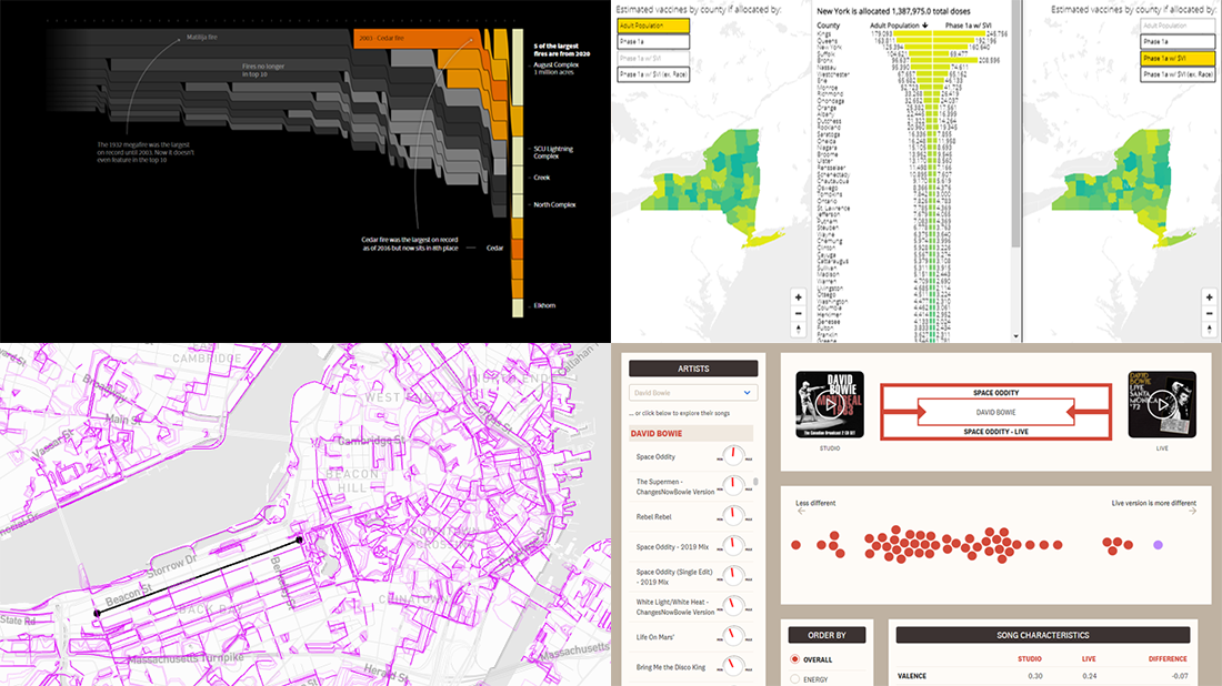 “Numbers have an important story to tell. They rely on you to give them a clear and convincing voice,” Stephen Few once said. That actually is the purpose of data visualization. On DataViz Weekly, we show you how this works in reality. Welcome to our new roundup of the most interesting data visualization projects we’ve recently found!
- Comparing live and studio versions of songs — The Pudding
- Historical wildfires in the U.S. West — Reuters
- Boston’s most desirable streets — MIT Senseable City Lab
- Inequality and COVID-19 vaccine allocation in America — GHJP Yale & C4SR Columbia
- Categories: Data Visualization Weekly
- No Comments »
Four New Awesome Data Visualization Examples for Inspiration — DataViz Weekly
February 5th, 2021 by AnyChart Team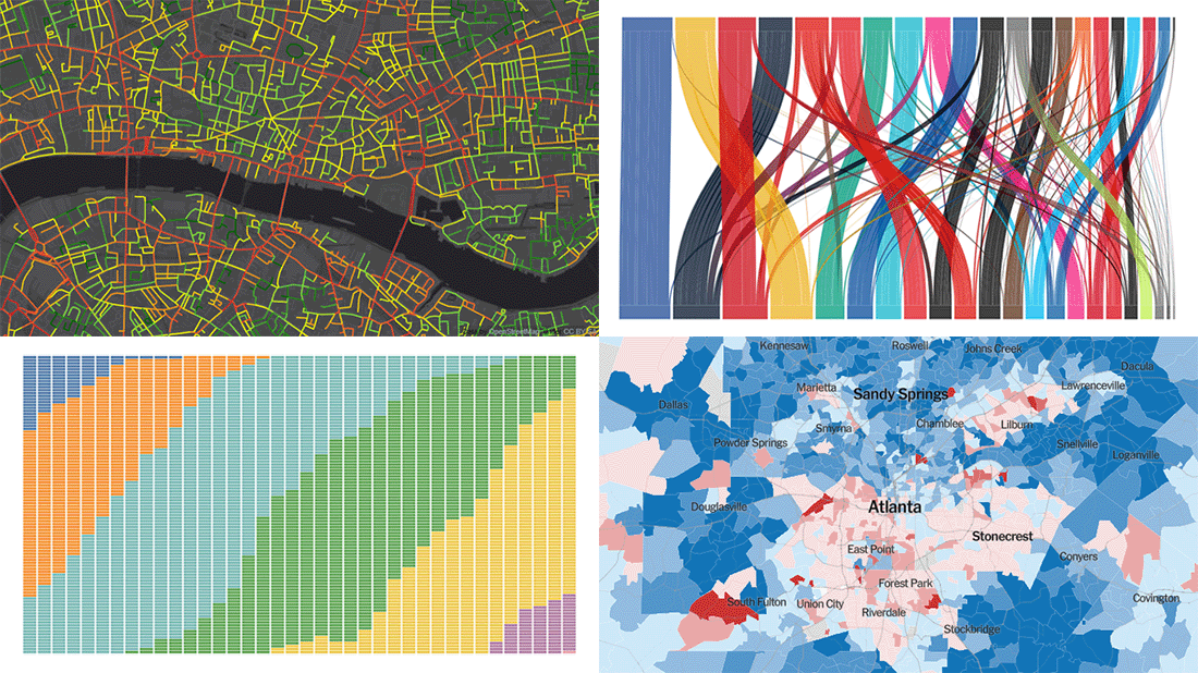 Data visualization is our passion and we are glad to high-five all who share it! Welcome to DataViz Weekly! For all of you guys, we have curated another four new awesome interactive data visualization projects worth checking out. Glance at their list below and then take a closer look:
- WorldTour transfers during the 2020-2021 offseason — Carrie Bennette
- Precinct-level map of the 2020 U.S. election — The Upshot
- Representation of age generations in the U.S. Senate over time — wcd.fyi
- Healthy Streets Index for London — _STREETS
- Categories: Data Visualization Weekly
- No Comments »
Creating JavaScript Angular Gauge
February 3rd, 2021 by Shachee Swadia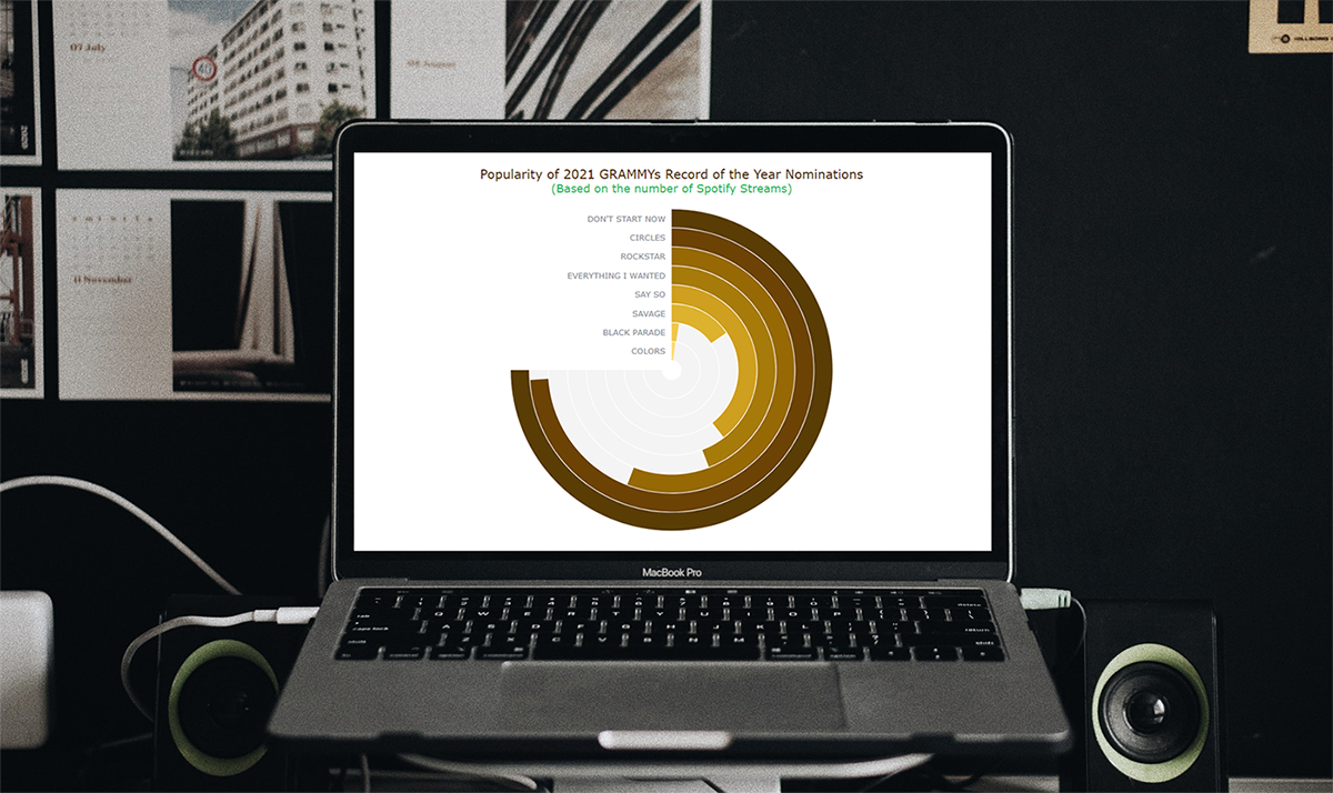 Would you like to add another really cool and interesting chart to your data visualization portfolio? Follow this simple tutorial and you’ll learn how to create a beautiful and interactive Angular Gauge using JavaScript, with ease!
An Angular Gauge, also known as a Circular Gauge, is a type of gauge chart with a radial scale. Such visualizations can nicely show a value within a range and are widely used in various dashboards.
The recent good news of vaccines feels like music to our ears. So, I thought why not take some interesting music data for visualization in this tutorial! The 63rd annual Grammy Awards ceremony will be held in March 2021, and when I looked through the list of the Record of the Year nominees, I wondered how popular each of these songs is. To find out, I decided to look at the number of their streams on Spotify, one of the world’s leading music streaming platforms, and thought that a Solid Angular Gauge could work well in such a visual analysis. It also resembles a vinyl record, which makes it an especially interesting chart type to opt for when representing such data!
So, along the tutorial, I will be visualizing Spotify stream counts for each 2021 GRAMMYs Record of the Year nominee song in a JS Angular Gauge chart. That is going to be entertaining! All aboard!
Read the JS charting tutorial »
- Categories: AnyChart Charting Component, HTML5, JavaScript, JavaScript Chart Tutorials, Tips and Tricks
- No Comments »