4 Great Examples of Data Visualization in Action — DataViz Weekly
August 28th, 2020 by AnyChart Team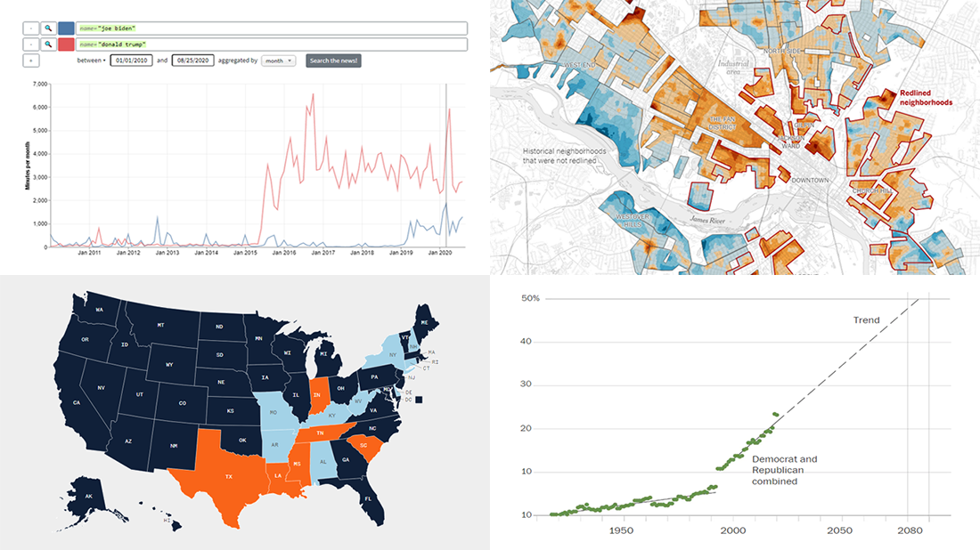 We’ve curated another four great examples of data visualization in action. Would you like to learn about them and check them out right now? Wait no longer! Below is a list of the projects highlighted in the new DataViz Weekly — just give it a glance and go ahead!
- Exploring a link between racism in the housing policy and hotter neighborhoods — The New York Times
- Analyzing the content of cable TV news — Stanford University
- Tracking gender inequality in American politics — The Washington Post
- Summarizing voting rules for the 2020 U.S. election by state — NBC News
- Categories: Data Visualization Weekly
- No Comments »
New Great Charts and Maps for Data Visualization Addicts — DataViz Weekly
August 21st, 2020 by AnyChart Team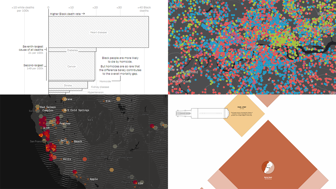 DataViz Weekly is here with a new dose of awesome charts and maps for all data visualization addicts! Today, we are putting a spotlight on the following projects where data is allowed to speak with the help of graphics:
- Stop and search incidents in London — Esri UK Education
- California wildfires — Los Angeles Times
- Scale of the Beirut explosion — Reuters
- Mortality rates for Black and White Americans — New York Times Opinion
- Categories: Data Visualization Weekly
- No Comments »
New Information Visualization Projects Not to Be Missed — DataViz Weekly
August 14th, 2020 by AnyChart Team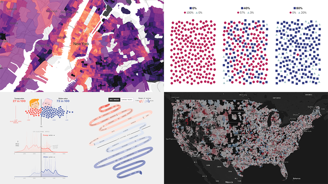 Look at these new cool information visualization projects and notice how different techniques help explore and communicate data, in practice.
Today in DataViz Weekly:
- FiveThirtyEight’s 2020 U.S. presidential election model — FiveThirtyEight
- Herd immunity simulations — The Washington Post
- Unemployment in the United States at the census tract level — The Upshot
- Home prices in America — Realbloc
- Categories: Data Visualization Weekly
- No Comments »
Impressive Charts on Age, Energy, Climate, and Music — DataViz Weekly
August 7th, 2020 by AnyChart Team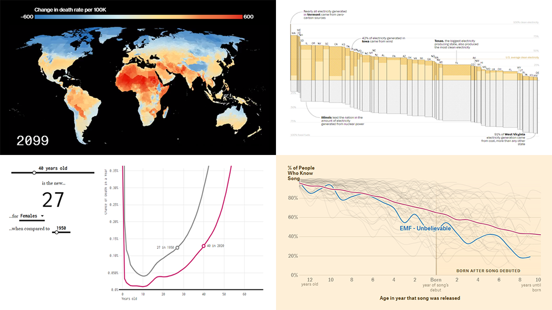 Lately, we’ve come across a lot of new impressive charts all over the internet. Here are some of the most interesting ones — check them out and you’ll see the real power of data visualization in action! Today in DataViz Weekly:
- New age for your age — FlowingData
- Electricity generation in the U.S. states by fuel source — The Washington Post
- Mortality consequences of climate change and income inequality — Bloomberg Green
- 1990s music recognition across generations — The Pudding
- Categories: Data Visualization Weekly
- No Comments »
Connecting MySQL Database to JS Chart Using PHP
August 4th, 2020 by Wayde Herman When using a charting library like AnyChart, which makes visualizing data so quick and easy, often the most challenging step for beginners is loading data. I think this is largely a result of the fact that while the ways we output the data are quite similar, the input data is commonly very different. The data may differ in many ways including the number of features in the dataset, what type these features may be, the format of the data, and how the data is stored. It is this final issue which we will be addressing today.
There is a lot of coverage in the documentation of using a data object declared within the code as well as importing your data from a file using AnyChart’s data loader. But what about importing the data from an SQL database? This is an easily done but often misunderstood approach to handling and loading data for data visualizations.
Unfortunately, it is not possible to use JavaScript to query a database because JavaScript is a client side solution and querying a database requires a server side approach due to security concerns — you just can’t store database login and password in your JavaScript code. There are many workarounds for this problem including approaches involving PHP, Ajax, Node.js, and many more. Today we will focus on using PHP to handle this task for us when our data is stored in MySQL.
In this tutorial, we will be covering how to query a MySQL database using PHP. We will describe the steps involved and reveal that it is in fact not challenging at all, just different!
- Categories: AnyChart Charting Component, AnyGantt, AnyMap, AnyStock, HTML5, JavaScript, JavaScript Chart Tutorials, Tips and Tricks
- 2 Comments »
Plotting Data on Park Soundscapes, $600 Unemployment, COVID-19 Deaths, and Game of Thrones Battles — DataViz Weekly
July 31st, 2020 by AnyChart Team There are many ways of plotting data. Which one to choose in your case? The answer depends, of course, on what kind of data you need to analyze and what questions you want it to answer. In DataViz Weekly, we meet you with some of the best practices on a regular basis. The only thing that unites them is, all the highlighted projects have been launched in public just about now. So here are the new great examples and inspirations:
- Changing soundscapes of urban parks worldwide — MIT Senseable City Lab
- Extra $600 unemployment benefits in America — The New York Times
- COVID-19 deaths in Brazil (as if all of them happened in one neighborhood) — Agência Lupa & Google News Initiative
- Game of Thrones battles in a network graph — Wayde Herman
- Categories: Data Visualization Weekly
- No Comments »
Good Charts That Let Data Speak — DataViz Weekly
July 24th, 2020 by AnyChart Team Good charts let data speak, providing insight, revealing patterns and trends, and telling stories. Look at new projects featuring graphics like that, from data visualization professionals!
- Physical traits defining men and women in literature — The Pudding
- Remote work dividing America — Reuters
- Racial disparities in unemployment in America — ProPublica
- Ageing indicators across the United Kingdom — ONS
- Categories: Data Visualization Weekly
- No Comments »
How to Create JavaScript Network Graph
July 22nd, 2020 by Wayde Herman Network graphs are a special, very interesting form of data visualization. Unlike more traditional chart types like bar graphs or pie charts, a network graph does a bit more than visualize numerical data. With these charts, you represent each object as a point, referred to as a node, and the connections between the objects as a line, referred to as either a link or an edge. Here, we do not focus on representing objects with the same precision we are typically used to. Instead, we are trying to discover relationships in a network or sections of a network and are less worried about individual nodes.
Right now, I will guide you through how to develop an interactive network graph for the web using JavaScript (HTML5). Inspired by one fun visualization created by Ben Sullins, I decided to take data about the last decade’s biggest TV series, Game of Thrones. It is an epic fantasy tale revolving around the quabbles of various faction-like houses. So in this tutorial, I will be visualizing the relationships in the world of Game of Thrones by showing who attacked whom. Follow me, it’s going to be a cool adventure!
Read the JS charting tutorial »
- Categories: AnyChart Charting Component, HTML5, JavaScript, JavaScript Chart Tutorials, Tips and Tricks
- 7 Comments »
Curating New Interesting Data Visualizations Worth Checking Out — DataViz Weekly
July 17th, 2020 by AnyChart Team We continue to curate new interesting data visualizations from around the web for our DataViz Weekly blog. Join us as we look at some of the best charts and maps we have seen these days!
- Parenting and Working During Lockdown — Nathan Yau
- Nearest Neighboring Countries — Topi Tjukanov
- Excess Deaths Worldwide — The Economist
- Reopening India from Lockdown — Development Seed and Mapbox
- Categories: Data Visualization Weekly
- No Comments »
Qlik Sense Visualization Extensions AnyChart, AnyStock and AnyGantt Updated with New Features
July 16th, 2020 by AnyChart Team A number of new powerful capabilities are now available in our extensions for Qlik Sense! The new features are designed to help speed up data analysis in the native Qlik environment, making it even more intuitive and workflows streamlined.
Read more at qlik.anychart.com »
- Categories: AnyChart Charting Component, AnyGantt, AnyStock, Big Data, Business Intelligence, Financial Charts, Gantt Chart, News, Qlik, Stock Charts
- No Comments »