New Cool Graphics From Around the Web — DataViz Weekly
July 10th, 2020 by AnyChart Team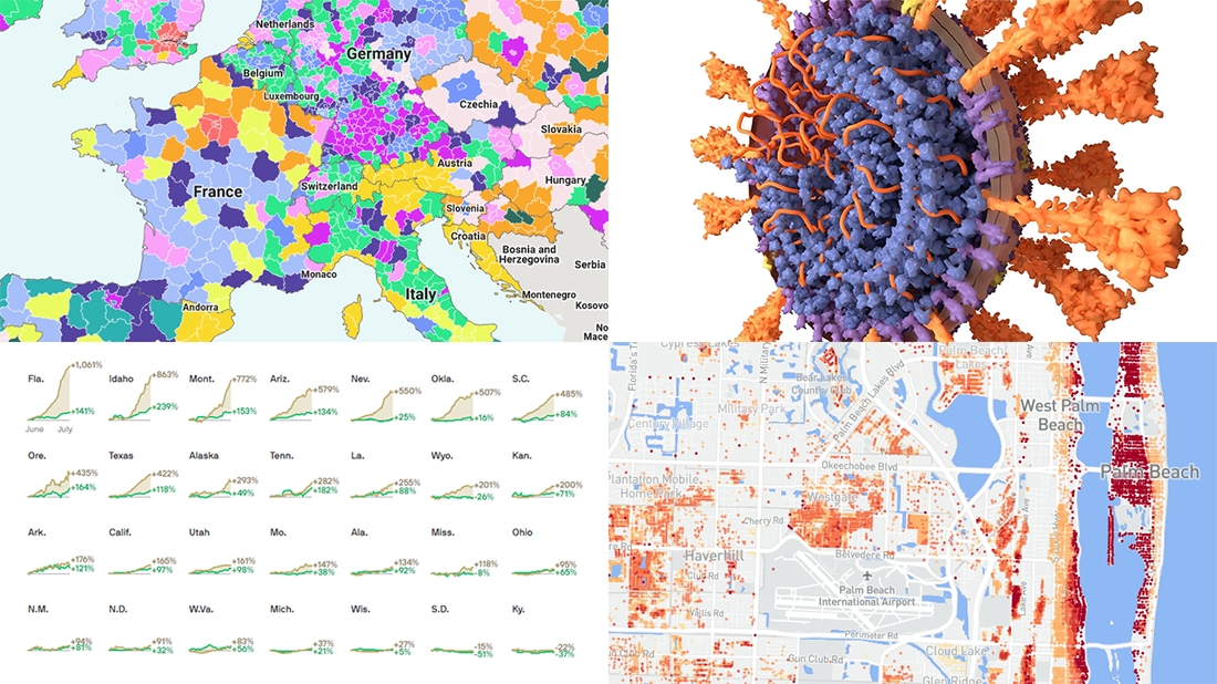 It’s Friday and we’re glad to share with you some of the most interesting third-party visualizations we’ve recently come across. Here’s what DataViz Weekly has for you to check out this time — look at these cool graphics:
- Future of jobs in the regions of Europe — McKinsey Global Institute, Google, et al.
- Flood risk factor database for the United States — First Street Foundation, et al.
- Changes in new cases against testing — Axios
- All we know about SARS-CoV-2 — Scientific American
- Categories: Data Visualization Weekly
- 1 Comment »
Building JavaScript Radar Chart
July 7th, 2020 by Wayde Herman Radar charts, which are also referred to as spider charts or radar plots, are a data visualization used to compare observations with multiple quantitative variables. Each variable is encoded to a spoke which are equidistant apart. The higher the value, the further away from the center of the chart the point is made. Radar charts are best used to compare the ‘profile’ of observations and to detect outliers within the data. They are therefore used quite a bit in sports, most notably in basketball and soccer for profiling players.
In this tutorial I will be teaching you how to build your own radar chart with JavaScript and how to use them to help with one of the toughest decisions in gaming history: which starting pokemon to choose!
That’s right, we will be building radar charts to perform data analysis on Bulbasaur, Charmander and Squirtle to determine, once and for all, which is the best choice.
Read the JS charting tutorial »
- Categories: AnyChart Charting Component, Charts and Art, HTML5, JavaScript, JavaScript Chart Tutorials, Tips and Tricks
- No Comments »
New Great Graphics from Data Visualization Experts — DataViz Weekly
July 3rd, 2020 by AnyChart Team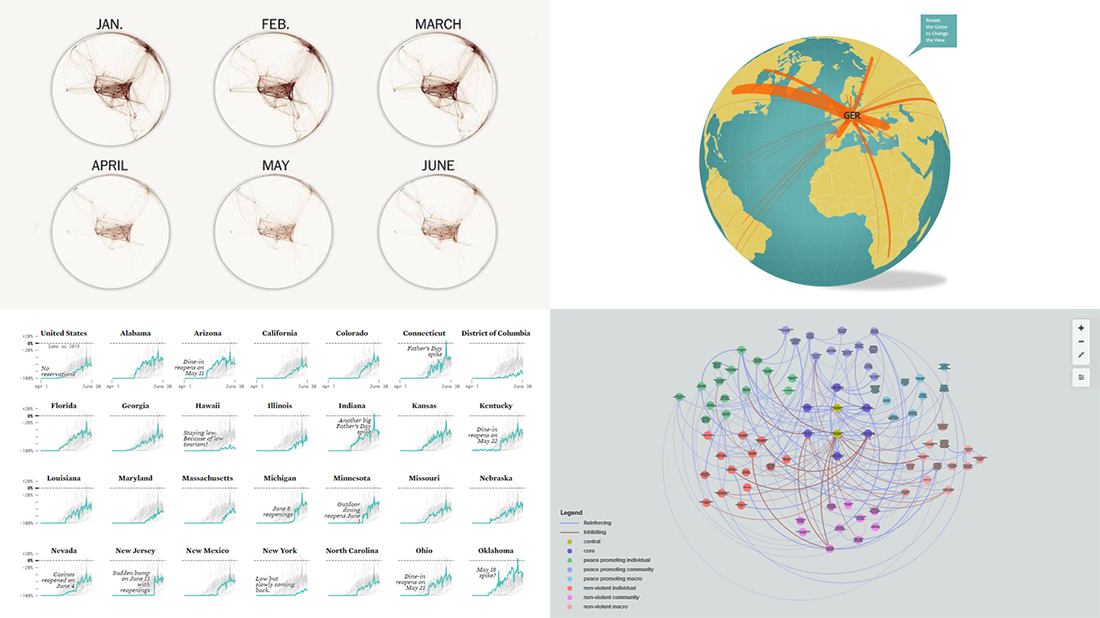 Check out new interesting graphics created by different data visualization experts and made public these days. We’ve met them around the web and decided to introduce you to them in today’s DataViz Weekly. These examples are definitely worth seeing if you like good charts and maps (as we do)!
- American Restaurant Reopenings — Nathan Yau
- Sustaining Peace Project — AC4, The Earth Institute, Columbia University
- International Migrant Stock — Nicolas Lambert and Françoise Bahoken
- Global Shutdown — Washington Post
- Categories: Data Visualization Weekly
- No Comments »
Information Visualization Techniques in Action on Democracy, Covid-19, Inequality & Gerrymandering — DataViz Weekly
June 26th, 2020 by AnyChart Team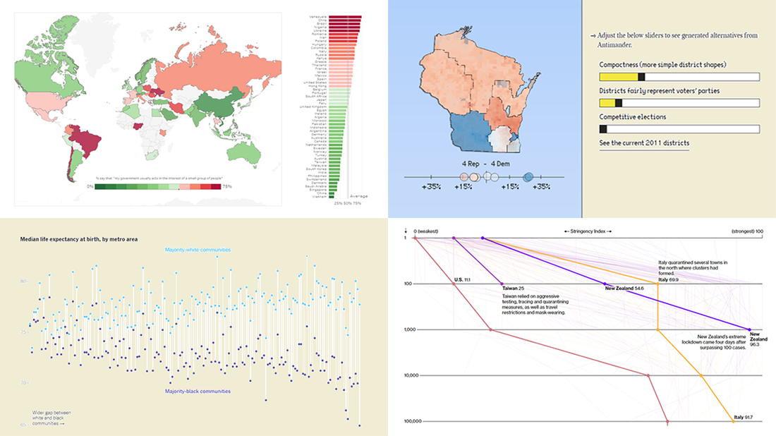 DataViz Weekly is here exhibiting new interesting projects from around the web that demonstrate a great use of different information visualization techniques to deliver better insight. See our new picks:
- Democracy Perception Index 2020 — Dalia
- Government reactions to the Covid-19 pandemic — Bloomberg News
- Gaps between Black and White America — The New York Times Opinion
- Antimander, a tool to expose gerrymandering in congressional districts — Joel Simon
- Categories: Data Visualization Weekly
- No Comments »
New Charting Best Practices Worth Looking At — DataViz Weekly
June 19th, 2020 by AnyChart Team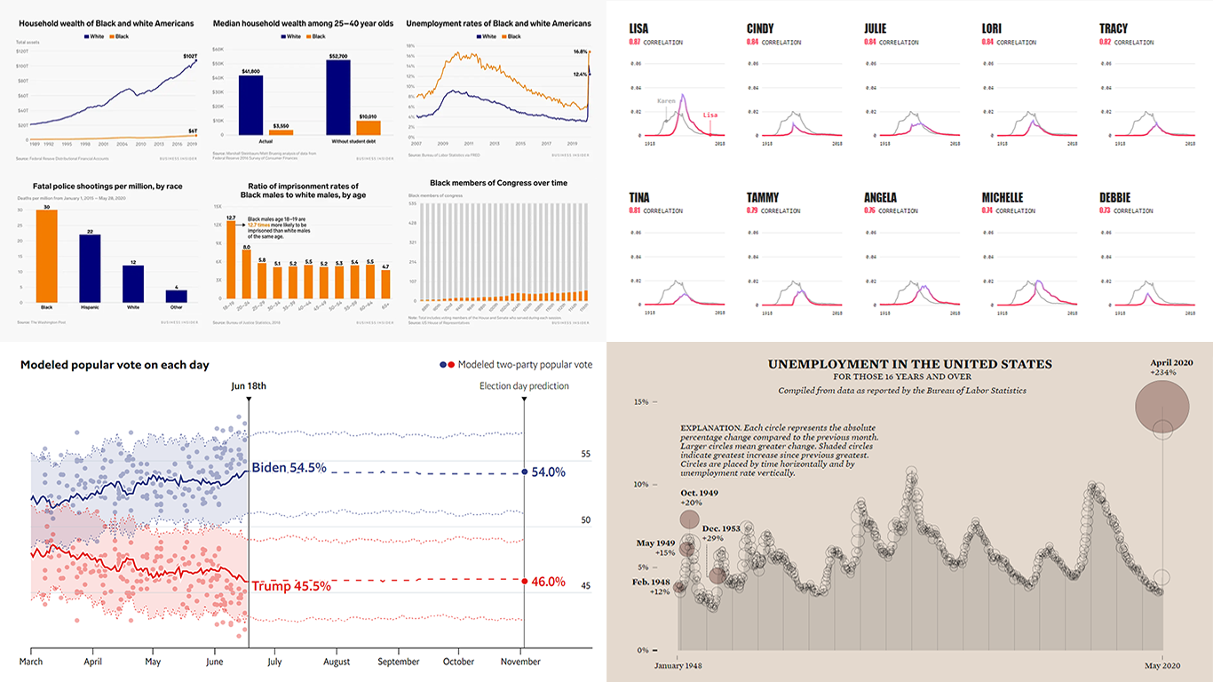 In data visualization, theory is very important but practice is absolutely everything. We continue to share with you some of the new charting best practices we’ve come across around the web so you could see what others do and keep improving. Check out how various experienced data visualization professionals make data speak and tell insightful stories, in DataViz Weekly.
Today, we are happy to meet you with the following new interesting projects:
- Black Lives Matter and racial disparities in America, in 25 charts — Business Insider
- The Economist’s forecast model for the 2020 U.S. presidential election — The Economist
- Unemployment rate in the United States since 1948 — FlowingData
- Names with a similar trajectory of popularity over time as Karen — The Pudding
- Categories: Data Visualization Weekly
- No Comments »
New Helpful Features in AnyGantt Project Management Bundle for Qlik Sense
June 16th, 2020 by AnyChart Team Just added, two new helpful features for our project management bundle for Qlik Sense! Enjoy a more precise control over the visualization of your data and make better decisions!
Read more at qlik.anychart.com »
- Categories: AnyChart Charting Component, AnyGantt, Big Data, Business Intelligence, Gantt Chart, News, Qlik
- No Comments »
New Data Graphics to Check Out This Weekend — DataViz Weekly
June 12th, 2020 by AnyChart Team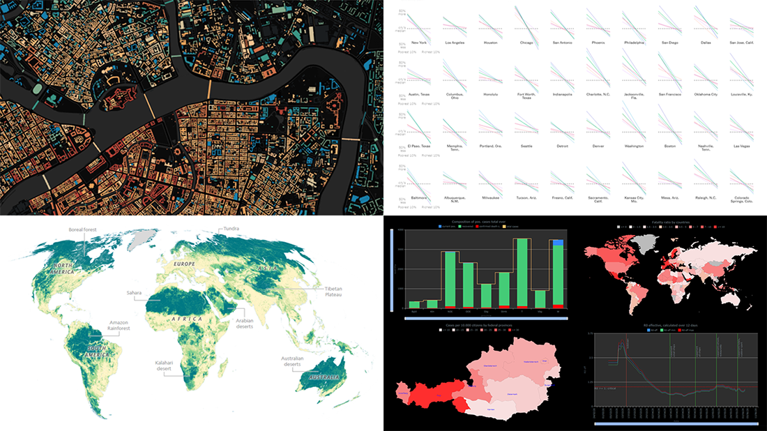 Hey everyone! Here’s DataViz Weekly with a quick presentation of four new data graphics projects that we’ve found worth checking out. Look at these stunning examples of charts and maps in action!
- Areas with the humanity’s lowest impact on the natural world — National Geographic
- COVID-19 in Austria (and worldwide) — Jürgen Höfer
- Age of buildings in Saint Petersburg (Russia) — Nikita Slavin
- Chronic health conditions by income and race — NYT
- Categories: Data Visualization Weekly
- 1 Comment »
How to Create Stacked Area Chart with JavaScript
June 10th, 2020 by Anastasia Zoumpliou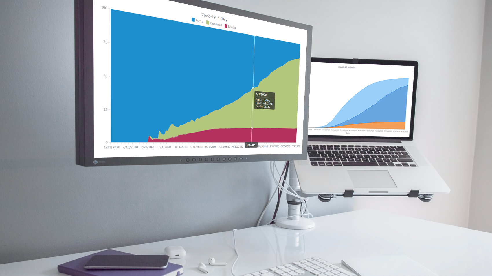 Stacked area charts, a variation of classic area charts, are quite a popular form of data visualization. They work great to graphically represent how multiple variables and their totals are changing over time. In this tutorial, I will show you how to easily create an interactive JavaScript stacked area chart which will look compelling in any HTML5 project, web site or app.
To demonstrate this way, which is quite simple to master even if you only have basic HTML coding skills, I am going to visualize official data about the outbreak of the COVID-19 pandemic in Italy. The visualizations built along the tutorial will display how the numbers of cases, recoveries, and deaths have been changing — from January 31, when the first two cases were confirmed, to yesterday, June 9, when the total number of coronavirus cases in Italy reached 235,561.
Read the JS charting tutorial »
- Categories: AnyChart Charting Component, HTML5, JavaScript, JavaScript Chart Tutorials, Tips and Tricks
- No Comments »
Visual Presentations of Data About Jobs, Simpsons, NYC and Journals — DataViz Weekly
June 5th, 2020 by AnyChart Team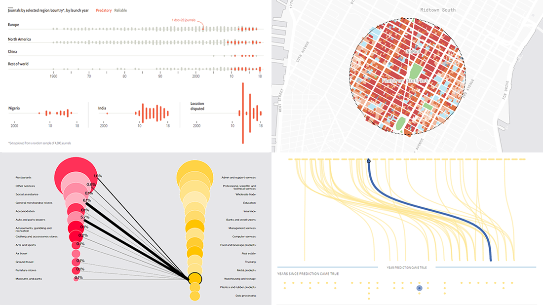 Every week, we meet a number of new visual presentations of data around the web. Then, on Friday, we pick the four most interesting of them to tell you about. The following projects made it to DataViz Weekly this time:
- Job losses in the United States, the second wave — Bloomberg
- Predictions from The Simpsons that came true — Seffana Mohamed-Ajaz
- Morphocode’s city explorer — Morphocode
- Dodgy academic journals — The Economist
- Categories: Data Visualization Weekly
- No Comments »
New Coronavirus Data Visualization Projects Worth Seeing — DataViz Weekly
May 29th, 2020 by AnyChart Team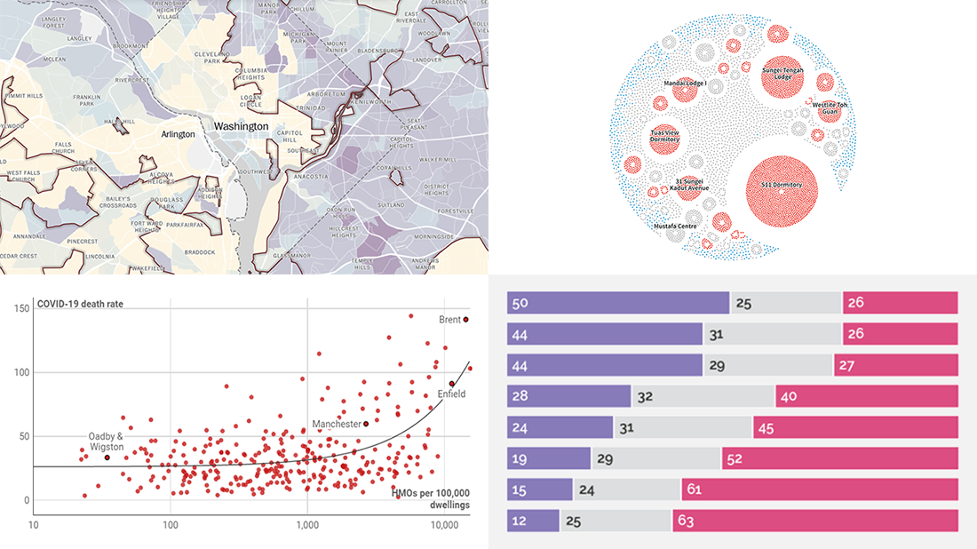
Waiting for a new serving of interesting chart examples? DataViz Weekly is here! Check out new coronavirus data visualization projects from around the web that we’ve found worth seeing:
- Anatomy of the COVID-19 outbreak in Singapore — Reuters
- Health disparities in communities of color across the United States as revealed by COVID-19 — The Washington Post
- Bill Gates coronavirus conspiracy theory in public opinion — Yahoo News
- Link between the housing crisis and COVID-19 deaths in the United Kingdom — Inside Housing
- Categories: Data Visualization Weekly
- No Comments »