Unlocking Visual Data Insights — DataViz Weekly
August 16th, 2024 by AnyChart Team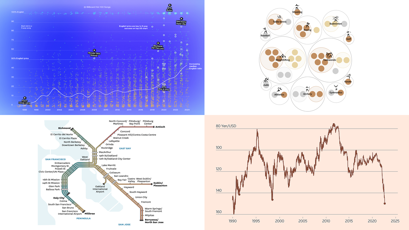 Data speaks louder when it’s represented graphically. Unlock the power of visual data insights in our new edition of DataViz Weekly, putting a spotlight on new charts and maps that make trends and patterns clear and engaging. Take a look at the projects that have stood out to us this week:
- K-pop’s global reach through internationalization — Bloomberg
- The Bay Area’s microclimates revealed through the BART network — The San Francisco Chronicle
- Taiwan’s Olympic medals — Taiwan Data Stories
- Yen fluctuations and the Bank of Japan’s influence — Reuters
- Categories: Data Visualization Weekly
- No Comments »
Paris 2024 Olympic Medal Count Trackers — DataViz Weekly
August 9th, 2024 by AnyChart Team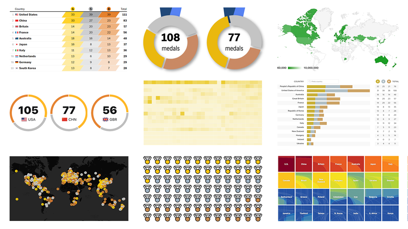 The Paris Summer Olympics are in full swing. If you’re interested in tracking the results and want to know which countries are excelling, numerous media outlets have prepared a variety of medal count trackers. In this special edition of DataViz Weekly, we showcase a selection of these projects, with a special focus on those that not only display numbers but also present them through compelling visualizations. Let’s dive in!
- Categories: Data Visualization Weekly
- No Comments »
Fresh Charts and Maps You Need to See — DataViz Weekly
August 2nd, 2024 by AnyChart Team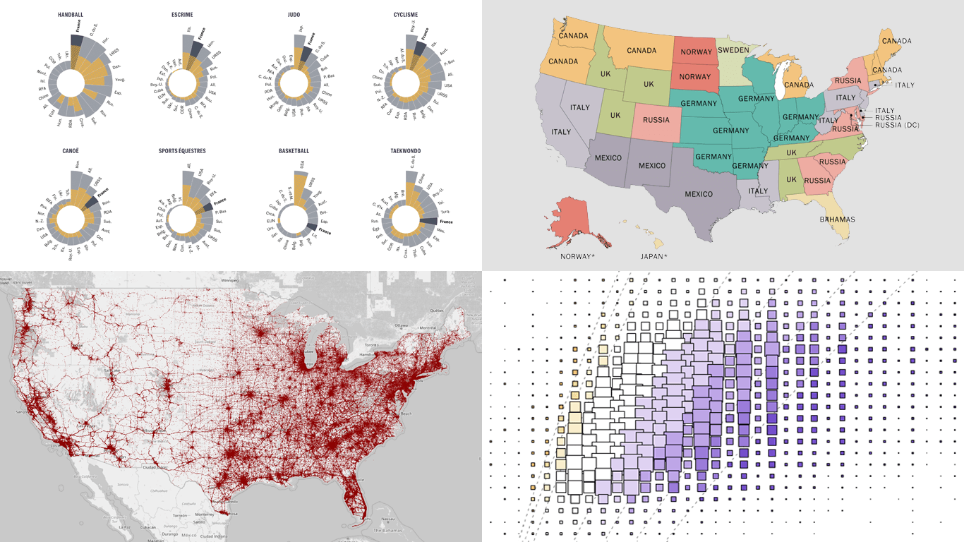 Greetings from DataViz Weekly, a feature on our blog dedicated to exploring the power of charts and maps in uncovering and communicating data. As visual creatures, humans understand and engage with information more effectively when it’s presented in graphical form. Our series focuses on highlighting outstanding and fresh data visualizations that have captured our attention. Today, we’ll showcase these great projects:
- Olympic performances since 1948 with focus on France — Le Monde
- U.S. immigrant origins and settlements in 1850–2022 — Pew Research Center
- Body mass index in the United States — FlowingData
- Traffic fatalities in the U.S. in 2001–2022 — Roadway Report
- Categories: Data Visualization Weekly
- No Comments »
Stunning New Data Visualization Examples in Our Curated Collection — DataViz Weekly
July 26th, 2024 by AnyChart Team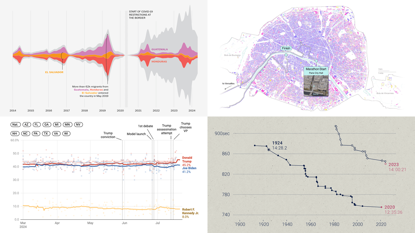 Welcome to DataViz Weekly, where we present a curated selection of stunning data visualization examples our there. Whether you’re a data professional or simply interested in visual data, these charts and maps can provide both inspiration and practical ideas. Here’s what we have for you to explore today:
- U.S. immigration patterns — WaPo
- 2024 U.S. presidential election forecast — Silver Bulletin
- Paris Olympics 100 years later — SCMP
- Extreme heat challenges at the 2024 Summer Olympics — Bloomberg Green
- Categories: Data Visualization Weekly
- No Comments »
New Data Visualization Projects Worth Checking Out — DataViz Weekly
July 19th, 2024 by AnyChart Team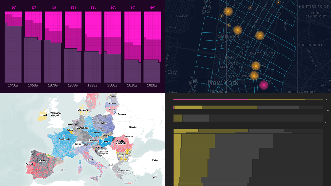 Data is easier to explore and analyze when visualized. If you’re looking for practical examples, you’ve arrived at the right place. DataViz Weekly is here to introduce you to some new data visualization projects we have found on the web.
- NYC congestion zone crash tracker — Transpo Maps
- 2024 European Parliament election map — ZEIT ONLINE
- Global hunger insights — Reuters
- Evolution of sci-fi films — The Pudding
- Categories: Data Visualization Weekly
- No Comments »
Visualizing Forecast Accuracy, College Admissions, Global Demographics, and Election Results — DataViz Weekly
July 12th, 2024 by AnyChart Team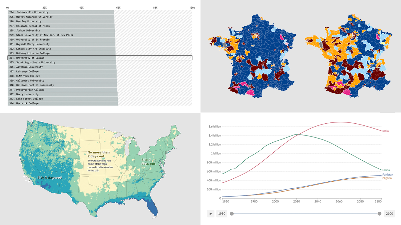 Ready for a fresh dose of impressive data visualizations crafted by seasoned professionals? Here’s what DataViz Weekly has in store for you this time:
- Weather forecast accuracy across the United States — The Washington Post
- U.S. college admission rates — FlowingData
- Global demographic shifts — Our World in Data
- France’s parliamentary election results — Various publications
- Categories: Data Visualization Weekly
- No Comments »
2024 UK Election Maps — DataViz Weekly
July 8th, 2024 by AnyChart Team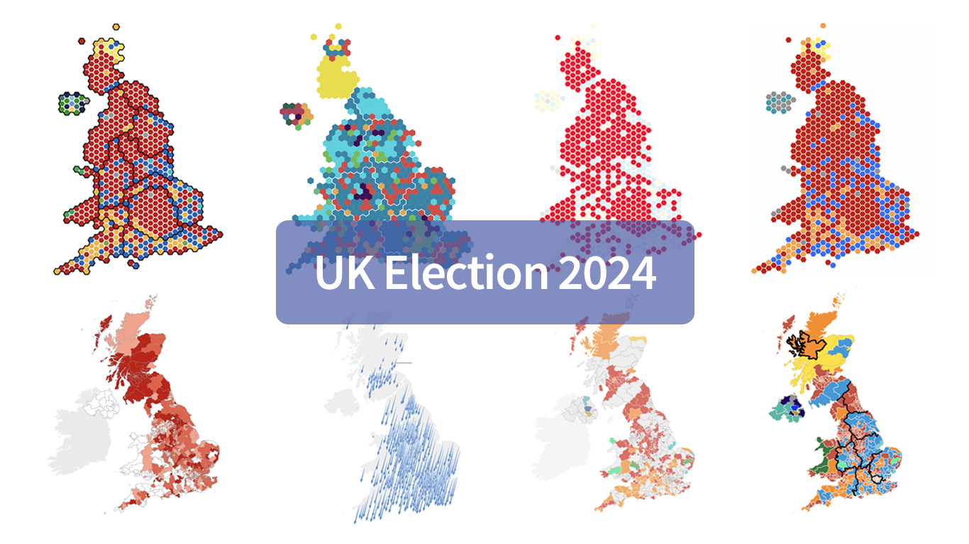 Last Thursday’s 2024 United Kingdom general election resulted in a historic shift within the nation’s political landscape, marking the Conservatives’ most severe defeat in nearly two centuries. As people look for clarity on these changes, election maps have come to the forefront as effective visual tools to make sense of voting outcomes and underlying patterns.
In this special edition of DataViz Weekly, we present a quick overview of UK election maps from prestigious sources including Sky News, The Independent, the BBC, The Financial Times, The Guardian, CNN, Open Innovations, and The New York Times, complete with links to them. Explore these data visualization projects to delve deeper into the dramatic shifts of the 2024 election, experience the power of effective electoral data mapping, and perhaps find inspiration for your own work.
💡 See also: 2024 U.S. Election Maps (November 2024).
- Categories: Data Visualization Weekly
- No Comments »
Engaging Data Visualizations to Explore — DataViz Weekly
June 21st, 2024 by AnyChart Team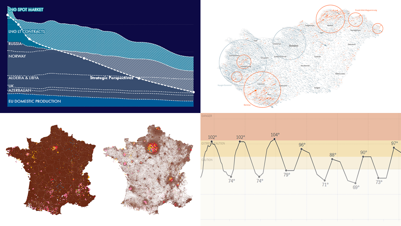 Welcome to another edition of DataViz Weekly, where we bring you some of the most interesting data visualizations we’ve recently come across. This week, we’re highlighting four fresh projects that effectively use data visualization to provide valuable insights:
- Tracking heat across the United States — The New York Times
- EU gas insights — Strategic Perspectives
- European Parliament election vote in France — Karim Douïeb (Jetpack.ai)
- European Parliament election vote in Hungary — Attila Bátorfy (atlo.team)
- Categories: Data Visualization Weekly
- No Comments »
Revealing Insights with Data Visualizations — DataViz Weekly
June 14th, 2024 by AnyChart Team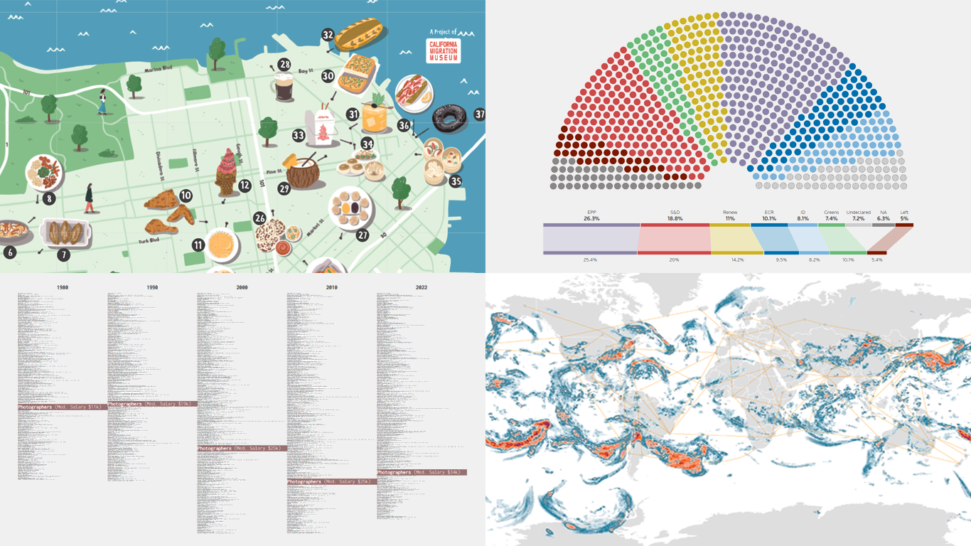 Data visualizations bridge the gap between raw numbers and clear, understandable insights. This week on DataViz Weekly, we showcase four remarkable new examples of how charts and maps illuminate diverse topics in a comprehensible and engaging manner:
- In-flight turbulence — South China Morning Post
- Shifts in occupation and income — FlowingData
- San Francisco’s culinary diversity — California Migration Museum
- EU election results — Reuters
- Categories: Data Visualization Weekly
- No Comments »
Stunning New Data Visualizations Not to Miss — DataViz Weekly
May 17th, 2024 by AnyChart Team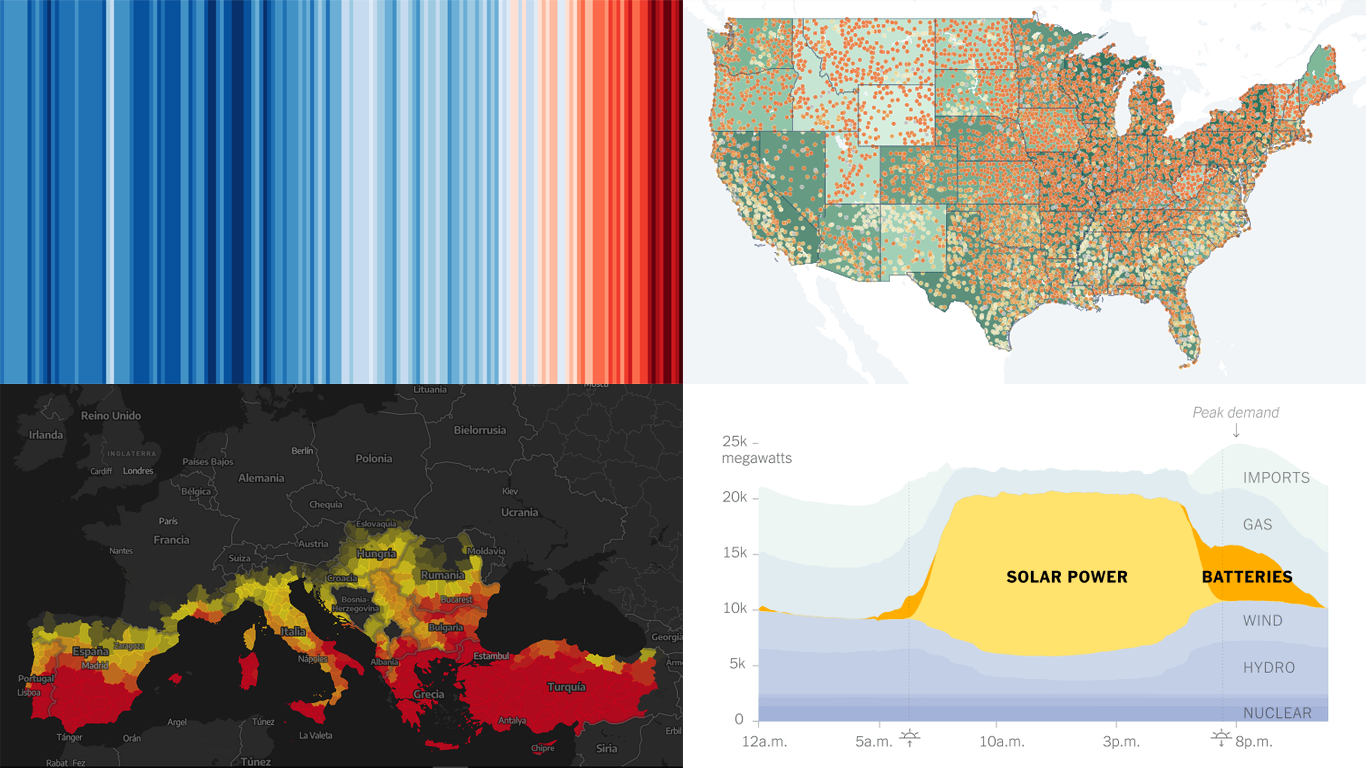 Data visualization is not just about making data look pretty; it’s about uncovering hidden patterns, revealing trends, and providing a clearer understanding of information. Through innovative visual techniques, we can explore data in ways that traditional methods can’t match. This week on DataViz Weekly, we bring you four compelling projects that showcase the transformative power of data visualization:
- Revealing the warming stripe for 2023 — Ed Hawkins
- Analyzing and predicting megafires in Europe — elDiario.es
- Understanding the growing role of giant batteries in electricity grids — NYT
- Analyzing segregation in U.S. schools — Stanford University
- Categories: Data Visualization Weekly
- No Comments »