New Charting Best Practices Worth Looking At — DataViz Weekly
June 19th, 2020 by AnyChart Team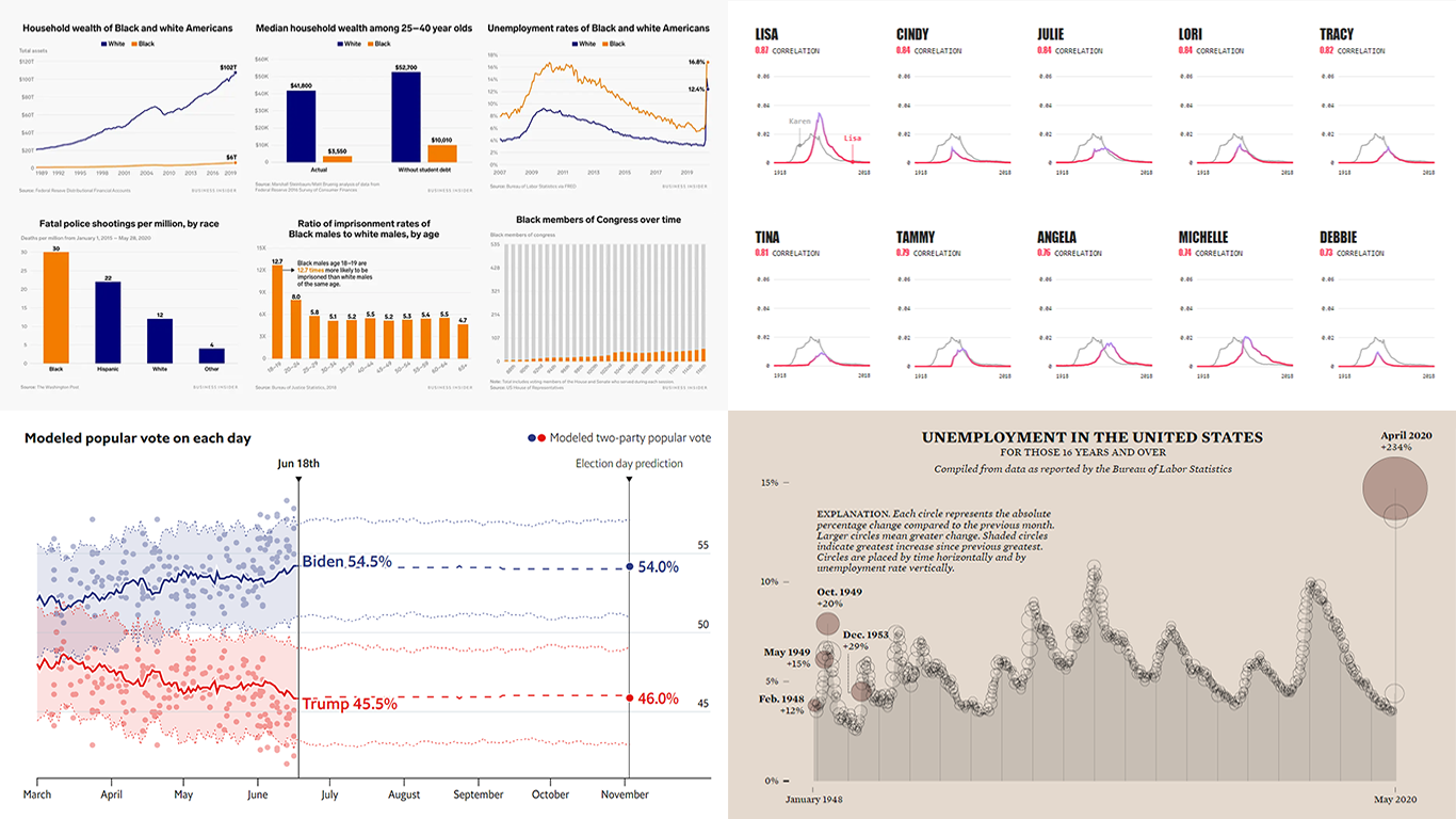 In data visualization, theory is very important but practice is absolutely everything. We continue to share with you some of the new charting best practices we’ve come across around the web so you could see what others do and keep improving. Check out how various experienced data visualization professionals make data speak and tell insightful stories, in DataViz Weekly.
Today, we are happy to meet you with the following new interesting projects:
- Black Lives Matter and racial disparities in America, in 25 charts — Business Insider
- The Economist’s forecast model for the 2020 U.S. presidential election — The Economist
- Unemployment rate in the United States since 1948 — FlowingData
- Names with a similar trajectory of popularity over time as Karen — The Pudding
- Categories: Data Visualization Weekly
- No Comments »
New Data Graphics to Check Out This Weekend — DataViz Weekly
June 12th, 2020 by AnyChart Team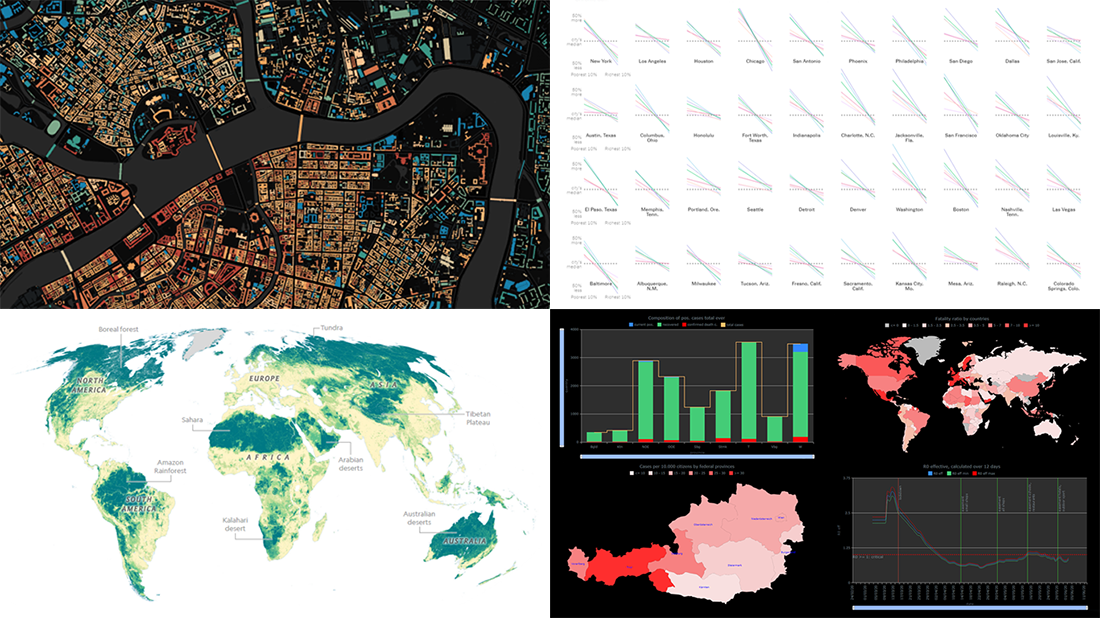 Hey everyone! Here’s DataViz Weekly with a quick presentation of four new data graphics projects that we’ve found worth checking out. Look at these stunning examples of charts and maps in action!
- Areas with the humanity’s lowest impact on the natural world — National Geographic
- COVID-19 in Austria (and worldwide) — Jürgen Höfer
- Age of buildings in Saint Petersburg (Russia) — Nikita Slavin
- Chronic health conditions by income and race — NYT
- Categories: Data Visualization Weekly
- 1 Comment »
Visual Presentations of Data About Jobs, Simpsons, NYC and Journals — DataViz Weekly
June 5th, 2020 by AnyChart Team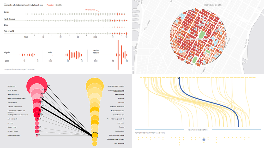 Every week, we meet a number of new visual presentations of data around the web. Then, on Friday, we pick the four most interesting of them to tell you about. The following projects made it to DataViz Weekly this time:
- Job losses in the United States, the second wave — Bloomberg
- Predictions from The Simpsons that came true — Seffana Mohamed-Ajaz
- Morphocode’s city explorer — Morphocode
- Dodgy academic journals — The Economist
- Categories: Data Visualization Weekly
- No Comments »
New Coronavirus Data Visualization Projects Worth Seeing — DataViz Weekly
May 29th, 2020 by AnyChart Team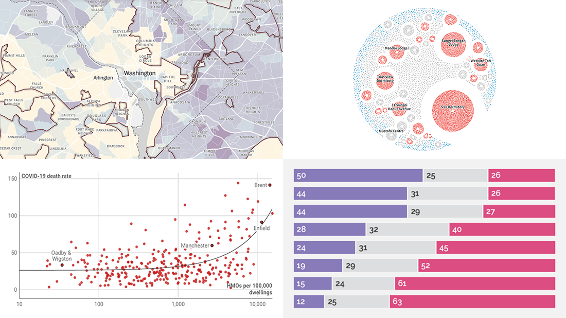
Waiting for a new serving of interesting chart examples? DataViz Weekly is here! Check out new coronavirus data visualization projects from around the web that we’ve found worth seeing:
- Anatomy of the COVID-19 outbreak in Singapore — Reuters
- Health disparities in communities of color across the United States as revealed by COVID-19 — The Washington Post
- Bill Gates coronavirus conspiracy theory in public opinion — Yahoo News
- Link between the housing crisis and COVID-19 deaths in the United Kingdom — Inside Housing
- Categories: Data Visualization Weekly
- No Comments »
Visualizing COVID Statistics and Data About Each Berlin Tree — DataViz Weekly
May 22nd, 2020 by AnyChart Team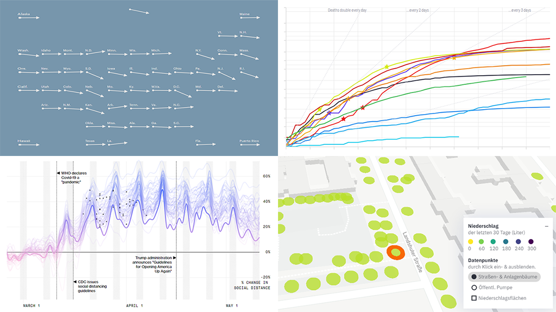 In the new DataViz Weekly article, we highlight four fresh projects, visualizing COVID statistics and data about Berlin trees, for great use of charts. Here’s a quick list of what each is about:
- StopCorona, a COVID tracker charting data from over 20 sources — Diffco
- Social distancing in America and how it worked in each state — Bloomberg
- COVID-19 test trends in the United States, by state — ProPublica
- Berlin trees and how each is watered — CityLAB Berlin
- Categories: Data Visualization Weekly
- No Comments »
Charting COVID-19 Data and Models — DataViz Weekly
May 15th, 2020 by AnyChart Team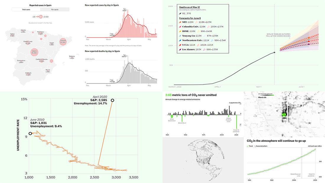 Check out new interesting examples of charting COVID-19 data in action. We have seen a lot of visualizations over the past few days and selected the following projects to share with you today in DataViz Weekly:
- Fatality models for the United States – FiveThirtyEight
- Impact on climate change – Bloomberg Green
- (Now broken) correlation between the stock market and unemployment rates in America – The Washington Post
- Situation in Spain – The New York Times
- Categories: Data Visualization Weekly
- No Comments »
COVID-19 Vaccine, Future, Impact, and Non-COVID Wiki Atlas Visualizations — DataViz Weekly
May 8th, 2020 by AnyChart Team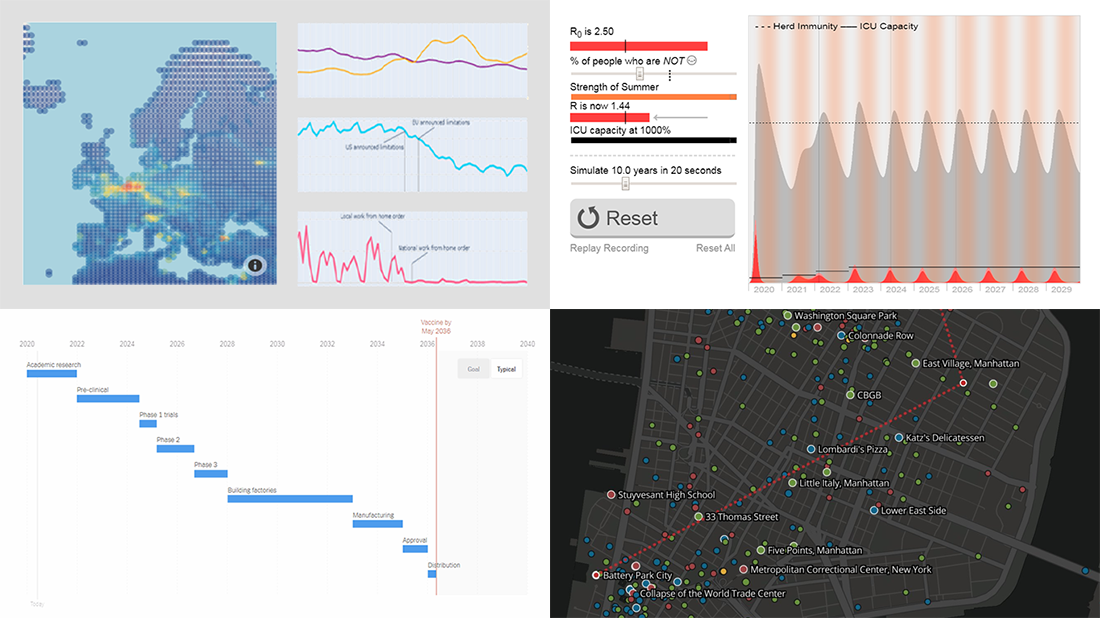 Without any exaggeration, the vast majority of data visualizations made public these weeks (and already months) are about the novel coronavirus pandemic. In compliance with the general trend, three of the four projects presented in the new DataViz Weekly article shed light on issues related to COVID-19. Take a glance at a quick list of the featured data visualization works and read more to meet them.
- COVID-19 vaccine development timeframe and how to reduce it – NYT
- COVID-19 future, in playable simulators – M. Salathé & N. Case
- COVID-19 impact on traffic and air pollution in Europe – European Data Portal
- Atlas of places featured in Wikipedia – T. Noulas, R. Schifanella, D. Sáez-Trumper & J. Tan
- Categories: Data Visualization Weekly
- No Comments »
New COVID-19 Data Visualizations — DataViz Weekly
May 1st, 2020 by AnyChart Team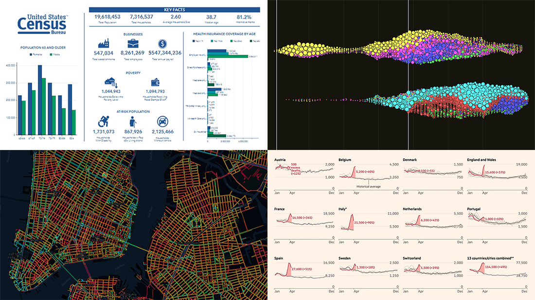 It’s Friday, May 1, and we invite you to take a quick look at the fresh DataViz Weekly selection of cool charts and maps. This article presents the following new COVID-19 data visualizations we have come across this week:
- Discovering excess deaths from COVID-19 — FT
- Exploring NYC sidewalk widths through the prism of social distancing — Meli Harvey
- Analyzing coronavirus search trends — Schema Design, Google News Initiative and Axios
- Visualizing demographic and economic data for COVID-19 impact planning reports — U.S. Census Bureau
- Categories: Data Visualization Weekly
- No Comments »
New Interesting Graphics on Climate Change, Media Credibility, Hospital Occupancy, and Job Losses — DataViz Weekly
April 24th, 2020 by AnyChart Team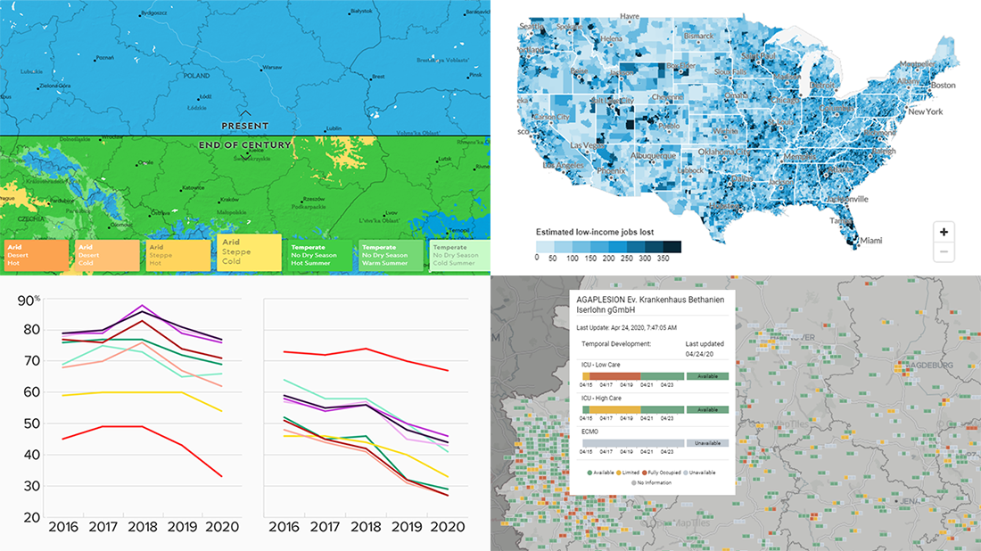 Continuing our series of regular DataViz Weekly articles highlighting new interesting graphics from all over the web, here’s what data visualization projects we picked to show you this time:
- Climate change in your city by 2070 — National Geographic
- New American media credibility ratings — Morning Consult
- Hospital bed occupancy in Germany — University of Konstanz
- Low-income job losses across the United States — Urban Institute
- Categories: Data Visualization Weekly
- No Comments »
1918 Spanish Flu Pandemic in Data and Charts — DataViz Weekly
April 17th, 2020 by AnyChart Team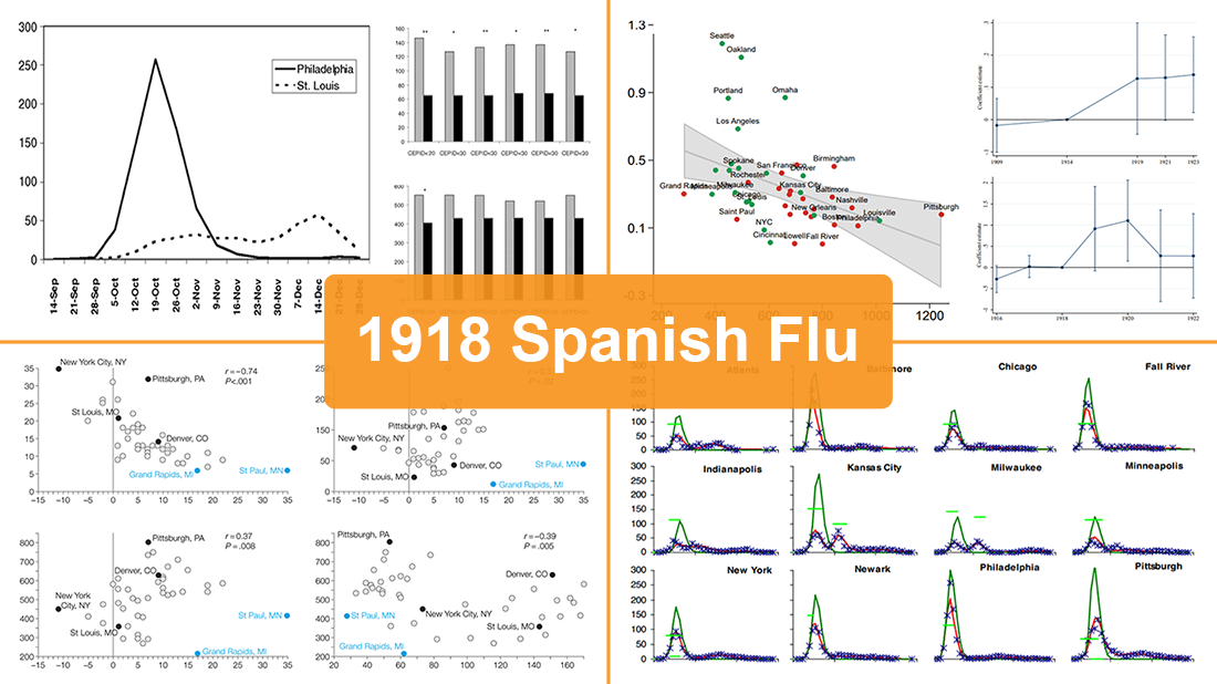 While the world keeps fighting the coronavirus disease outbreak, we have seen a number of attempts to draw analogies between the COVID-19 and previous influenza pandemics. Inspired by a recent National Geographic article by Nina Strochlic with graphics from Riley D. Champine, today we invite you to find out (or remember) what the 1918 Spanish flu pandemic looked like and what lessons it may offer to cope with the current crisis.
For this new DataViz Weekly, we have curated four researches on the 1918 flu pandemic in the United States. Focusing on an analysis of nonpharmaceutical interventions (NPIs) such as social distancing measures and their role, these studies contain a lot of diverse data and charts. They are worth checking out if you’re interested in the subject of epidemics or in data science, analytics, and visualizations as such.
- Categories: Data Visualization Weekly
- No Comments »