Engaging Data Visualizations About Time, Light, America, and Britain — DataViz Weekly
July 5th, 2019 by AnyChart Team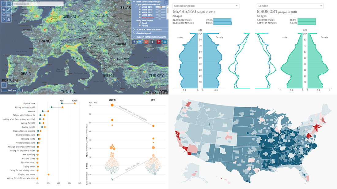 Here are some of the cool, engaging data visualizations we’ve come across these days. They are great examples of how awesome and informative charts can be when they truly let data talk.
The visualizations we are featuring this time on DataViz Weekly are as follows:
- Differences between men and women’s everyday life with kids — FlowingData
- 50 maps showing various aspects of the American life — Business Insider
- New population estimates for the United Kingdom — ONS
- Light pollution around the globe — Jurij Stare
- Categories: Data Visualization Weekly
- No Comments »
New Data Graphic Examples Worth Checking Out — DataViz Weekly
June 28th, 2019 by AnyChart Team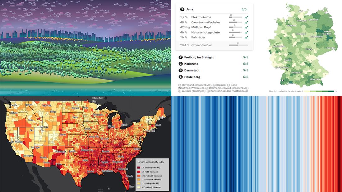 We’ve picked another four awesome projects as new data graphic examples to showcase in DataViz Weekly this Friday. Check them out right away as they are definitely worth it:
- Suicides in the Netherlands
- Where Germany is really green
- Temperature change worldwide
- Vulnerability to tornadoes across the United States of America
- Categories: Data Visualization Weekly
- 1 Comment »
New Cool Diagrams, Graphs, and Maps Visualizing Interesting Data — DataViz Weekly
June 21st, 2019 by AnyChart Team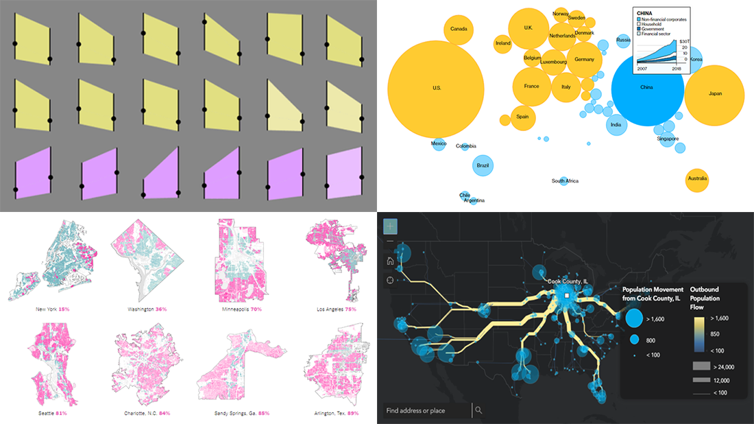 Generally, data becomes much easier to make sense of when it is visualized in diagrams, maps, or other forms of graphics. DataViz Weekly shows you examples of how this is true in reality. Today, we’ve put together another four of the latest data visualization projects discovered by our team around the internet. They bring insight into the following topics:
- Single-family home zoning in the United States of America
- Time use of parents vs people without kids
- Debt of emerging market countries
- U.S. internal migration
- Categories: Data Visualization Weekly
- 1 Comment »
4 Great Visualization Projects on Privacy, Electricity, Ocean, and Emotions — DataViz Weekly
June 14th, 2019 by AnyChart Team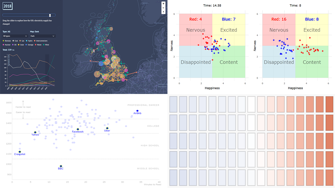 Are you ready to check out new compelling visualization projects? DataViz Weekly is awaiting your attention! Today in the focus:
- Privacy policies of 150 popular websites and apps
- Transformation of electricity supply in the United Kingdom
- Oceans in the changing climate
- Emotions during a basketball game
- Categories: Data Visualization Weekly
- No Comments »
Most Interesting Data Visualization: GBP, EU Election, MHW, Bob Ross — DataViz Weekly
June 7th, 2019 by AnyChart Team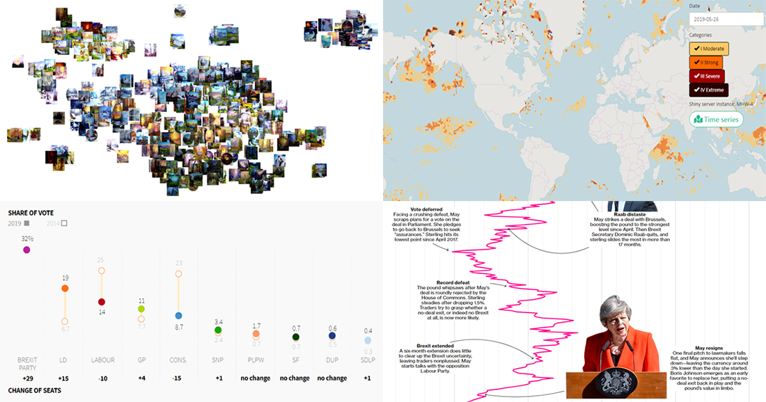 Take a look at four of the most interesting data visualization projects and stories we have found around the web during the last few days. Here’s what we feature today in DataViz Weekly:
- GBP rate change in the context of Brexit turns
- European Parliament election in the United Kingdom
- Marine Heatwave Tracker
- Evolution of Bob Ross’s famous phrases over all 403 episodes of The Joy of Painting
- Categories: Data Visualization Weekly
- No Comments »
New Data Chart Examples Worth Seeing About Coal, People, Movies, and Migration — DataViz Weekly
May 31st, 2019 by AnyChart Team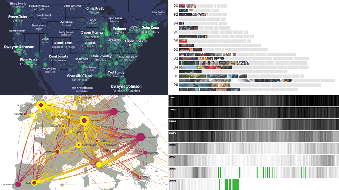 Data visualization is a powerful way to facilitate making sense of numbers. It can provide an insightful look at data and display trends and patterns at a glance for a more efficient and quicker analysis. Check out new data chart examples from around the web that nicely show how it works in practice.
Today on DataViz Weekly:
- How Britain is phasing out coal-powered energy
- U.S. cities’ most Wikipedia’ed residents
- Rise of summer movie sequels
- European migration flow map
- Categories: Data Visualization Weekly
- 1 Comment »
Created Visualizations on Cities, Politics, Education, and Romanovs — DataViz Weekly
May 24th, 2019 by AnyChart Team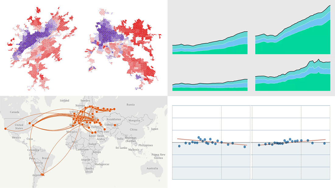 Each Friday, we meet you with four of the most interesting data-based projects we’ve just come across. Here’s what recently created visualizations we are glad to tell you about this time on DataViz Weekly:
- Why Workers Without College Degrees Are Fleeing Big Cities — The New York Times
- Where Democrats And Republicans Live In Your City — FiveThirtyEight
- Cost of College — FlowingData
- The Romanovs’ Twilight — TASS
- Categories: Data Visualization Weekly
- No Comments »
Graphics Visualizations About Immigration, Elections, Pitchers, and Salinity — DataViz Weekly
May 17th, 2019 by AnyChart Team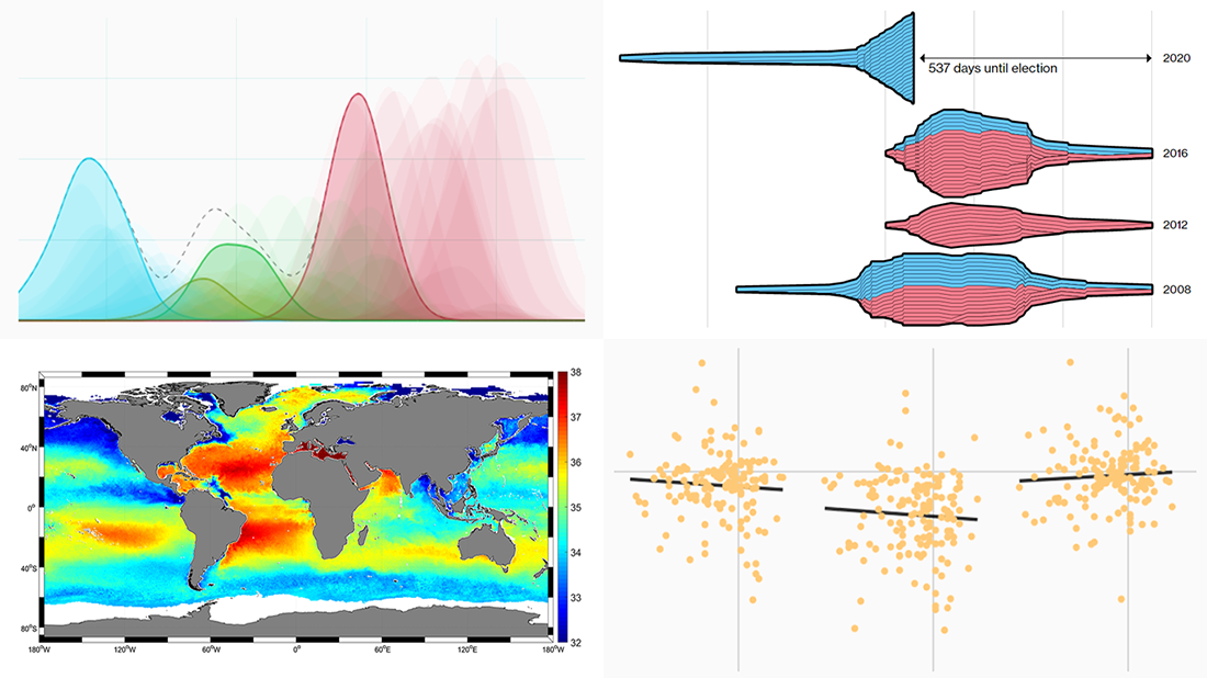 New DataViz Weekly is here, highlighting some of the new cool graphics visualizations we found around the web just recently:
- Finding a link between undocumented immigration and crime in the United States
- Competition in the U.S. presidential elections since 1980
- MLB pitchers’ pitch distribution
- Sea-surface salinity
- Categories: Data Visualization Weekly
- No Comments »
Compelling Data Visualization Examples on Trade, Diets, Mortality, and Birth Rates — DataViz Weekly
May 10th, 2019 by AnyChart Team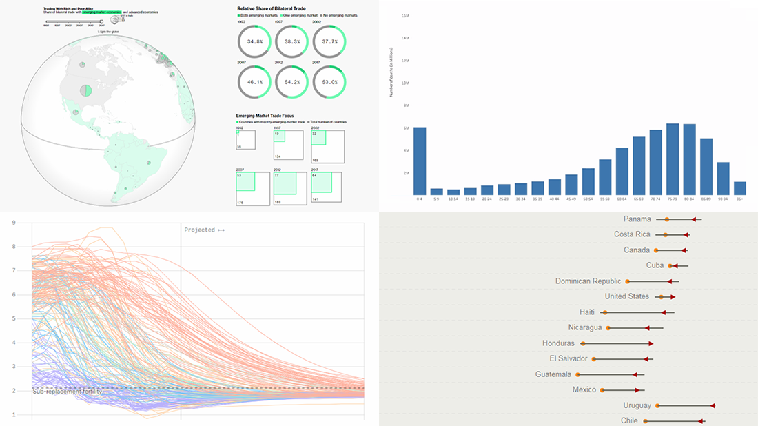 Take a look at another set of compelling data visualization examples we have come across these days, in DataViz Weekly on the AnyChart blog:
- Rise of developing countries in global trade
- Birth rates
- Growing similarity of diets
- Child mortality
- Categories: Data Visualization Weekly
- No Comments »
Plotting NBA Shots, Diversity, Disasters, and Air Traffic — DataViz Weekly
May 3rd, 2019 by AnyChart Team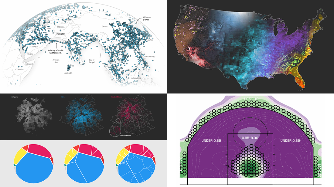 Check out new interesting examples of how plotting data on charts and maps can be both insightful and beautiful. Here is what we are happy to feature in today’s article in the DataViz Weekly series:
- Visualizing how India-Pakistan tensions disrupt air travel
- Plotting diversity of Brussels
- Mapping where natural disasters tend to strike in the United States
- Charting NBA shots
- Categories: Data Visualization Weekly
- No Comments »