New Insightful Data Visualizations in Focus — DataViz Weekly
May 10th, 2024 by AnyChart Team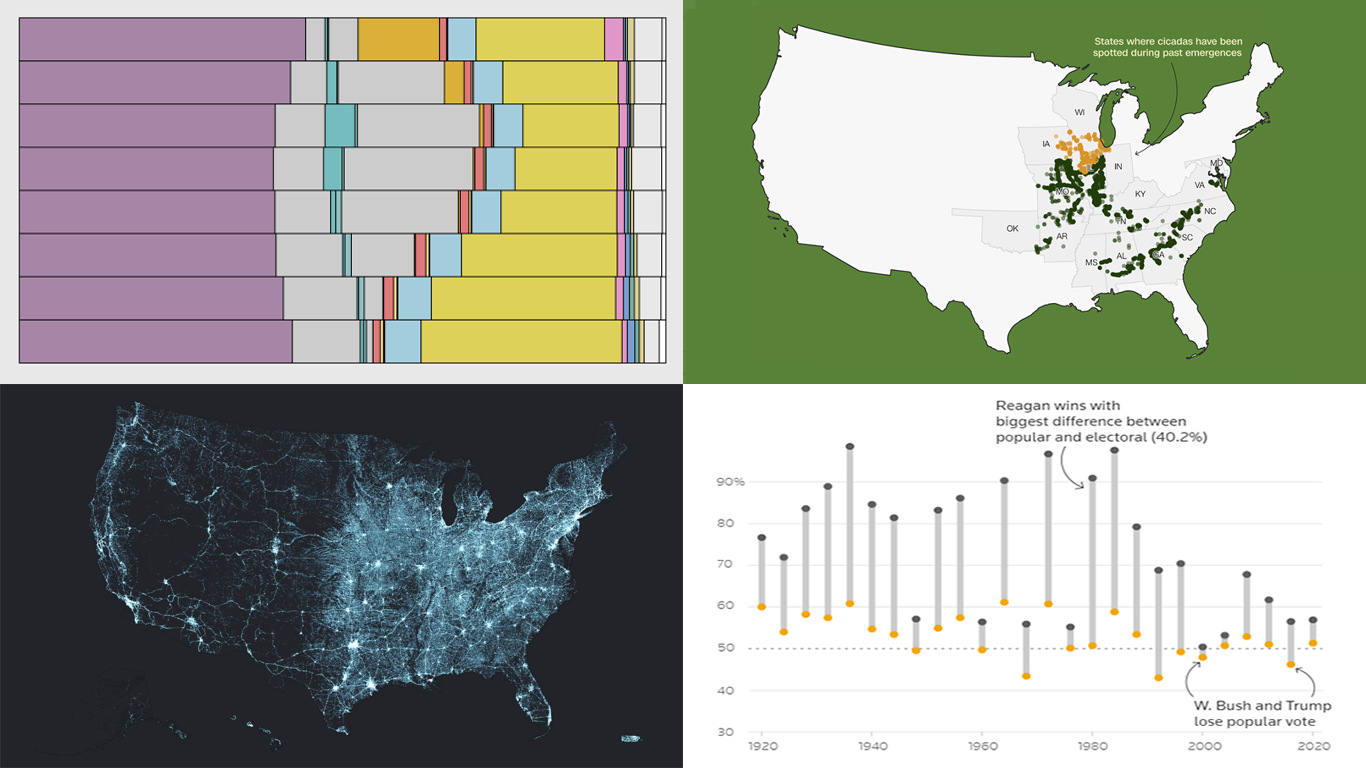 Data visualization serves as a powerful tool that enhances our understanding of complex data, transforming raw figures into insights. DataViz Weekly is here to share several great examples that demonstrate this capability in action. This week, we highlight four data visualization projects that have recently captured our attention:
- Exploring the U.S. bridges — Esri
- Analyzing time use by age — FlowingData
- Tracking historic cicada emergence 2024 — CNN
- Understanding election polls — Reuters
- Categories: Data Visualization Weekly
- No Comments »
Exploring Insights with Data Visualization — DataViz Weekly
May 3rd, 2024 by AnyChart Team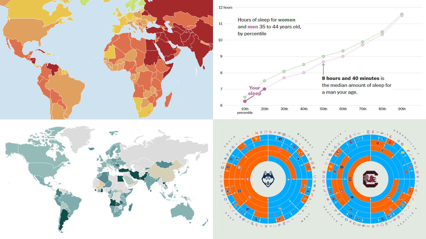 Welcome to the new DataViz Weekly, where we continue exploring the transformative power of data visualization. This edition presents a selection of new examples of how charts and maps can help us understand trends and patterns in various subjects — from sports and philanthropy to global challenges like press freedom and inflation, and everyday topics such as sleep. Here are the projects featured this time:
- March Madness philanthropy challenge — Bloomberg
- 2024 World Press Freedom Index — Reporters Without Borders
- Global Inflation Tracker — Council on Foreign Relations
- Sleep trends in America — The Washington Post
- Categories: Data Visualization Weekly
- No Comments »
Understanding Complex Topics Through Data Graphics — DataViz Weekly
April 26th, 2024 by AnyChart Team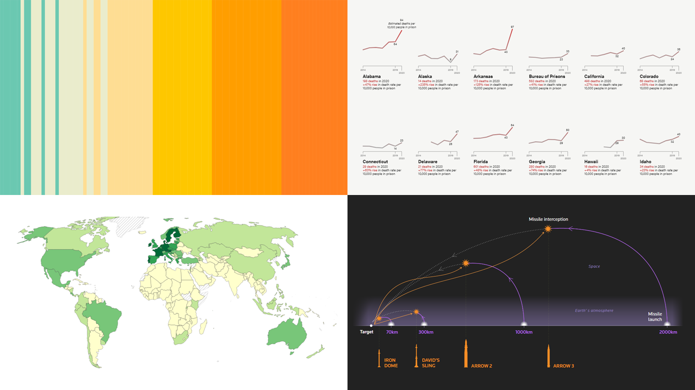 DataViz Weekly is here! Today, we spotlight cool new projects that illuminate how complex topics can be presented and explored in a comprehendible and impactful manner with the help of appropriate data graphics. Here’s a quick look at what we’re covering today:
- Evaluating agri-environmental policy effectiveness globally — Our World in Data
- Visualizing сlimate сhange across generations — The Tardigrade
- Revealing pandemic toll on U.S. prison populations — The Marshall Project
- Exploring Israel’s integrated air defense capabilities in action — Reuters
- Categories: Data Visualization Weekly
- No Comments »
New Data-Driven Stories Worth Exploring — DataViz Weekly
April 19th, 2024 by AnyChart Team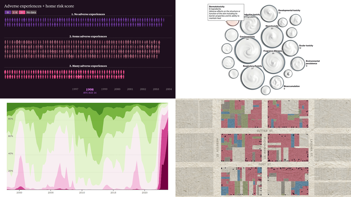 This week’s DataViz Weekly showcases a quartet of compelling data-driven stories, each powered by the adept use of data visualization techniques. These narratives not only inform but inspire, perhaps sparking creative concepts for your upcoming projects.
Here are the visual stories featured in this issue:
- Unraveling the hold of historical mortgage rates in the U.S. — The Upshot
- Retelling the transformation of San Francisco’s Japantown after Roosevelt’s Executive Order 9066 — The San Francisco Chronicle
- Revealing hidden risks in common fragrances — Bloomberg
- Exploring the persistent shadows of teen adversity — The Pudding
- Categories: Data Visualization Weekly
- No Comments »
Exploring Eclipse Impact, Nature Access, Marital Ages, Voter Profiles — DataViz Weekly
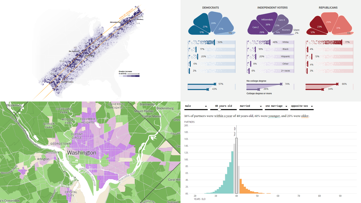
April 12th, 2024 by AnyChart TeamWelcome back to DataViz Weekly! We’re thrilled to restart our series, presenting each Friday a carefully curated selection of recent data visualizations that have caught our eye from around the web. These charts and maps serve as excellent examples of how data can be transformed into insightful and engaging graphical representations for understanding complex issues.
This time, we feature:
- Eclipse traffic and movements — The New York Times
- America’s access to natural spaces — The Washington Post
- Marital age patterns — FlowingData
- Profiling independent voters — Reuters
Join us as we take a closer look at these visualizations and check them out for a dose of inspiration.
- Categories: Data Visualization Weekly
- No Comments »
MARVI Project Uses AnyChart Android Charts to Visualize Groundwater Data in MyWell App
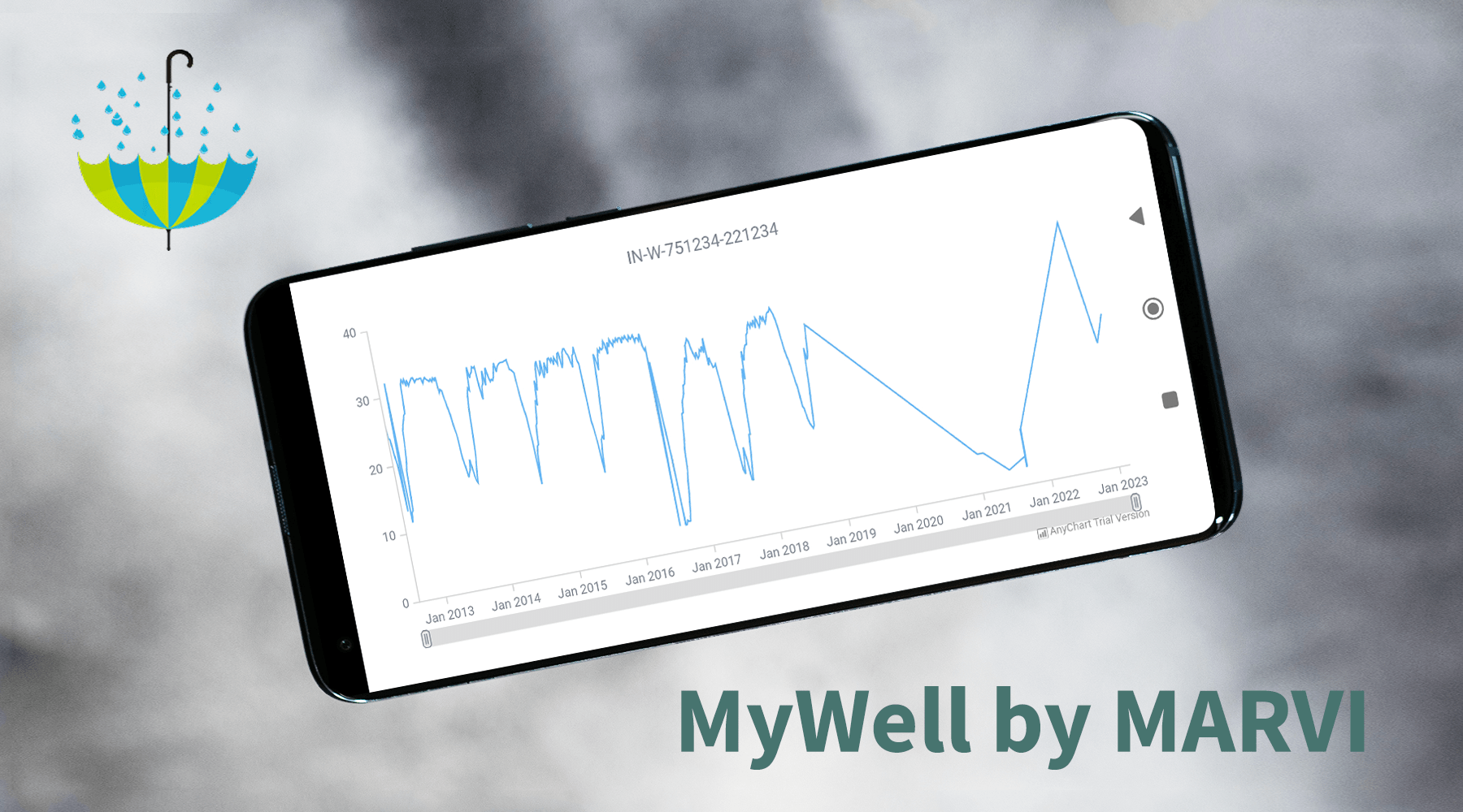
May 25th, 2023 by AnyChart TeamAt AnyChart, we take great pride in our position as leaders in the global data visualization industry. Our JavaScript Charting Library is renowned for its excellence for developers, while our Qlik Sense Extensions continue to push the boundaries with innovative solutions for analysts. But we don’t stop at being awesome! We also bring the ultimate data visualization magic to Android app developers with AnyChart Android Charts! You’ve probably come across these charting wonders in some of your favorite mobile apps. Today, we’re putting the spotlight on one specific use case that caught our attention.
We recently had a blast speaking with Professor Basant Maheshwari, the lead scientist at the MARVI project. Their mission? To revolutionize groundwater management through community empowerment. They are achieving that with the help of MyWell, a mobile app that streamlines crowdsourced data collection to sustain groundwater resources, ensure access to clean drinking water, and boost livelihoods. MyWell harnesses the power of our Android data visualization library. And to fuel MARVI’s noble mission, we provided them with a complimentary license to wield the mighty AnyChart within the app.
Dive into the inspiring world of MARVI and MyWell, and witness firsthand how AnyChart contributes to making a real difference for ordinary people while paving the way for the future of groundwater management.
- Categories: AnyChart Charting Component, AnyStock, Big Data, HTML5, JavaScript, Stock Charts, Success Stories
- No Comments »
Ukraine-Russia in Data Visualizations — DataViz Weekly
February 24th, 2023 by DataViz Weekly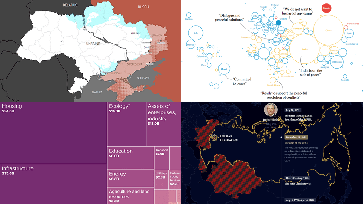 One year ago today, on February 24, 2022, Russia launched a massive attack on Ukraine. To mark this anniversary, DataViz Weekly has put together a collection of remarkable data visualizations that may offer insights into the conflict. These include Grid’s interactive that maps out how events unfolded over the last 365 days, Politico’s series of graphics that highlight some of the key numbers, The New York Times’s charts that illustrate the world’s stance, and Russia Beyond’s timeline of Russia’s territorial evolution since the 9th century.
- Categories: Data Visualization Weekly
- No Comments »
Most Notable New Data Visualizations — DataViz Weekly
February 10th, 2023 by AnyChart Team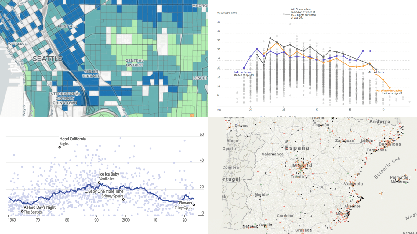 If you like cool data visualizations, DataViz Weekly is for you! In our new roundup, check out some of the most notable graphics we have seen around the web over the last seven days.
- Seattle as a 15-minute city — Nat Henry
- LeBron James vs the NBA’s other top scorers — The New York Times
- Subnational immigration patterns across Spain — El Confidencial
- Intro length in the top songs in 1960–2023 — The Economist
- Categories: Data Visualization Weekly
- No Comments »
Exciting Visual Graphics That Tell Stories — DataViz Weekly
January 13th, 2023 by AnyChart Team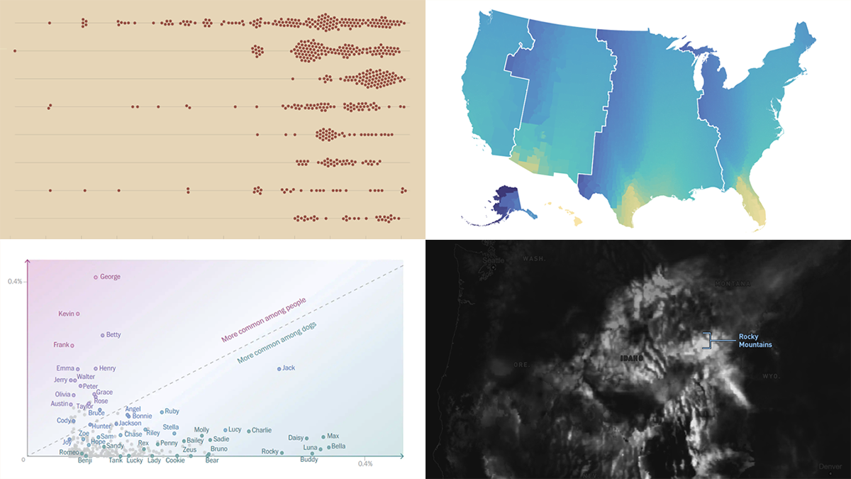 DataViz Weekly is our regular blog feature where we curate the most exciting charts, maps, and infographics we’ve recently come across. Today, we want to attract your attention to some cool visual stories published out there near the end of the last year, which we did not get a chance to spotlight before:
- Animal species extinction over time — Reuters
- Daylight optimization in the United States — FiveThirtyEight
- Top human names for dogs — The Washington Post
- Snowfall across the U.S. — William B. Davis
- Categories: Data Visualization Weekly
- No Comments »
2022 Year in Data Visualizations — DataViz Weekly
January 6th, 2023 by AnyChart Team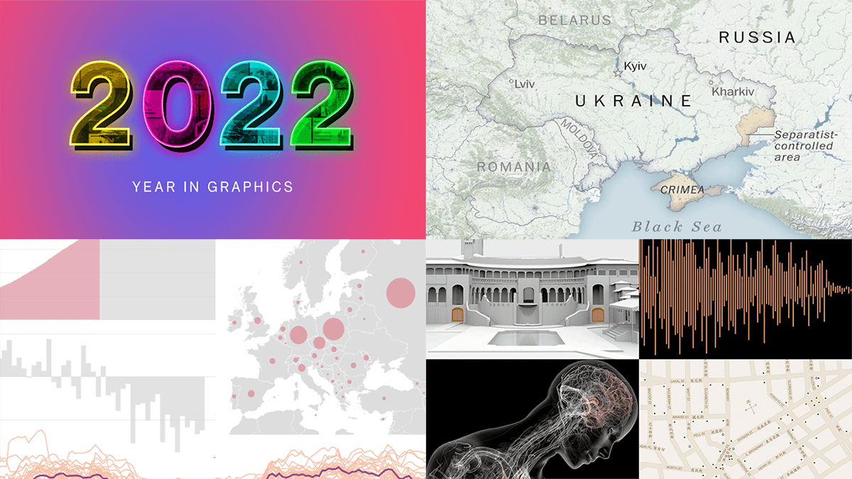 Finally we are in 2023! May this new year be the best one for all of you!
Before getting too far into 2023, we thought it would be interesting to look back at 2022 in data visualizations. And the first DataViz Weekly in the new year seems like a nice occasion! Let’s say farewell to 2022 by recalling its hottest topics with the help of “year in graphics” features on Politico, The Post, NYT, and Bloomberg.
- Categories: Data Visualization Weekly
- No Comments »
