Amazing Data Visuals Showing US Energy Generation and Other Important Data – DataViz Weekly
November 17th, 2017 by AnyChart Team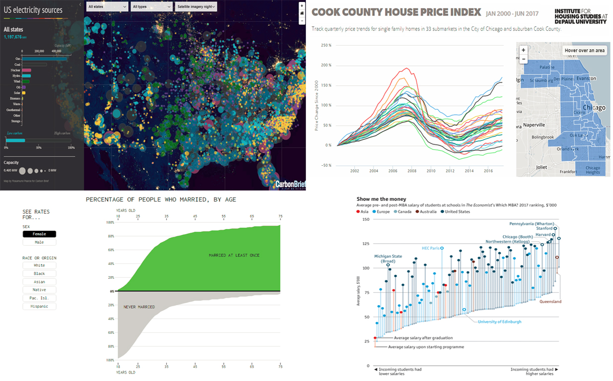 Welcome to our Data Visualization Weekly series where we bring you some of the latest news and information on a wide range of topics, from family and property to energy and education. We use creative and amazing data visuals from around the Web to present information.
Today we introduce to you interesting data on 4 specific areas that you will find quite interesting to know something about, using a variety of visual elements. We take a closer look at energy generation, marriage statistics by age, and Chicago housing price trends. Another area that we will focus on is MBA – what schools give the biggest (and smallest) boost to salaries. So let’s begin straight away with the first topic.
- Categories: Data Visualization Weekly
- No Comments »
New Cool Visualization Examples Worth Seeing – DataViz Weekly
November 10th, 2017 by AnyChart Team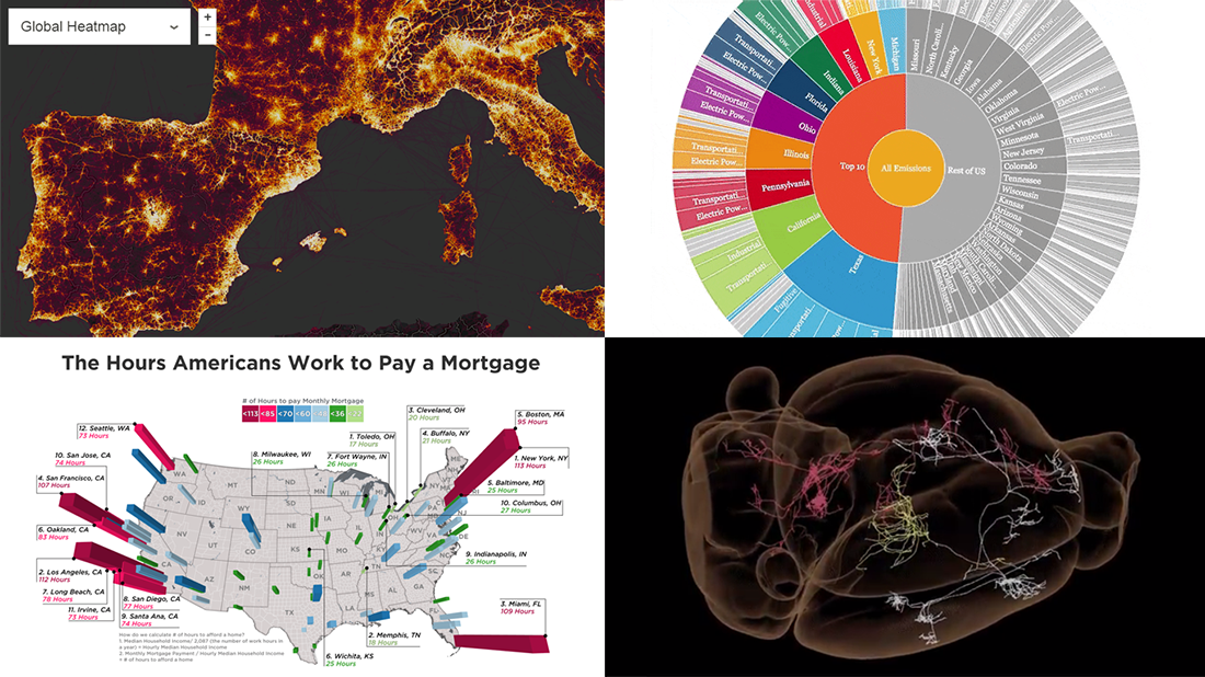 Another week, another four interesting visualization examples. That’s how our DataViz Weekly feature works!
For the present post, we’ve selected the following visual graphics:
- world map of fitness routes;
- how much Americans need to work to pay mortgage;
- explorer of US state greenhouse gas emissions;
- extensive map of mouse brain wiring.
- Categories: Data Visualization Weekly
- No Comments »
Data Visualization Weekly: “US Maps” Edition
November 3rd, 2017 by AnyChart Team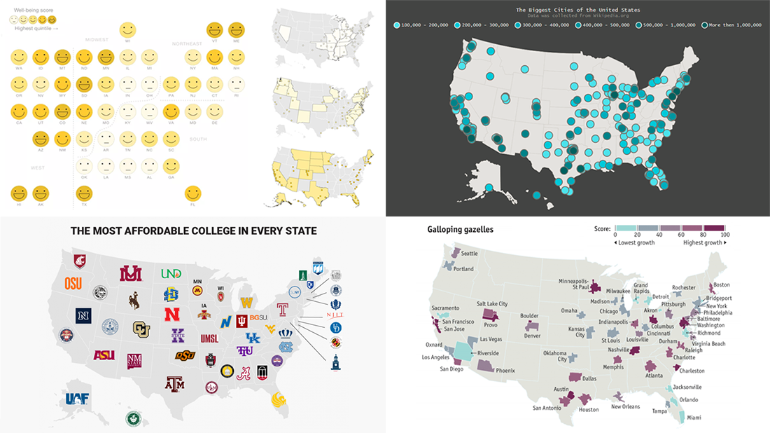 The new issue of DataViz Weekly is fully devoted to US maps. Here you’ll find four interesting geo visualizations telling data stories about the United States of America: the biggest cities, well-being, affordable colleges, high-growth entrepreneurship hotspots.
- Categories: Data Visualization Weekly
- No Comments »
Interesting Data Visualization Examples for Fun and Inspiration – DataViz Weekly
October 27th, 2017 by AnyChart Team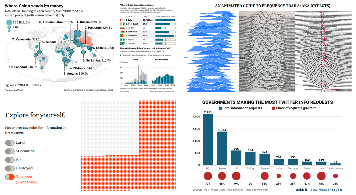 Here we are, bringing you the new pick of interesting data visualization examples we came across lately!
Check out what visual graphics we’ve included in this week’s Data Visualization Weekly post:
- where China sends money;
- what governments make the most requests for Twitter’s user data;
- visualizing every weapon in the US nuclear arsenal;
- animated interactive guide to frequency trails charts.
- Categories: Data Visualization Weekly
- No Comments »
Charts Showing Various Interesting Data – DataViz Weekly
October 20th, 2017 by AnyChart Team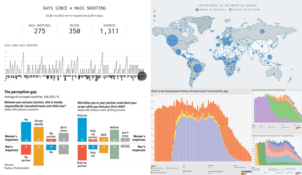 We know that our Data Visualization Weekly has been watched and read by many people. So we are glad to continue this series of posts and share the next one right now, presenting new cool charts showing various interesting data.
Today in Data Visualization Weekly:
- days between mass shootings in the United States;
- interactive world map of Christianity;
- how US citizens differ by age;
- what women and men think about careers and household tasks.
- Categories: Data Visualization Weekly
- No Comments »
Beauty of Data Visualization – DataViz Weekly
October 13th, 2017 by AnyChart Team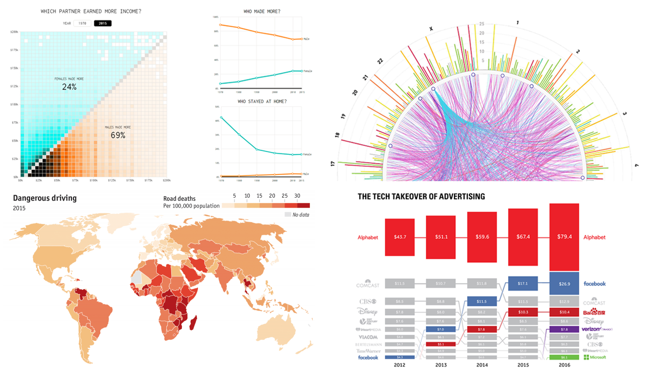 The beauty of data visualization lies not only in a pretty design or any graphical features one might like to implement. Also – and actually, foremost – it is about making data speak and communicate trends, connections, and patterns previously hidden or simply been harder to discover and explore.
Check out the new Data Visualization Weekly with several new examples of dataviz that are both informative and cute:
- tech takeover of the global advertising industry;
- road deaths in developing countries;
- who earns more in male-female partner households in the US;
- SFARI Gene – gene-centered autism research data and visuals.
- Categories: Data Visualization Weekly
- No Comments »
Visualized Data is Powerful (and Beautiful) – DataViz Weekly
October 6th, 2017 by AnyChart Team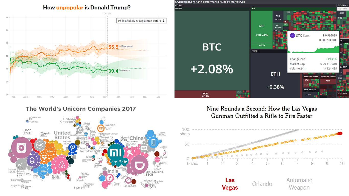 Data is great. Visualized data is awesome! Charts, dashboards, infographics – all these are specifically designed to provide an advanced look into data, deliver a better insight, and finally, get a clearer understanding of what’s happening so we can make the right decisions.
We are keen on showing you some good data visualization examples each week to prove that. Here are the new ones we’ve decided to share this time:
- Trump’s approval ratings;
- cryptocurrency market;
- Las Vegas gunfire speed;
- map of all unicorn companies.
- Categories: Data Visualization Weekly
- No Comments »
Interesting Data Visualizations – DataViz Weekly
September 29th, 2017 by AnyChart Team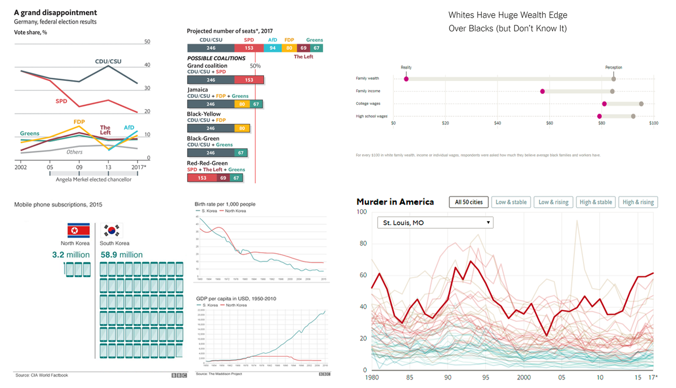 Imagine a week without any new interesting data visualizations, a week when nobody published at least one piece of dataviz that would be worth seeing… No way! Nowadays, at the times when data visualization is clearly well on the rise, the number of charts being created and shared is only growing day by day. So we are likely to always have something out there to choose from for our Data Visualization Weekly series. Well, this is definitely a good thing!
In the new weekly post, we are glad to present you with another set of interesting visualizations that have appeared and come to light only recently:
- Nine charts and infographics for visually comparing North Korea to South Korea.
- Germany’s recent election results.
- Wealth inequality between black and white families in America.
- Murder rate on the rise in the US.
- Categories: Data Visualization Weekly
- No Comments »
Data Visualization Best Practices and Cool Chart Examples – DataViz Weekly
September 22nd, 2017 by AnyChart Team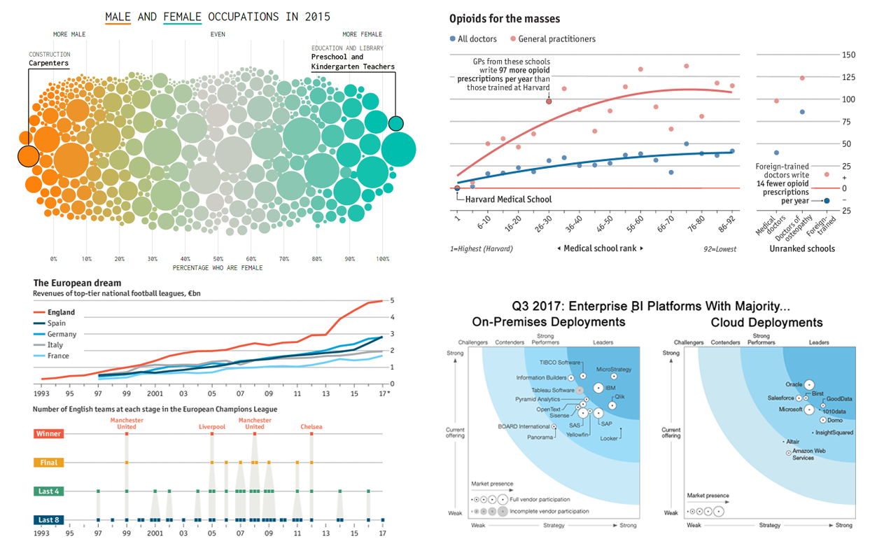 Data visualization is one of those fields where knowledge of theory, of course, is very important but practice is basically everything. That’s why we keep sharing data visualization best practices and interesting examples every week to help you see how experienced data journalists and scientists make data speak and tell stories so you could learn from there and see what’s possible.
In today’s DataViz Weekly, you’ll find the charts delivering insights into the following:
- Better trained doctors prescribe fewer opioids.
- Male and female jobs nowadays and since the middle of the 20th century.
- The English Premier League is wealthy in money but mediocre in football.
- Enterprise BI platforms with majority cloud and on-premises deployments.
- Categories: Data Visualization Weekly
- No Comments »
Visualizing Data in Charts – Data Visualization Weekly
September 15th, 2017 by AnyChart Team Visualizing data is a great way to communicate it to people and ensure its better, more insightful perception. That’s why charts and dashboards have already become so widespread.
We continue the Data Visualization Weekly initiative to let you learn about new and interesting dataviz examples on a regular basis. This article showcases another four of them that might serve well for inspiration or simply help you get a better understanding of some facts and processes taking place out there in the world.
- Categories: Data Visualization Weekly
- No Comments »