Great New Charts & Maps Worth Seeing — DataViz Weekly
April 8th, 2022 by AnyChart Team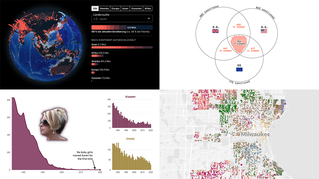 Ready for a new selection of great charts and maps? Join us in checking out four awesome data visualization projects we have come across this week! Today on DataViz Weekly:
- Uninhabitable locations worldwide by 2100 — Berliner Morgenpost
- Sanctions against Russian oligarchs — Bloomberg
- Baby naming trends in Scotland — The Courier
- Milwaukee architectural home styles — The Milwaukee Journal Sentinel
- Categories: Data Visualization Weekly
- No Comments »
Plotting Building Age, Electricity Price, Temperature Highs, Excess Mortality — DataViz Weekly
April 1st, 2022 by AnyChart Team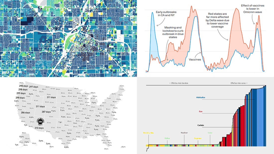 Visualized data is much easier for the human brain to process and understand than textual or tabular. On DataViz Weekly, we collect the most interesting examples of charts and maps demonstrating how that works in reality. Enjoy our new picks:
- Age of buildings in Las Vegas — Las Vegas Review-Journal
- Electricity market price determination in Spain — elDiario.es
- Time since a record temperature high across the United States — The Pudding
- Excess deaths in Republican-leaning and Democratic-leaning states — Axios
- Categories: Data Visualization Weekly
- No Comments »
Reviewing Four New Exciting Data Visualizations — DataViz Weekly
March 25th, 2022 by AnyChart Team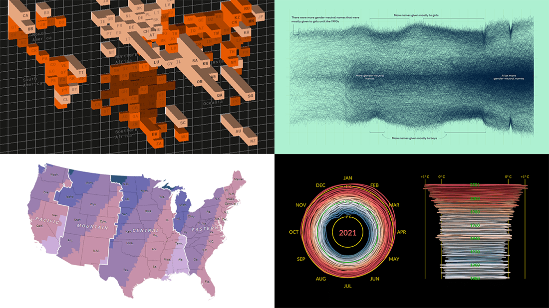 If you are reading this, you (almost certainly) love good data graphics. Well, we won’t leave you hanging! Check out a new DataViz Weekly review of exciting data visualizations recently built by honored professionals.
- Sunrise times with permanent daylight saving time in the U.S. — The Washington Post
- Inequality between rich and poor people’s carbon emissions — Bloomberg
- Gender-neutral baby names in America — Georgios Karamanis
- 3D climate spiral for 1880–2021 — NASA
- Categories: Data Visualization Weekly
- No Comments »
Visualizing Gender, Cycling, Polling & Climate Data — DataViz Weekly
March 18th, 2022 by AnyChart Team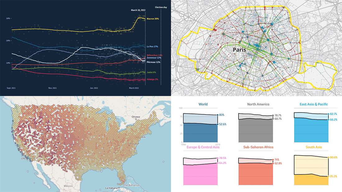 Friday is a lucky day for all fans of data visualization: DataViz Weekly is out! Join us as we look at some great examples of charts and maps published out there just recently.
- World Bank Gender Data Portal — The World Bank
- Cycling environment across France — FUB
- French presidential election polls — Reuters
- Ideal climate finder — Luke Champine
- Categories: Data Visualization Weekly
- No Comments »
Impressive New Data Graphics on Abortions, Homes, Names, Land — DataViz Weekly
March 11th, 2022 by AnyChart Team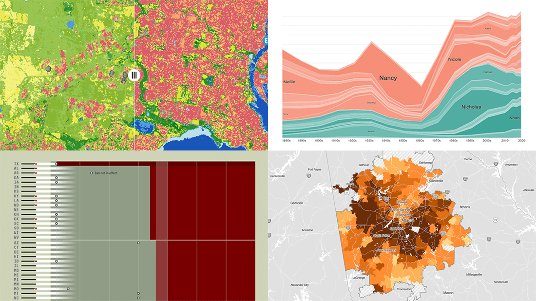 DataViz Weekly is here with another batch of impressive data graphics worth looking at and exploring! Today, we are eager to tell you about the following four new projects:
- Burden of abortion across the United States — FiveThirtyEight
- Real estate investor activity in the 40 major American cities in 2021 — The Washington Post
- Historical popularity of baby names in the U.S. since the 1880s — Namerology
- Australia land cover in detail — Geoscience Australia
- Categories: Data Visualization Weekly
- No Comments »
Most Interesting Visualizations to Check Out and Learn From — DataViz Weekly
March 4th, 2022 by AnyChart Team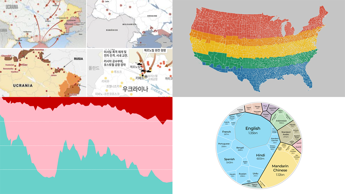 We are glad to continue our DataViz Weekly blog feature where we curate some of the most interesting and topical visualizations from around the internet. Check out a new selection:
- Russia–Ukraine conflict in maps — Lisa Charlotte Muth’s thread on Twitter
- The world’s most popular languages — Al Jazeera
- Dividing the U.S. by equal populations — Engaging Data
- Lifestyle changes during COVID-19 lockdowns — The Guardian
- Categories: Data Visualization Weekly
- No Comments »
Beijing Olympics Medal Trackers — DataViz Weekly
February 25th, 2022 by AnyChart Team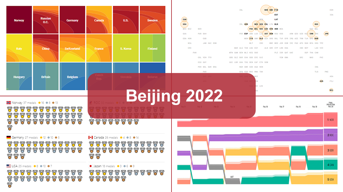 Following sixteen days of thrilling, action-packed competition, the Beijing 2022 Winter Olympics officially came to an end on Sunday, February 20. Norway finished at the top of the leaderboard, with 16 gold and 37 total medals won by its athletes at the Games.
During the Tokyo 2020 Summer Olympics that took place just six months before, we published a special edition of DataViz Weekly looking at four awesome medal trackers produced by The New York Times’s The Upshot, Bloomberg, Axios, and FiveThirtyEight. These interactive data visualization projects were brought back for the Beijing 2022 Winter Olympics. So now, we invite all lovers of charts and sports to look at their newest editions. They offer a frictionless way to explore medal counts and country standings after the Games with the help of stunning visualizations.
- Categories: Data Visualization Weekly
- 1 Comment »
Check Out These Great New Visual Data Stories — DataViz Weekly
February 18th, 2022 by AnyChart Team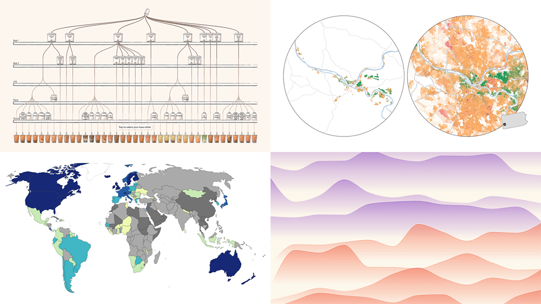 Eager to see some great visualizations? We’re here to tell you about four new data stories that are definitely worth checking out! See which projects made it to this DataViz Weekly and read on.
- Bubble tea versions in a visual breakdown — Taiwan Data Stories
- Age of democracies worldwide — Our World in Data
- Women in news headlines — The Pudding
- Redlining’s lasting legacy — FiveThirtyEight
- Categories: Data Visualization Weekly
- No Comments »
Recalling Most Awesome Recent Data Visualizations — DataViz Weekly
February 11th, 2022 by AnyChart Team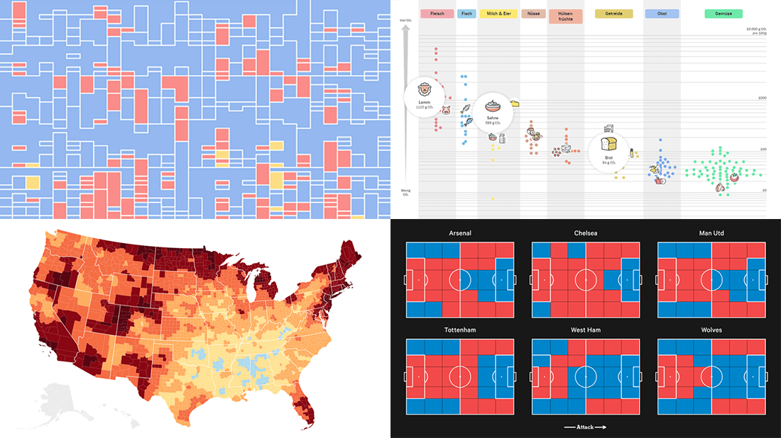 It’s Friday, time to recall the most awesome data visualizations of all that have caught our attention over the past week. So everyone, welcome to DataViz Weekly!
- Decline of English on Spotify — The Economist
- English Premier League contenders for the Champions League qualification — The Athletic
- Carbon footprint of food — Der Tagesspiegel
- Air temperature change in every U.S. county — The Guardian
- Categories: Data Visualization Weekly
- No Comments »
How to Create Calendar Chart in JavaScript
February 11th, 2022 by Shachee Swadia A calendar chart is an effective way to represent activity over time graphically. It can nicely display how a quantity varies with the days, weeks, months, and years. If you want to learn to build stylish interactive calendar charts easily using JavaScript, welcome to my step-by-step tutorial!
To make this guide not only educating but also entertaining, I decided to reproduce GitHub’s calendar graph and visualize the repository contribution activity of Mike Bostock, a prominent computer scientist known globally as one of the creators of the open-source JavaScript charting library D3.js and of the interactive data visualization development platform Observable. So, we’ll also get a telling picture of how he performed in that regard!
Read the JS charting tutorial »
- Categories: AnyChart Charting Component, Big Data, HTML5, JavaScript, JavaScript Chart Tutorials, Tips and Tricks
- No Comments »