Best Data Visualizations of 2024 — DataViz Weekly
January 17th, 2025 by AnyChart Team In 2024, data visualization remained a vital tool for exploring complex topics and presenting insights in engaging ways. From global conflicts and environmental challenges to cultural phenomena and historical trends, charts and maps provided valuable perspectives and captivated audiences.
This special edition of DataViz Weekly highlights the best data visualizations of 2024. Featuring projects selected by FlowingData, The Pudding, and the Global Investigative Journalism Network (GIJN), as well as year-in-review collections from leading media sources, it offers a curated look at some of the most compelling visual storytelling created during the year. All aboard!
- Categories: Data Visualization Weekly
- No Comments »
Top Data Visualizations We’ve Recently Seen — DataViz Weekly
October 18th, 2024 by AnyChart Team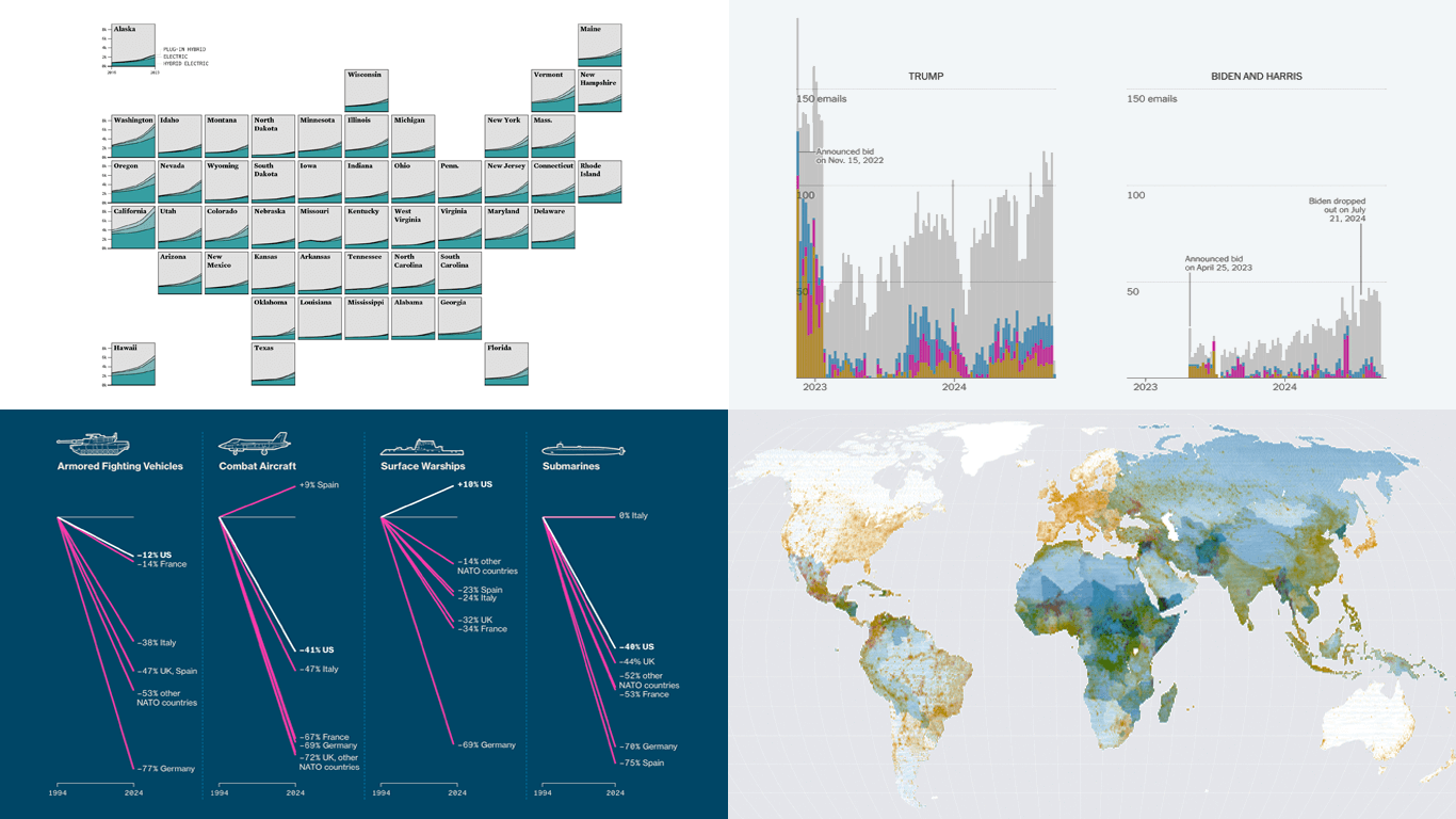 It’s Friday, which means it’s the perfect moment to look back at the data visualizations that have sparked our curiosity over the past few days. So, without further ado, welcome to DataViz Weekly!
- Electric vehicle adoption across the United States — FlowingData
- Europe’s military reductions and defense challenges — Bloomberg
- Climate—Conflict—Vulnerability Index for global risk assessment — UniBw München, PIK, AA, Truth & Beauty
- Campaign emails with donation incentives in the 2024 U.S. presidential race — The New York Times
- Categories: Data Visualization Weekly
- No Comments »
Fresh Charts and Maps You Need to See — DataViz Weekly
August 2nd, 2024 by AnyChart Team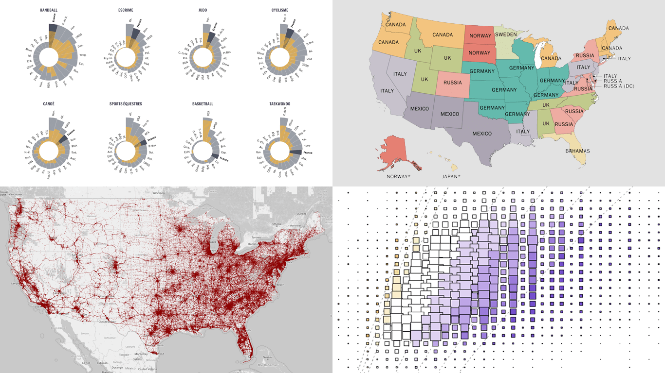 Greetings from DataViz Weekly, a feature on our blog dedicated to exploring the power of charts and maps in uncovering and communicating data. As visual creatures, humans understand and engage with information more effectively when it’s presented in graphical form. Our series focuses on highlighting outstanding and fresh data visualizations that have captured our attention. Today, we’ll showcase these great projects:
- Olympic performances since 1948 with focus on France — Le Monde
- U.S. immigrant origins and settlements in 1850–2022 — Pew Research Center
- Body mass index in the United States — FlowingData
- Traffic fatalities in the U.S. in 2001–2022 — Roadway Report
- Categories: Data Visualization Weekly
- No Comments »
Visualizing Forecast Accuracy, College Admissions, Global Demographics, and Election Results — DataViz Weekly
July 12th, 2024 by AnyChart Team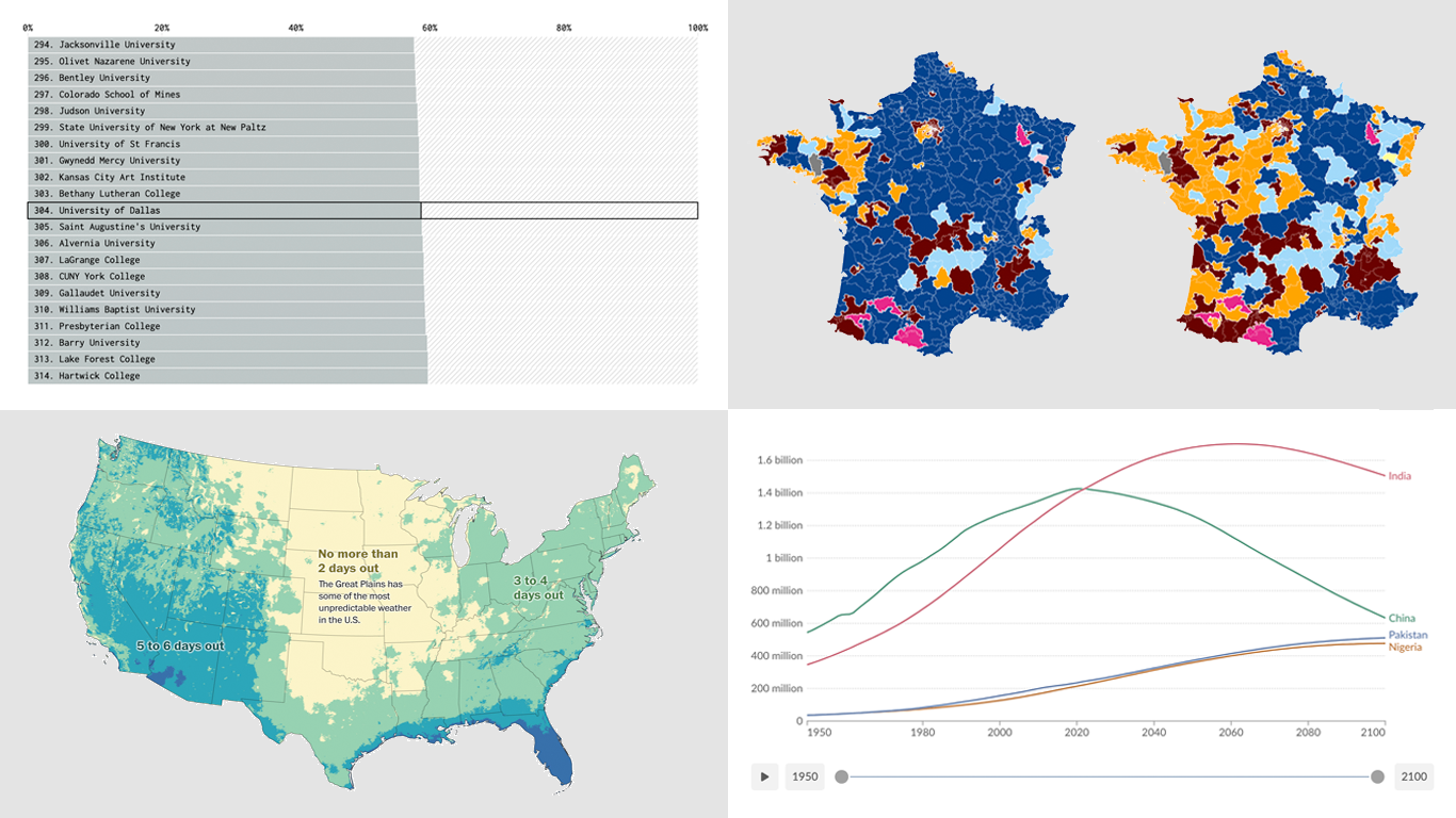 Ready for a fresh dose of impressive data visualizations crafted by seasoned professionals? Here’s what DataViz Weekly has in store for you this time:
- Weather forecast accuracy across the United States — The Washington Post
- U.S. college admission rates — FlowingData
- Global demographic shifts — Our World in Data
- France’s parliamentary election results — Various publications
- Categories: Data Visualization Weekly
- No Comments »
Revealing Insights with Data Visualizations — DataViz Weekly
June 14th, 2024 by AnyChart Team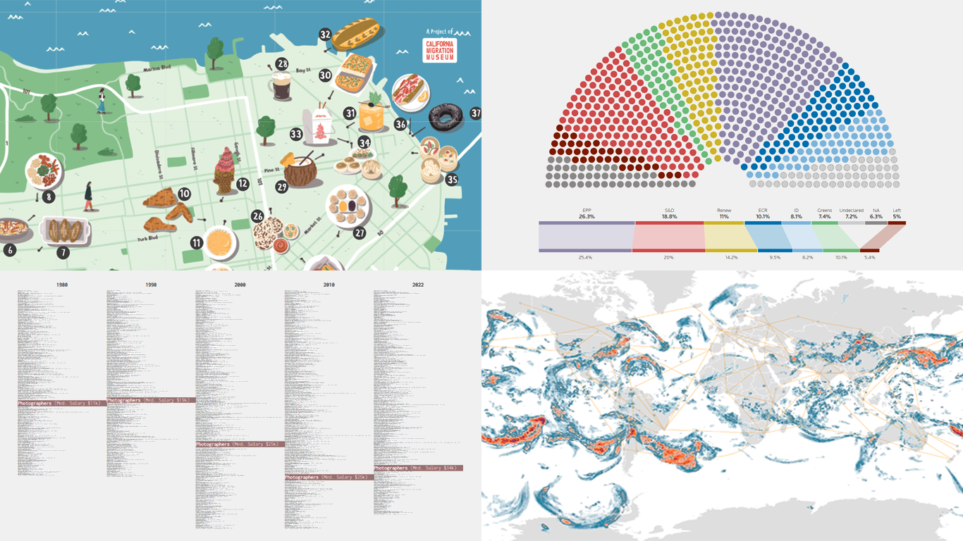 Data visualizations bridge the gap between raw numbers and clear, understandable insights. This week on DataViz Weekly, we showcase four remarkable new examples of how charts and maps illuminate diverse topics in a comprehensible and engaging manner:
- In-flight turbulence — South China Morning Post
- Shifts in occupation and income — FlowingData
- San Francisco’s culinary diversity — California Migration Museum
- EU election results — Reuters
- Categories: Data Visualization Weekly
- No Comments »
New Insightful Data Visualizations in Focus — DataViz Weekly
May 10th, 2024 by AnyChart Team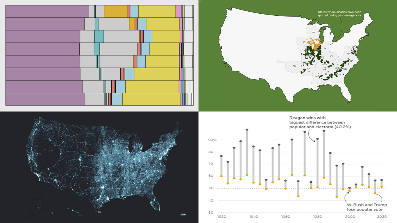 Data visualization serves as a powerful tool that enhances our understanding of complex data, transforming raw figures into insights. DataViz Weekly is here to share several great examples that demonstrate this capability in action. This week, we highlight four data visualization projects that have recently captured our attention:
- Exploring the U.S. bridges — Esri
- Analyzing time use by age — FlowingData
- Tracking historic cicada emergence 2024 — CNN
- Understanding election polls — Reuters
- Categories: Data Visualization Weekly
- No Comments »
Best Data Visualizations of 2022 — DataViz Weekly
December 30th, 2022 by AnyChart Team 2022 has been fruitful in terms of data visualizations for every taste and interest. On DataViz Weekly, we’ve shown you more than 200 awesome projects as great examples of effective charting and mapping in action. Today, in the year’s last edition, let’s look at the best data visualizations of 2022 through the eyes of third-party experts!
Find out which projects made it to the “best of the year” selections of Nathan Yau, DataJournalism.com, The Pudding, and Kenneth Field.
- Categories: Data Visualization Weekly
- No Comments »
Best Data Visualizations We’ve Come Across Most Recently — DataViz Weekly
October 28th, 2022 by AnyChart Team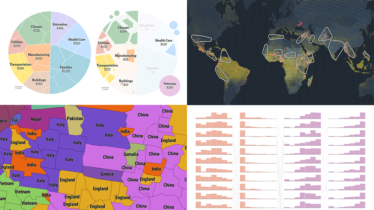 Interesting charts and maps come out all the time. DataViz Weekly is here to show you the best data visualizations we have seen most recently! Look at our newest picks!
- Feelings at work by occupation — FlowingData
- Impact of climate on conflicts — Auswärtiges Amt (German Foreign Office)
- U.S. President Biden’s legislative agenda — The Upshot
- Australians’ birth countries, languages, and religions — SBS News
- Categories: Data Visualization Weekly
- No Comments »
Fresh Collection of Interesting Charts & Maps — DataViz Weekly
June 10th, 2022 by AnyChart Team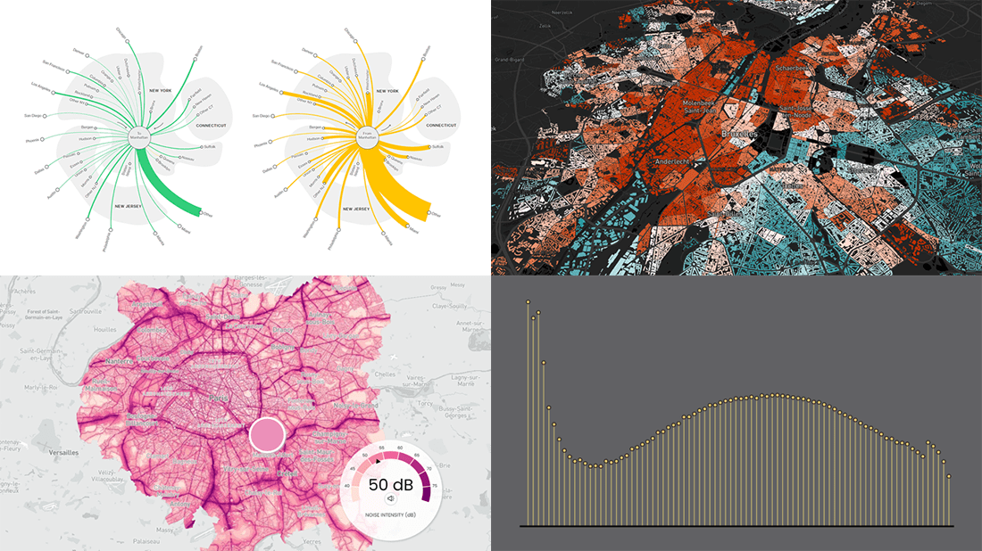 A lot of visualizations appear every day all over the web. On DataViz Weekly, we share with you those that we’ve found especially noteworthy. Check out our fresh collection of interesting charts and maps!
- Inequality and health in Brussels — Médor
- Noise pollution in Paris, London, and New York City — Possible
- Manhattan migration patterns — Bloomberg
- Commonness of divorce in the United States — FlowingData
- Categories: Data Visualization Weekly
- No Comments »
Wonderful Data Graphics on Time Use, Rents, COVID-19, Airlines — DataViz Weekly
April 22nd, 2022 by AnyChart Team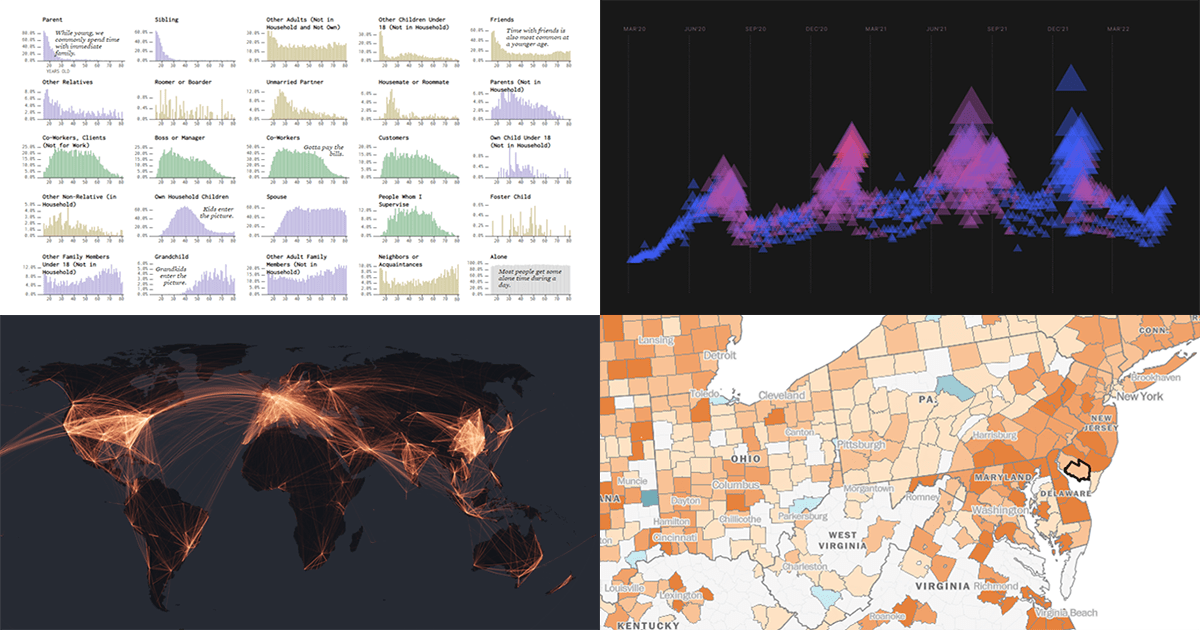 Each Friday, we recall the best data graphics we have seen out there over the last seven days or so and present them to you in a quick roundup. So, DataViz Weekly is here! Just making sure you have not missed these wonderful visualizations:
- People we spend time with over the lifetime — Nathan Yau
- Housing rents across the U.S. from Q1 2021 to Q1 2022 — The Washington Post
- Two years of the COVID-19 pandemic in South Africa — Media Hack
- Air travel market recovery worldwide — The Financial Times
- Categories: Data Visualization Weekly
- No Comments »