Visualizing Data on Income, Volcano Eruption, Shopping, Climate — DataViz Weekly
January 28th, 2022 by AnyChart Team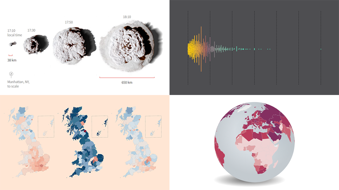 Continuing our regular roundups of the most interesting charts, maps, and infographics, we are glad to spotlight a bunch of new awesome projects for your inspiration. Today on DataViz Weekly:
- Americans’ annual personal income — Nathan Yau
- Tonga eruption’s true scale — Reuters
- High street crisis in Great Britain — The Financial Times
- Climate change drivers and sufferers — Der Tagesspiegel
- Categories: Data Visualization Weekly
- No Comments »
Best Data Visualizations of 2021 — DataViz Weekly
January 7th, 2022 by AnyChart Team In 2021, there were 53 Fridays. It means a total of 53 DataViz Weekly roundups came out during the year, putting a spotlight on some of the most interesting charts, maps, and infographics from around the web. Today, on the first Friday of 2022, we invite you to remember — or get to know in case you missed something — the very best data visualizations of 2021.
As in previous “best of year” collections (2020, 2019, 2018), we decided not to reinvent the wheel but to take a quick look at renowned experts’ picks. Now, check out four lists of the best projects — from Nathan Yau, Kenneth Field, Terence Shin, and DataJournalism.com.
- Categories: Data Visualization Weekly
- No Comments »
Analyzing Population Shifts, Box Office, Heat Exposure, Daily Routines — DataViz Weekly
November 26th, 2021 by AnyChart Team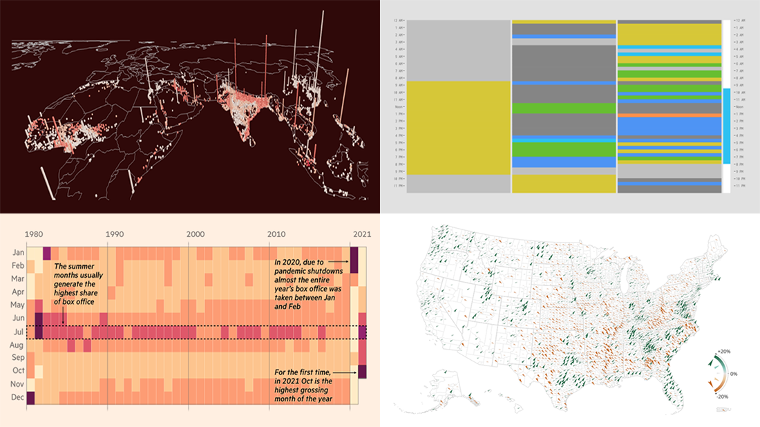 It is much easier to analyze large amounts of data when they are represented using the right visualization techniques. We are ready to show you another four vivid examples! Today on DataViz Weekly:
- Population and racial changes in the United States — Pitch Interactive & Census 2020 Data Co-op
- Box office for cinema-exclusive and simultaneous release movies — FT
- Global extreme urban heat exposure — AP News
- Most common daily time uses — Nathan Yau
- Categories: Data Visualization Weekly
- No Comments »
Visualizing Data on Prices, Emissions, Workforce, Palm Oil — DataViz Weekly
November 12th, 2021 by AnyChart Team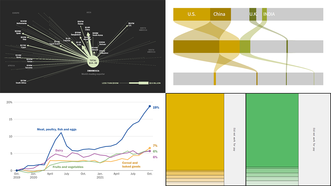 Hi everyone! DataViz Weekly is here to introduce you to some awesome new data visualizations that we have recently found out there and admired!
- Inflation in America — The Washington Post
- Carbon dioxide emissions by country — Reuters
- Shifts in how much U.S. men and women work — Nathan Yau
- Sustainable palm oil problem — Bloomberg Green
- Categories: Data Visualization Weekly
- No Comments »
Coolest Latest Visualizations You Can’t Miss — DataViz Weekly
October 29th, 2021 by AnyChart Team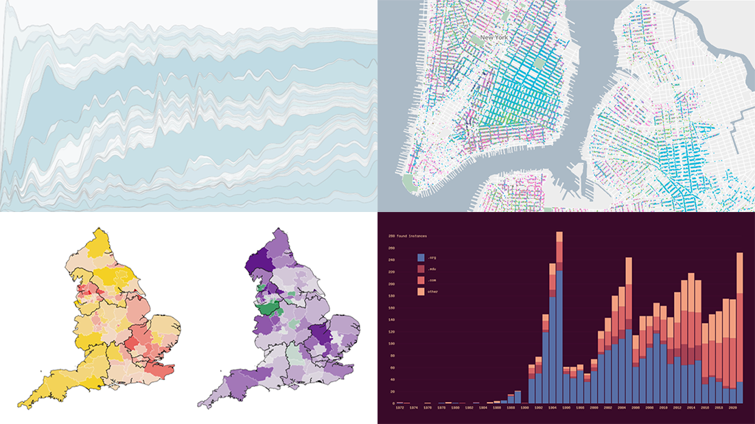 Welcome back to DataViz Weekly, a regular series of posts on AnyChart Blog putting a spotlight on the coolest data visualization works we have come across over the last few days! Today, we’re glad to feature and tell you about the following projects:
- Mapping historical New York City — Columbia University
- Tracking the Lenna image — The Pudding
- Analyzing the number of doctors in England — Sky News
- Charting TV genres over time — Nathan Yau
- Categories: Data Visualization Weekly
- No Comments »
Demonstrating Power of Clever Data Visualization in 4 Examples — DataViz Weekly
October 15th, 2021 by AnyChart Team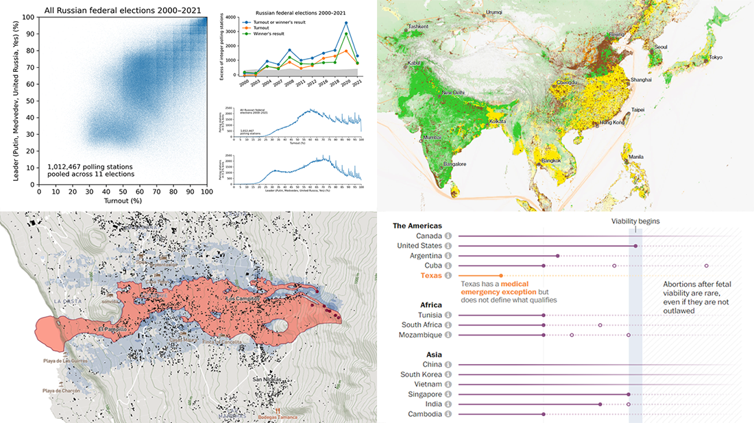 When properly visualized, data can truly speak and tell stories allowing us to quickly decode what raw numbers hide. Would you like to see some clever examples? Look at the awesome new charts and maps that made it to this Friday’s DataViz Weekly!
- All Russian federal elections since 2000 — Dmitry Kobak and Sergey Shpilkin
- Advance of the lava in La Palma — El País
- Abortion laws worldwide — The Washington Post
- Global methane emissions — Bloomberg Green
- Categories: Data Visualization Weekly
- No Comments »
New Interesting Visualizations on Jobs, Climate, TV Shows, Pandemic — DataViz Weekly
October 8th, 2021 by AnyChart Team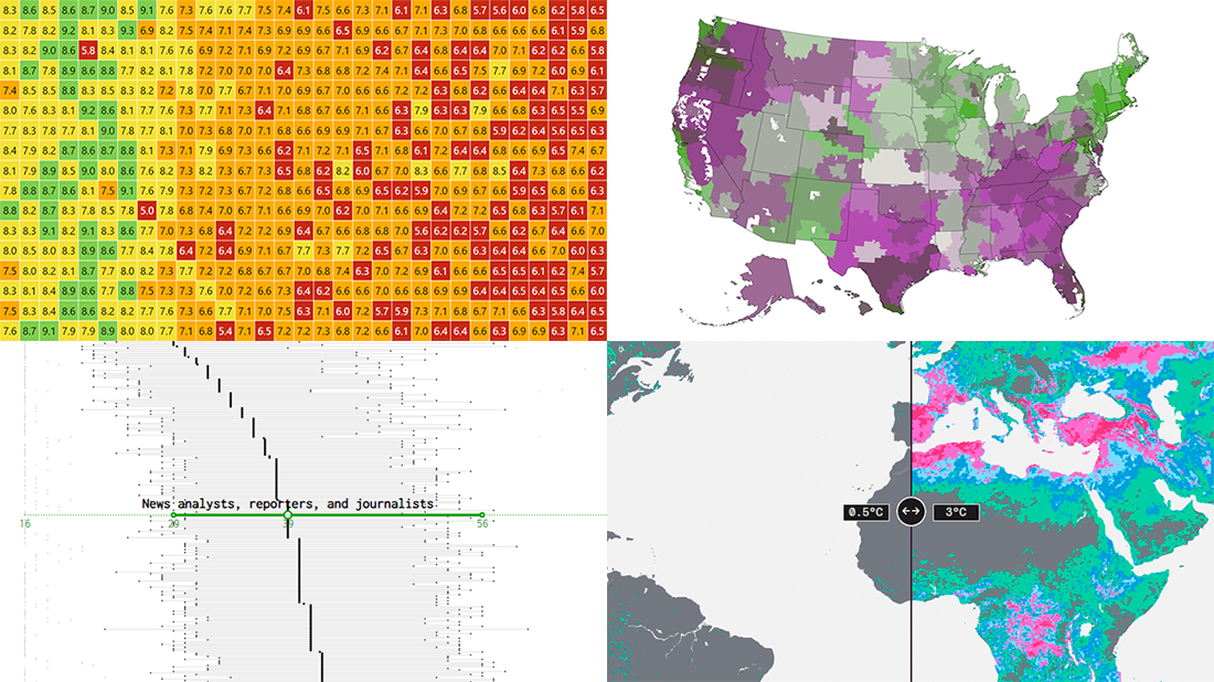 For all who already have an eye for data visualization or only want to get it, DataViz Weekly is here with an overview of four new interesting projects curated from around the web!
- U.S. jobs by age of workers — Nathan Yau
- Probable climate futures based on different scenarios — Probable Futures
- Average IMDb scores of all TV series by episode — Jim Vallandingham
- Vaccination vs hospitalization rates across the United States — The Washington Post
Read on to learn more about each and check them out!
- Categories: Data Visualization Weekly
- No Comments »
Most Compelling New Examples of Data Visualization in Action — DataViz Weekly
September 24th, 2021 by AnyChart Team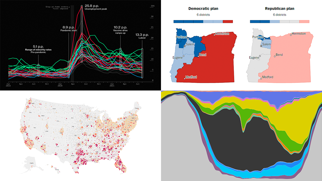 Hey everyone! It is Friday, and we are here to put a spotlight on the most compelling examples of sensible data visualization we have recently seen around the internet. As always, let’s start with a quick list and then look at each project. All aboard for DataViz Weekly!
- Intensive care unit occupancy rates in the United States — The New York Times
- Minority unemployment rates in 15 large U.S. cities. — Bloomberg
- Early proposals for congressional redistricting in Oregon, Indiana, and Colorado — The Washington Post
- Time use of American men and women by employment status — Nathan Yau
- Categories: Data Visualization Weekly
- No Comments »
Excellent Examples of Data Graphics from Around Internet — DataViz Weekly
August 27th, 2021 by AnyChart Team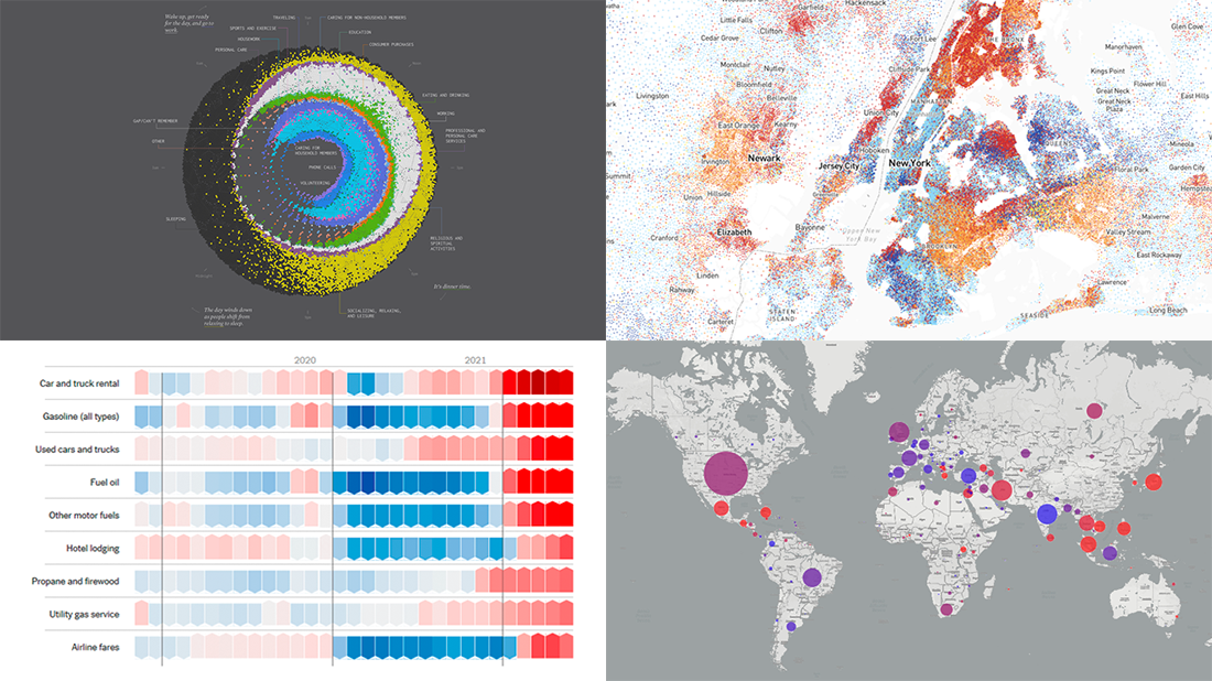 Are you ready for another set of excellent data graphics examples? It’s time! The following projects made it to the newest DataViz Weekly digest — see the list below and keep reading for a closer look!
- Average weekday in the life of Americans — Nathan Yau
- Race and ethnicity across the United States — CNN
- Inflation in the United States — NYT Opinion
- COVID-19 spread across the world over time — Olivia Jack
- Categories: Data Visualization Weekly
- No Comments »
Visualizing Codebase Structure, Climate Data, Time Use Patterns, and Census Stats — DataViz Weekly
August 13th, 2021 by AnyChart Team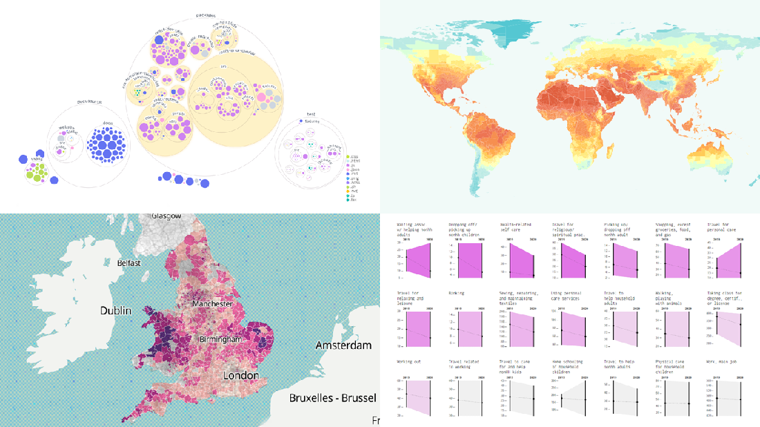 It is Friday the 13th. But don’t worry about the irrational! Check out the four really cool data visualization projects we have discovered around the web these days and you will be fine, entertained, and inspired.
Today on DataViz Weekly:
- Codebase visualization in packed bubble charts — GitHub OCTO
- Climate change impacts through 2099 — Climate Impact Lab
- Shifts in U.S. time use patterns during the pandemic — Nathan Yau
- 50 years of social change in England and Wales — ONS
- Categories: Data Visualization Weekly
- No Comments »