Impressive Charts on Age, Energy, Climate, and Music — DataViz Weekly
August 7th, 2020 by AnyChart Team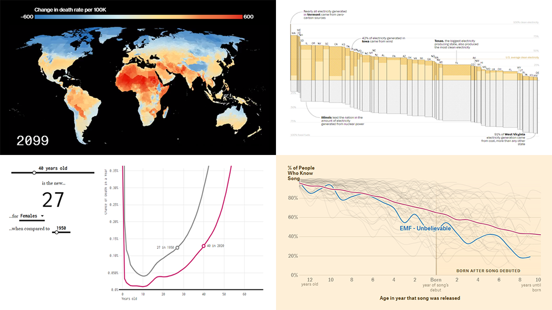 Lately, we’ve come across a lot of new impressive charts all over the internet. Here are some of the most interesting ones — check them out and you’ll see the real power of data visualization in action! Today in DataViz Weekly:
- New age for your age — FlowingData
- Electricity generation in the U.S. states by fuel source — The Washington Post
- Mortality consequences of climate change and income inequality — Bloomberg Green
- 1990s music recognition across generations — The Pudding
- Categories: Data Visualization Weekly
- No Comments »
Curating New Interesting Data Visualizations Worth Checking Out — DataViz Weekly
July 17th, 2020 by AnyChart Team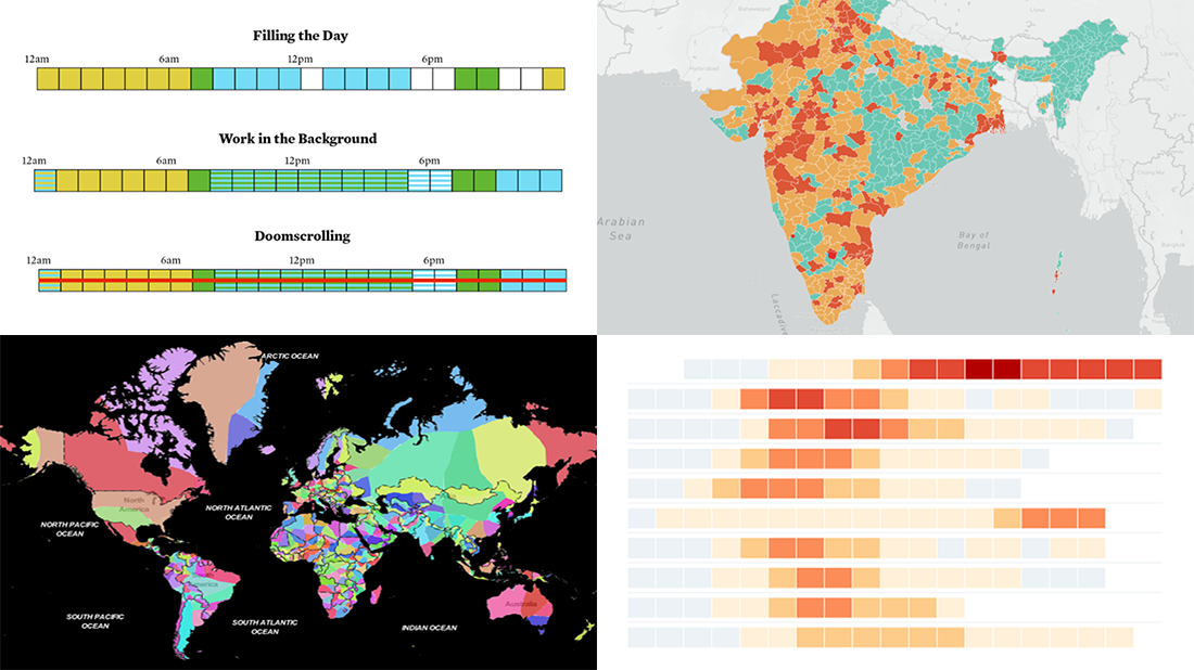 We continue to curate new interesting data visualizations from around the web for our DataViz Weekly blog. Join us as we look at some of the best charts and maps we have seen these days!
- Parenting and Working During Lockdown — Nathan Yau
- Nearest Neighboring Countries — Topi Tjukanov
- Excess Deaths Worldwide — The Economist
- Reopening India from Lockdown — Development Seed and Mapbox
- Categories: Data Visualization Weekly
- No Comments »
Hot Visualizations on Youth Life, American Names, Climate Change, and Mother Tongues — DataViz Weekly
January 24th, 2020 by AnyChart Team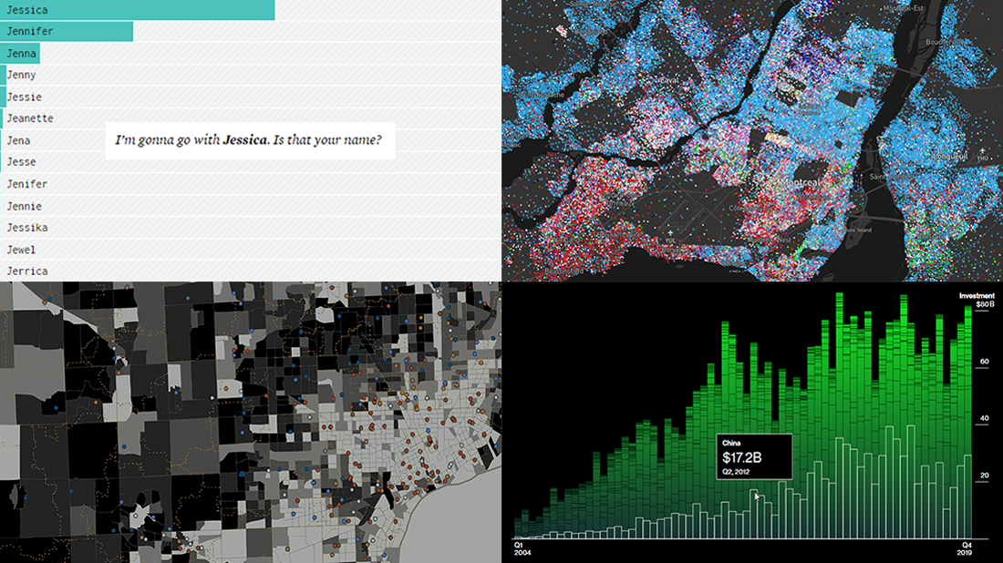 Check out some of the new hot visualizations we have come across this week! Not only are they good graphical data presentation examples, they also bring interesting insights.
- Youth life expectancy and educational opportunity across the United States — Child Trends
- Guessing names based on what letter(s) they start with — FlowingData
- Climate change scoreboard — Bloomberg Green
- Mother tongues across Canada — Anagraph
- Categories: Data Visualization Weekly
- No Comments »
Best Charts of 2019 — DataViz Weekly
January 10th, 2020 by AnyChart Team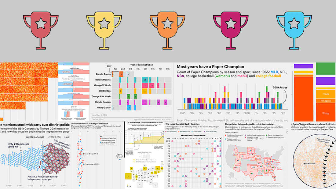 2019 was very fruitful for the world of data visualization. We saw a lot of charts, maps, and infographics on all kinds of topics published here and there. Today we would like to invite you to recall some of the most top-notch data visualization projects. Enjoy these four awesome collections of the best charts of the past year:
- FlowingData’s picks for the best data visualization projects of 2019
- The Pudding’s favorite visual and data-driven stories of 2019 (the Pudding Cup winners)
- FiveThirtyEight’s 56 best (“and weirdest”) charts made in 2019
- Visual Capitalist’s top infographics of 2019
- Categories: Data Visualization Weekly
- 2 Comments »
Cool Charts on Housing, Climate, Jobs, and Economy — DataViz Weekly
December 13th, 2019 by AnyChart Team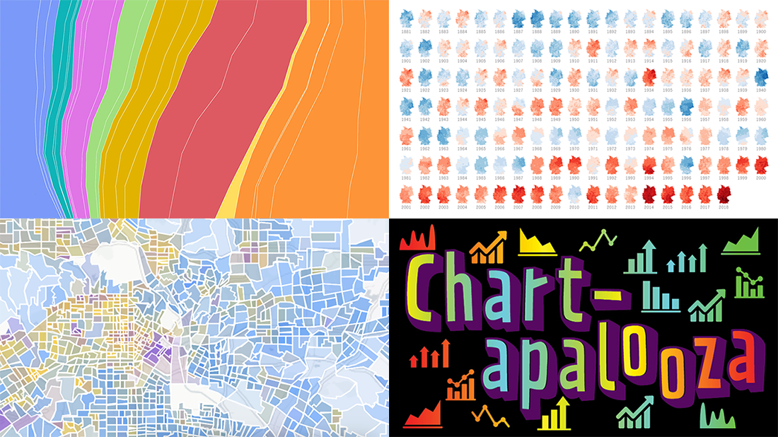 We know you love good data visualizations. So what we have here for you today is a presentation of new cool charts we’ve found this week. Look at the fresh examples of awesome data graphics, in DataViz Weekly:
- U.S. metropolitan growth — Zillow
- Climate change in Germany — Zeit Online
- Changes in job distribution in America — FlowingData
- Canada’s economy chartapalooza — Maclean’s Magazine
- Categories: Data Visualization Weekly
- No Comments »
Charting Salaries, Earthquakes, Housing, and Coffee Shops — DataViz Weekly
November 22nd, 2019 by AnyChart Team Join us as we praise new amazing data visualization projects from around the web. These are cool examples dedicated to charting salaries, earthquakes, housing history, and coffee shop locations. Look what DataViz Weekly has to showcase today:
- Salaries across occupations in the United States — FlowingData
- Earthquakes worldwide, with exaggerated depth — Raluca Nicola
- History of Moscow housing — Strelka Mag
- Coffee shops in America and worldwide — Thinknum
- Categories: Data Visualization Weekly
- No Comments »
Charting Data About Retirement Savings, Warren’s Plans, California Housing, and UK Election — DataViz Weekly
November 15th, 2019 by AnyChart Team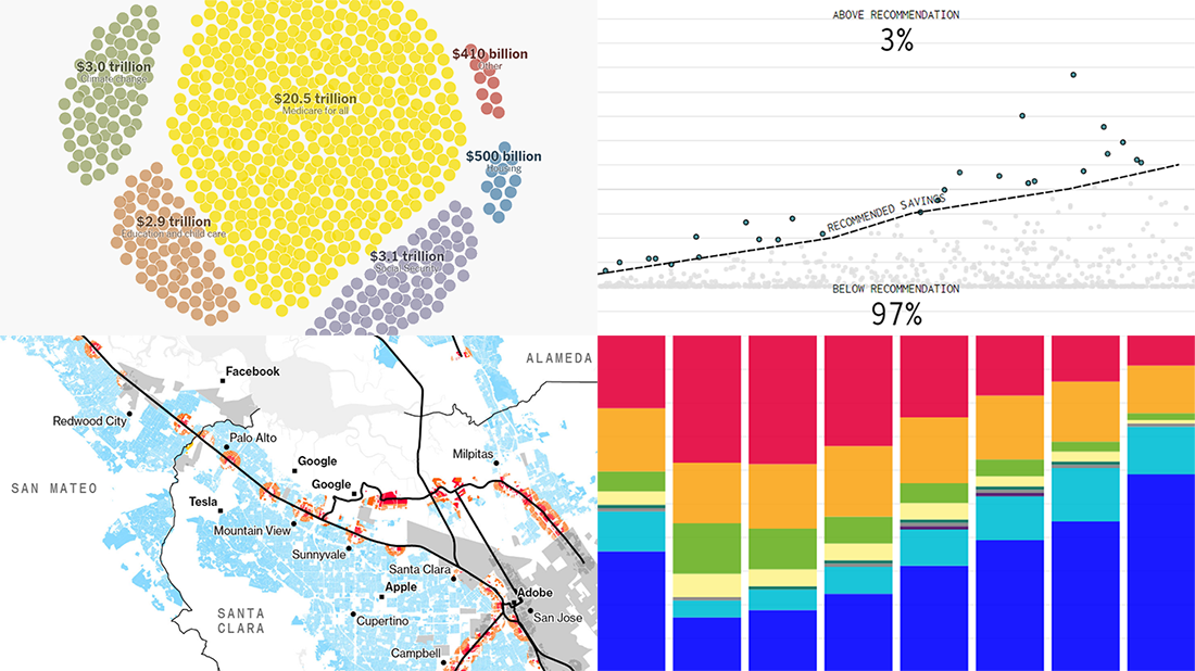 It’s Friday, which means we are ready to share with you new awesome examples of charting in action. Look how powerful the right visualization can be when one needs to explore or communicate various statistics. Here’s a quick list of the projects presented in this new DataViz Weekly post — we’ve found them out there these days:
- Saving for retirement in the United States — FlowingData
- Costs of Elizabeth Warren’s policy plans — The New York Times
- Housing crisis in California — Bloomberg
- Voting intentions before the 2019 United Kingdom general election — CNBC
- Categories: Data Visualization Weekly
- No Comments »
Information Graphics About Friends, Birds, Savings, and Pollution — DataViz Weekly
November 1st, 2019 by AnyChart Team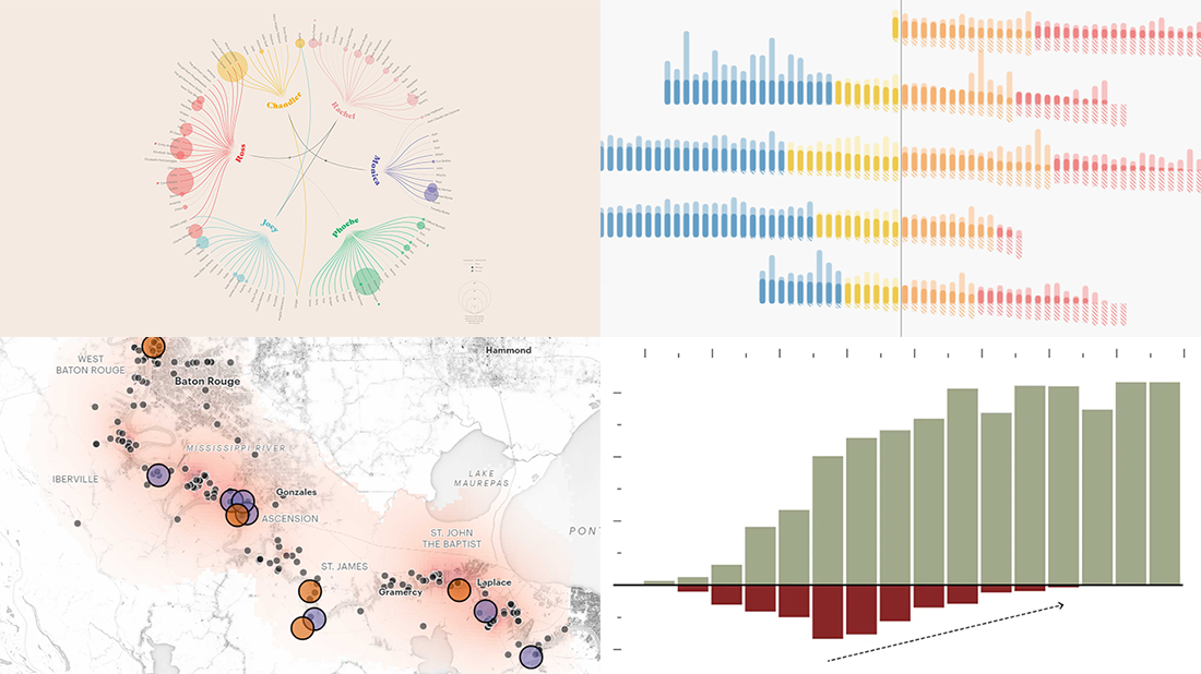 Take a look at four cool information graphics projects we’ve recently come across around the web and decided to feature this time in the DataViz Weekly series:
- Travels, events, and relationships in the Friends TV series — Marion Rouayroux, IIB Awards
- North American birds at risk from climate change — Audubon
- Assets and debt in the United States by age group — FlowingData
- Aggravating air pollution in Louisiana’s “Cancer Alley” — ProPublica
- Categories: Data Visualization Weekly
- 3 Comments »
Visualizing Numbers on Migration, Powerlifting, Commute, and Nature — DataViz Weekly
October 18th, 2019 by AnyChart Team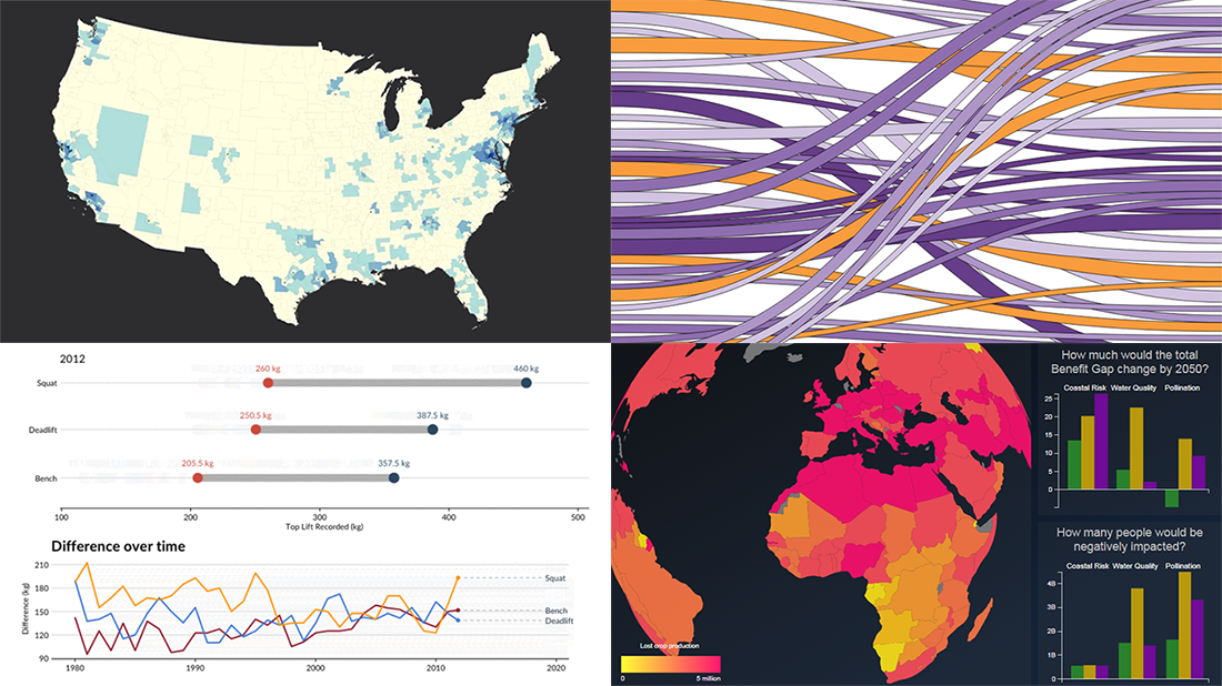 This week, we’ve found more new cool projects that wonderfully demonstrate the power of visualizing numbers. Here are the four most interesting ones where charts and maps actually let data speak — join us as we quickly present them in today’s DataViz Weekly:
- Charting migration pathways worldwide — Bloomberg
- Plotting differences between men’s and women’s top lifts at IPF events — Connor Rothschild, Rice University
- Mapping commute thresholds across the United States of America — Nathan Yau, FlowingData
- Visualizing nature’s contributions to people globally — Natural Capital Project
- Categories: Data Visualization Weekly
- No Comments »
Visualizing Income in Spain, Restless Sleep, California Legislature, and Political Regimes — DataViz Weekly
September 13th, 2019 by AnyChart Team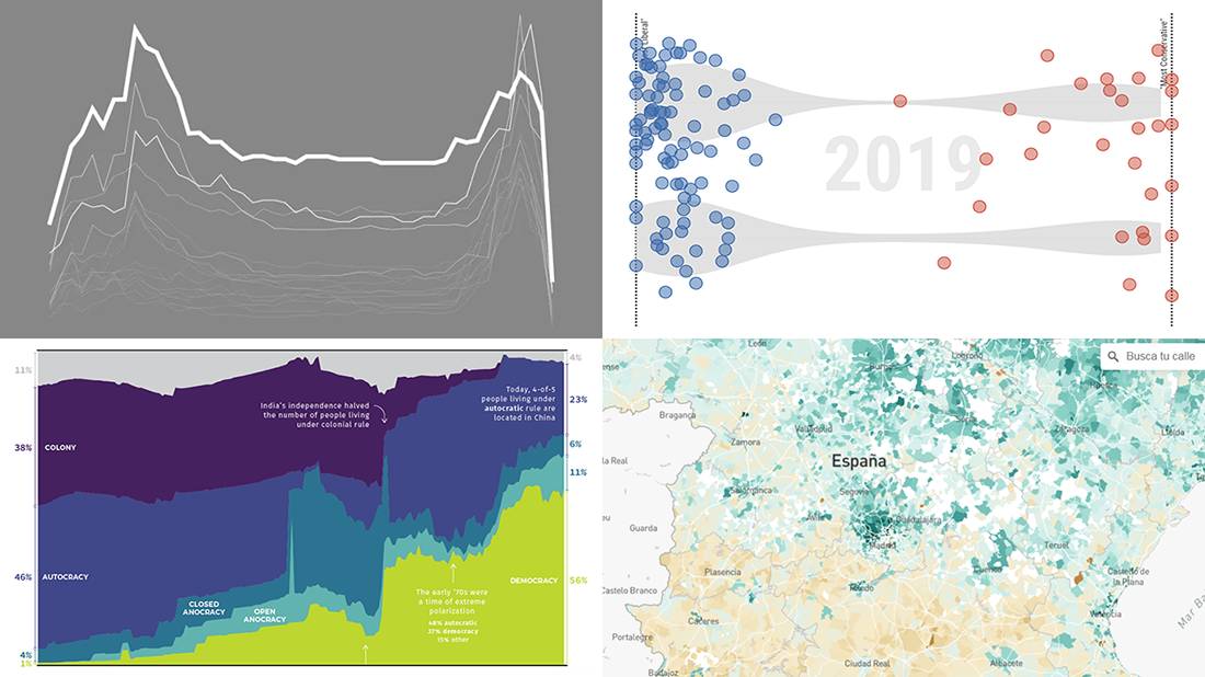 It’s Friday, so we continue the DataViz Weekly series on our blog. Today we praise new interesting projects with charts and infographics visualizing income of Spaniards (El País), restless sleep with age (FlowingData), ideological polarization in the California legislature in 1993-2019 (CalMatters), and political regime changes worldwide since 1816 (Visual Capitalist). Look at these cool examples of the power of data visualization in action.
- Categories: Data Visualization Weekly
- No Comments »