Data Visualization in Action: Fresh Examples — DataViz Weekly
February 14th, 2025 by AnyChart Team We’re back with DataViz Weekly, where we showcase some of the best new data visualization examples — from individual charts and maps to full-scale visual stories and projects. Take a look at our latest picks:
- Swiss research funding — Colas Droin
- Education and voting patterns in U.S. presidential elections — Jon Boeckenstedt
- City walkability and improvement potential — The Economist & Matteo Bruno et al.
- Self-censorship in Super Bowl halftime shows — Artur Galocha for The Washington Post
- Categories: Data Visualization Weekly
- No Comments »
Awesome New Data Visualization Works — DataViz Weekly
November 15th, 2024 by AnyChart Team Welcome back to DataViz Weekly, where we spotlight the most awesome data visualization works we have recently come across. Check out the projects we’re diving into this time:
- Love songs: death or evolution? — The Pudding
- Historical dry streaks in NYC — Bloomberg Green
- NYC subway ridership in detail — Subway Stories
- Vote swings in U.S. presidential elections — NYT
- Categories: Data Visualization Weekly
- No Comments »
How to Build Heatmap in JavaScript
May 30th, 2023 by Shachee Swadia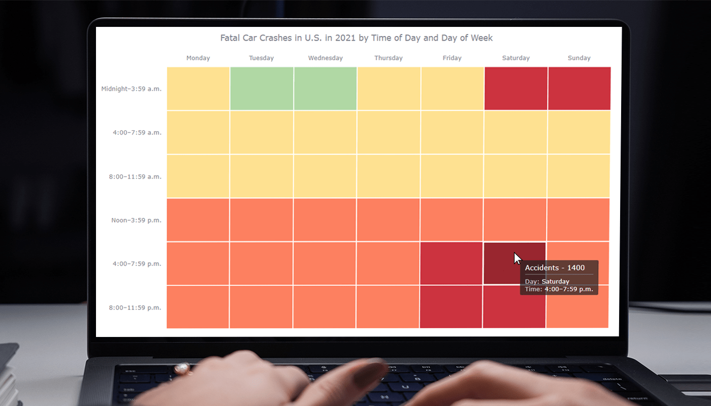 Data visualization is a powerful tool that helps us make sense of complex data. With it, we can spot patterns and trends that might take much more time to become obvious just by looking at raw numbers. One particularly useful chart type is the heatmap, and I’m excited to teach you how to create one with JavaScript in this tutorial.
Read the JS charting tutorial »
- Categories: AnyChart Charting Component, Big Data, HTML5, JavaScript, JavaScript Chart Tutorials, Tips and Tricks
- No Comments »
New Interesting Visualizations on Jobs, Climate, TV Shows, Pandemic — DataViz Weekly
October 8th, 2021 by AnyChart Team For all who already have an eye for data visualization or only want to get it, DataViz Weekly is here with an overview of four new interesting projects curated from around the web!
- U.S. jobs by age of workers — Nathan Yau
- Probable climate futures based on different scenarios — Probable Futures
- Average IMDb scores of all TV series by episode — Jim Vallandingham
- Vaccination vs hospitalization rates across the United States — The Washington Post
Read on to learn more about each and check them out!
- Categories: Data Visualization Weekly
- No Comments »
Excellent Examples of Data Graphics from Around Internet — DataViz Weekly
August 27th, 2021 by AnyChart Team Are you ready for another set of excellent data graphics examples? It’s time! The following projects made it to the newest DataViz Weekly digest — see the list below and keep reading for a closer look!
- Average weekday in the life of Americans — Nathan Yau
- Race and ethnicity across the United States — CNN
- Inflation in the United States — NYT Opinion
- COVID-19 spread across the world over time — Olivia Jack
- Categories: Data Visualization Weekly
- No Comments »
Creating Heat Map Chart Using JavaScript
February 26th, 2020 by Anastasia Zoumpliou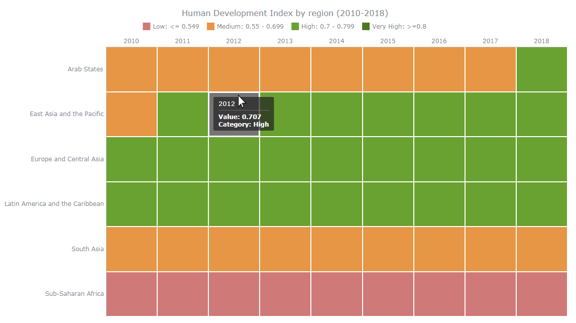 Want to learn how to quickly create an interactive heat map chart using JavaScript? This data visualization tutorial will guide you through the coding process step by step. Basic knowledge of HTML (HTML5) and some understanding of programming are more than enough to master this charting technique.
A heat map (or heatmap chart) is a two-dimensional, matrix-based data visualization in which colors represent values. It is often used to facilitate the analysis of complex data sets, revealing patterns in how variables change, correlate, and more.
Read this JS charting tutorial to the end and you will have no more problems with getting compelling heat maps up and running on your web sites and in your apps.
Read the JS charting tutorial »
- Categories: AnyChart Charting Component, Big Data, Business Intelligence, HTML5, JavaScript, JavaScript Chart Tutorials, Tips and Tricks
- 1 Comment »