Stacked Bar Charts Explained, Vizzies 2017 Winners, Global Temperature Graph, Map of Sea Level Rise | DataViz Weekly
March 31st, 2017 by AnyChart Team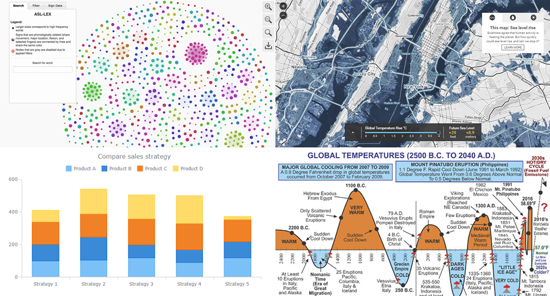
Today is the 13th Friday of the 2017 year, and another weekend is coming! In the meantime, we invite you to enjoy another portion of last week’s notable works in the data visualization field. The first highlight here is the article about stacked bar charts and how to use them, written by our Data Visualization Expert Vitaly Radionov specifically for Smashing Magazine. After briefing you on that, we’ll also take a look at this year’s winners of the Vizzies Challenge, a graph of global temperature change from 2500 BC to 2040 AD, and a (scary) map visualization of the sea level rise expected in the (near?) future.
- Categories: Charts and Art, Data Visualization Weekly
- No Comments »
How to Integrate AnyChart JavaScript Charts in SAP Web UI
March 30th, 2017 by Sandor van der Neut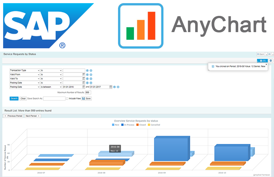 We as ‘mere’ humans are not very good at processing raw statistical data visually when it’s delivered to us in an unrefined form. We are, however, very good in detecting complex patterns when data is presented to us in a graph or a chart. It is therefore no wonder that as a developer you often get the requirement to represent data in a more comprehensible form. When you want to visualize data in the SAP Web UI in a more graphical way the standard possibilities available to you are rather limited. Luckily there are ways to overcome these limitations. When you combine SAP with the graphical power of AnyChart JS Charts a whole range of new possibilities will become available to you.
In this blog I will describe how you can integrate AnyChart in the SAP Web UI with relative ease, how you can feed AnyChart objects with SAP data using both a ‘pull’ and a ‘push’ mechanism and how you can respond in the SAP backend to the events triggered from user interaction with an AnyChart object.
- Categories: AnyChart Charting Component, AnyGantt, AnyMap, AnyStock, Business Intelligence, Dashboards, HTML5, JavaScript, Tips and Tricks
- No Comments »
25 Data Visualization Examples for One Dataset, Animated Map of Twitter Reactions During Oscars, and More | DataViz Weekly
March 17th, 2017 by AnyChart Team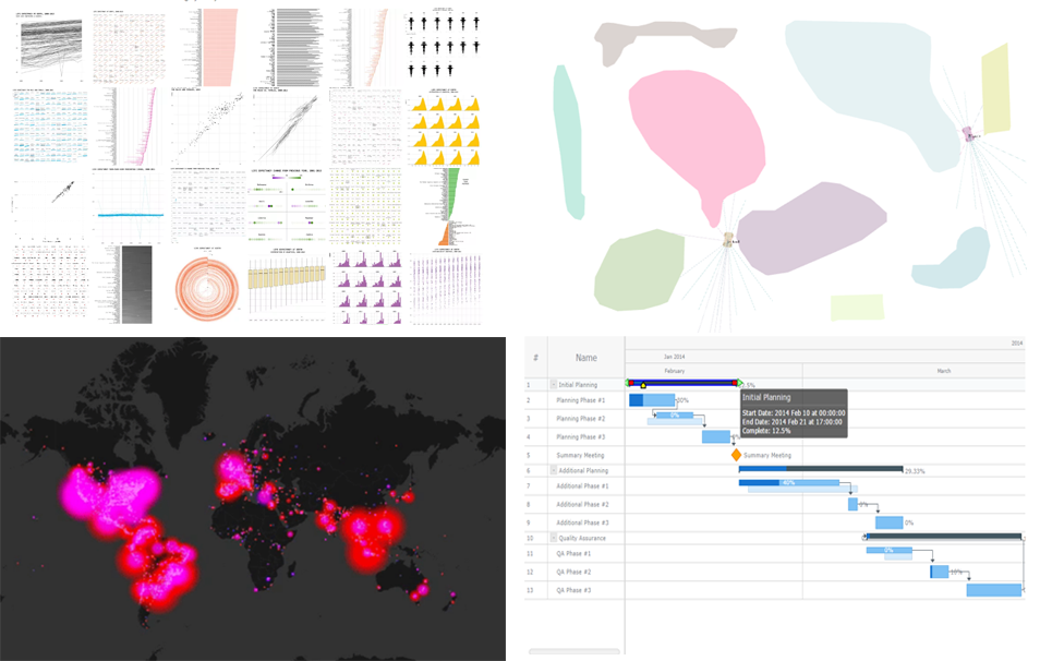 25 data visualization examples of how you can present the same dataset, an animated map of Twitter users’ reaction during this year’s Oscars, JavaScript-based self-driving cars, and an interactive Gantt chart sample with customized connectors in the Live Edit mode. These are the masterpieces that we are highlighting in today’s Data Visualization Weekly post.
Without more ado, let’s get to our latest collection of popular and most shared new charts from around the Web.
- Categories: Charts and Art, Data Visualization Weekly, News
- No Comments »
Data Visualization Weekly: Interactive Dashboard of US States and More
February 17th, 2017 by AnyChart Team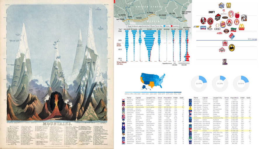 Data Visualization Weekly presented by AnyChart is here! In this new issue, we are glad to show you an interactive dashboard as well as maps and charts in another collection of the best and most followed dataviz masterpieces that we shared on Facebook and Twitter over the course of the last week. These include:
- Interactive Dashboard of US States
- Is Donald Trump’s Wall Necessary?
- Finding the Cleanest Restaurants in NYC
- Early Maps and Infographics of the 1800s
- Categories: Data Visualization Weekly, News
- No Comments »
AnyChart JS Charts 2016 Year in Review: Look How Much Was Done!
December 26th, 2016 by AnyChart TeamThis year has been so busy and fruitful for AnyChart JS Charts that now our team is extremely tired and feels incredibly happy at the same time. In fact, we went all out to make our JavaScript (HTML5) based charting libraries AnyChart, AnyStock, AnyGantt, and AnyMap even much more feature-rich, flexible, user-friendly, and faster with only one purpose – to bring you an unprecedented data visualization experience.
Looking back, we are proud of how MUCH was done in 2016! And now, we invite you to join us in quickly reviewing this year’s accomplishments that further strengthened AnyChart’s global leadership in interactive data visualization.
Without more ado, here is the list of new product and feature arrivals as well as major improvements to our JS charts solutions – a great chance to make sure you did not miss any important innovation.

1. More Types of JS Charts.
JS graphs and diagrams
- Treemap charts
- Linear gauges – LED, tank, and thermometer
- 3D area charts
- 3D bar charts
- 3D column charts
Stock and financial JS charts
- Candlestick charts
- Spline charts
- Step line charts
- Area charts
- Step area charts
- Spline area charts
- Marker charts
- Range column charts
- Range area charts
- Range spline area charts
JS Gantt charts
- PERT (Program Evaluation and Review Technique) charts
- Resource charts (redesigned; beta)
JS maps
- Dot (point) maps
- Flow (connector) maps
- Seat maps
2. More Features in JS Charts.
All JS charts
- Full accessibility (Section 508)
- Localization engine with 196 culture-specific locale settings files. Demos: AnyChart, AnyStock, AnyGantt, AnyMap
JS graphs and diagrams
- Chart themes/palettes (demo)
- Exclude/include data points
- Context menu
- Save data as XSLX and CSV
- Save chart configuration as XML and JSON
- String tokens
- Chart statistics
- Standalone chart elements
- Tooltip settings improvement
Stock and financial JS charts
- Drawing tools and annotations (demo)
- Technical indicators – MACD, RSI, SMA, EMA, ROC, Aroon, and custom
- Data grouping
- Markers on data points
- Range selection UI
- Legend interactivity
- Y-scale comparison mode (changes and percentage changes)
JS Gantt charts
- Calendar support
- Smart timeline
- Event markers for time intervals and important events
- Timeline markers for multiple milestones
JS maps
- Drill down
- Longitude/latitude API
- Move/zoom API
- Rich integration of keyboard and mouse controls
- 13 map projections
3. Easier JS charting.
- Chart editor (demo)
- Demos of business solutions including the following JavaScript (HTML5) dashboards:
- Web Audience dashboard
- Human Resources dashboard
- Investment Portfolio dashboard
- Sales dashboard
- CIO dashboard
- Site Speed Overview dashboard
- States of the US dashboard
- Migration tool – a small library for easier transit from AnyChart 5/6 to 7
- 20+ technical integration templates and samples for easy JS/HTML5 data visualization with any popular technology stack:
- ASP.NET – C# / C#, SignalR / VB.NET – MySQL integration template
- Clojure – ClojureScript – PostgreSQL integration template
- Go – (Revel) – MySQL integration template
- iOS – Objective-C – SQLite integration template
- Java Servlets – Maven, JDBC, JSP – MySQL integration template
- Java Spring – Maven, Hibernate – MySQL integration template
- Julia – MySQL integration template
- NodeJS – (Express, Jade) / Socket.IO – MongoDB integration template
- Perl – Catalyst – MySQL integration template
- PHP – (Laravel / Slim / Symfony) – MySQL integration template
- Python – Flask / Django – MySQL integration template
- R – Shiny – MySQL integration template
- Ruby on Rails – (Sinatra) – MySQL integration template
- Scala – Akka / Play – MySQL integration template
- Electron integration template
4. Faster JS Charts.
- Performance improvement (speed test):
- Less than 1s to render 250,000 data points
- Less than 60ms to stream 500 points
- Async rendering (docs)
5. New Products.
- AnyChart 7.x Plugins for Oracle APEX
- GraphicsJS, a powerful open-source JavaScript graphics library (SVG)
To sum up, 2016 was immensely intensive. But 2017 will be no less productive from the very beginning – we promise.
We wish you a peaceful, prosperous, and happy new year!
- Categories: AnyChart Charting Component, AnyGantt, AnyMap, AnyStock, Business Intelligence, Dashboards, Financial Charts, Gantt Chart, GraphicsJS, HTML5, JavaScript, News, Oracle Apex, Stock Charts
- 2 Comments »
JS Charting Without Borders: 21 New Integration Templates for Popular Stacks
December 19th, 2016 by AnyChart TeamMaking your data visualization life ever easier is what we at AnyChart are boundlessly passionate about. This time we focused on further simplifying the integration of our JS charting solutions into your web development environment.
So, prepare to replan your schedule! From now on, you will spend tangibly less time on charting. And please greet the 21 New Technical Integration Templates that we have just released! They will help you deploy HTML5 graphs, maps, stock charts, dashboards, and Gantt diagrams in your stack as easily (and rapidly!) as never before, no matter what programming languages, frameworks, and databases are used.
You can find the templates right here on our website, in the Technical Integrations section.
Basically, our powerful JavaScript/HTML5 based solutions for interactive data visualization – AnyChart, AnyMap, AnyStock, and AnyGantt – are inherently compatible with all major technologies and platforms. Configuring each JS charting library is easy, and we are sure all of you are more than capable of making even rather complicated integrations prefectly done by yourself. But we keep on doing our best to bring you the ultimate simplicity and clarity so you could get along without additional research and other time-consuming activities.
The integration templates we’ve added cover the most popular languages, frameworks and libraries, and database programs. Below is the list of the newly available combinations.
Templates for easily integrating AnyChart JS charting libraries into your stack:
 |
ASP.NET integration
|
 |
Go integration
|
Java integration
|
 |
Julia integration
|
 |
NodeJS integration
|
 |
Perl integration
|
 |
PHP integration
|
 |
Python integration
|
 |
R integration
|
 |
Ruby on Rails integration
|
 |
Scala integration
|
We hope you agree that this is a tremendous addition to the JS charting integration samples published earlier:
- Clojure, ClojureScript and PostgreSQL,
- iOS, Objective-C and SQLite,
- NodeJS and MongoDB,
- PHP and MySQL,
- PHP, Slim and MySQL.
So, you are welcome to make use of our integration templates and samples for easier data visualization. All of them are released on GitHub under the Apache 2.0 License, rest in the AnyChart Integrations repository, and can be forked and changed in any way.
We are going to keep the collection growing further. Meanwhile, please send us your suggestions on what other particular integration you are interested to learn about first, and – as always! – that one will be prioritized; just contact our Support Team for that and name your stack.
To make your JS charting life even easier, we will release special AnyChart plugins for Angular, Ember, jQuery, Meteor, and React JavaScript frameworks in February 2017, with the 7.13.0 update. But this is a completely other remarkable story. Stay tuned. And thanks for being with us!
- Categories: AnyChart Charting Component, AnyGantt, AnyMap, AnyStock, Business Intelligence, Dashboards, Financial Charts, Gantt Chart, HTML5, JavaScript, News, Stock Charts, Third-Party Developers, Tips and Tricks
- 2 Comments »
Bubble JavaScript Map by AnyChart, Abolitionist infographic, and more
December 13th, 2015 by Margaret SkomorokhHave you seen the cool data visualizations (including an interactive JavaScript map by AnyChart) that we have shared this week on AnyChart Facebook Page and Twitter? Here is a quick recap of these posts:
- This abolitionist infographic (1788) shows deck plans and cross sections of British slave ship Brookes. It is a strange, unexamined feature of the bicentenary that this image has still served to shape perceptions over two hundred years since its publication. Its continued usage cannot be explained away with traditional assumptions of its ‘innate power’ or ‘effective communication’. Read more about the poster in this article.
- NARKOZ/hacker-scripts – Hate to waste your time on routine tasks like waiting for the coffee-machine to make your latte? Use scripts to hack your life! LOL “The coffee machines uses telnet not SSH!!! this one waits exactly 17 seconds (!), then opens a telnet session to our coffee-machine (we had no frikin idea the coffee machine is on the network, runs linux and has a TCP socket up and running) and sends something like
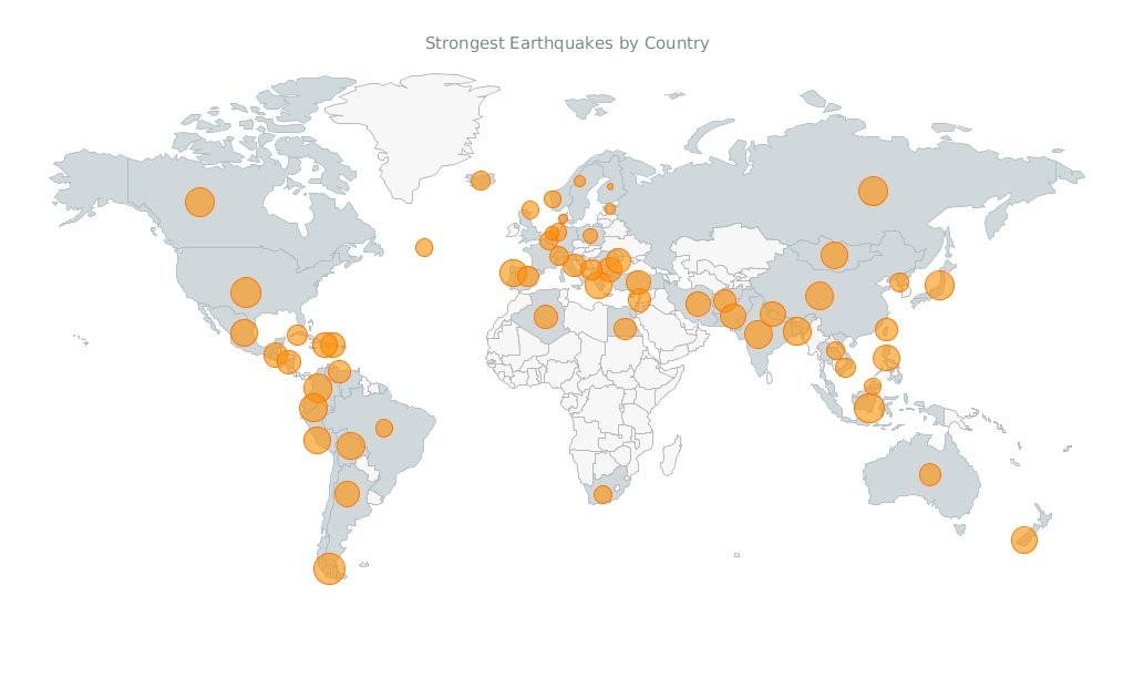
sys brew…” - Bubble Earthquakes Map – Visit our gallery and check out this interactive bubble JavaScript map created with AnyMap. It shows where the world’s strongest earthquakes occurred. AnyMap is ideal for interactive dashboards and side-by-side reporting. This JavaScript mapping solution will help you to build interactive maps and display them in any browser on any platform. AnyMap is useful when you need to display sales by region, election results, population density, or any other information related to a geographic area.
- 15 Years of Terror – a time-lapse of all terrorist attacks with more than 20 fatalities between 1.12.2000 and 13.11.2015.
- Categories: AnyChart Charting Component, AnyMap, Charts and Art, HTML5, JavaScript, News
- No Comments »

