Paris 2024 Olympic Medal Count Trackers — DataViz Weekly
August 9th, 2024 by AnyChart Team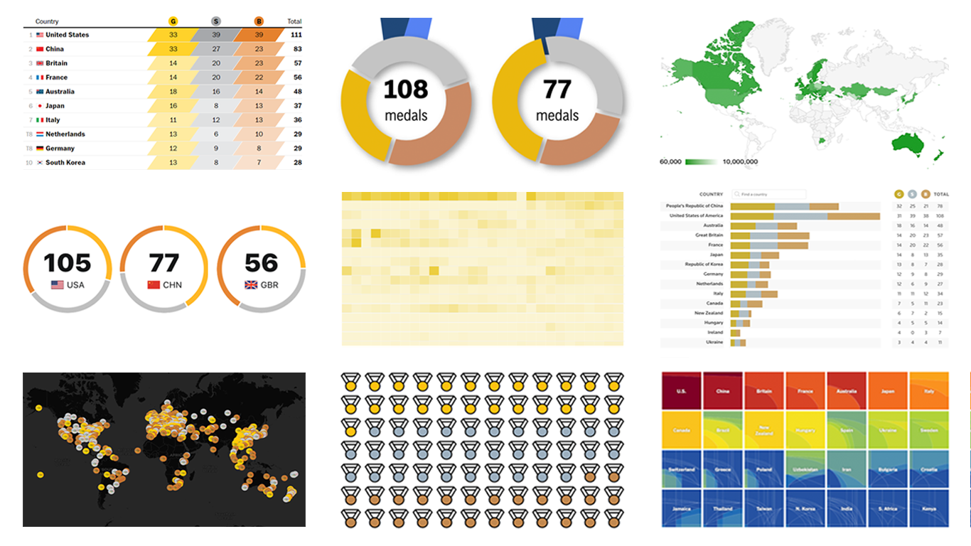 The Paris Summer Olympics are in full swing. If you’re interested in tracking the results and want to know which countries are excelling, numerous media outlets have prepared a variety of medal count trackers. In this special edition of DataViz Weekly, we showcase a selection of these projects, with a special focus on those that not only display numbers but also present them through compelling visualizations. Let’s dive in!
- Categories: Data Visualization Weekly
- No Comments »
2024 UK Election Maps — DataViz Weekly
July 8th, 2024 by AnyChart Team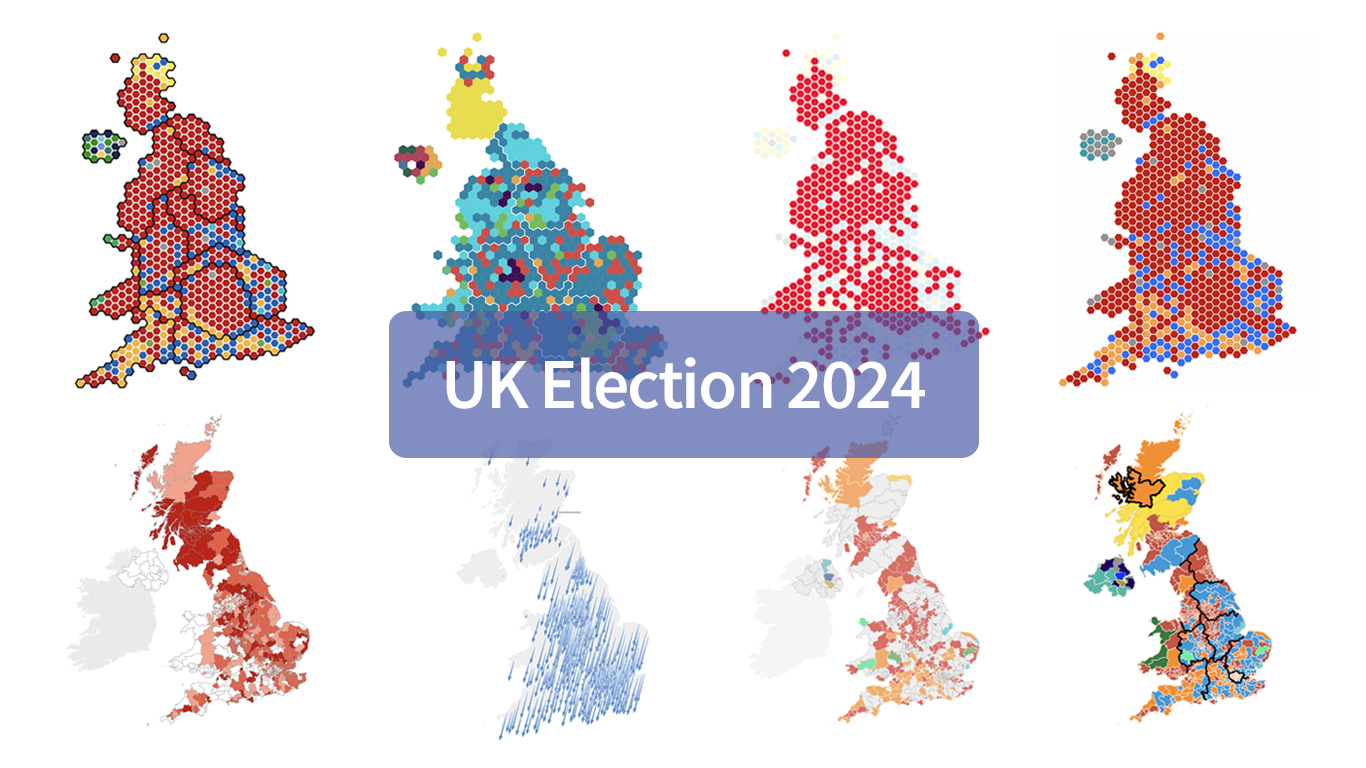 Last Thursday’s 2024 United Kingdom general election resulted in a historic shift within the nation’s political landscape, marking the Conservatives’ most severe defeat in nearly two centuries. As people look for clarity on these changes, election maps have come to the forefront as effective visual tools to make sense of voting outcomes and underlying patterns.
In this special edition of DataViz Weekly, we present a quick overview of UK election maps from prestigious sources including Sky News, The Independent, the BBC, The Financial Times, The Guardian, CNN, Open Innovations, and The New York Times, complete with links to them. Explore these data visualization projects to delve deeper into the dramatic shifts of the 2024 election, experience the power of effective electoral data mapping, and perhaps find inspiration for your own work.
💡 See also: 2024 U.S. Election Maps (November 2024).
- Categories: Data Visualization Weekly
- No Comments »
Best Data Visualizations of 2022 — DataViz Weekly
December 30th, 2022 by AnyChart Team 2022 has been fruitful in terms of data visualizations for every taste and interest. On DataViz Weekly, we’ve shown you more than 200 awesome projects as great examples of effective charting and mapping in action. Today, in the year’s last edition, let’s look at the best data visualizations of 2022 through the eyes of third-party experts!
Find out which projects made it to the “best of the year” selections of Nathan Yau, DataJournalism.com, The Pudding, and Kenneth Field.
- Categories: Data Visualization Weekly
- No Comments »
How to Make Bubble Maps in JavaScript
November 16th, 2022 by Shachee Swadia Map charts are a great way to put data in a geographical context. And they are not difficult to create! I am eager to demonstrate that by walking you through the creation of a bubble map, one of the most popular types data maps, with the help of JavaScript.
A bubble map is a combination of a bubble chart and a geographical map. It uses circles of different sizes (and sometimes colors) to indicate numeric values relating to locations or territories.
In this tutorial, I will be visualizing the data on gasoline prices across the United States. They saw record highs this summer after a surge fueled by the outbreak of the Russia–Ukraine conflict. The first, basic bubble map will display the gas prices in July by state. The final one will add the magnitude of the change since February 23, one day before Russia launched an attack on Ukraine.
Follow along and you’ll learn to build beautiful interactive maps in JS with ease and no problem!
Read the JS charting tutorial »
- Categories: AnyChart Charting Component, AnyMap, Big Data, HTML5, JavaScript, JavaScript Chart Tutorials, Tips and Tricks
- No Comments »
Creating Connector Map with JavaScript
July 15th, 2022 by Awan Shrestha Connector maps are designed to be ideal for visualizing routes and other links between locations in geospatial data analysis. In this tutorial, you’ll learn how to quickly create a compelling interactive one using JavaScript.
Step by step, we will be visualizing a route of the famous ancient Silk Road. We’ll start with the development of a basic JS connector map in four moves and then make a few tweaks to make it look awesome. Let’s start the voyage!
Read the JS charting tutorial »
- Categories: AnyChart Charting Component, AnyMap, HTML5, JavaScript, JavaScript Chart Tutorials, Tips and Tricks
- No Comments »
Best New Charts and Maps Not to Miss — DataViz Weekly
February 4th, 2022 by AnyChart Team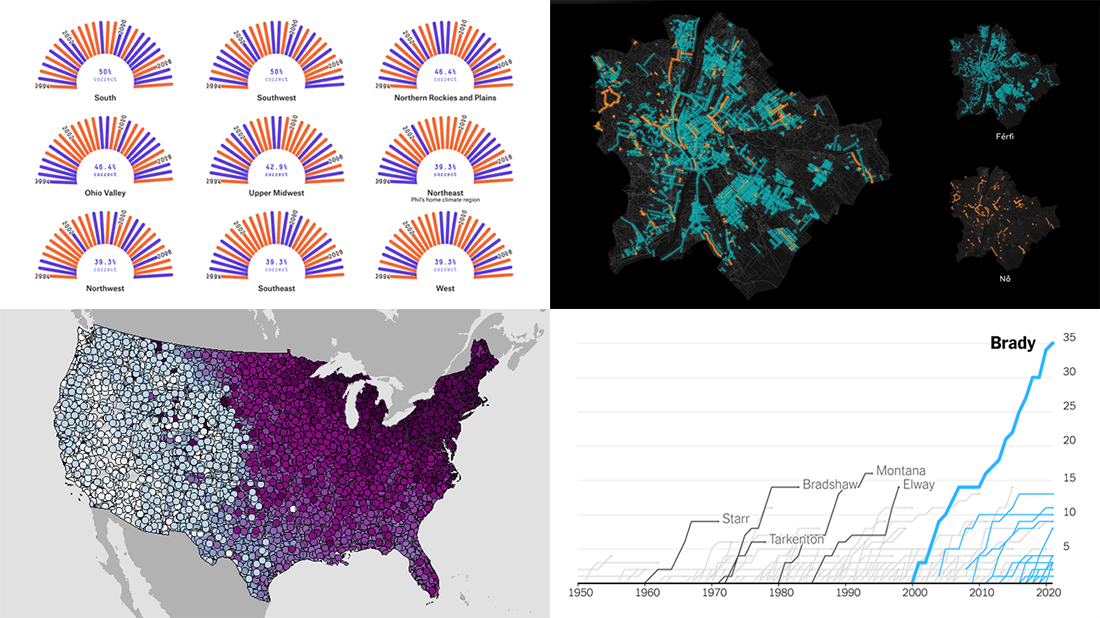 Are you sure you have seen all the best new charts and maps? Let’s see. Check out our new DataViz Weekly roundup and make sure you have not missed these four fascinating data visualization projects!
- Accuracy of Punxsutawney Phil’s and other animal meteorologists’ weather predictions — FiveThirtyEight
- The coldest day of the year across the United States — NOAA NCEI
- Tom Brady’s stellar career in American Football — The Upshot
- Budapest street names — ATLO
- Categories: Data Visualization Weekly
- No Comments »
Best Data Visualizations of 2021 — DataViz Weekly
January 7th, 2022 by AnyChart Team In 2021, there were 53 Fridays. It means a total of 53 DataViz Weekly roundups came out during the year, putting a spotlight on some of the most interesting charts, maps, and infographics from around the web. Today, on the first Friday of 2022, we invite you to remember — or get to know in case you missed something — the very best data visualizations of 2021.
As in previous “best of year” collections (2020, 2019, 2018), we decided not to reinvent the wheel but to take a quick look at renowned experts’ picks. Now, check out four lists of the best projects — from Nathan Yau, Kenneth Field, Terence Shin, and DataJournalism.com.
- Categories: Data Visualization Weekly
- No Comments »
Great Recent Data Graphics Worth Looking At — DataViz Weekly
October 22nd, 2021 by AnyChart Team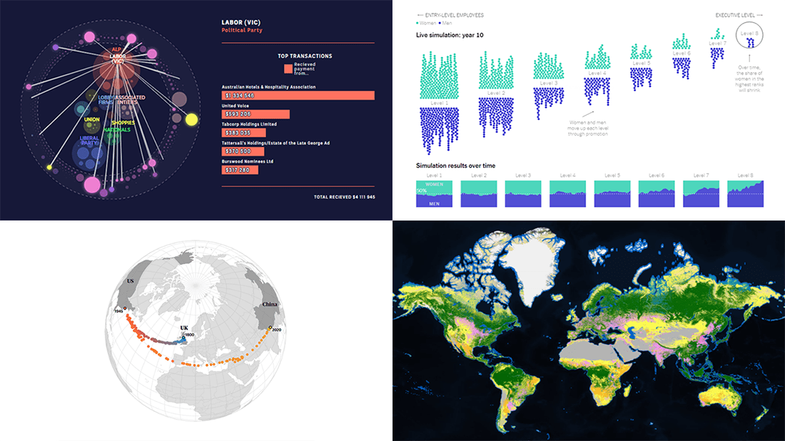 It’s time for DataViz Weekly! Check out the most interesting data visualizations that have recently come to our attention!
- Political donations from the gambling industry in Australia — ABC News
- Land cover worldwide — ESA
- Gender bias in the workplace — NYT Opinion
- World’s carbon “center of gravity” from 1800 through 2020 — The Guardian
- Categories: Data Visualization Weekly
- No Comments »
How to Build Interactive Connector Map with JavaScript
September 21st, 2021 by Shachee Swadia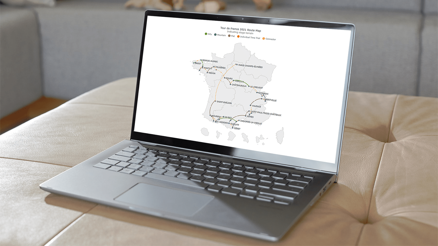 A connector map is a set of straight or curved lines that link points on a geographical map. It is commonly used to graphically represent routes or any other connections between locations. Would you like to learn how to build an attractive data visualization like that for a web page or app?
Actually, it is easy to create an interactive connector map using JavaScript. And I am ready to show you how right now! Follow along with this tutorial as I depict the cycling path of the 2021 Tour de France in the form of a JS connector map and thoroughly explain all steps.
Read the JS charting tutorial »
- Categories: AnyChart Charting Component, AnyMap, HTML5, JavaScript, JavaScript Chart Tutorials, Tips and Tricks
- 2 Comments »
Visualizing Codebase Structure, Climate Data, Time Use Patterns, and Census Stats — DataViz Weekly
August 13th, 2021 by AnyChart Team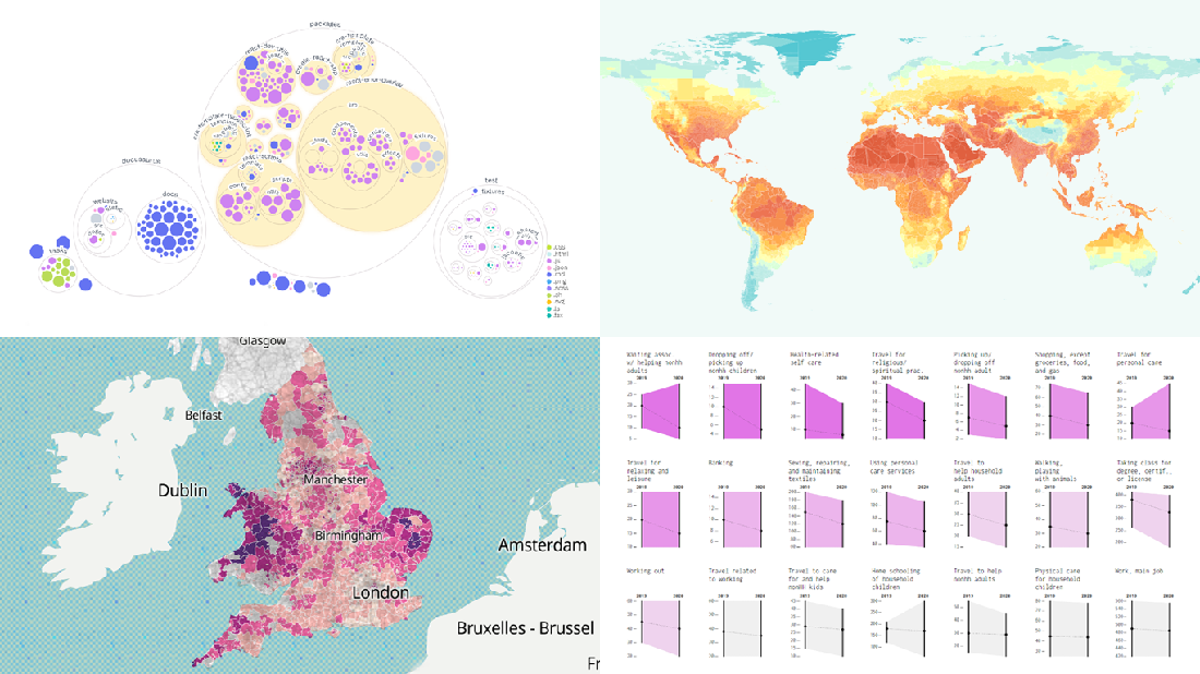 It is Friday the 13th. But don’t worry about the irrational! Check out the four really cool data visualization projects we have discovered around the web these days and you will be fine, entertained, and inspired.
Today on DataViz Weekly:
- Codebase visualization in packed bubble charts — GitHub OCTO
- Climate change impacts through 2099 — Climate Impact Lab
- Shifts in U.S. time use patterns during the pandemic — Nathan Yau
- 50 years of social change in England and Wales — ONS
- Categories: Data Visualization Weekly
- No Comments »