New Amazing Graphics for Fans of Data Visualization — DataViz Weekly
July 16th, 2021 by AnyChart Team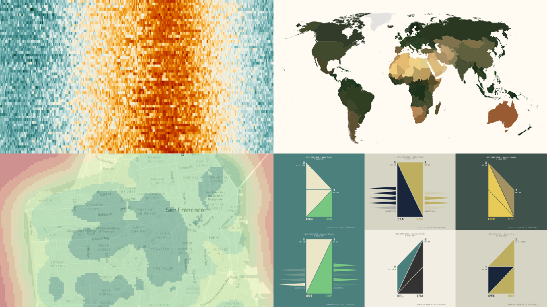 Are you ready for another set of amazing data graphics? It’s Friday, so DataViz Weekly is here to let you know about four great new visualization works worth checking out right now!
- 15-minute cities in Germany and worldwide — Chris and Nils from Gießen
- Daily temperatures in Tokyo since 1964 (and what to expect at the Olympics) — Reuters
- Average colors of countries, as well as U.S. states and counties — Erin Davis
- Euro 2020 and Copa América 2021 playoffs visualized in triangles — Krisztina Szűcs
- Categories: Data Visualization Weekly
- 1 Comment »
Visualizing Vaccination Rates, Political Bubbles, Curry’s Stats, World Justified — DataViz Weekly
May 7th, 2021 by AnyChart Team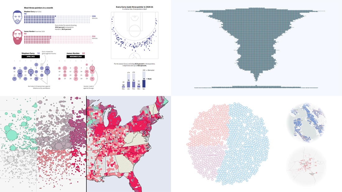 Every week, we choose the four most interesting visualizations from all we came across these days and present them to you in a quick review. Below is a list of the ones that made it to this new DataViz Weekly — take a glance and keep reading for a closer look at each!
- Vaccination rates in comparison with case metrics across the U.S. — McKinsey & Company
- Political bubbles across the U.S. — The New York Times Opinion
- Stephen Curry’s record-setting April scoring spree — The Washington Post
- World justified, left-aligned, centered, right-aligned — Nicolas Lambert
- Categories: Data Visualization Weekly
- No Comments »
Making JS Dot Density Map to Visualize Shipping Ports Across Globe
April 20th, 2021 by Shachee Swadia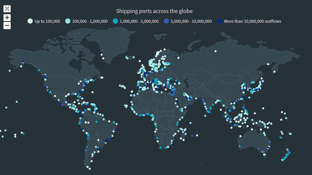 The recent incident of the Suez Canal blockage caught my interest in shipping and prompted me to explore the various shipping ports around the globe. There are more than 850 ports in the world and to get an overall view of where these are located, I decided to plot them on a dot map, or dot density map, using JavaScript.
Building an interactive JS dot density map can seem like a daunting task. But let me assure you that it can be pretty straightforward. Right now, I will show how to make a fully functional dot map chart using a JavaScript library for data visualization.
Read the JS charting tutorial »
- Categories: AnyChart Charting Component, AnyMap, Big Data, HTML5, JavaScript, JavaScript Chart Tutorials, Tips and Tricks
- No Comments »
How to Create Bubble Map with JavaScript to Visualize Election Results
January 25th, 2021 by Shachee Swadia In these times of exponentially growing data, visualization is a necessary skillset to have in your tool box. Popular techniques include bar charts, line graphs, pie charts, and bubble maps among others.
Building interactive charts from scratch with JavaScript can be a difficult endeavor for any developer, especially someone starting out new. That is exactly why we have JS charting libraries which make it much easier and quicker to conjure up insightful visualizations!
Read on to see how I create a JavaScript Bubble Map with one of these libraries.
Read the JS charting tutorial »
- Categories: AnyChart Charting Component, AnyMap, Big Data, Charts and Art, HTML5, JavaScript, JavaScript Chart Tutorials, Tips and Tricks
- No Comments »
Creating Choropleth Map Data Visualization Using JavaScript, on COVID-19 Stats
May 6th, 2020 by Anastasia Zoumpliou These days you see choropleth maps in a variety of webpages and utilized for various subjects. Have you wondered how such data visualizations are built? Are you interested in making them by yourself? If so, stay with me through this JS charting tutorial, where I will show you how to create an interactive JavaScript choropleth map from scratch but with ease.
Basic knowledge of HTML5 and JS is always helpful, but even if you are a beginner in this field, understand these four simple steps and you will be able to quickly get a good-looking cross-platform interactive choropleth map data visualization for your app or website!
What exactly are choropleth maps? When you break down the word, you see that choro- (“choros”) means “area” and pleth- (“plethos”) means “multitude.” Exactly, these maps are used to visualize statistical data related to multiple geographic areas. Each area is colored or shaded differently according to the value of the given data, making it easy to grasp how a measurement varies across a territory.
For this JS mapping tutorial, I will use open COVID-19 data to show the distribution of confirmed cases and deaths around the world by country. I will start with a basic choropleth map that will graphically represent the confirmed cases. Then I will add a legend, customize the tooltip, and add bubbles to visualize the number of deaths.
Let’s get started!
Read the JS charting tutorial »
- Categories: AnyChart Charting Component, AnyMap, Big Data, HTML5, JavaScript, JavaScript Chart Tutorials, Tips and Tricks
- 2 Comments »
Mapping Data About Cancer, Nobel Physicists, Rain, and Fall Foliage — DataViz Weekly
September 28th, 2018 by AnyChart Team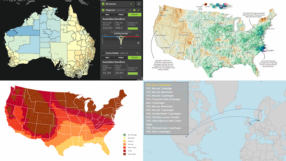 Today’s DataViz Weekly article highlights new beautiful map visualizations, demonstrating how mapping data can help to get geographical insights such as spatial trends, clusters, and so on:
- Australian Cancer Atlas;
- lifetime movements of Nobel Prize laureates in physics;
- U.S. summer rain levels;
- fall foliage prediction across the U.S.
- Categories: Data Visualization Weekly
- 1 Comment »
Map Visualizations About US Violence, UK Real Estate, Brazil Streets, and Berliners — DataViz Weekly
August 31st, 2018 by AnyChart Team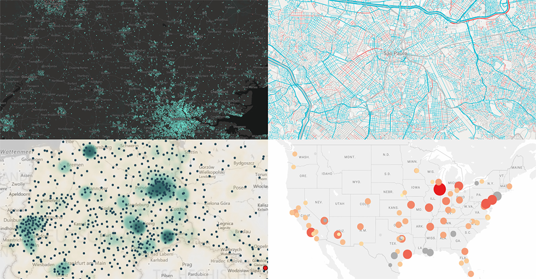 Hey everyone. This week, we’ve come across four interesting map visualizations and decided to share them with you within the framework of our DataViz Weekly feature. Let’s start with a quick list of what projects are featured and then, without more ado, take a look at them more closely right away:
- gender of all streets in Brazil;
- birthplaces of current Berliners;
- house price change in England and Wales;
- violent crime trends in the USA.
- Categories: Data Visualization Weekly
- No Comments »