Recent Data Visualization Projects Worth Exploring — DataViz Weekly
December 6th, 2024 by AnyChart Team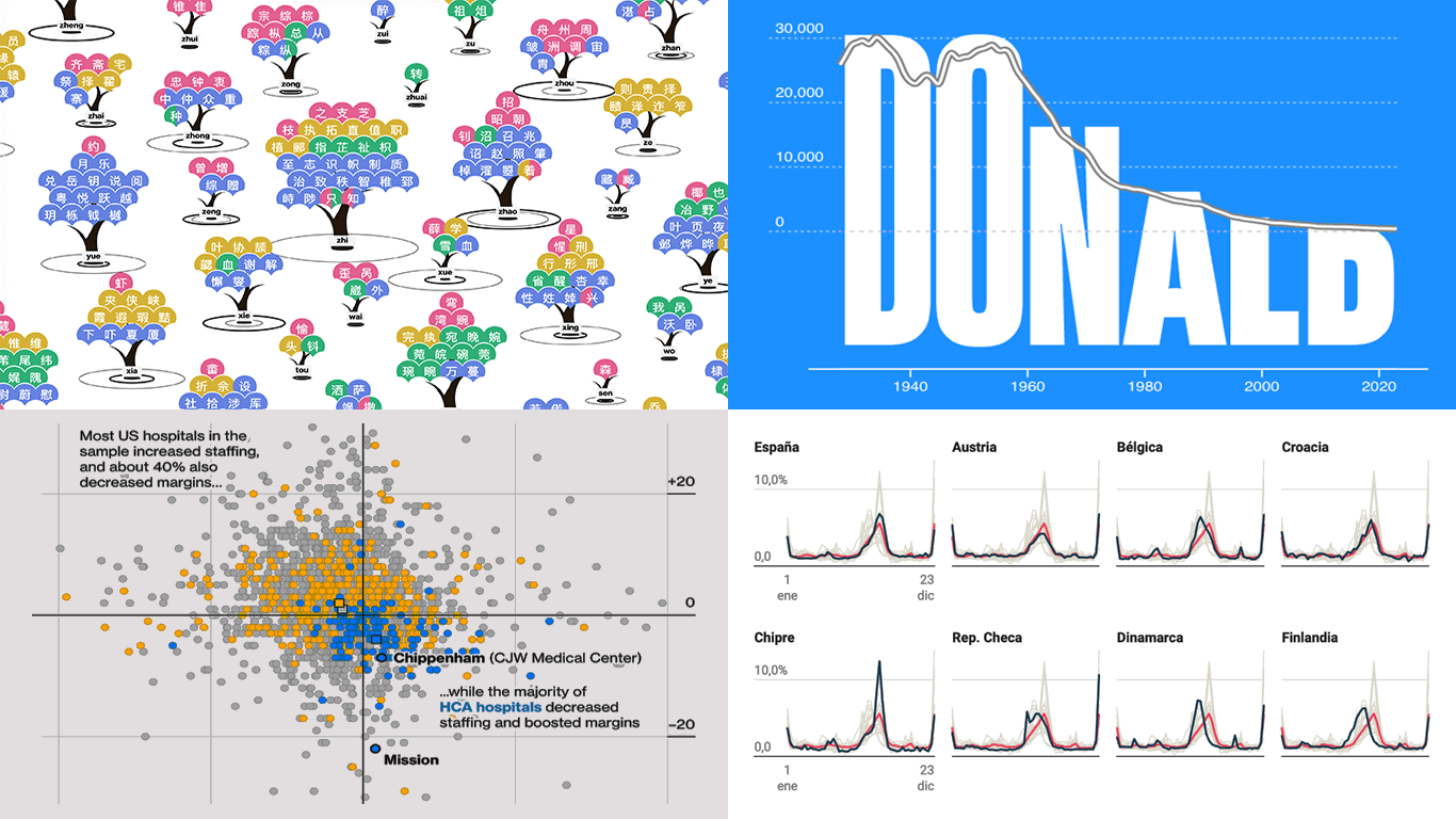 Data visualization makes complex information accessible and insightful, serving as a valuable tool for both analysis and communication. This edition of DataViz Weekly features four recent projects that showcase its application across diverse topics.
- Chinese name complexity in Pinyin translation — CSH
- Name popularity visualized through letter size — Jetpack.AI
- Nurse practitioner risks and HCA Healthcare — Businessweek
- Temporal vacation trends across Europe — El Confidential
- Categories: Data Visualization Weekly
- No Comments »
Impressive New Data Graphics on Abortions, Homes, Names, Land — DataViz Weekly
March 11th, 2022 by AnyChart Team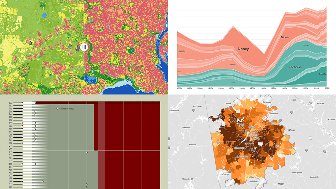 DataViz Weekly is here with another batch of impressive data graphics worth looking at and exploring! Today, we are eager to tell you about the following four new projects:
- Burden of abortion across the United States — FiveThirtyEight
- Real estate investor activity in the 40 major American cities in 2021 — The Washington Post
- Historical popularity of baby names in the U.S. since the 1880s — Namerology
- Australia land cover in detail — Geoscience Australia
- Categories: Data Visualization Weekly
- No Comments »
Hot Visualizations on Youth Life, American Names, Climate Change, and Mother Tongues — DataViz Weekly
January 24th, 2020 by AnyChart Team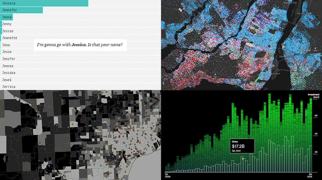 Check out some of the new hot visualizations we have come across this week! Not only are they good graphical data presentation examples, they also bring interesting insights.
- Youth life expectancy and educational opportunity across the United States — Child Trends
- Guessing names based on what letter(s) they start with — FlowingData
- Climate change scoreboard — Bloomberg Green
- Mother tongues across Canada — Anagraph
- Categories: Data Visualization Weekly
- No Comments »
Stunning Data Visuals on Names, Slavery, Privacy, and Foliage — DataViz Weekly
August 30th, 2019 by AnyChart Team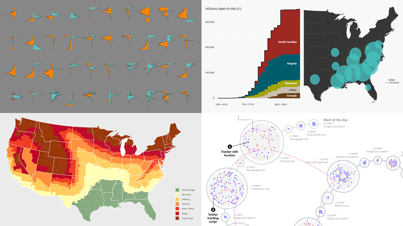 Are you ready for a new dose of stunning data visuals? Today is Friday, and DataViz Weekly is already here! Today we invite you to take a look at the following new interesting projects with charts and infographics:
- Gender-switched names in the United States
- Growth of slavery in America
- Website user data trackers
- Peak fall foliage color across the U.S.
- Categories: Data Visualization Weekly
- No Comments »