Let’s Connect at Qlik Connect 2024: AnyChart Booth #807
May 13th, 2024 by AnyChart Team Qlik Connect 2024 is on the horizon, and we’re pleased to announce that AnyChart will be participating as an Emerald sponsor and exhibitor. Join us from June 3–5 at Rosen Shingle Creek in Orlando, Booth #807!
Read more at qlik.anychart.com »
- Categories: AnyChart Charting Component, Business Intelligence, Dashboards, Gantt Chart, News, Qlik
- No Comments »
Exploring Insights with Data Visualization — DataViz Weekly
May 3rd, 2024 by AnyChart Team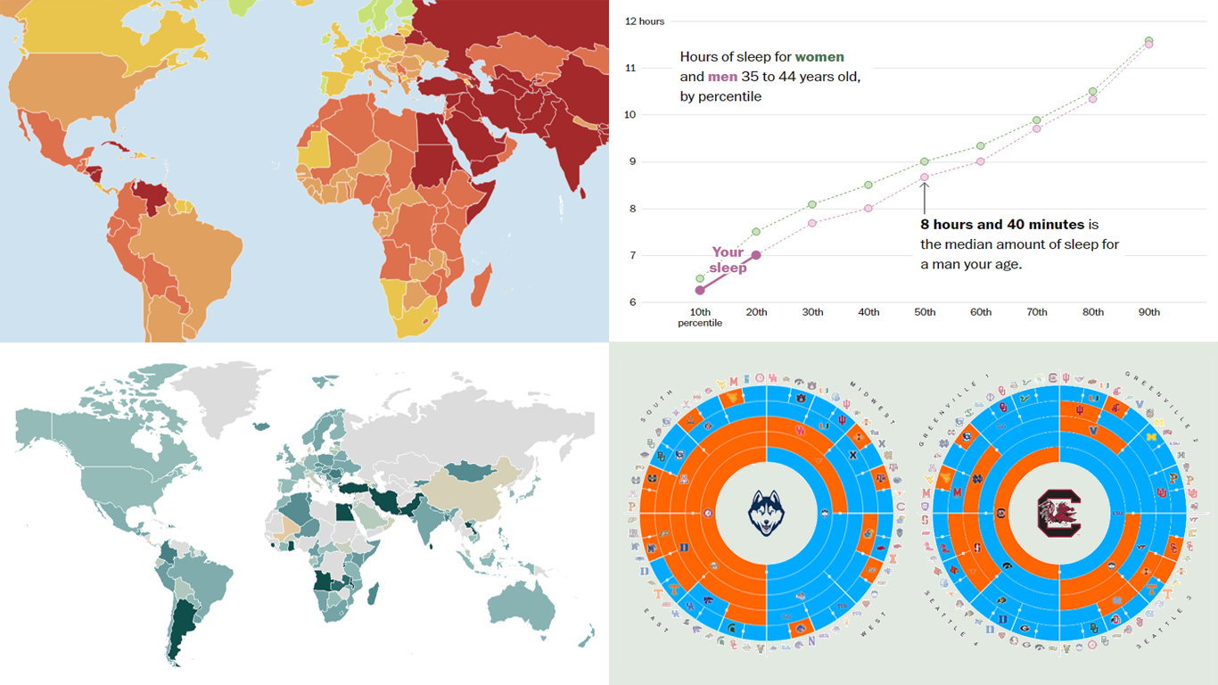 Welcome to the new DataViz Weekly, where we continue exploring the transformative power of data visualization. This edition presents a selection of new examples of how charts and maps can help us understand trends and patterns in various subjects — from sports and philanthropy to global challenges like press freedom and inflation, and everyday topics such as sleep. Here are the projects featured this time:
- March Madness philanthropy challenge — Bloomberg
- 2024 World Press Freedom Index — Reporters Without Borders
- Global Inflation Tracker — Council on Foreign Relations
- Sleep trends in America — The Washington Post
- Categories: Data Visualization Weekly
- No Comments »
Freiheit Gruppe Uses AnyChart JS to Visually Organize Berliners’ Ideas for Berlin University Alliance
July 5th, 2023 by AnyChart Team Data visualization is a game-changer when it comes to exploring and making sense of data. And here at AnyChart, we’re passionate about making the development of interactive charts a breeze. Our award-winning JavaScript charting library is not only trusted by the big players in enterprise data intelligence systems, with over 75% of Fortune 500 companies relying on it. It is a go-to choice for thousands of developers worldwide who want to easily create awesome visualizations for their – and their clients’ – websites and apps.
Recently, we discovered a stunning sunburst chart powered by AnyChart on the website of the Berlin University Alliance. This diagram effectively organizes the ideas submitted by Berliners within the framework of the #Berlinforschtmit project, which calls upon the local community to tip scientists regarding new research topics. These collective efforts aim to make significant contributions toward enhancing the quality of life in the city.
We’ve had the pleasure of having a quick conversation with Björn Knetter from Freiheit Gruppe, the team responsible for the design and technical implementation of #Berlinforschtmit. He told us more about this innovative initiative and how they leverage AnyChart for impactful data visualization. All aboard for our quick interview!
- Categories: AnyChart Charting Component, Big Data, HTML5, JavaScript, Success Stories
- No Comments »
How to Make Sunburst Chart in JavaScript
June 19th, 2023 by Awan Shrestha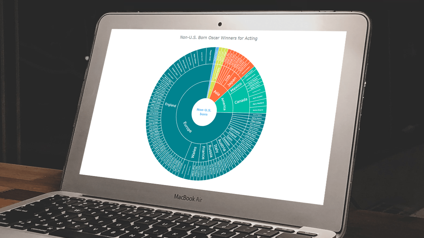 In the world of data all around us, charts play a crucial role in helping us explore and understand data more effectively. One powerful visualization technique is the sunburst chart, which allows us to represent hierarchical datasets, providing insights into complex compositions visually. In this tutorial, I’ll show you how to create your own stunning interactive sunburst charts using JavaScript effortlessly.
We’ll embark on an exciting journey using data about Oscar-winning actors and actresses from countries around the world as an example. Our JS-based sunburst chart will shine a spotlight on the achievements of those born outside the United States, representing the rich diversity of their origins.
Get ready to unlock the secrets of JavaScript sunburst chart development as I’ll guide you step-by-step. Together, we’ll learn how to effortlessly bring data to life, creating this mesmerizing visualization that engages and informs. Let’s dive in and discover the fascinating world of the sunburst chart!
Read the JS charting tutorial »
- Categories: AnyChart Charting Component, Big Data, HTML5, JavaScript, JavaScript Chart Tutorials, Tips and Tricks
- No Comments »
Viva Qlik with AnyChart — Thank You QlikWorld!
May 24th, 2023 by AnyChart Team Hey, we’d like to share with you the amazing experience QlikWorld provided to its Customers and Partners alike. It was fantastic, and we’re still buzzing with excitement about all that happened in and around Mandalay Bay Las Vegas on April 17–20!
First and foremost, our Decomposition Tree extension for Qlik Sense stole the show…
Read more at qlik.anychart.com »
- Categories: AnyChart Charting Component, AnyGantt, Big Data, Business Intelligence, Gantt Chart, Qlik
- No Comments »
Vasari Diagram Visualizes Wikipedia Networks of Painters with AnyChart JS
September 29th, 2022 by AnyChart Team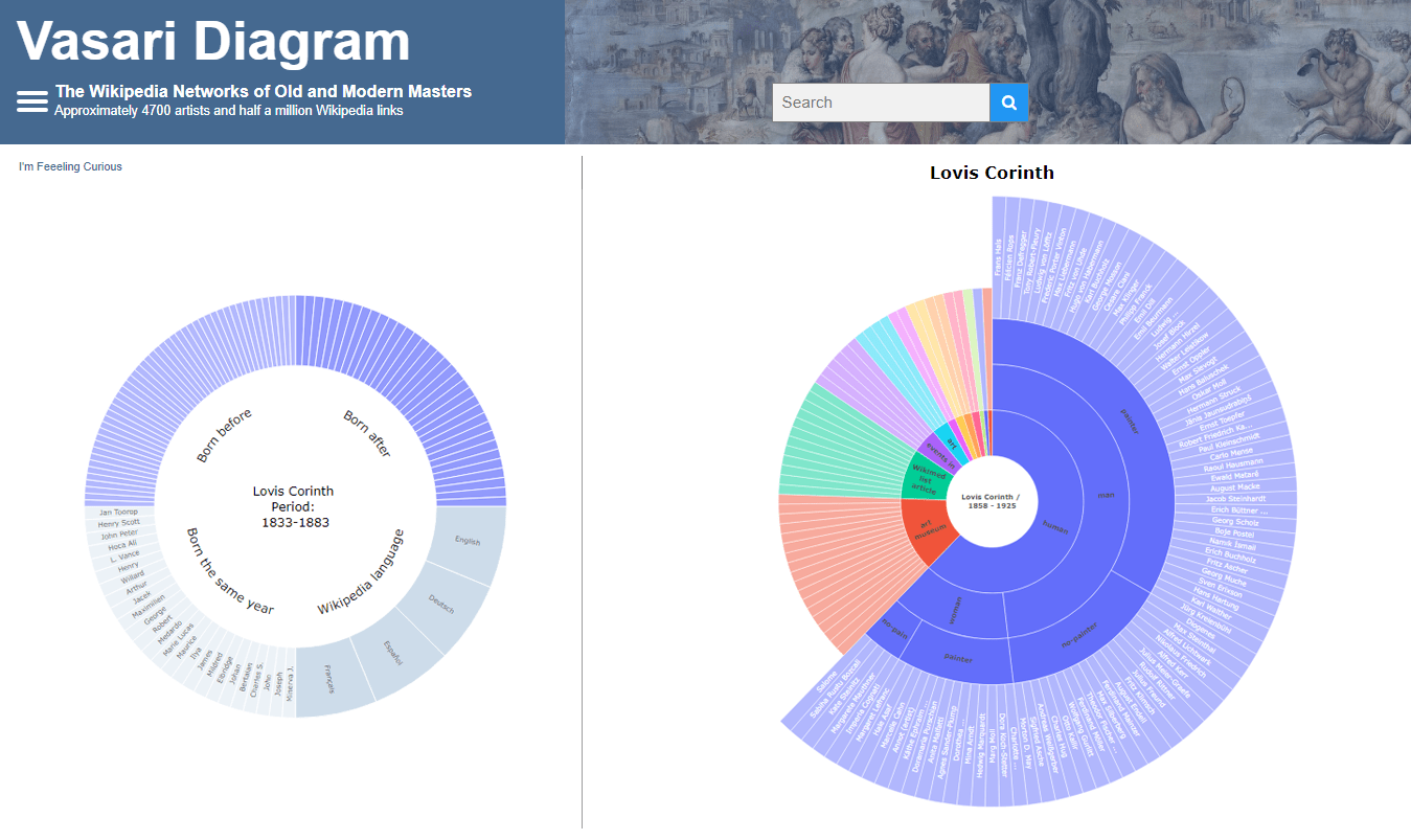 There are numerous cases where our customers first picked a different JavaScript charting library to operate data visualization in their projects but then could not get absolutely what they wanted, and in the end, switched to AnyChart and are happy with their new and final choice. Here is one of such examples.
Francis Lapique and Temenuzhka Dimova ended up using our Sunburst Chart solution in their Vasari Diagram, a fascinating asset for art history researchers and enthusiasts. This project lets anyone explore which people and topics various painters are connected with.
Read our interview where Francis describes the Vasari Diagram project and how AnyChart is used, and check it out!
- Categories: AnyChart Charting Component, Big Data, Charts and Art, HTML5, JavaScript, Success Stories
- No Comments »
AnyChart Used for Data Visualization in Open-Source Redis Inventory Tool
September 29th, 2021 by AnyChart Team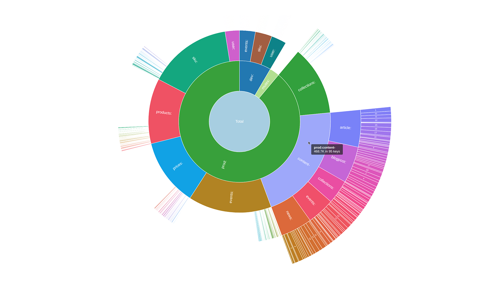 Sunburst charts are known to be greatly useful for visualizing hierarchical data structures. So it is no surprise that this chart type became a big hit among our users immediately after we added it to the AnyChart JavaScript library. Because the core of our global customer base is enterprise clients, most of the real-world use cases for our JS sunburst chart are hidden in internal corporate apps. But AnyChart is often picked for data visualization in open projects as well, and we invite you to see a super cool example we have recently found out about — Redis Inventory. It is an open-source tool that makes it easy to view Redis memory usage by key patterns in a hierarchical way, with an interactive sunburst chart in action.
Learn more about Redis Inventory and how AnyChart is used there from our quick interview with its creator Aleksandr Obukhov. (Stack: Go/Cobra/Redis.)
- Categories: AnyChart Charting Component, Big Data, HTML5, JavaScript, Success Stories
- No Comments »
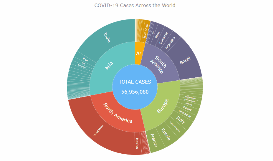
How I Created Sunburst Chart Using JavaScript to Visualize COVID-19 Data
December 8th, 2020 by Shachee Swadia Almost recovered from COVID-19 myself these days, I decided to explore how the world is currently doing, during the pandemic. So I created a sunburst chart to see at a glance what continents and countries are more (and less) affected by the coronavirus than others. The process was quick and I thought someone could be interested to learn about how such data visualizations can be built in a pretty straightforward way, even with very little technical skills. So I also made a tutorial. And here I am — (1) sharing my interactive sunburst chart of COVID cases and (2) describing how I created it using JavaScript in a matter of minutes, step by step!
My JS sunburst chart provides an overview of the situation as of November 24, 2020, and also shows the global count, continent-wide data, and country-wise proportions for the current active COVID-19 cases and deaths. Scroll down to explore it by yourself and check out the tutorial along the way. Here is a sneak peek of the final chart to get you excited:
This sunburst charting tutorial is mainly for beginners to data science. So before we get to business, let’s make sure we’re on the same page. I’ll explain what a sunburst chart is and how it works, to start with. Then I’ll show you how to create a cool and colorful interactive visualization like that with JavaScript (and you can do it even if you don’t know it too well). That’s the plan!
Read the JS charting tutorial »
- Categories: AnyChart Charting Component, Big Data, Business Intelligence, HTML5, JavaScript, JavaScript Chart Tutorials, Tips and Tricks
- No Comments »