Creating Timeline Chart of Roman History Using JavaScript
October 3rd, 2024 by AnyChart Team Ever caught yourself thinking about the Roman Empire more often than you’d like to admit? You’re not alone, and we’ve got just the thing for you! With the recent AnyChart JS Charts 8.13.0 release, we’ve enhanced our timeline chart for better support of historical data visualization. We’d love to showcase this improvement in action.
We’ve added a Roman History Timeline to our gallery of timeline chart examples, and we now invite you to discover how it was developed from scratch. In this in-depth JavaScript charting tutorial, we’ll cover everything from A to Z, meticulously guiding you through each step — from setting up the HTML environment to adding detailed data and customizing the visualization to make the chart both informative and engaging. The final result is an interactive timeline that you can proudly call your own Roman Empire.
So, whether you’re a history enthusiast caught up in the recent meme trend or a developer eager to expand your data visualization skills, follow along and learn how to create compelling historical timeline charts using JavaScript!
Read the JS charting tutorial »
- Categories: AnyChart Charting Component, Big Data, HTML5, JavaScript, JavaScript Chart Tutorials, Tips and Tricks
- No Comments »
New Examples of Charts Enabling Effective Visual Data Exploration — DataViz Weekly
September 9th, 2022 by AnyChart Team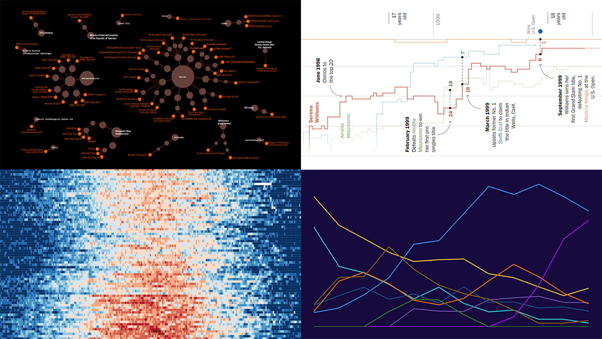 DataViz Weekly is back with a quick look at some of the most interesting new examples of charts that enable effective visual data exploration. Here are the projects featured this time:
- Producers of Russian military equipment — Texty
- Wins, losses, and comebacks in Serena Williams’s professional tennis career — The Washington Post
- Tropical nights in Spain over the decades — elDiario.es
- Platform origins of viral memes — Know Your Meme
- Categories: Data Visualization Weekly
- No Comments »